SprintSafe / B2B SaaS Startup - Brand Strategy and Design
Drazen Vukajlovic
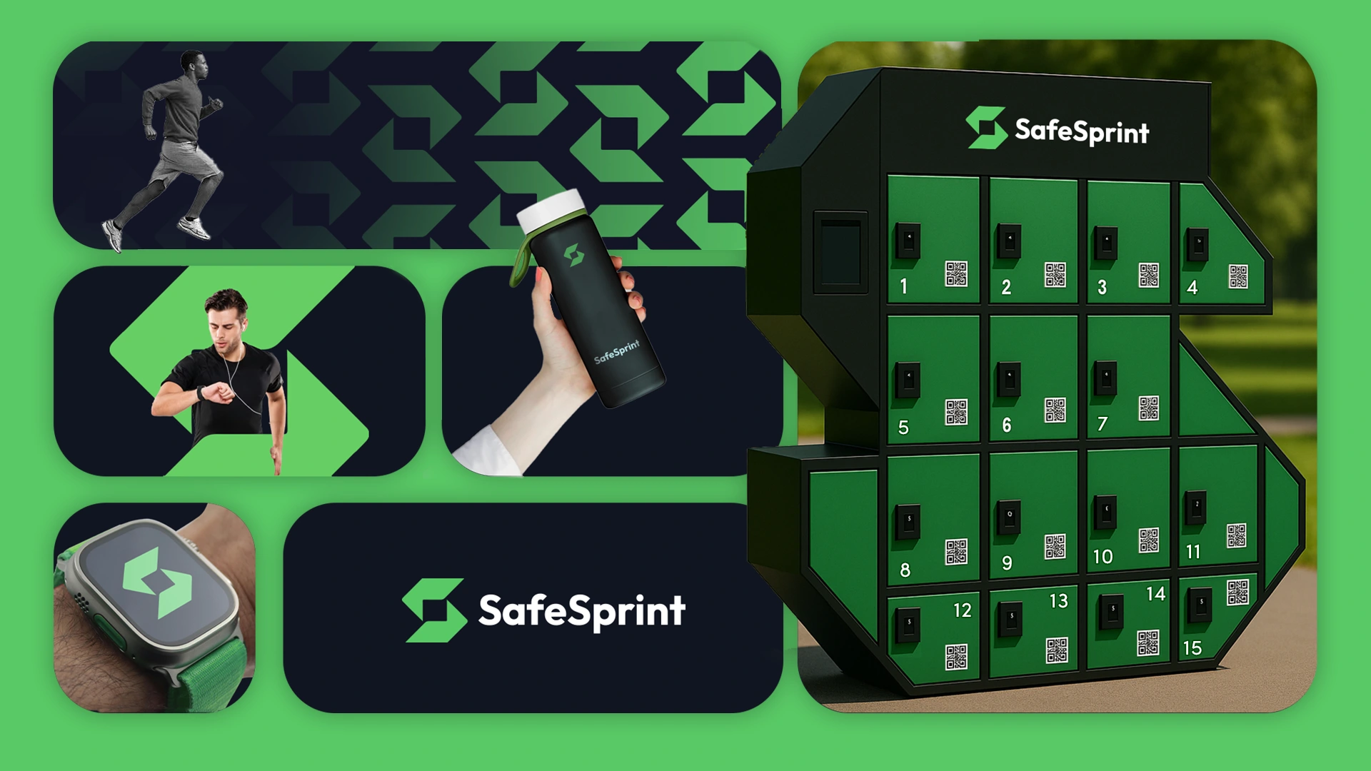
I designed the visual identity for SafeSprint, a network of smart safe boxes in public parks that let people securely stash belongings while their phones charge. My goal was to create a system that reads as modern and technically trustworthy but is ultimately rooted in human needs and the realities of a park environment.
I started by mapping the product’s physical context: boxes placed among trees, paths, benches, and people. Because these are physical objects in calm public spaces, I intentionally avoided a cold, overly techy aesthetic. Shapes, finishes, and colors were chosen to belong in the landscape, using subtle, muted base tones that blend with greenery and restrained accent colors that signal action or status without shouting.
Typographic and graphic choices focused on clarity and confidence. I used crisp, highly legible type for wayfinding and UI text so information reads quickly in motion. Geometric shapes and modular forms create a visual language that communicates precision and agility, while motion cues and iconography emphasize movement, quick access, and secure states.
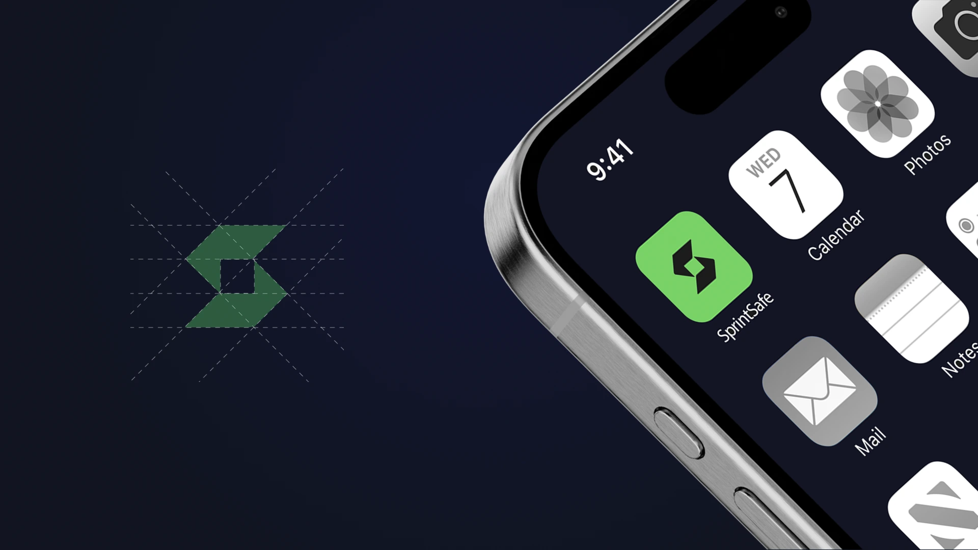
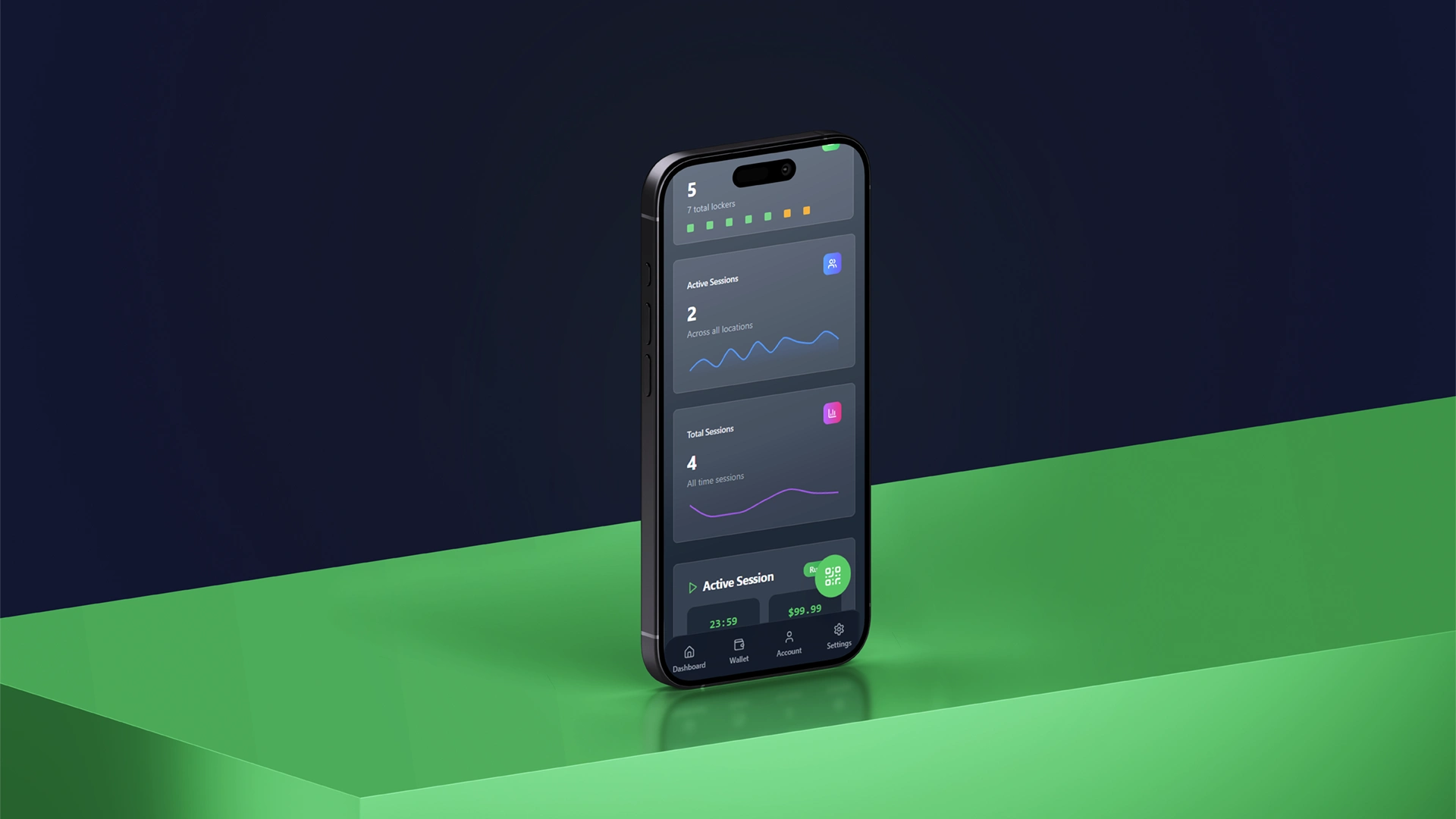
The identity system covers logo, icon set, motion language, and UI styling. Motion graphics were designed to suggest forward movement and smooth transaction flow (check-in, charging, secure), reinforcing the product promise of convenience and reliability. The UI and signage prioritize minimalism and instant comprehension, using large, clear indicators for charging and lock status so users can act quickly and confidently.
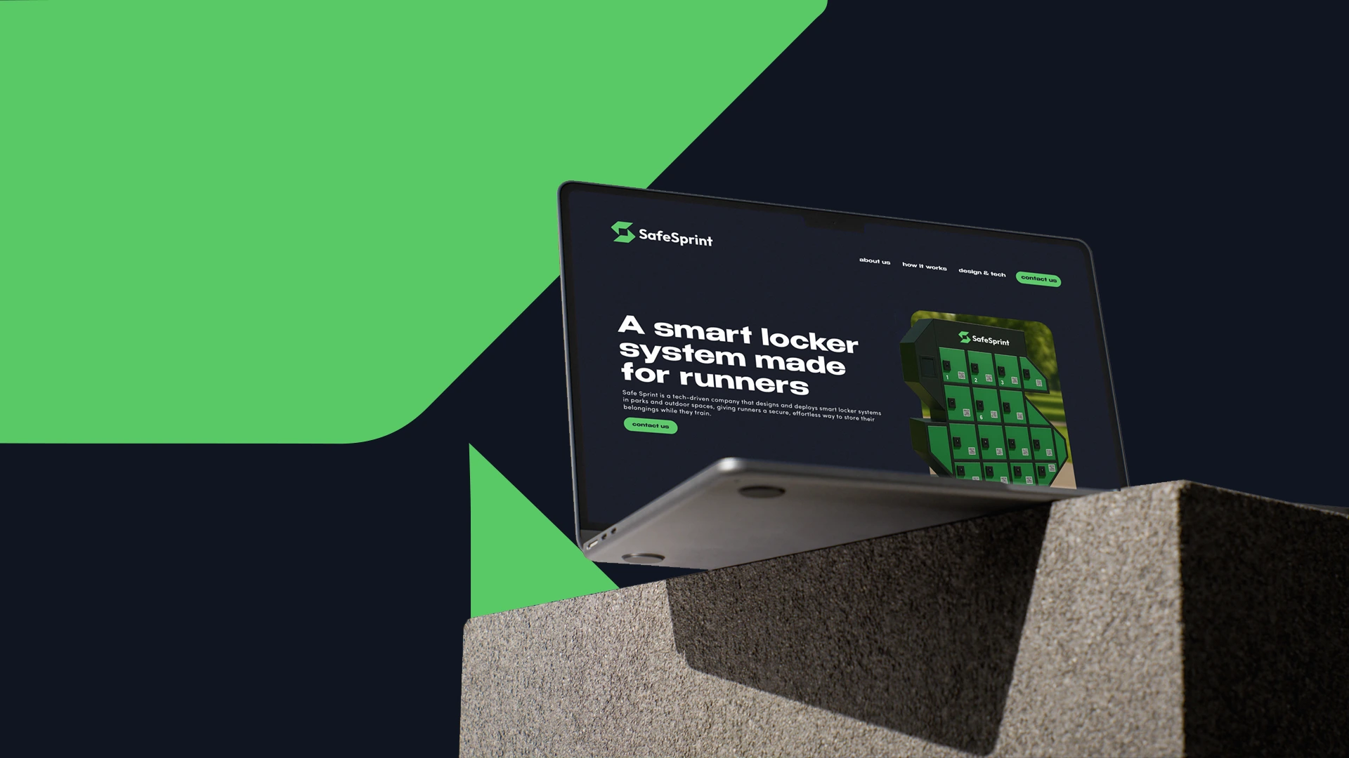
Physically, I designed the visual treatment to respect scale and durability, with forms that are compact and approachable, finishes that reduce glare and visual contrast, and markings that are readable at a glance from common approach angles. The result is a brand that integrates with the park environment while remaining distinctly usable and recognizable.
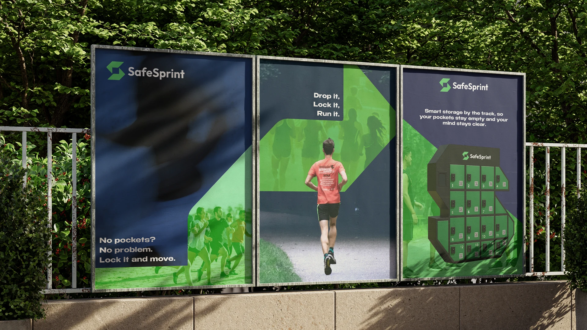
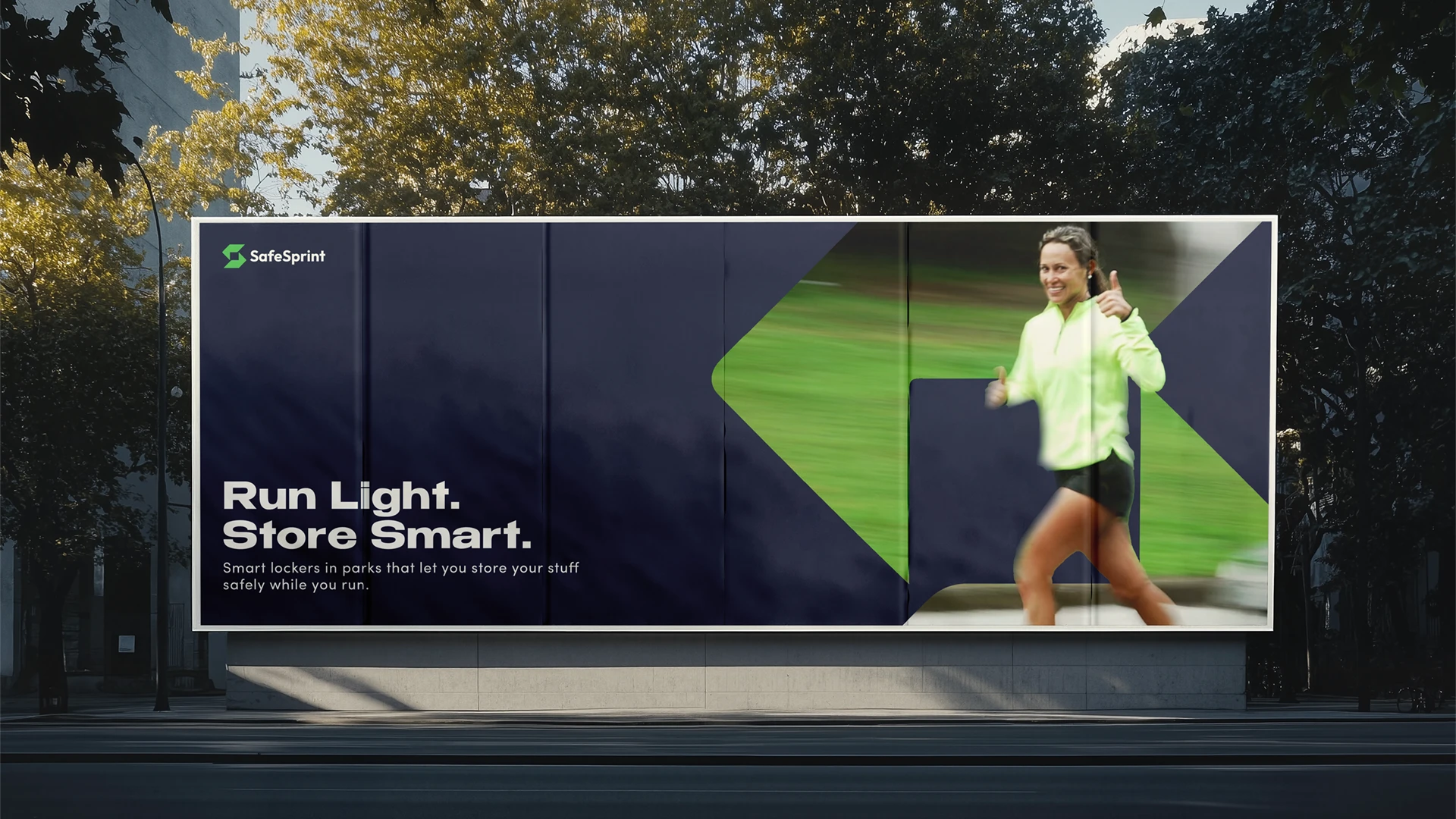
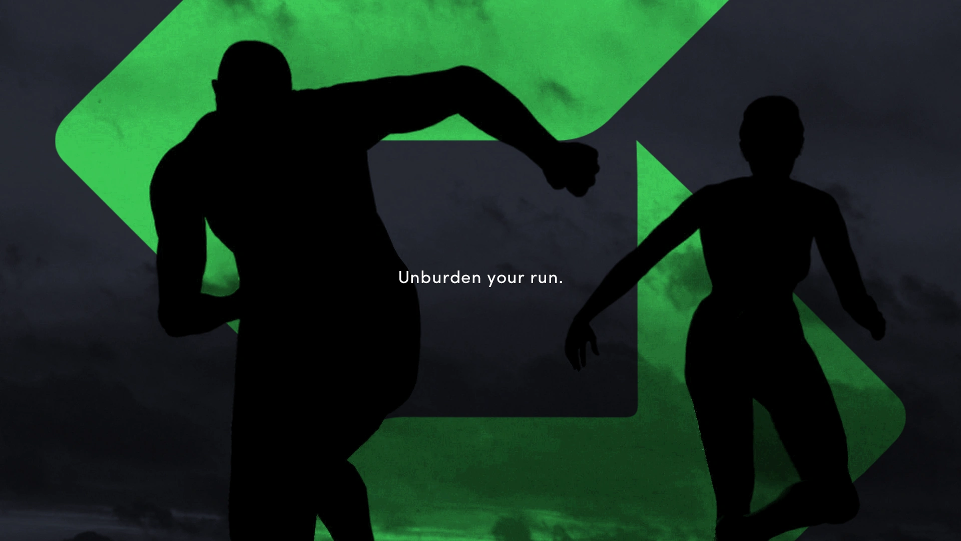
Throughout the project the guiding principle was human-first. The technology works quietly in the background so the person, the runner, the parkgoer, remains the focal point. Every decision, from palette to motion timing, was made to support a seamless, trusted experience that feels both modern and warmly approachable.
Like this project
Posted Aug 5, 2025
SprintSafe is a smart locker system for athletes and outdoor enthusiasts. It keeps your belongings safe while you train, run, or ride — so you can move freely.
Likes
7
Views
50
Timeline
Jul 2, 2025 - Jul 24, 2025