Freelancers using Adobe Photoshop in ColombiaFreelancers using Adobe Photoshop in Colombia
Frontend Developer | Framer & Webflow Expert
$25k+
Earned
10x
Hired
5.0
Rating
22
Followers
Frontend Developer | Framer & Webflow Expert
Motion designer
$25k+
Earned
6x
Hired
5.0
Rating
15
Followers
Motion designer
Brand Identity & Content Creation | Video & Motion
5.0
Rating
22
Followers
Brand Identity & Content Creation | Video & Motion
Cover image for There are design decisions that
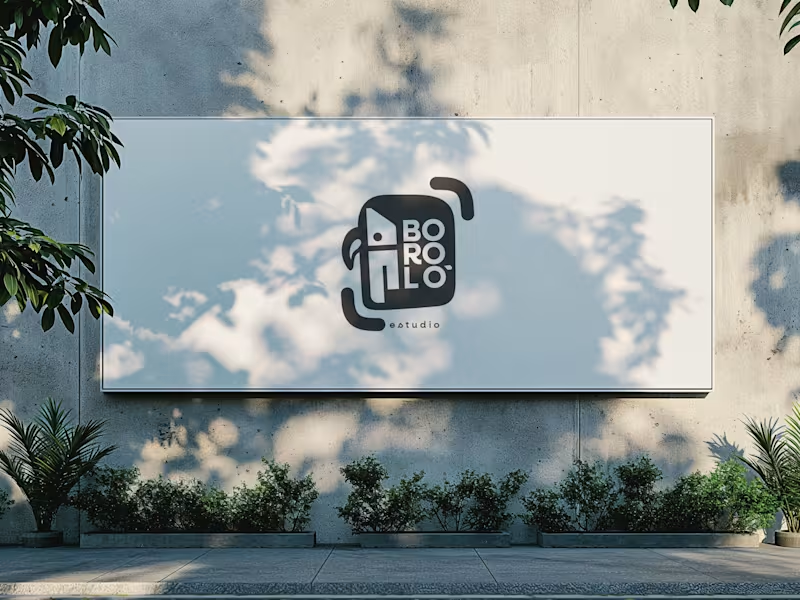
There are design decisions that don't come from the client. They come from within—and sometimes, that is exactly the problem. The previous logo for Boroló Estudio had soul. It had pre-Columbian roots, a hand-drawn stroke, and an indigenous character. It evoked drums, authenticity, and the Chocó—one of the most biodiverse and culturally rich regions in Colombia, a land of jungle, rivers, and a visual identity unlike any other. I loved it. And precisely because of that, I failed to evaluate the challenges the logo would face on real-world platforms: on a website, as an Instagram avatar, or in digital spaces. The redesign wasn't about letting go of the logo. It was about letting go of the attachment. The problem wasn't aesthetic—it was one of coherence. The studio’s brand had evolved, but the logo hadn't. A composition with too many elements in tension made the icon struggle to be memorable; what people saw didn't connect with who Boroló truly is. The new system retains the bird—now geometric, set in negative space within the icon. The inner container references the studio’s actual architectural blueprint: the diagonal of the cyclorama ceiling and the two zones of the space. The brackets refer to photographic framing. No layer imposes itself over the other—they are discovered. The result is a versatile system: imagotype, vertical logo, and wordmark. It works on a sticker, a billboard, an avatar, or a website. It scales without losing its identity. Redesigning doesn't mean the initial design was bad. It means communication needed to evolve. And from that point of view, the change isn't a correction—it’s a decision.
3
166
From the first spark to their brightest form.
$1k+
Earned
11x
Hired
5.0
Rating
41
Followers
From the first spark to their brightest form.
Architect | Interior Designer | 3D Rendering |
5.0
Rating
11
Followers
Architect | Interior Designer | 3D Rendering |
Freelance Logo, Brand and Motion Designer
New to Contra
Freelance Logo, Brand and Motion Designer
Art Director Building brands that connect, compete, and grow
New to Contra
Art Director Building brands that connect, compete, and grow
Cover image for Adamus Accessories — Full Branding
Some
Adamus Accessories — Full Branding Some brands arrive with a story worth telling from scratch. Adamus Accessories came with a singular material —bonded marble— and a clear conceptual obsession: alchemy. The challenge was building a visual universe from the ground up that could carry the weight of that inspiration. With no existing identity to work from, the process started where it had to: concept. Three pillars defined the visual direction —gothic art, sacred geometry, and alchemy as the brand's philosophical and aesthetic keystone. Every design decision that followed had to earn its place within that symbolic system. The logo was one of the most rewarding problems to solve. The brief was to compress three ideas into a single mark: the A as origin, the elemental star, and the phoenix as a symbol of transformation. The result fuses all three into a precise geometric form with a subtle resonance to masonic symbolism —enigmatic without being cryptic, distinctive without being loud. The scope covered the full brand ecosystem: brand identity, brand guidelines, art direction for graphic and audiovisual content, social media, stationery, packaging, and e-commerce website design. Every touchpoint was treated as part of a unified experience, not a collection of isolated deliverables. Art direction was the second major challenge —and the second major achievement. Translating the physical nature of the pieces into a visual language for screen and print required finding the exact tension between fashion, statement, and darkness. The outcome is an aesthetic that doesn't imitate its references —it distills them. Visuals that communicate the brand's personality before a single word is read. Adamus isn't an accessories brand that uses alchemy as decoration. It's a brand built inside out, where the symbol and the object are the same thing.
0
129