Results that are similar to your search
Similar results

Filmmaker, Creative Director and Editor.

Everlast — Spec Ad (Concept Case Study)
This spec was built to demonstrate how I approach brand storytelling from concept to final cut.
1
180


Before i left the states i had the luxury of working with skyhausmedia as a Director of photography! This project challenged me due to the tight turn around time yet me and the team executed effortlessly and the client was happy. With a mix of AI footage provided by the editors we were able to embark on combining great cinematography with Ai
https://youtu.be/ft0dQjGHEYI?si=EJT298a0VKHGhDXn
1
161

https://youtu.be/TbFA8aUecCc?si=auUOOYjPBYyAnojZ
I Don’t Code Switch is a visual love letter for Juneteenth, a poetic editorial honoring Black legacy, identity, strength, and softness. At Cychedelic Picture House, I led creative direction, casting, filming, and post-production, bringing together real people, real moments, and the undeniable presence of Black identity in motion.
This project began as a story about a mother and her son and evolved into a larger portrait of collective legacy, crafted with care, intention, and love for the art form. Every frame was designed to celebrate authenticity, resilience, and the power of showing up fully in your truth.
[CLIENT] Passion Project / Cychedelic Picture House
[YEAR] 2025
[SERVICES] Creative Direction, Filming, Post-Production
[CATEGORY] Editorial
0
177


Branding and Graphic Design
Branding and Graphic Design
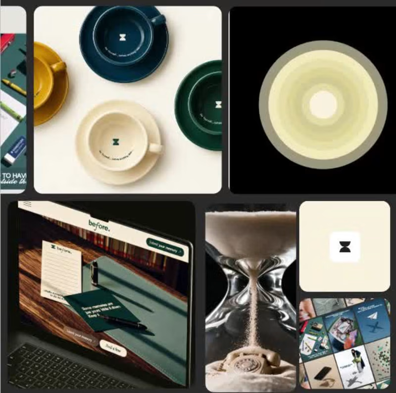
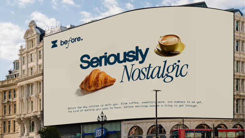
Most cafés are designed for people who want to be seen. I wanted to design one for people who’ve spent years not being seen.
Parents aged 38-52, with kids now grown, spent a decade making everyone else feel looked after. Nobody’s doing that for them anymore.
So the strategy behind Before started with one question: what would it feel like to be taken care of again?
The answer shaped every decision:
→ No clocks. The hourglass became the mark, a reminder that this is time that doesn’t need tracking.
→ Calm palette. Deliberately away from loud café energy and spa-café clichés.
→ A wall of memory and a note on every cup. Small rituals that bring the person back into focus.
Before anyone else, take care of yourself. That’s the whole brand.
Case study below 👇
https://contra.com/p/ZOcEeMYB-before-or-cafe-designed-for-parents?r=hoorain_arshad_h4kb4ubz
#BrandStrategy #BrandIdentity #Branding #CaseStudy
1
267
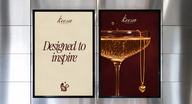
Most jewelry brands don’t have a logo problem.
They have a “who is this for?” problem. When KEESA Jewels came to me, the brief was [what they asked for]. But the real issue was "they looked like everyone else in the category"
So before opening Illustrator, I ran Discovery:
→ [Finding about the audience]
→ [Finding about competitors]
→ [Finding about what KEESA could own]
That led to the Direction: [one-sentence positioning].
Then Design:
→ The mark: [A poised cat whose tail curls into the curve of the K, with a small star beside it. “Keesa” comes from киса (kisa), Russian for a kitten and a term of endearment, so the cat carries the name’s meaning. Ornamental, not cute.]
→ The palette: [Deep burgundy, warm ivory, and burnished gold. Burgundy brings richness and drama, ivory keeps it light and breathable, and gold carries the jewelry’s glow.]
→ The type: [A high-contrast italic script with the confidence of a serif, with a tall, slanted K as the hero, over widely tracked sans-serif “JEWELS” for structure.]
The result is a brand that feels celebratory without being loud, with imagery built from candlelight, champagne, and velvet instead of flat-lay shots, so the jewelry feels like part of a world, not a catalogue.
Full case study on Behance: [CASESTUDY (https://contra.com/p/WAZNBrPF-keesa-jewel?r=hoorain_arshad_h4kb4ubz)] What’s the one thing a jewelry brand should never compromise on? Tell me below.
1
318


Content Creator and Social Media Strategist ✨



Part-time Videographer & Editor, Full-time Explorer
- $5k+
- Earned
- 8x
- Hired
- 5.0
- Rating
- 68
- Followers
Part-time Videographer & Editor, Full-time Explorer



Creative Partner | Motion Direction & PM

Brand & Marketing Strategy
Brand & Marketing Strategy
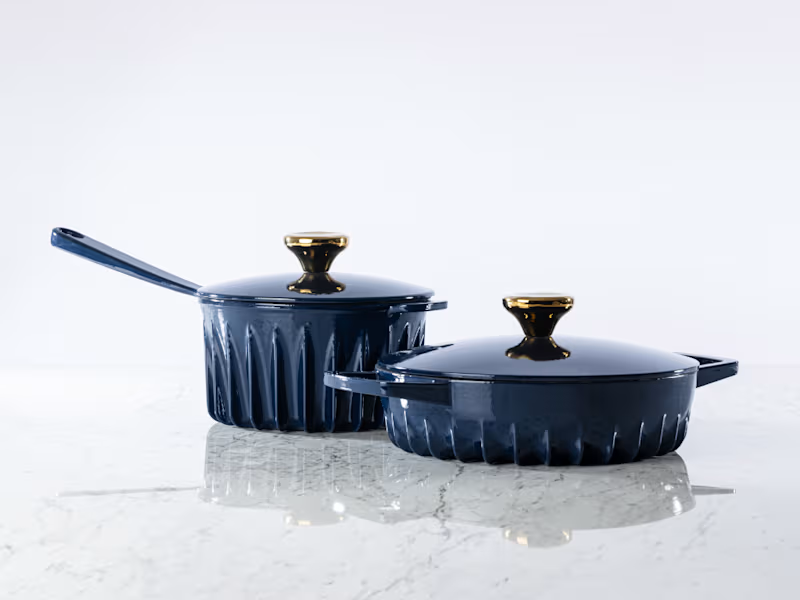
FIREUP Cookware | Fractional CMO
FIREUP is an innovative cast-iron cookware brand founded by an Oxford-trained rocket scientist and a traditional cookware manufacturer. Its patented fin technology distributes heat across the base and sides of the pan for faster, more even cooking.
As Fractional CMO, I am working with the founder to define the brand’s positioning, establish core value system. I also lead strategic marketing initiatives and stakeholder profiling that will translate their innovation into a distinctive brand proposition and a clear growth roadmap.
0
38

Mysa Organics - A conscious wellness and hygiene brand. Made to order. Small batches and slow commerce.
0
133

About
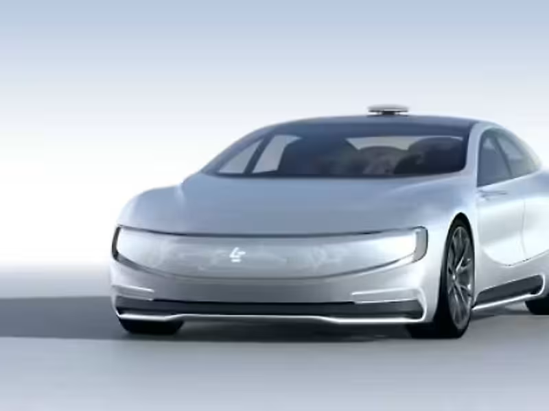
LeEco
LeEco was building towards a connected technology and entertainment ecosystem, with India as an important market in that expansion. Its proposition brought technology, content and connected experiences together across smartphones, entertainment and television.
I worked closely with the LeEco India team across multiple technology launches, helping translate that larger ecosystem into content and consumer experiences for the Indian market.
0
12

Motion Designer
Motion Designer


