Café Kutir - Brand Identity

Krish Prajapati


About this project
Café Kutir is a branding project built around a simple idea: a café should feel like more than a place to grab coffee. It should feel like a place you belong.
Inspired by the familiarity of a traditional Indian dwelling, the project explores how a café brand can bring together local character, thoughtful design, and the warmth of shared experiences.
The Challenge
Many contemporary cafés follow similar visual patterns. Minimal interiors, neutral palettes, soft lighting, and carefully styled spaces have become common ways to attract customers. While these choices can look appealing, they can also make different cafés feel interchangeable.
The challenge was to build a brand that could stand apart from the typical contemporary café aesthetic without losing the warmth and appeal that make people want to spend time in a café.
Rather than treating the café as just a visual experience, I approached it as a space where people could slow down, connect, and feel at home.
Research and Discovery
Before exploring the identity, I looked at how people experience cafés and what makes certain spaces feel inviting. The research focused on three key areas.
The people
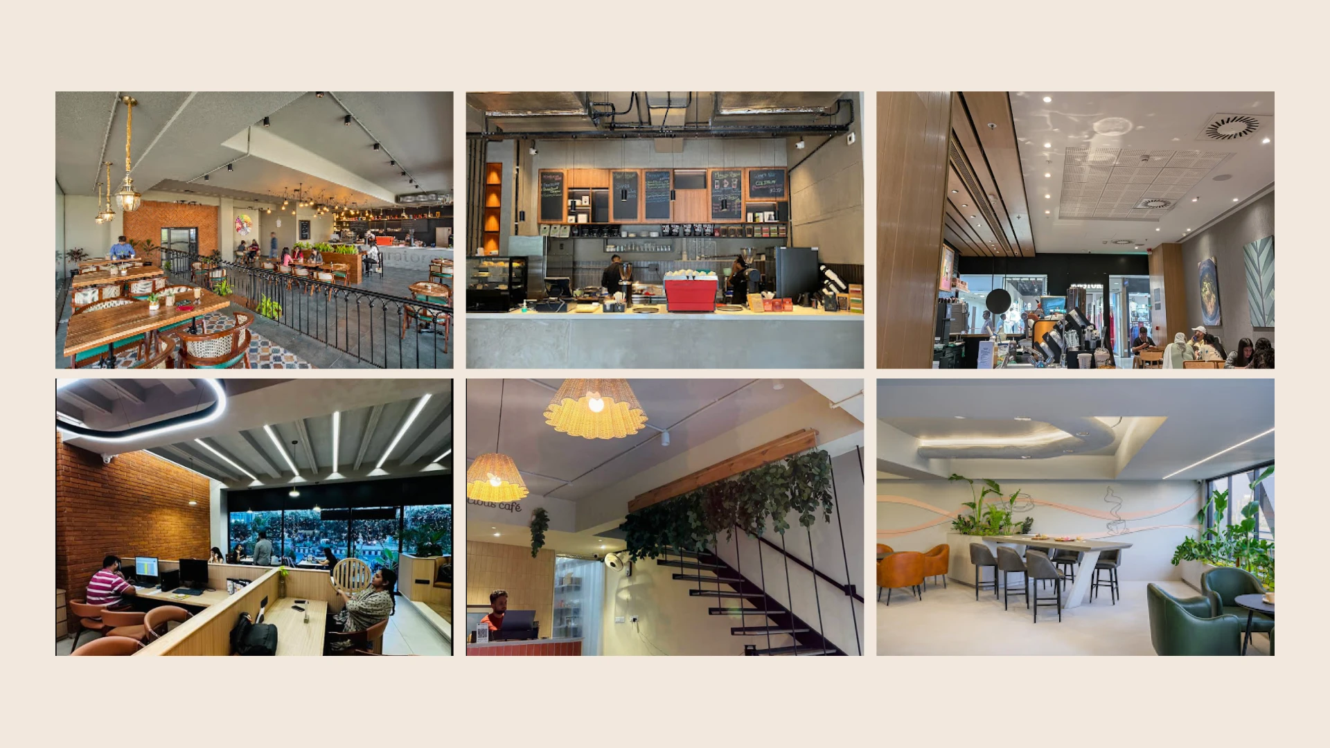
Cafés serve different purposes for different people. Some visit to work independently, others meet friends, and some simply want a quiet place to spend time. This made it important to consider a space that could accommodate both individual moments and shared experiences.
The atmosphere
Materials, lighting, furniture, greenery, and spatial arrangements all influence how a café feels. Elements such as exposed brick, wooden furniture, plants, warm lighting, and open spaces can create an atmosphere that feels welcoming and grounded.
The experience
A café experience extends beyond its interiors. Comfortable seating, an understandable menu, thoughtful service, and an environment that encourages people to stay all contribute to how customers connect with a place.
These observations helped shape the initial direction. Instead of building the brand around coffee alone, I began exploring the feeling of being somewhere familiar.
Finding the Name
The naming process explored words connected to Indian architecture, shared spaces, and the earth.
Some of the directions included:
Aangan: A traditional courtyard associated with gathering and everyday life.
Vasudha: A name connected to the earth.
Gara: A reference to traditional earth-based building materials.
Kutir: A small, simple dwelling that evokes shelter, familiarity, and a grounded way of living.
I chose Kutir because it communicated the central idea of the brand without needing an elaborate explanation.
A kutir is modest, rooted, and enduring. It suggests a place that offers shelter and comfort rather than one designed solely to impress.
The name gave the brand a foundation for something beyond the usual café vocabulary. It connected the experience to the familiarity of a home and opened up a visual direction inspired by traditional materials, Indian spaces, and everyday rituals.
Brand Strategy
Vadodara's modern village café
With the name established, the next step was to define what Café Kutir should stand for and how it should feel.
Vision
To become Vadodara's most grounded café, a place where people return not just for coffee, but for the feeling of being rooted.
Mission
To create a warm, textured space that honours local material traditions while serving thoughtful coffee and quiet moments in the middle of the city.
Positioning
Vadodara's modern village café. A soft maximalist space built with earth, brick, and folk surfaces, designed for people who want character, calm, and something real.
Brand personality
Quiet, warm, grounded, and slightly protective, with a timeless sense of class. The personality takes inspiration from a well-built little home that has seen many seasons.
The strategic direction
The aim was not to recreate a traditional village literally. It was to reinterpret the feeling of one for a contemporary café.
That meant balancing familiarity with freshness, tradition with modernity, and visual richness with a sense of calm. The brand needed to feel expressive without becoming overwhelming, and distinctive without losing its welcoming character.
Moodboard and Art Direction
Translating the feeling into a visual world
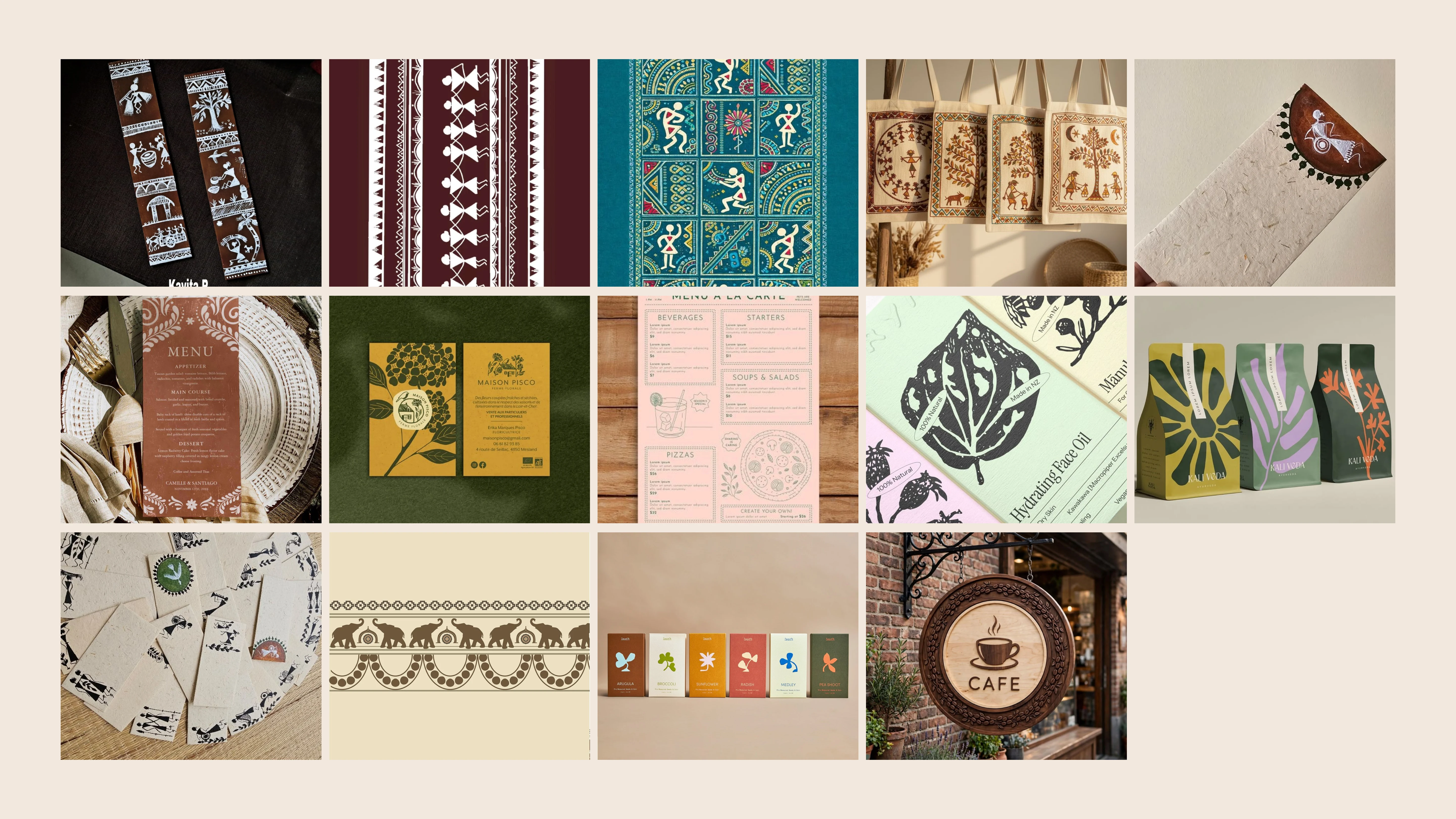
The moodboard explored the visual and material references that could communicate Kutir's personality.
The direction drew from earthy surfaces, traditional Indian visual culture, architectural details, natural materials, and spaces that feel lived in rather than overly polished.
Instead of treating minimalism as the default approach, the exploration leaned towards a more expressive visual language. Texture, colour, patterns, and decorative elements could give the brand a sense of history and individuality.
At the same time, the identity needed enough structure to remain recognisable across different applications.
Logo Exploration
The logo exploration began by investigating how the name and the café category could come together in a single visual idea.
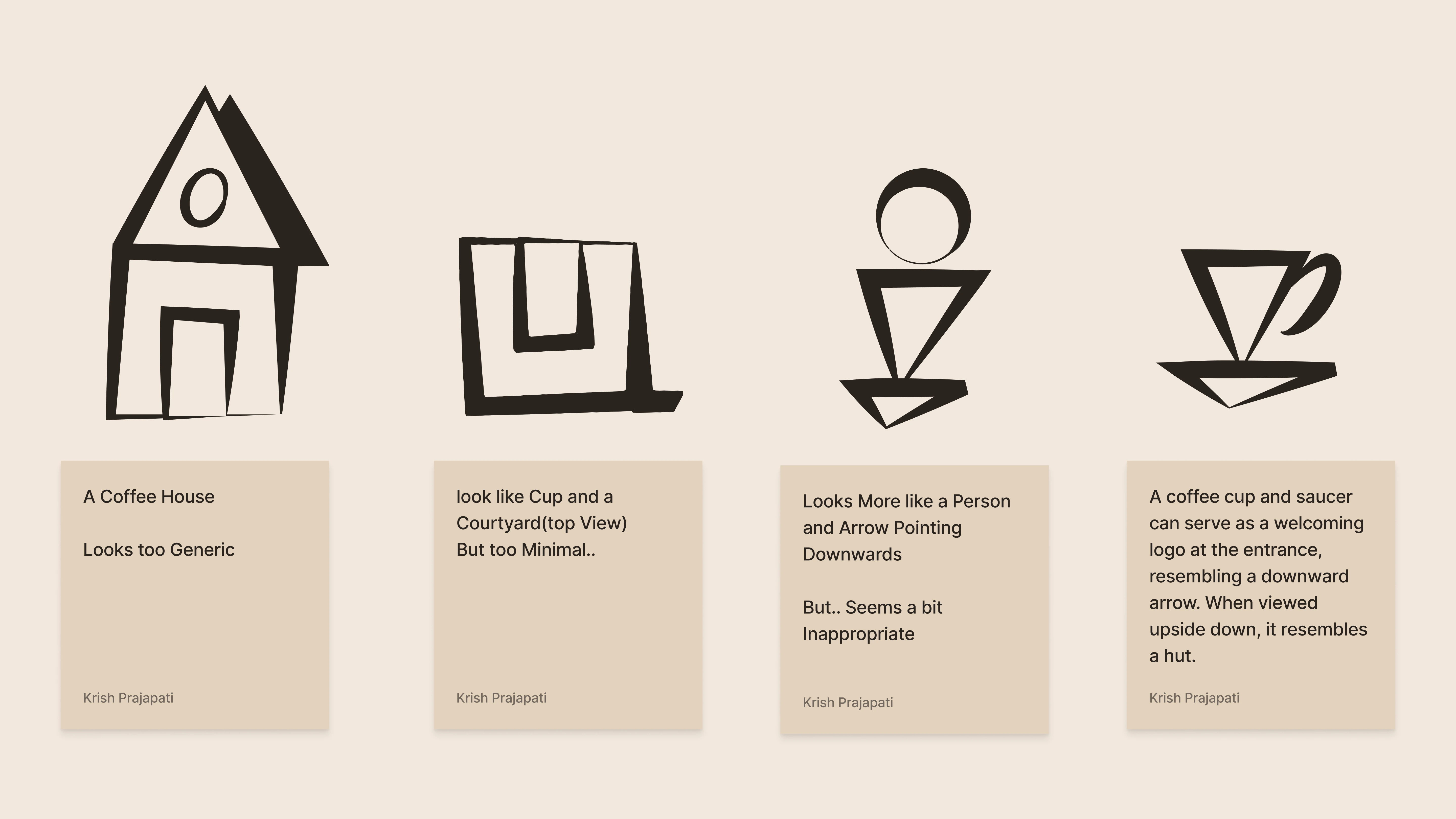
The initial directions explored familiar café imagery and geometric forms inspired by courtyards and dwellings.
Some concepts communicated the coffee category clearly but felt too generic. Others suggested a courtyard viewed from above, but their simplicity did not fully capture the personality I wanted the brand to have.
Another direction explored the relationship between a coffee cup and saucer. When placed at the entrance, the form could also suggest a downward arrow, creating a subtle gesture of welcome. When viewed upside down, the same form hinted at a hut.
This direction was more closely connected to the brand story because it allowed the logo to communicate multiple ideas through one form.
The exploration was not simply about finding an attractive symbol. It was about creating a mark that could connect the café experience with the meaning behind the name.
The Logo System
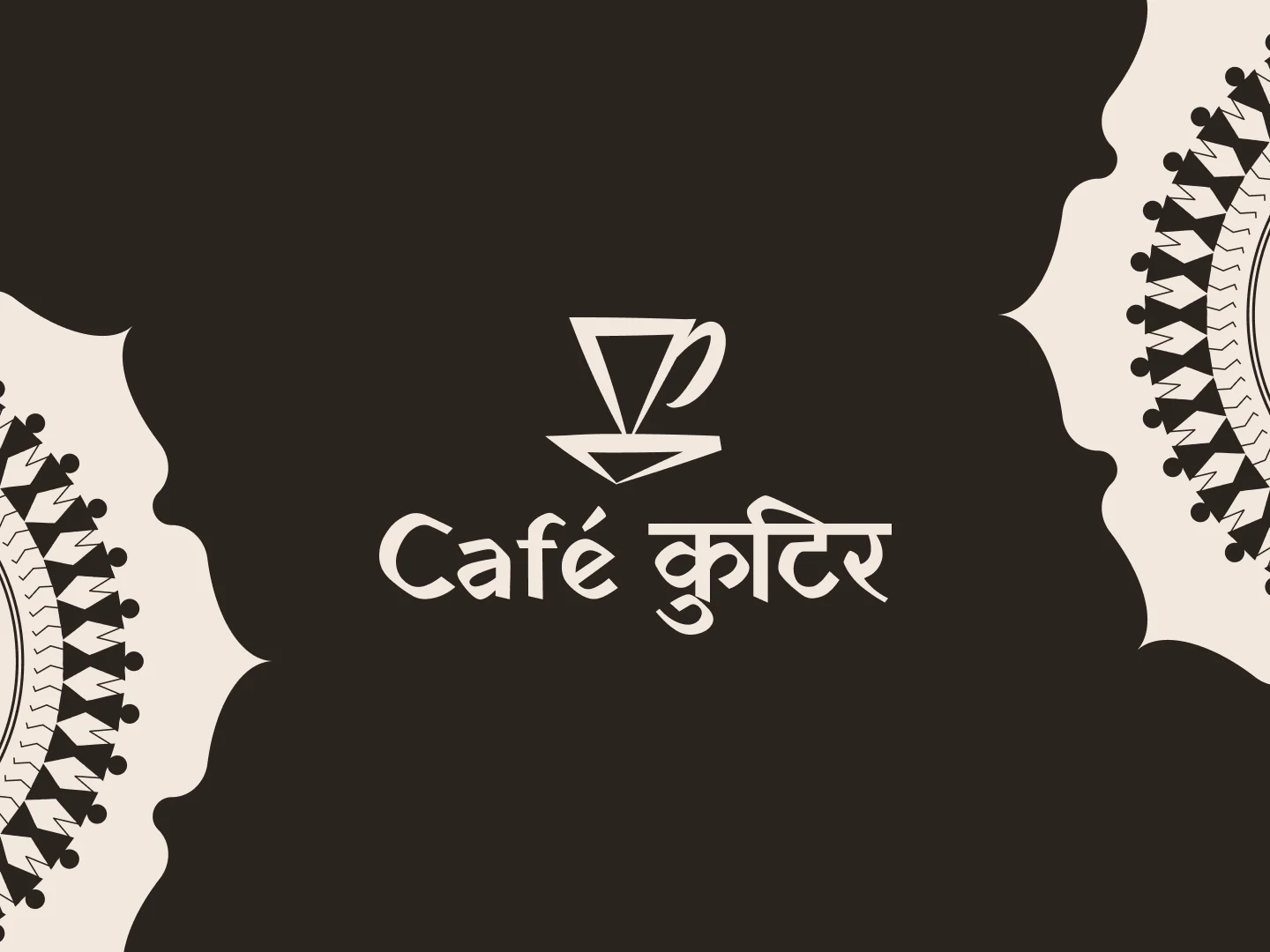
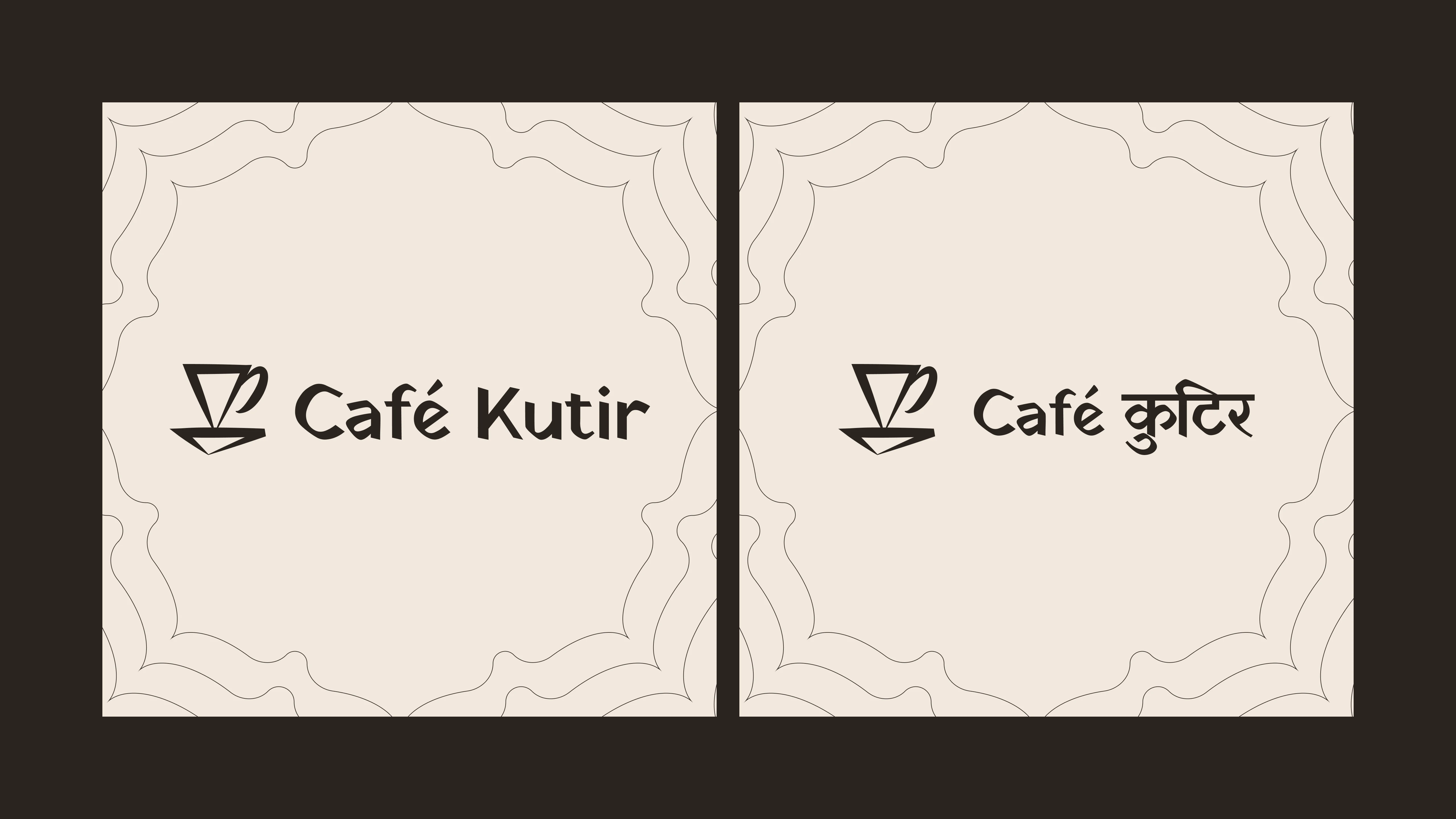
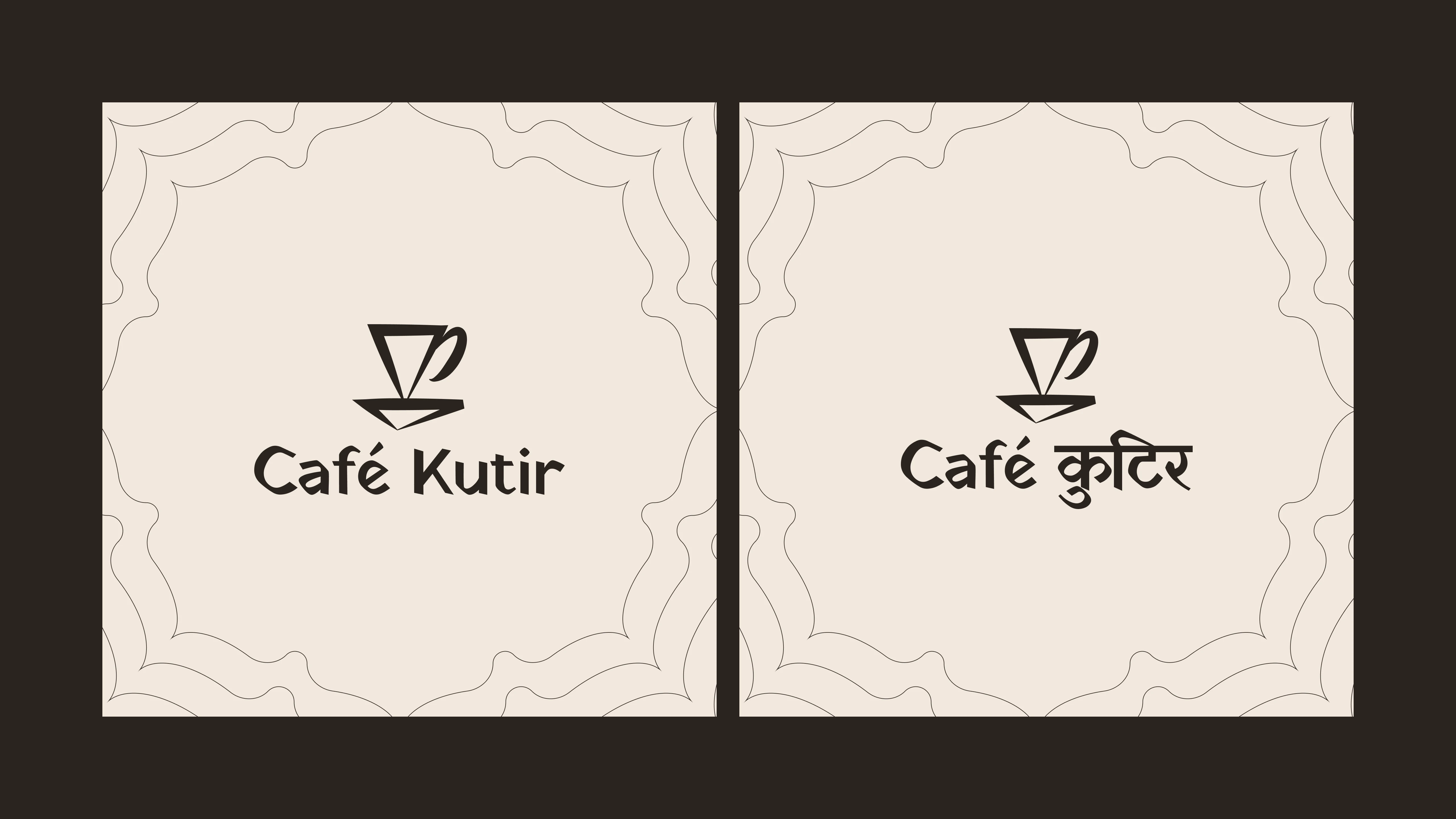
The Café Kutir logo brings together the familiarity of a coffee cup and the character of a traditional dwelling. The mark uses a minimal, geometric form to create a connection between the café experience and the meaning behind the name.
To make the identity flexible across different applications, I developed a logo system with four configurations.
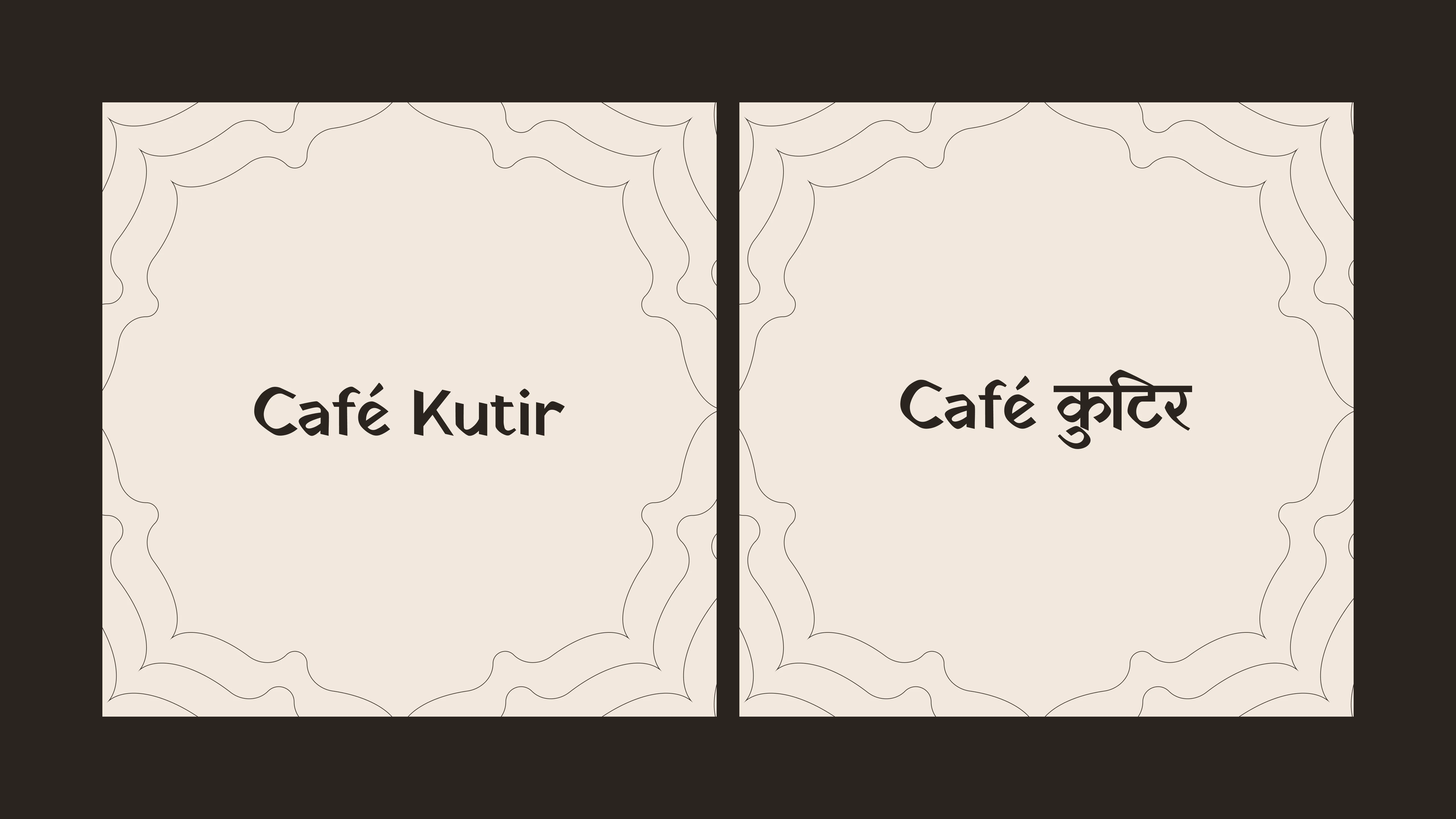
Primary Logo: Mark + Wordmark
The primary configuration combines the symbol with the Café Kutir wordmark. It is the main brand signature, designed to establish recognition while bringing the symbol and name together.
The wordmark is available in both Devanagari and Latin script, allowing the identity to communicate across languages while maintaining a consistent visual character.
Mark Only
The standalone symbol provides a compact brand identifier for applications where the full name is unnecessary or space is limited. It can be used on smaller surfaces and as a supporting graphic element.

Wordmark Only
The wordmark allows the brand name to take centre stage without the symbol. Available in both scripts, this configuration is useful for layouts where a text-led treatment works better.
Vertical Lockup
The vertical configuration places the symbol above the wordmark. Its compact, stacked arrangement offers an alternative for portrait-oriented layouts and applications where a vertical composition is more suitable.
Typography
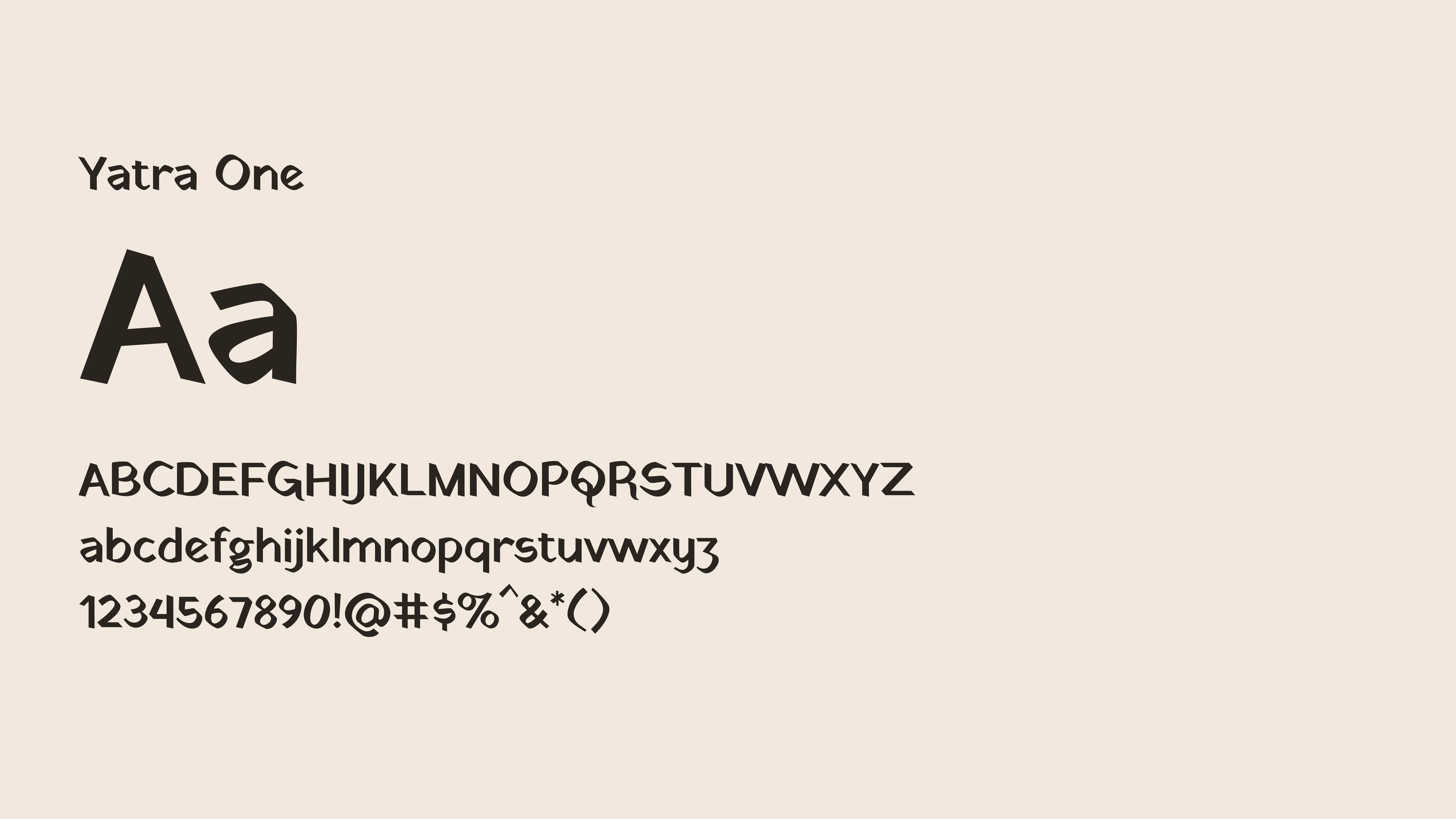
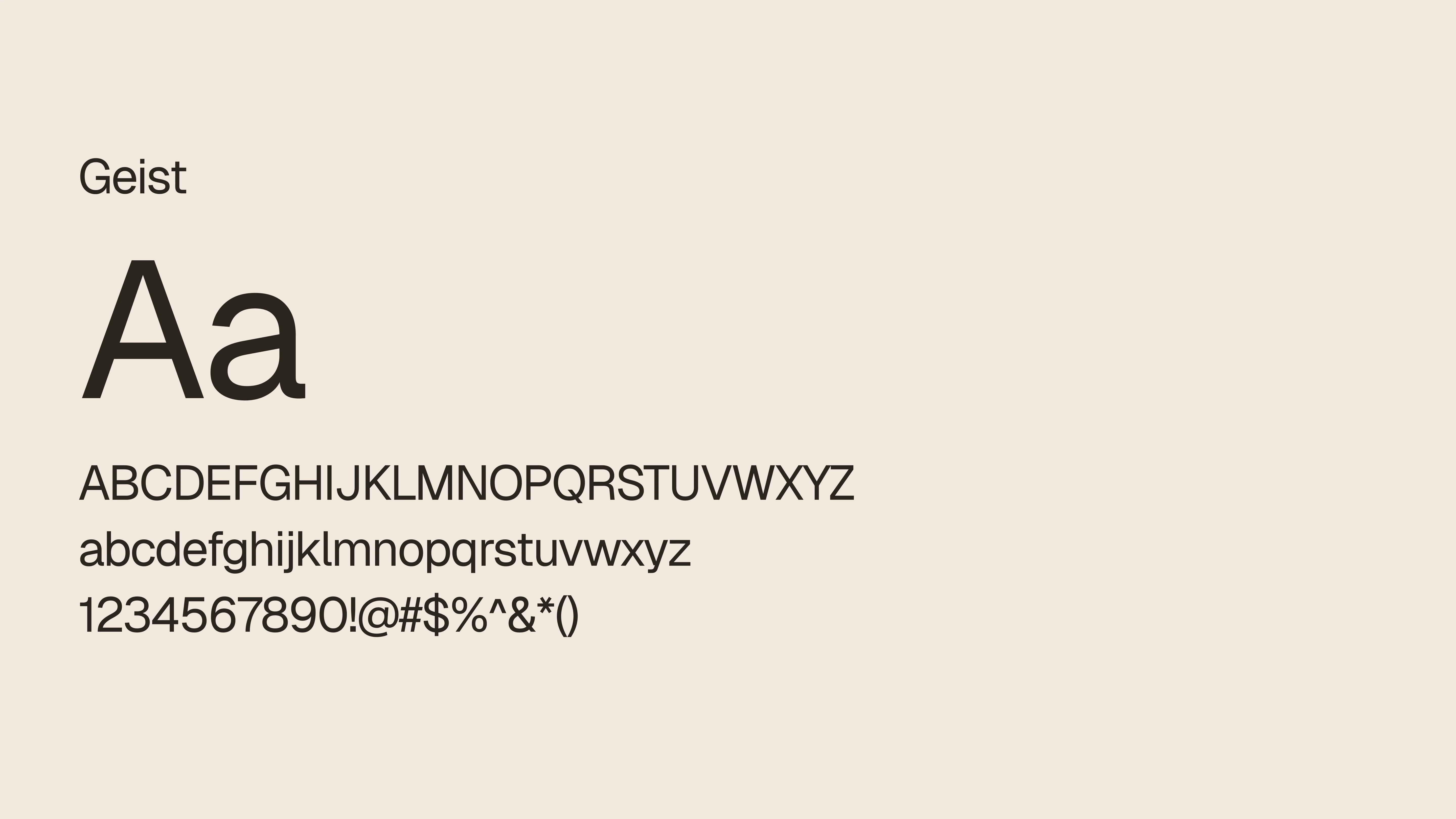
The typography system brings together three typefaces, each serving a distinct purpose. Yatra One gives Café Kutir its expressive, culturally rooted personality, while Geist and Geist Mono provide clarity, structure, and flexibility across brand communications.
Yatra One
Display Typeface
Yatra One is the primary display typeface, used for the brand's expressive headlines and prominent typographic moments. Its distinctive letterforms bring character to the identity and complement the warmth and cultural references behind Café Kutir.
Geist
Primary Typeface for Body Text
Geist is used for body copy and supporting information. Its clean, contemporary letterforms provide readability and balance the more expressive character of Yatra One. It keeps longer text, descriptions, and everyday communication clear and accessible.
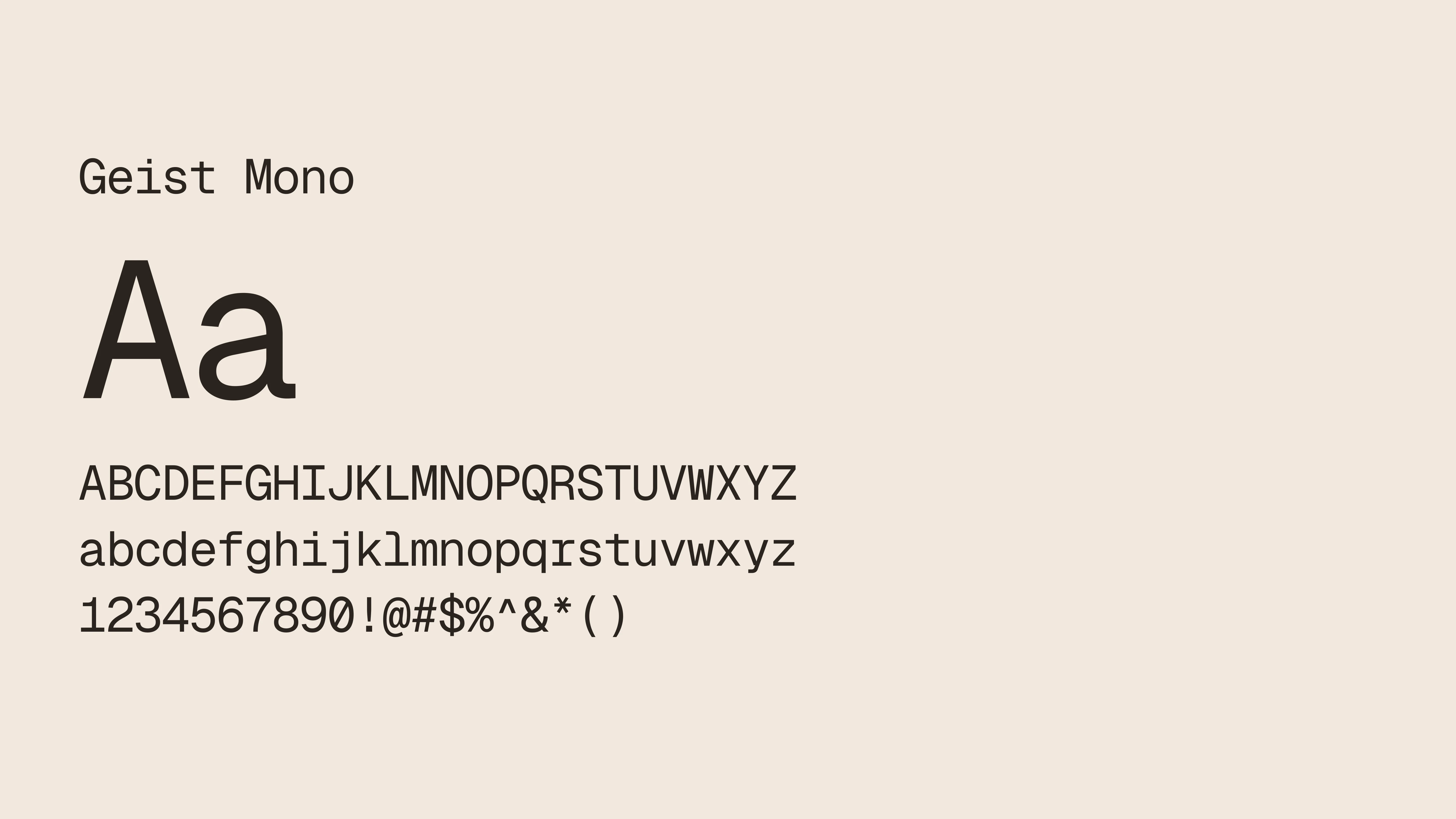
Geist Mono
Monospaced Accent Typeface
Geist Mono introduces a more structured typographic voice. Its monospaced letterforms can distinguish small labels, metadata, captions, and supporting details from the main typography, adding contrast while maintaining a consistent visual language.
The role of typography
Typography supports the identity in three ways:
Character: Display typography gives prominent brand messages a recognisable personality.
Hierarchy: Differences in size, weight, and placement help separate headlines, supporting information, and functional content.
Consistency: A considered typographic approach keeps menus, campaign graphics, digital content, and printed materials connected.
The typography should be presented as a dedicated part of the case study, including the typeface specimen, uppercase and lowercase characters, numerals, and examples of how the type works in actual layouts.
This makes the decision visible rather than simply naming the font.
Colour Palette
Inspired by earth, clay, and traditional materials
The colour palette establishes the visual atmosphere of Café Kutir. It moves away from the bright, cool, or highly neutral combinations commonly associated with contemporary cafés and towards a palette inspired by earthy materials and traditional spaces.
The identity system includes the following colours.
Brown
#2B2420 Dark, grounded typography and contrastClay White
#F2E8DD Primary light backgroundTeal
#1F4A46 Deep, distinctive brand colourBurnt Earth
#B85A32 Warm, earthy accentMaroon
#8F3F3C Restrained accent for emphasisSoft Sand
#E4D2BE Secondary warm neutralRaw Brick
#8A4A38 Material-inspired supporting colourColour hierarchy
The palette is intended to have a clear hierarchy rather than giving every colour equal importance.
The colour guidance in the identity presentation establishes the following approximate distribution:
60% Clay White or Soft Sand: Creates breathing room and keeps layouts readable.
25% Teal or Burnt Earth: Provides the main colour presence and establishes recognition.
10% Raw Brick: Adds material warmth and supporting detail.
5% Maroon: Introduces a restrained accent for small elements or labels.
These proportions are a starting point for maintaining consistency, not a requirement that every design must follow mathematically.
Visual System
Creating a consistent language beyond the logo
The logo establishes recognition, but the wider visual system gives the brand enough flexibility to communicate across different formats.
For Café Kutir, the system combines colour, typography, patterns, graphic elements, and composition. These elements work together to create an identity that feels expressive while remaining controlled.
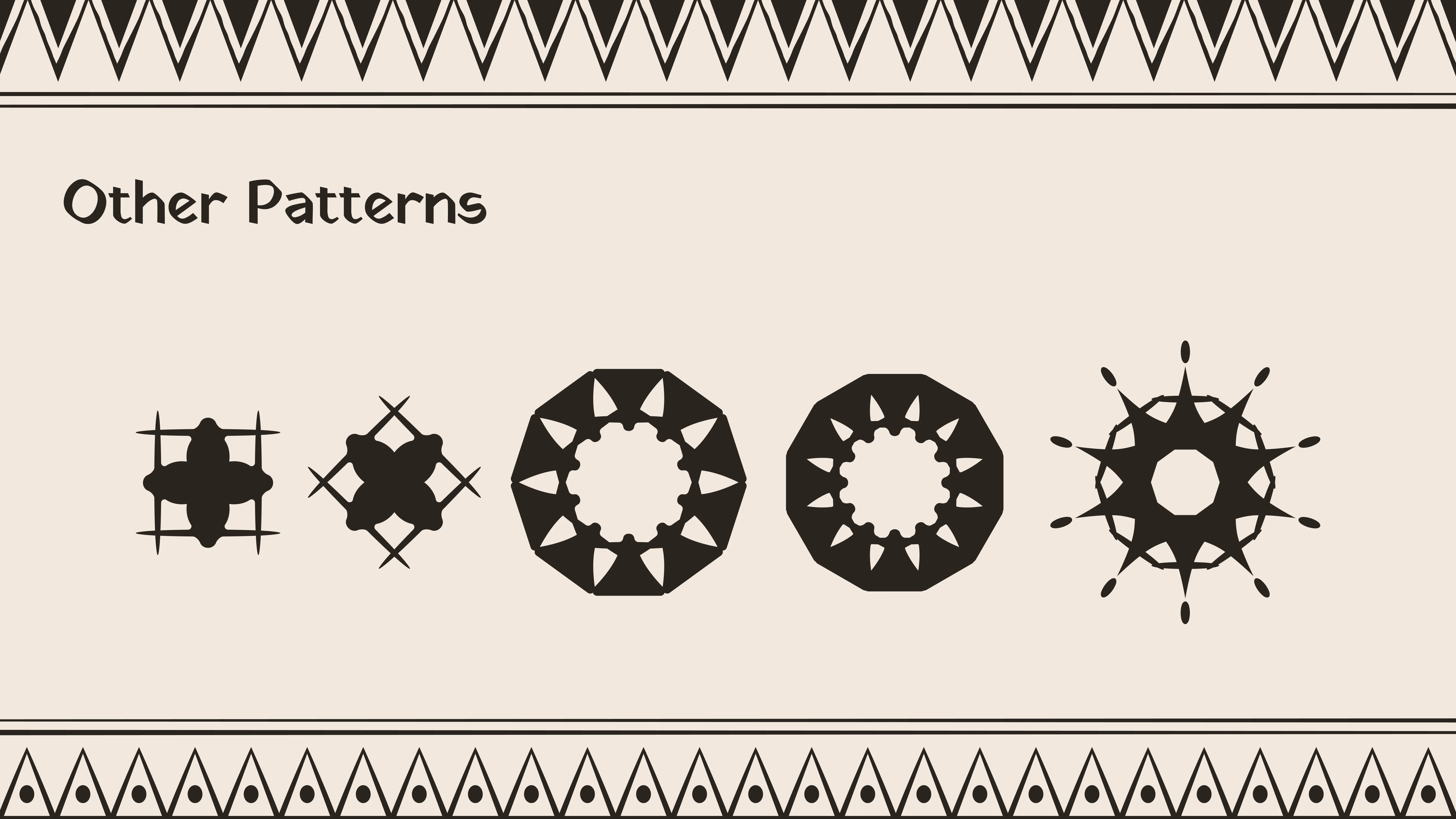
Pattern language
The pattern system draws on decorative and folk-inspired visual references to bring texture and cultural character into the brand.
The patterns are intended to complement the identity rather than compete with the logo.
The visual guidelines establish a few important principles:
Use strips or bands along the edges of a surface.
Use a single medallion as a seal or central mark.
Use cream patterns on Teal or Burnt Earth, or Raw Brick on Clay White.
Avoid combining multiple dominant patterns on the same surface.
Avoid full-page mandala backgrounds and repeating folk figures across every application.
Warli-inspired figures are treated as special elements rather than generic decoration. The guidelines reserve them for selected applications, such as a tote bag, a menu motif, or a sign.
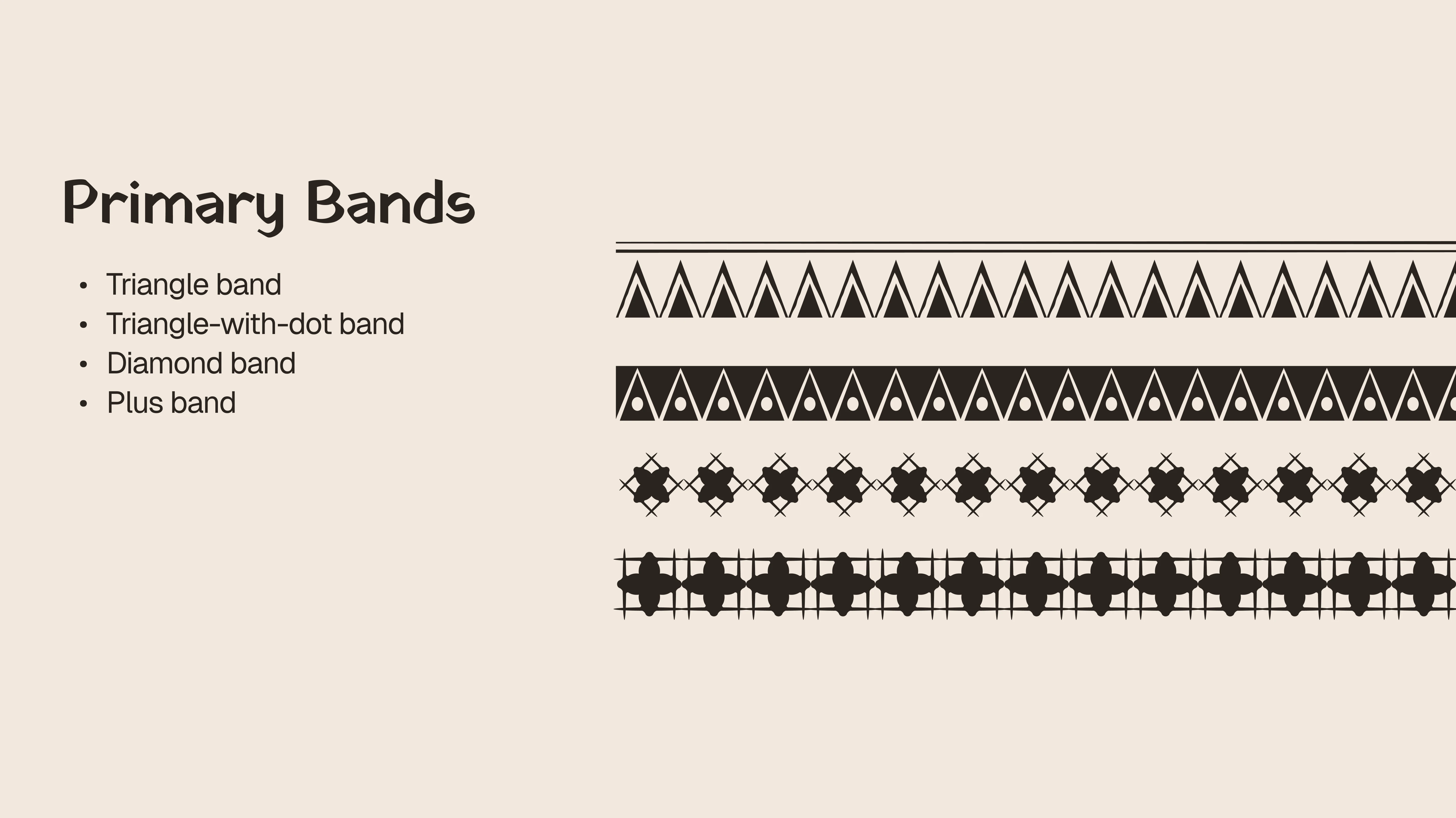
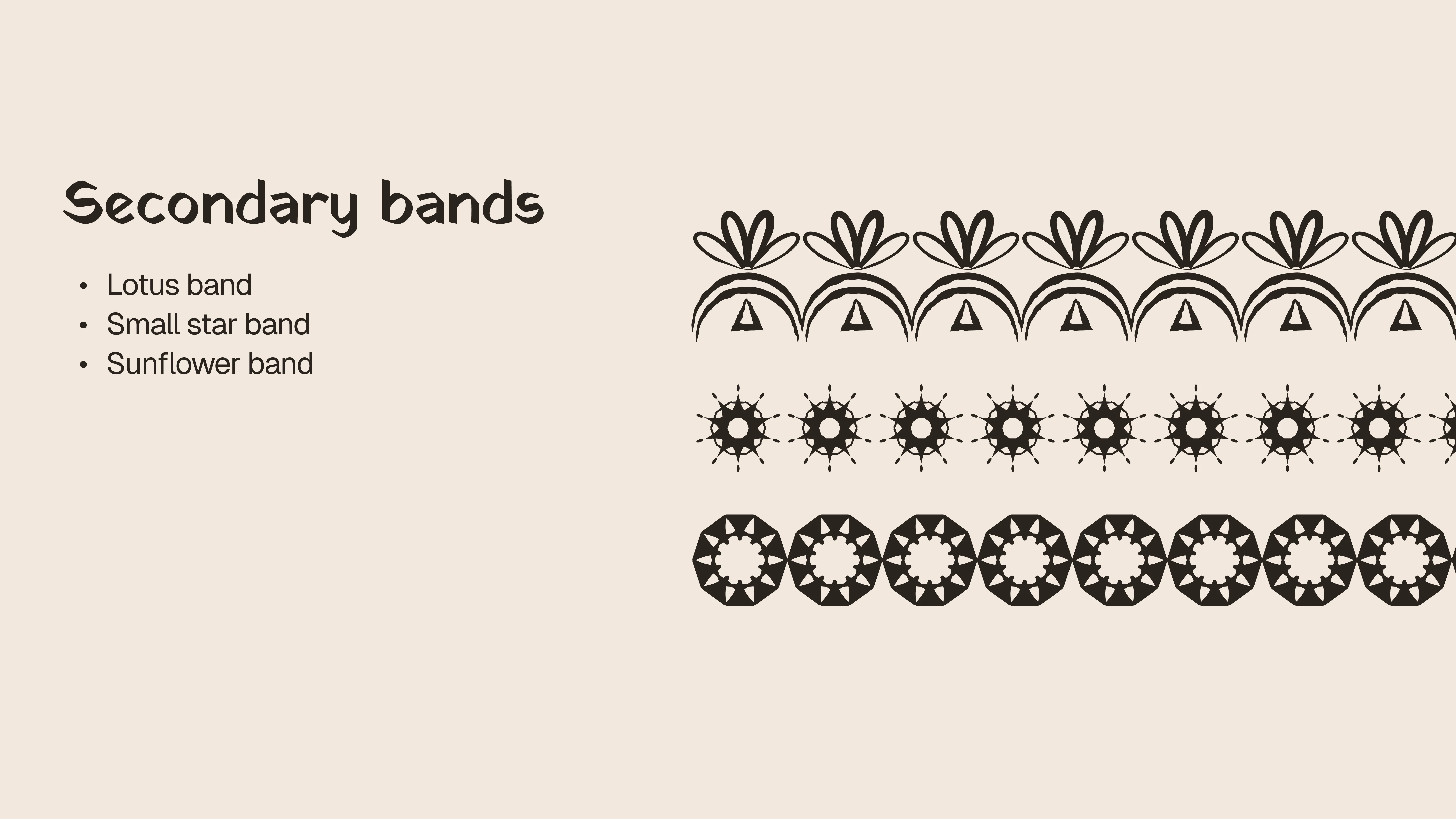
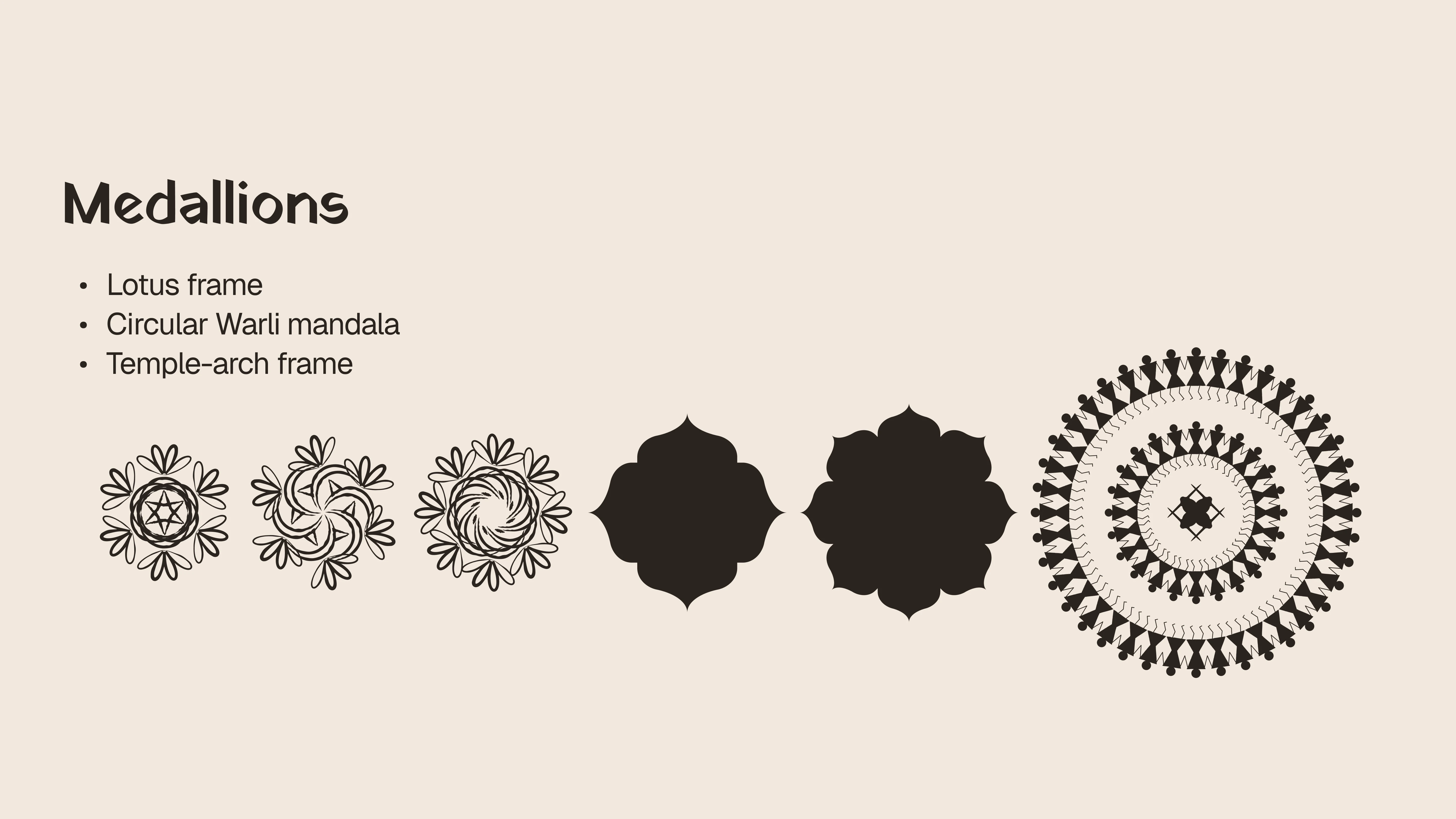
A principle of controlled maximalism
The identity explores a rich visual world, but visual richness does not mean adding every element everywhere.
The system follows a clear principle: maximalism can live on walls and surfaces while the brand assets remain controlled.
One band per surface. One medallion per object. Never both at full strength.
This gives the brand room to feel expressive without becoming visually overwhelming. It also allows individual applications to have their own character while still belonging to the same identity.
Brand Applications
Taking the identity into the real world
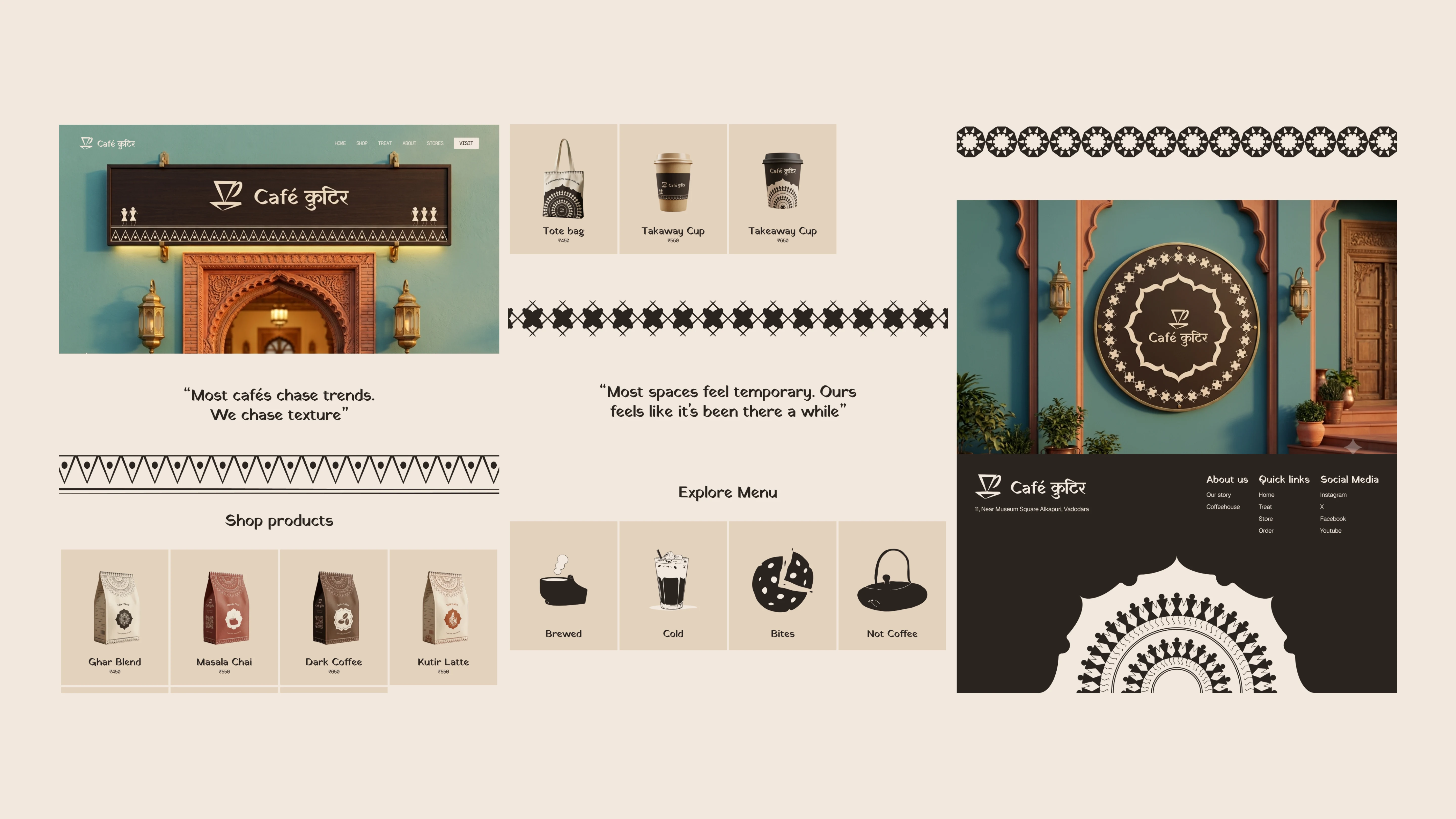
A visual identity becomes meaningful when it works beyond a presentation board. The brand applications explore how Café Kutir could express its personality across physical and digital touchpoints.
Each application serves a different purpose, but the same visual principles connect them.
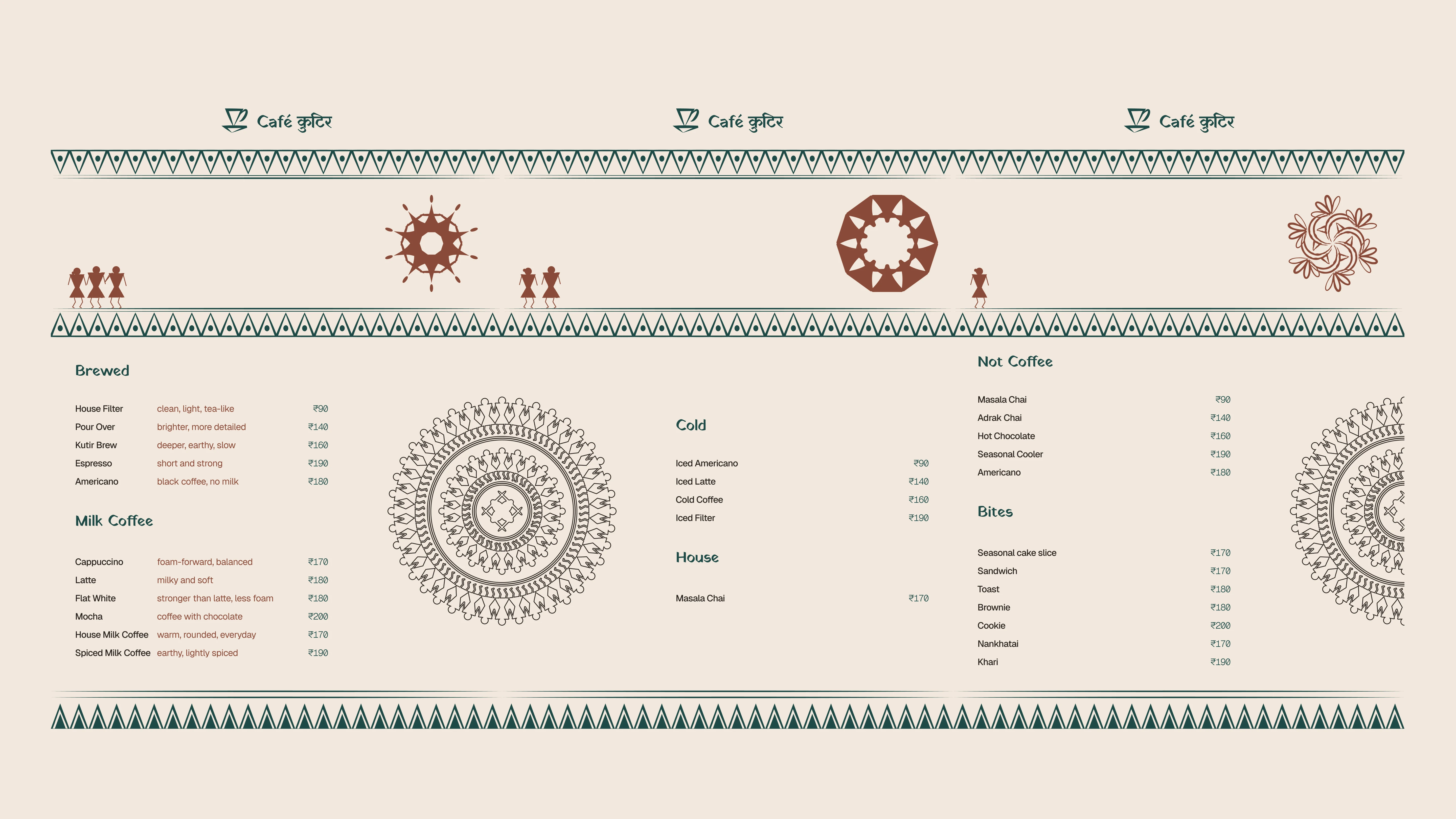
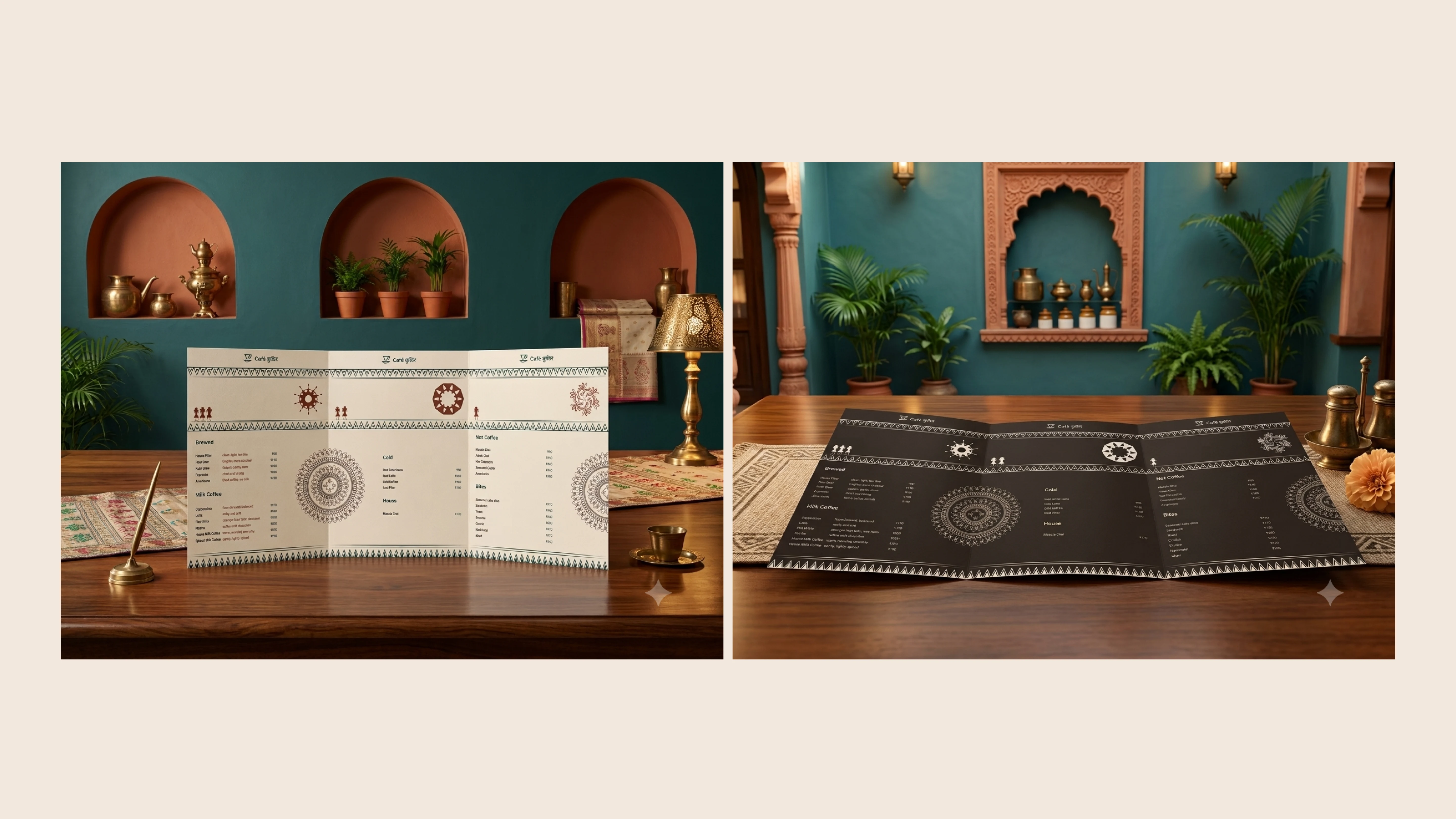
Menu design
The menu brings the identity into one of the café's most important customer interactions.
Typography, colour, and layout need to create a clear hierarchy so visitors can navigate the menu comfortably. Brand details add character without compromising readability.
The design should feel like a natural extension of the café rather than a separate graphic exercise.
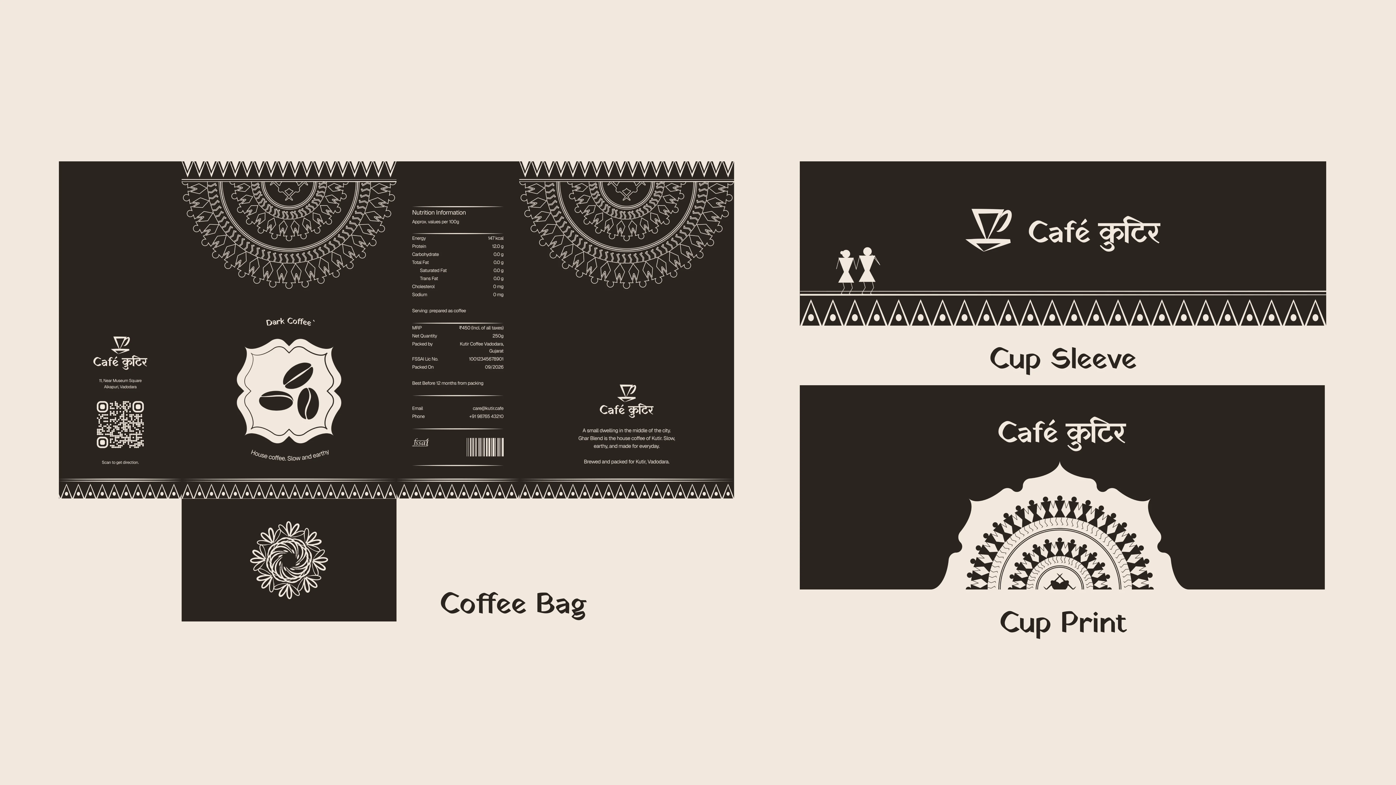
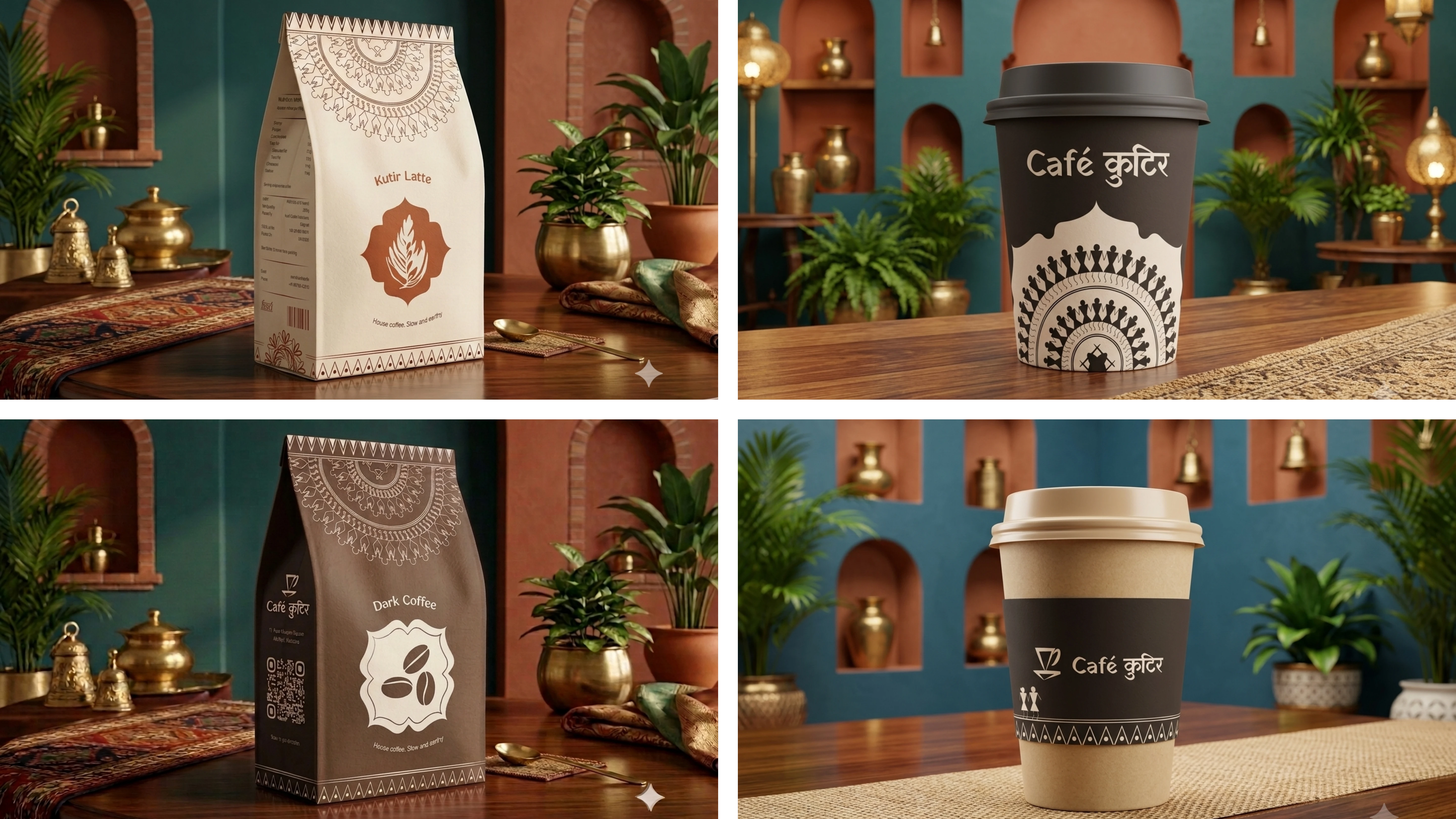
Cups and printed materials
Cup graphics and printed applications create opportunities for the identity to become part of the customer's everyday experience.
The logo, colour palette, and selected visual elements help make even small objects recognisable as part of Café Kutir.
Signage
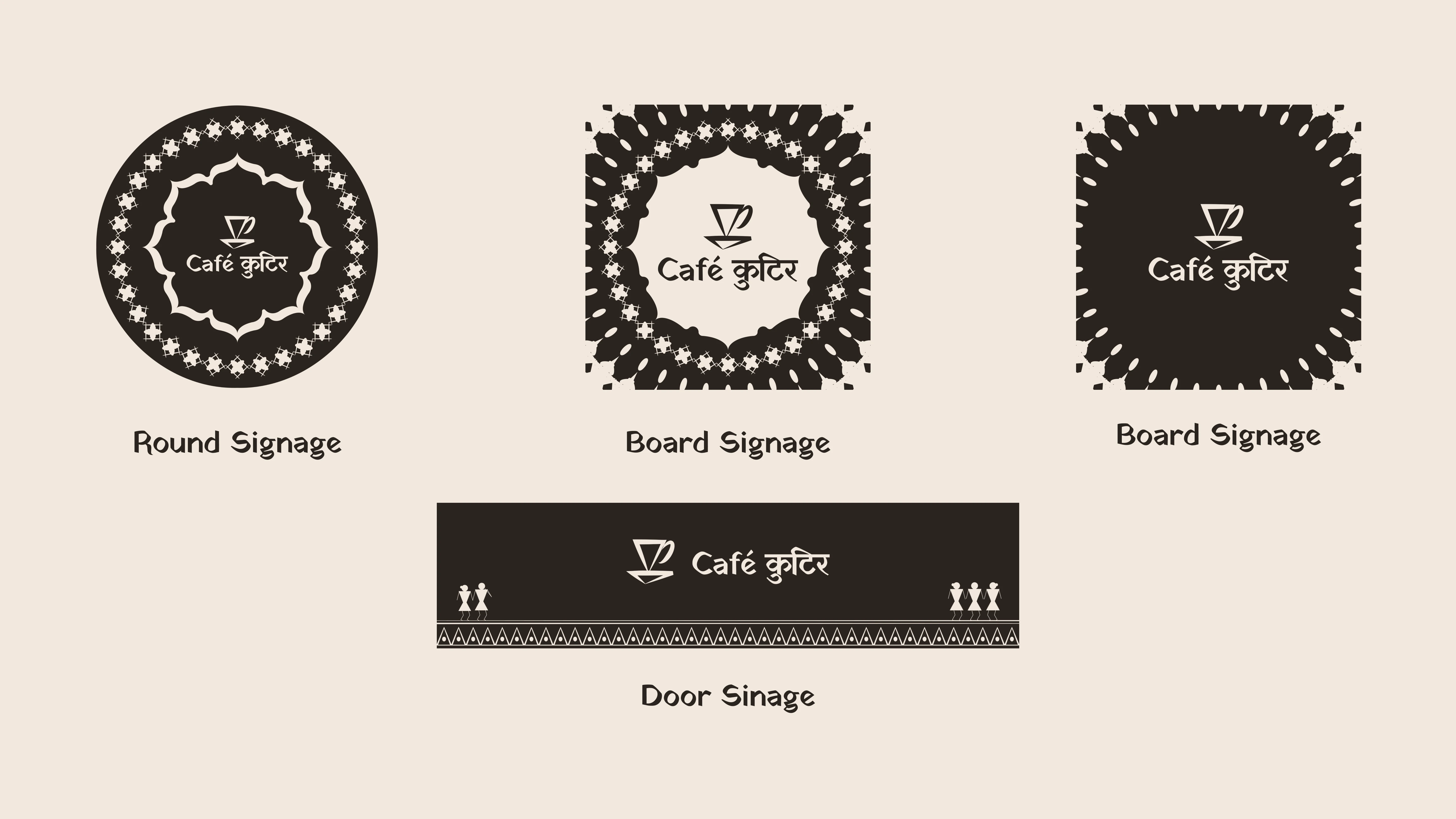
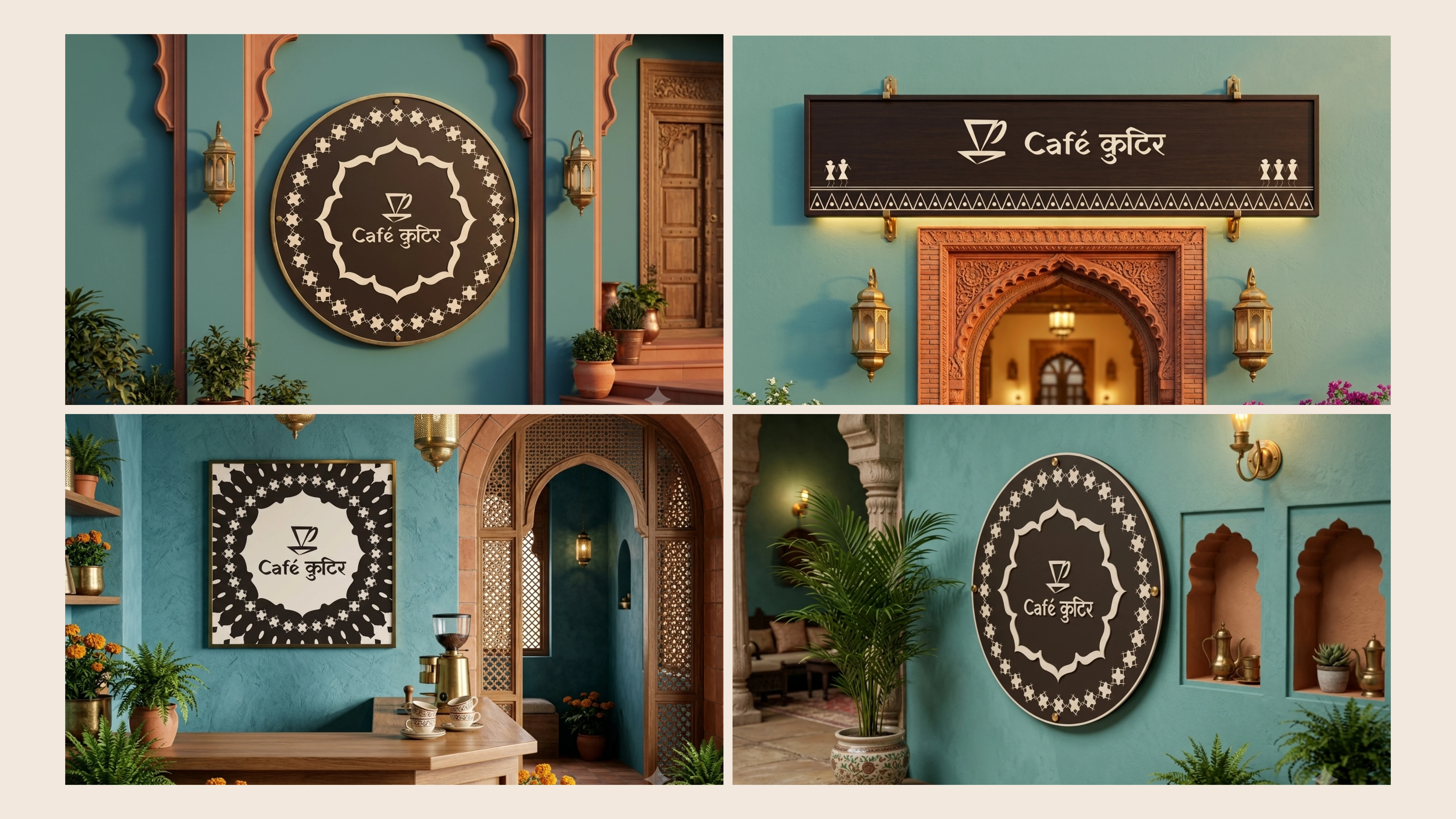
Signage connects the identity to the physical space.
The logo system allows different configurations to be used depending on the shape, scale, and viewing distance of each sign. The colour and graphic language help the café establish a presence while maintaining the warmth of the brand.
Merchandise
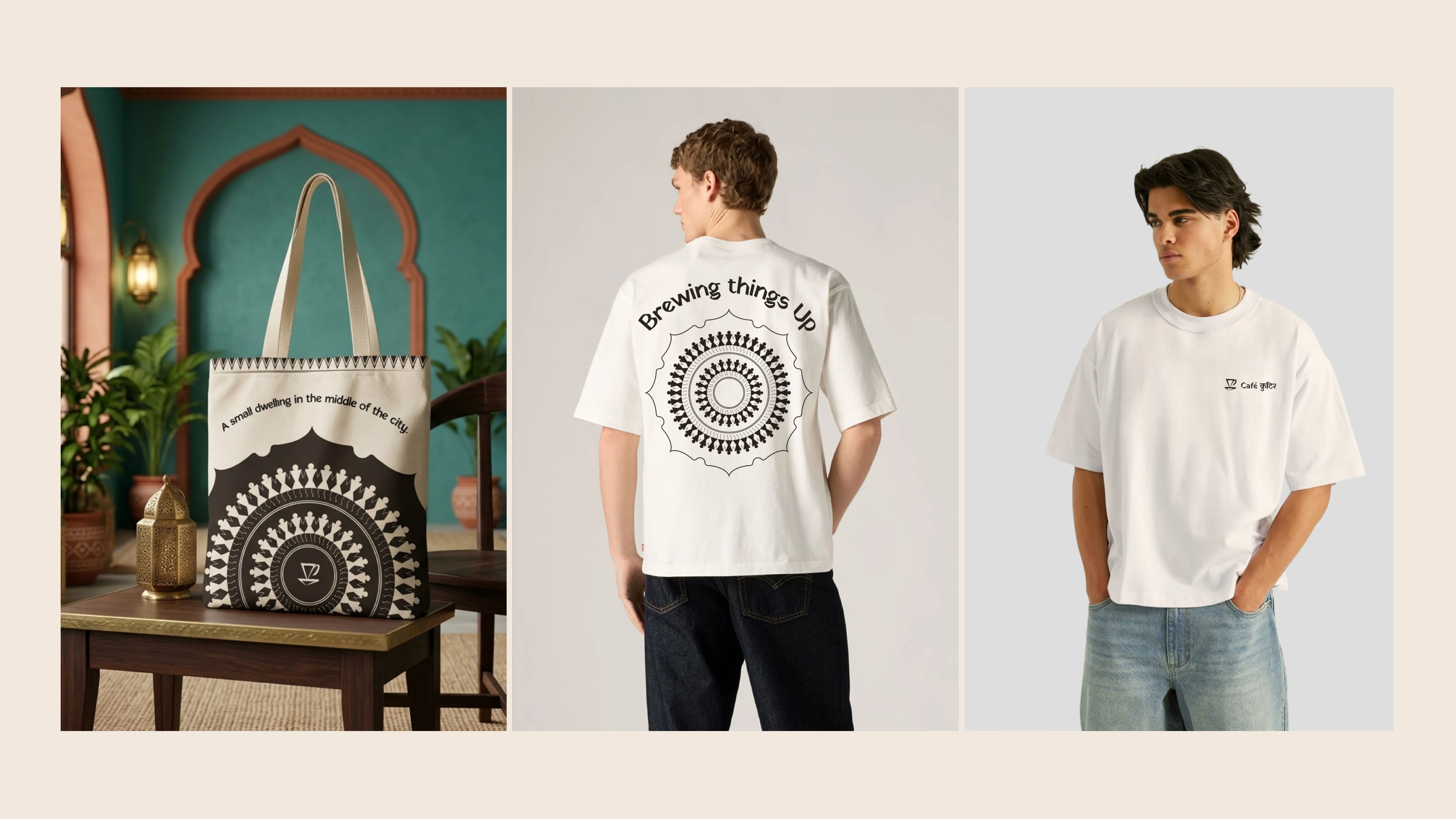
Merchandise extends the identity beyond the café visit.
The visual system can be used on selected items such as tote bags and printed objects, giving customers a way to carry the brand into their everyday lives. The restrained use of folk-inspired graphics allows these applications to feel distinctive without overwhelming the design.
Website
The website translates the brand into a digital environment.
Typography, colour, imagery, and layout need to work together to communicate the café's personality while helping visitors navigate information about the space, menu, and experience.
The digital application demonstrates how the identity can remain consistent without simply reproducing a printed brand layout on screen.
One connected experience
Together, these applications demonstrate how Café Kutir can move between physical spaces, printed materials, merchandise, and digital touchpoints while maintaining a coherent visual identity.
The goal is not to make every application look identical. It is to make each one feel unmistakably part of the same brand.
Campaign Design: Baithak
Making room for conversations
In a world where conversations compete with notifications, Café Kutir can become more than a place to eat and drink. It can become a place to pause, sit together, share stories, and simply spend time with one another.
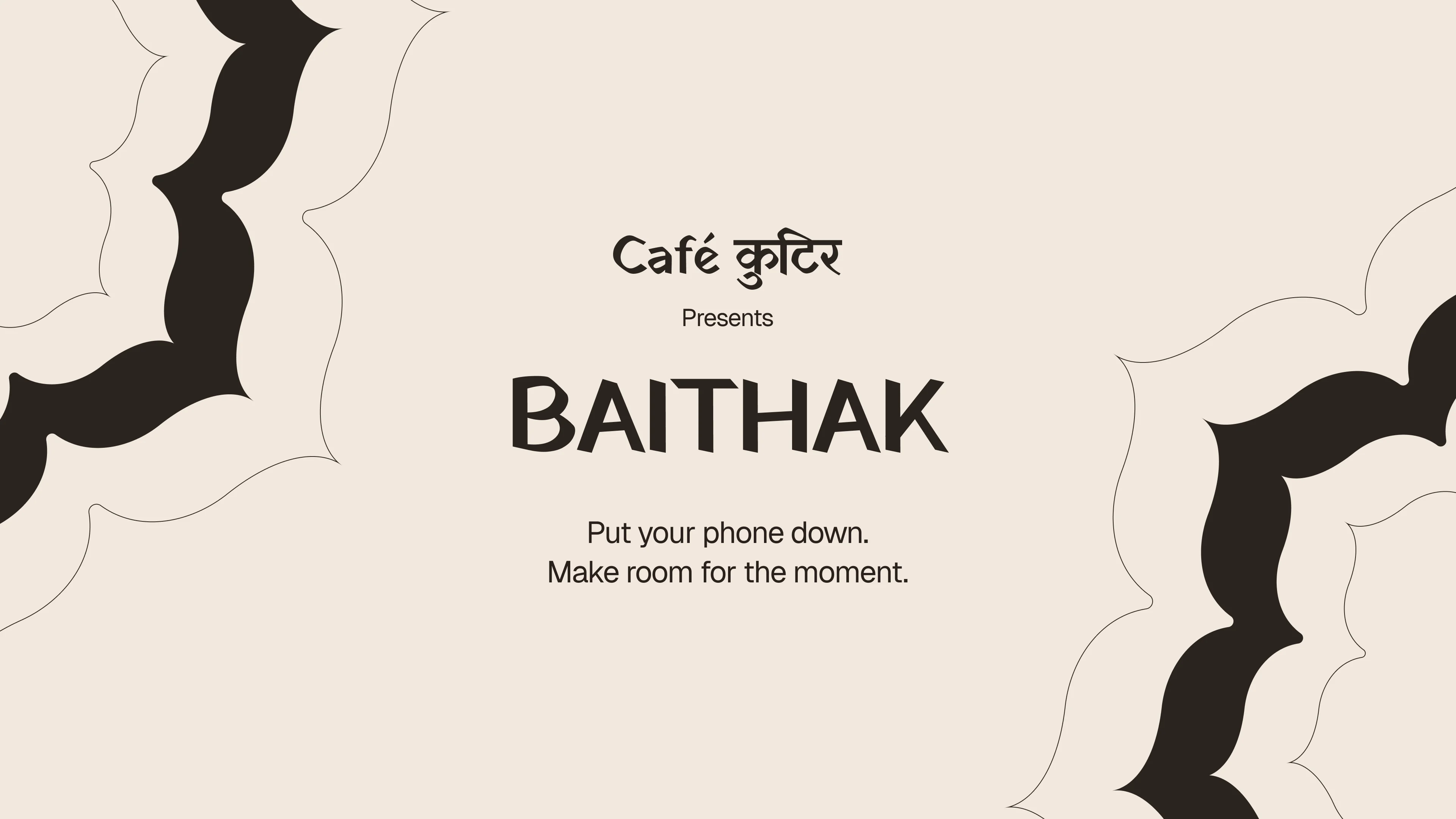
This thought became the foundation of Baithak, the campaign developed for Café Kutir.
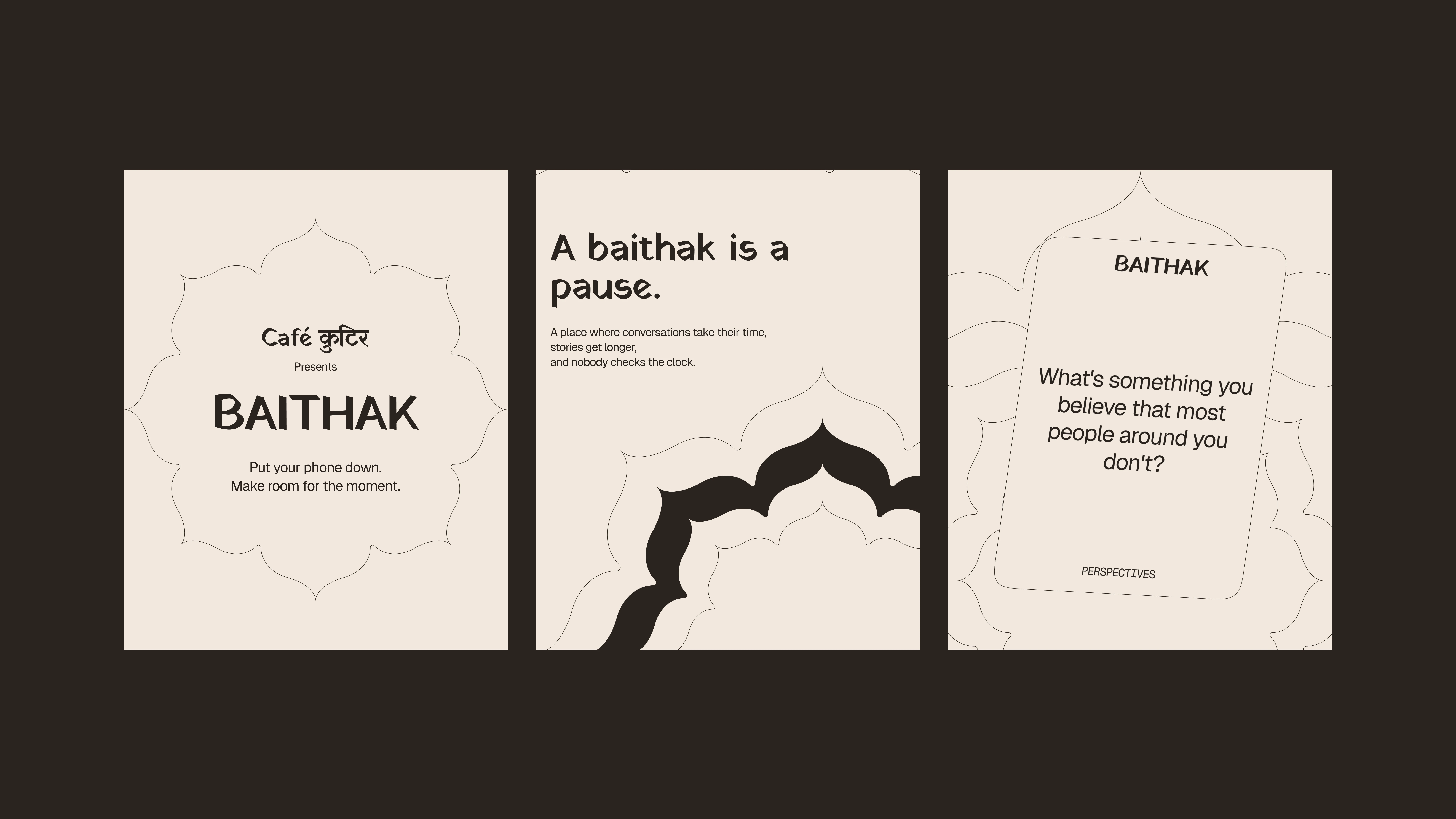
A baithak is a gathering where people sit together and talk. The idea connects with familiar forms of Indian social life, where conversation, storytelling, and shared time are valuable in themselves.
The concept felt natural for Kutir because the brand was already built around the idea of a welcoming dwelling.
If Kutir represented the feeling of home, Baithak represented what happens inside it: people gathering, talking, and creating memories.
The campaign idea
Baithak positions Café Kutir as a space for meaningful social interaction.
Instead of focusing exclusively on products or promotional messages, the campaign gives people a reason to engage with the café through an activity they can experience and share.
The central message is simple:
Put your phone down. Make room for the moment.
This turns the brand's broader positioning into an action that customers can participate in.
How it works
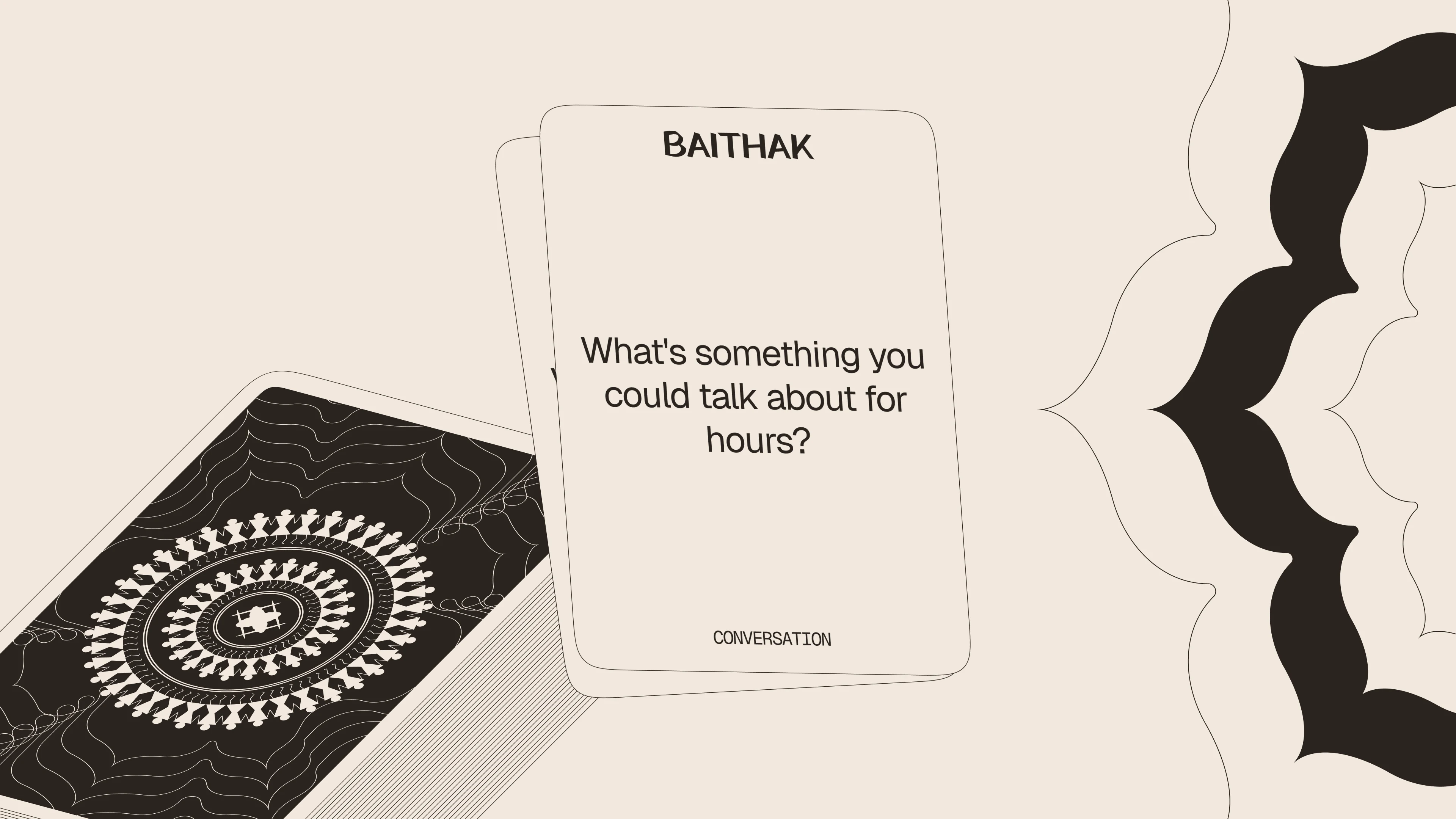
The campaign introduces a simple interaction built around conversation:
Pick a card.
Put your phone down.
Start a conversation.
Make a memory.
Leave your mark.
The card becomes a prompt for interaction rather than just another branded object. It gives people an easy way to start talking and makes the campaign part of the café experience.
Campaign touchpoints
The Baithak concept extends across multiple formats:
Social media posts and stories
Introduce the idea, encourage participation, and communicate the campaign's message.
In-café card deck
Give visitors a tangible reason to put their phones away and start a conversation.
Table cards
Bring the campaign directly into the customer's seating experience, making participation easy and immediate.
The Kutir Wall
Create a place where customer experiences, thoughts, or memories can become part of the wider café community.
User-generated content
Invite guests to share their Baithak moments online through the campaign hashtag #MeriBaithak.
Customer stories and reposts
Turn shared experiences into recurring social content that reflects the people who visit the café.
Extending the campaign
The campaign is designed to continue beyond a single post or launch.
Guests can share their Baithak moments, and Café Kutir can bring those stories back into its communication. This creates a cycle in which the café provides the setting, customers create the moments, and the community becomes part of the brand narrative.
Baithak therefore works on two levels. It is a campaign identity expressed through graphics and communication, and it is an experience that people can participate in.
Most importantly, it connects directly to the brand strategy. Café Kutir is not just communicating warmth and belonging. It is creating opportunities for visitors to experience them.
Like this project
Posted Oct 11, 2026
Branding project for Café Kutir, creating a distinct identity with Indian cultural elements.
Likes
0
Views
3
Timeline
Aug 21, 2026 - Sep 10, 2026