X-Vertice Brand Identity Development

Krish Prajapati


What is X-Vertice?
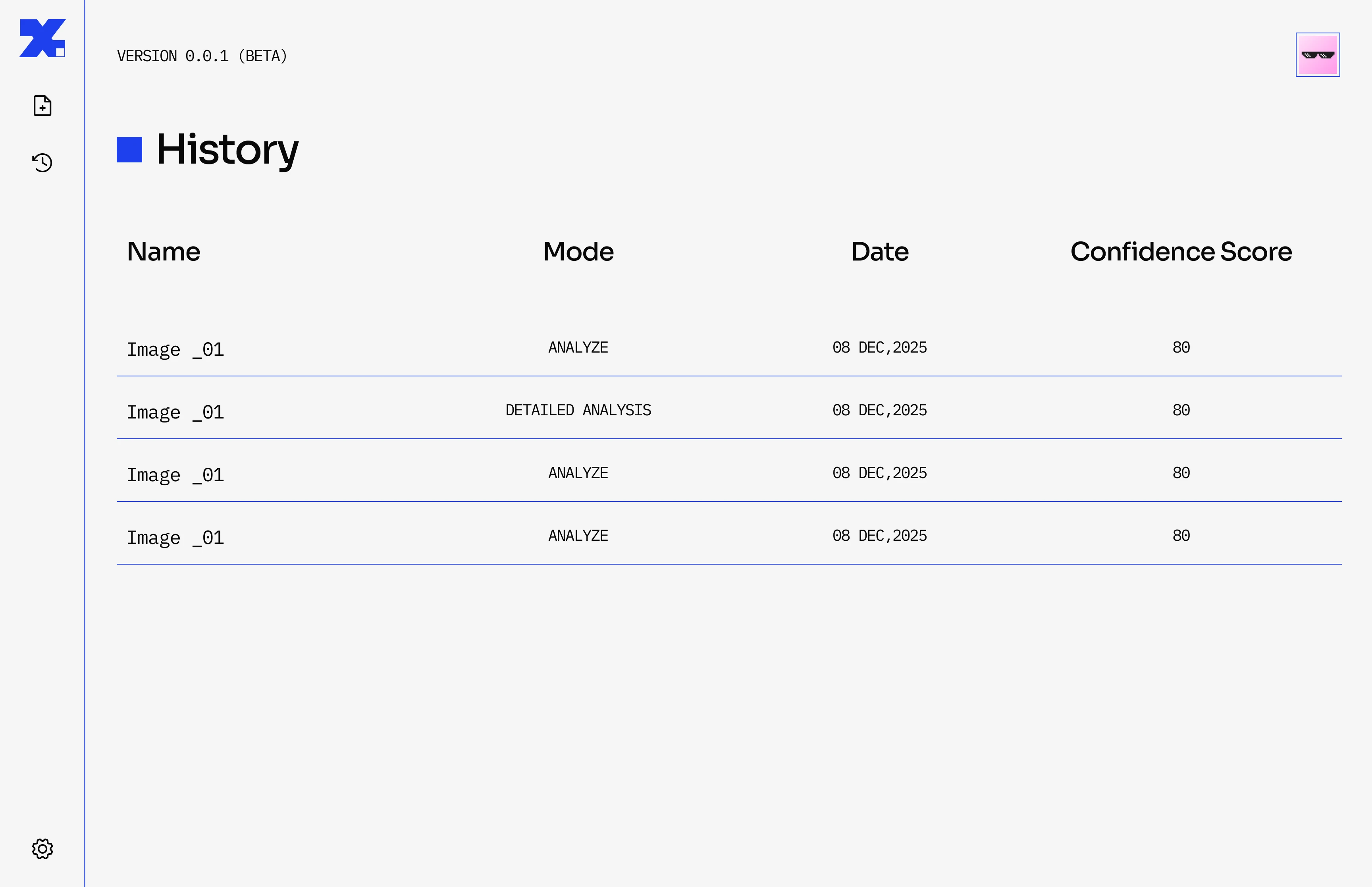
X-Vertice is an explainable fake image detection product. It uses various forensic tests and automates the entire process while also having specific tests to combat against AI generated images.
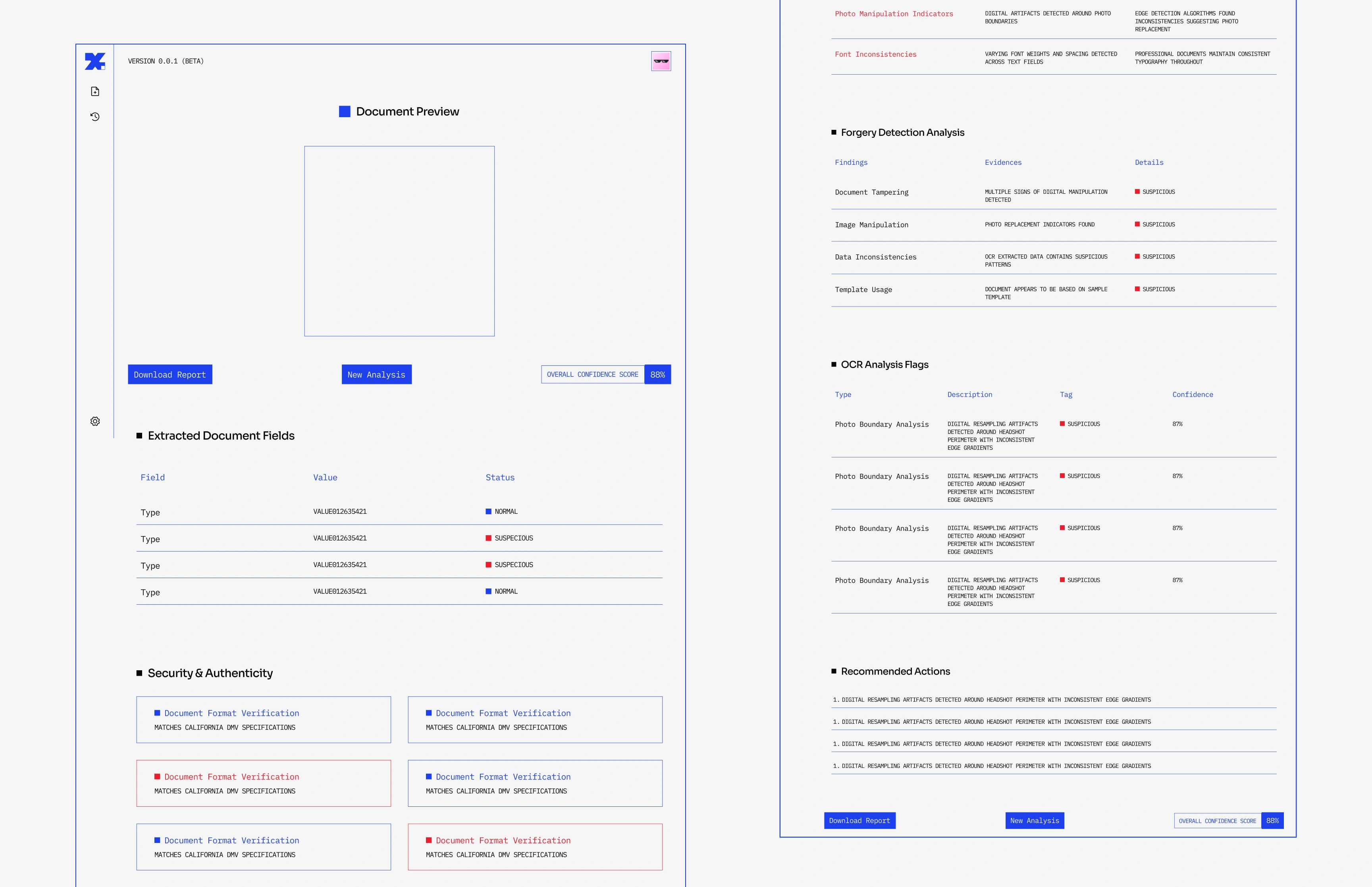
The final result is not just a number or answer but also a detailed explanation in both summary form and a detailed report with evidence like Image heat-maps of the various forensic tests, results from reverse search, metadata inconsistencies, etc.
What problem are they solving?
Manipulated and AI-generated images are becoming harder to identify, and most existing approaches try to reduce this complexity to a simple “real or fake” answer.
What is my job??
My job is to create a solid Brand Identity and a unique look for X-Vertice, making sure it catches attention and really fits what the company is all about.
Deliverables
Brand Kit
Visual Identity
Social Media Templates
Product Launch Website
Research & Discovery
To build a meaningful identity, I first had to understand how image forensics actually work. I explored the tech behind X-Vertice—learning how it uses pixel-level statistics to pinpoint Regions of Interest (ROI) and generates heat-maps to expose hidden layers of an image.
The Question
How can I visualize the underlying algorithms that find these hidden anomalies?
The Core Visual Concept
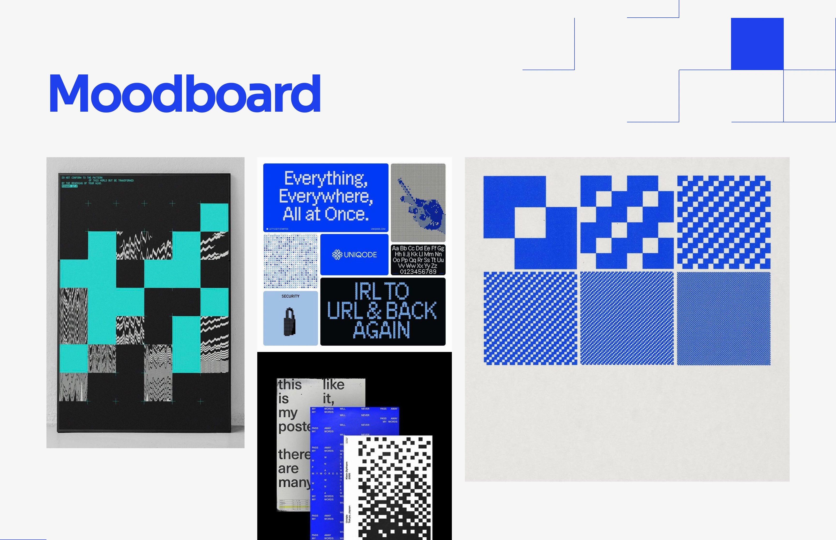
Inspired by X-Vertice’s deep noise analysis and forensic heat-maps, I developed a core visual theme: The Broken Pixel Grid.
This visual identity literally represents the anomalies hidden within a manipulated picture. By intentionally disrupting a perfect grid, the design language elegantly showcases how X-Vertice exposes the hidden errors, artificial edits, and inconsistencies in an altered image
Brand Elements
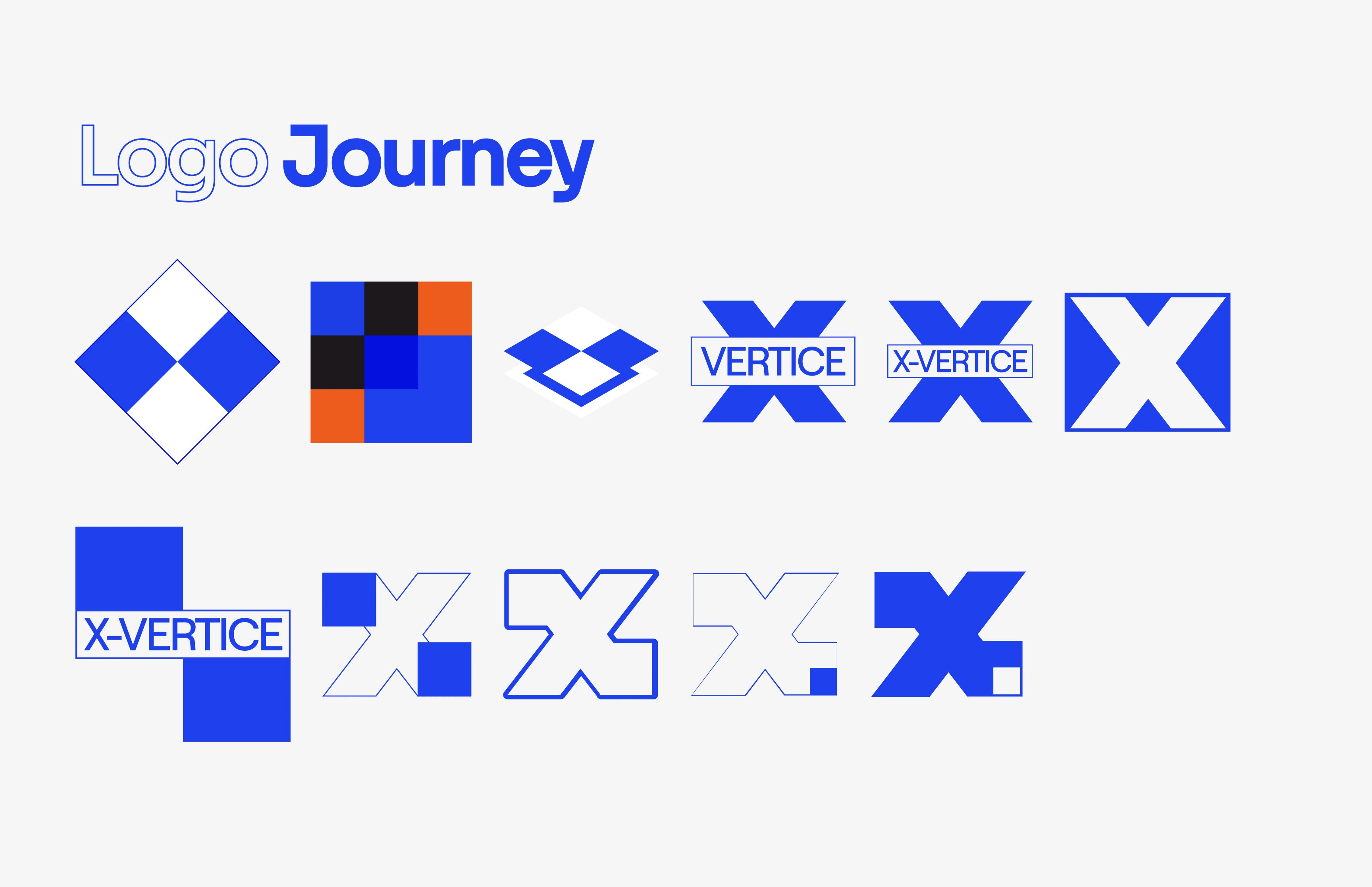
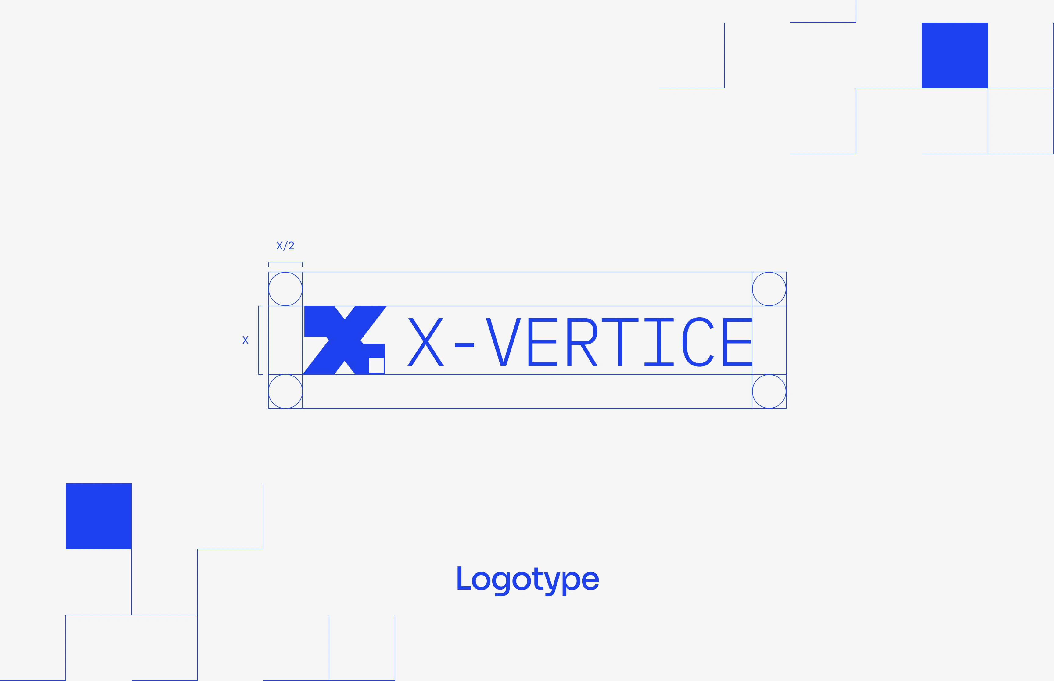
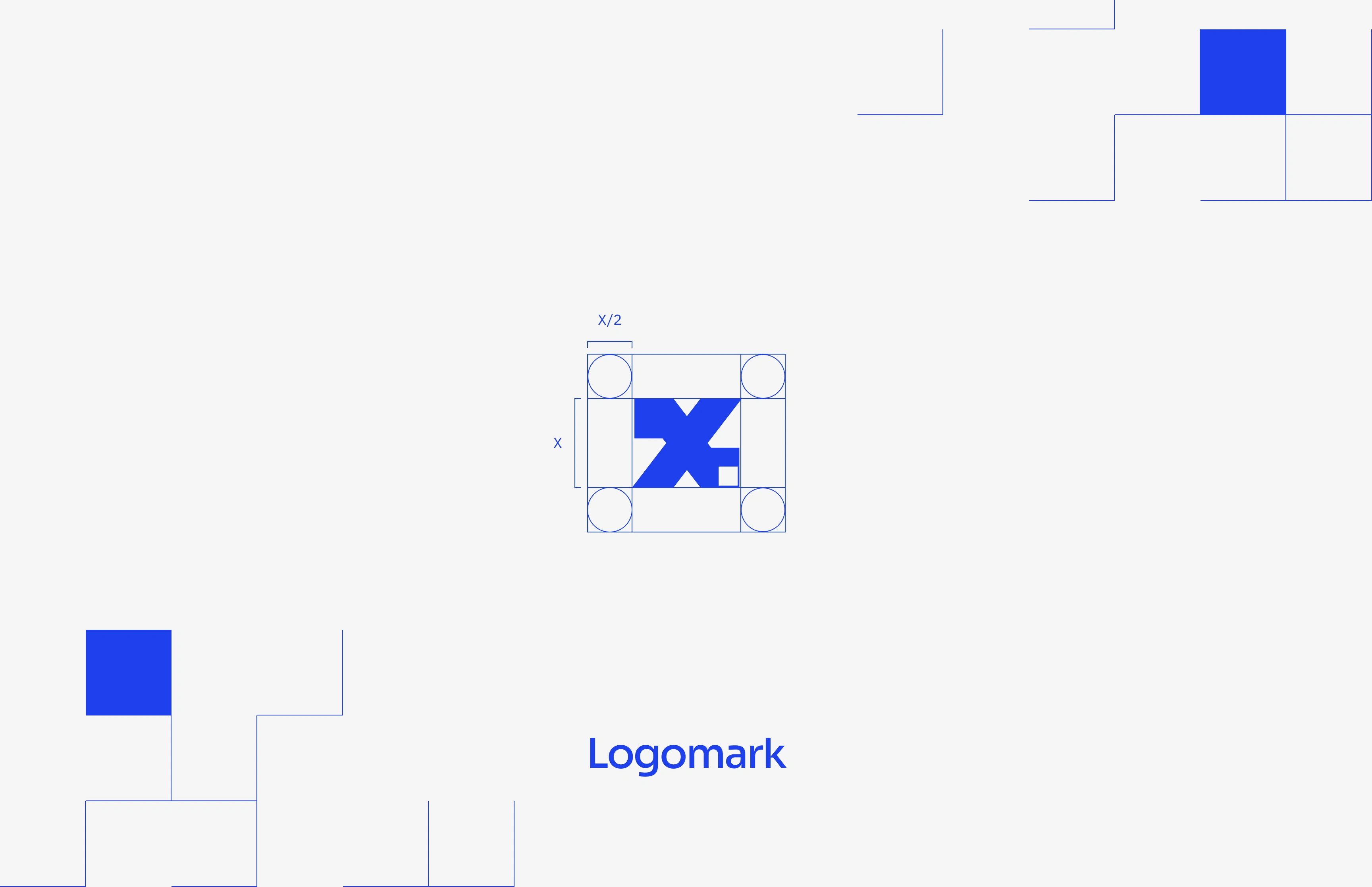
The X-Vertice logo represents the platform's forensic process. The 'X' maps the journey of an image through the system.
The negative space at the top left of the logo represents the raw user input—the unverified image as it is first uploaded.
The solid block at the bottom right shows the final result, highlighting anomalies and hidden manipulations after processing.
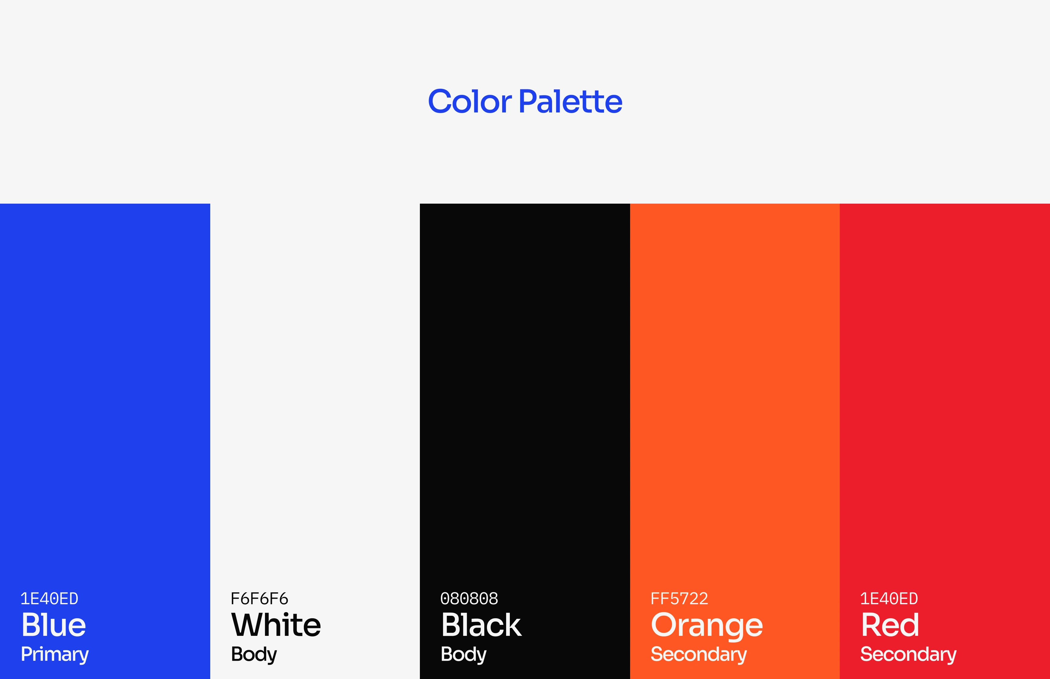
Typography & Color Palette
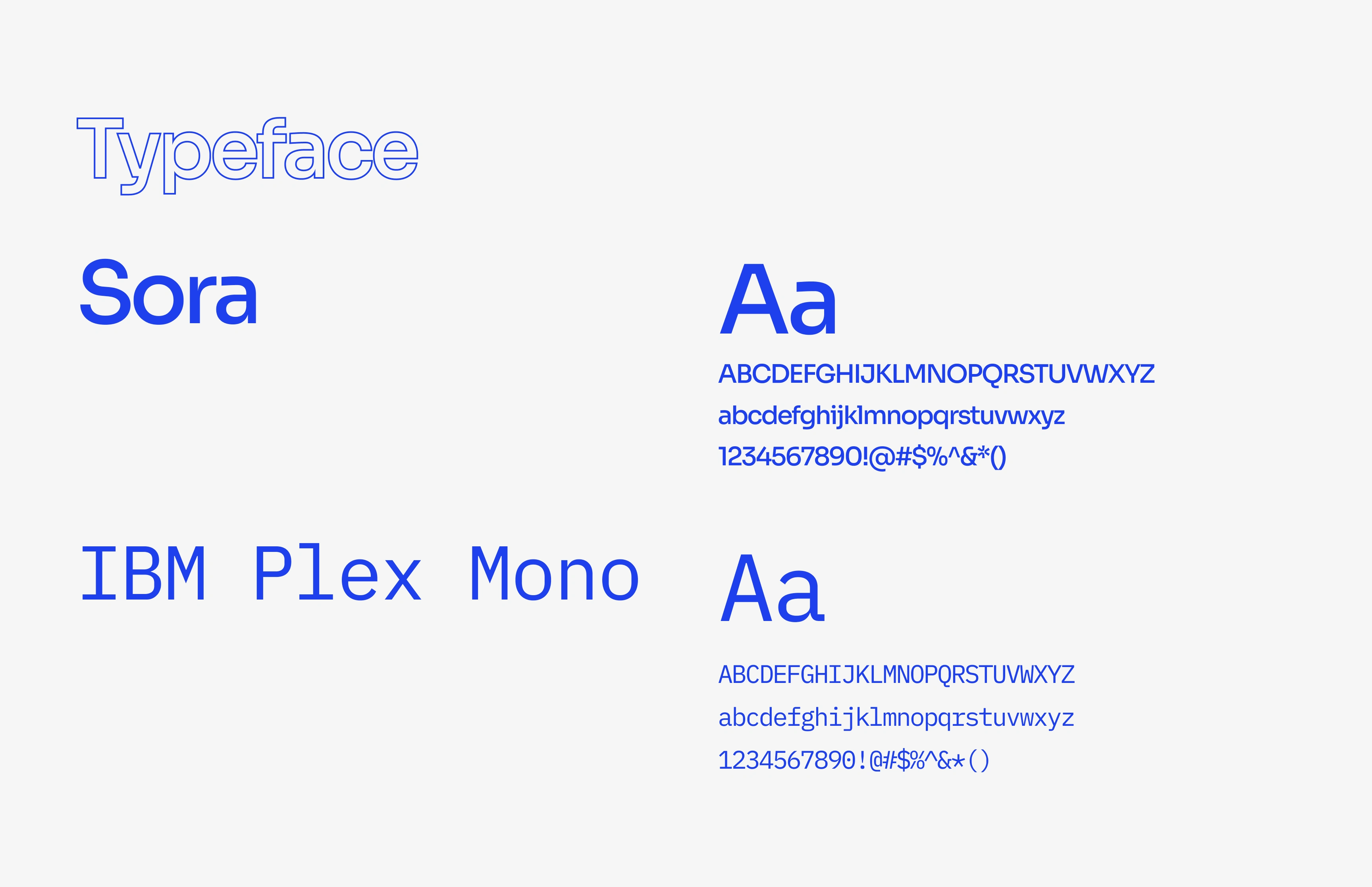
The content is technical and dense. So, typography had to step up. I focused on keeping things clear rather than flashy.
Headings point the way, body text is technical and easy to read, and there’s just enough space to help you skim before diving in.
The goal? Even if you don’t read it all, you’ll still get the idea.
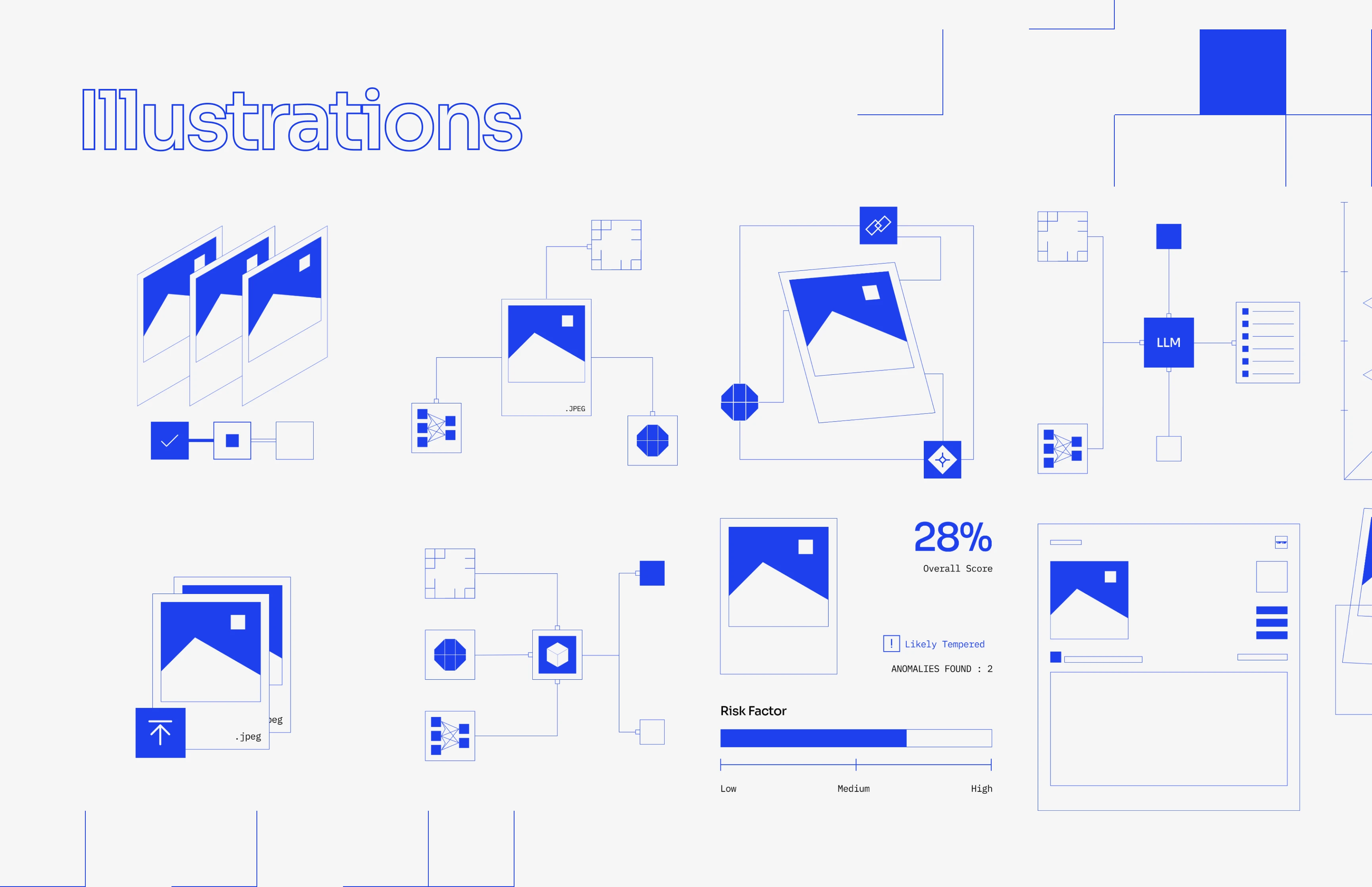
Illustrations
The product deals with Pixels, layers, Flows, things that are hard to grasp unless you can see them. So instead of relying on generic icons, i built a custom illustration system that explains as much as it decorates.
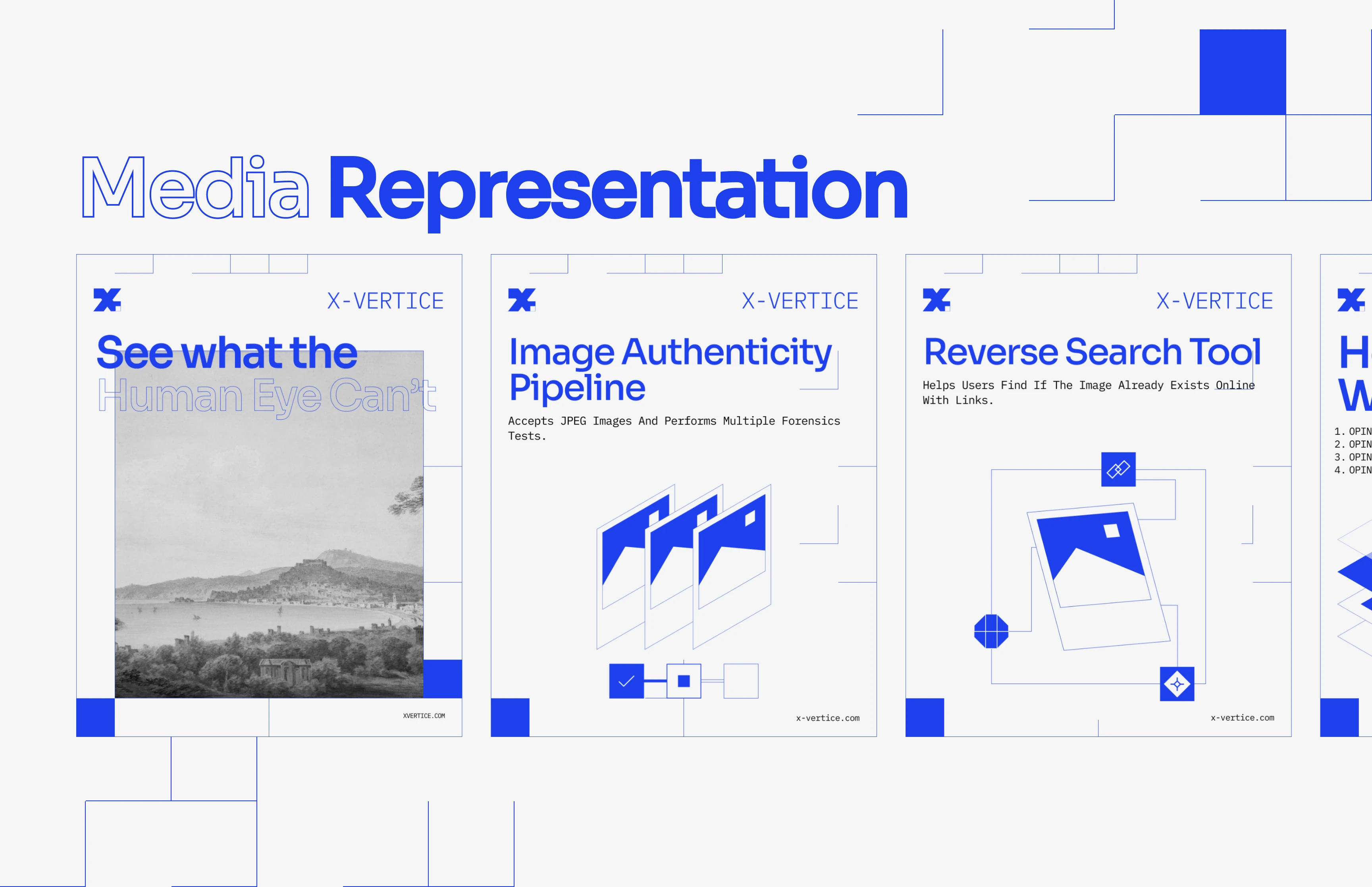
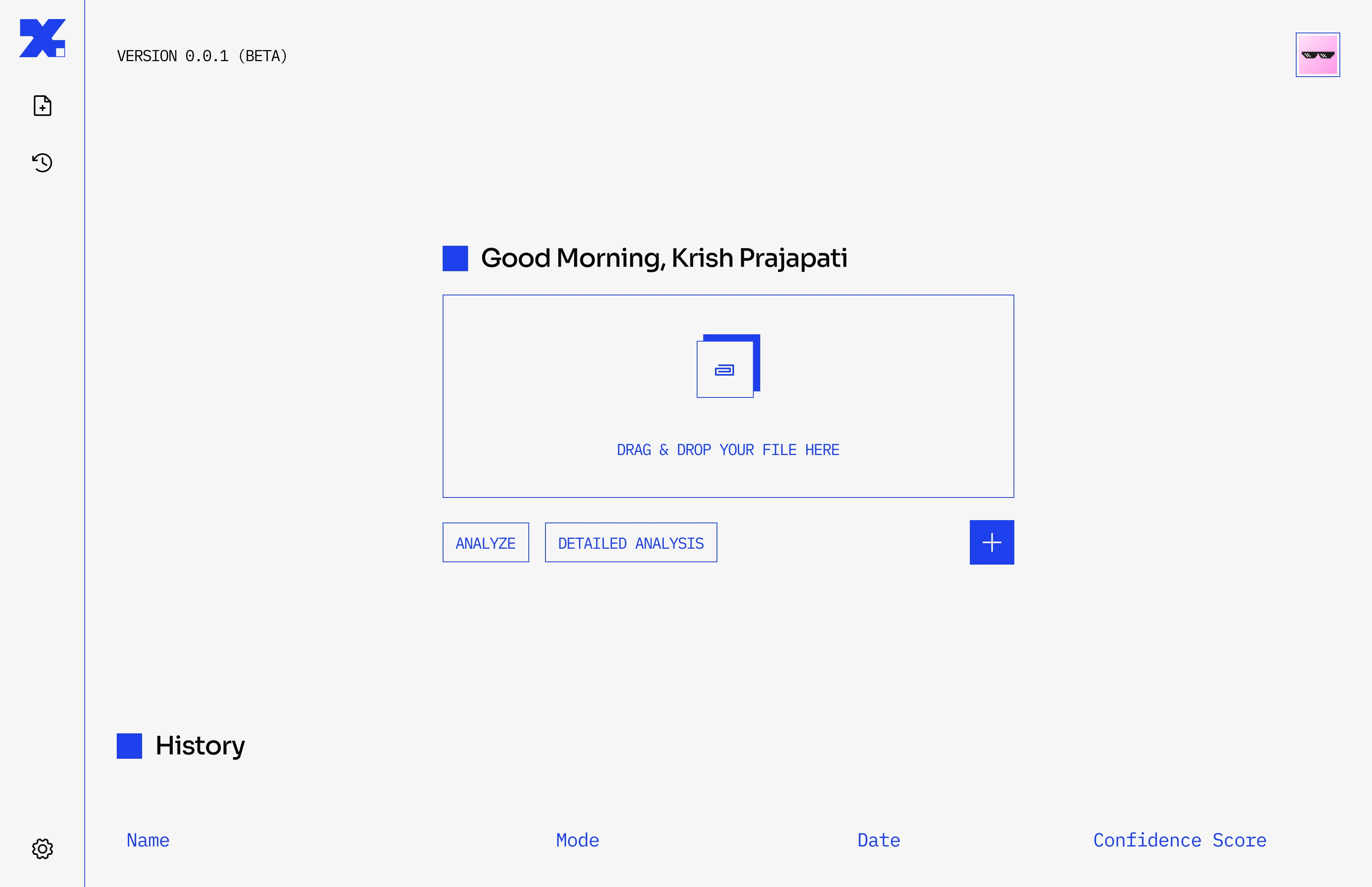
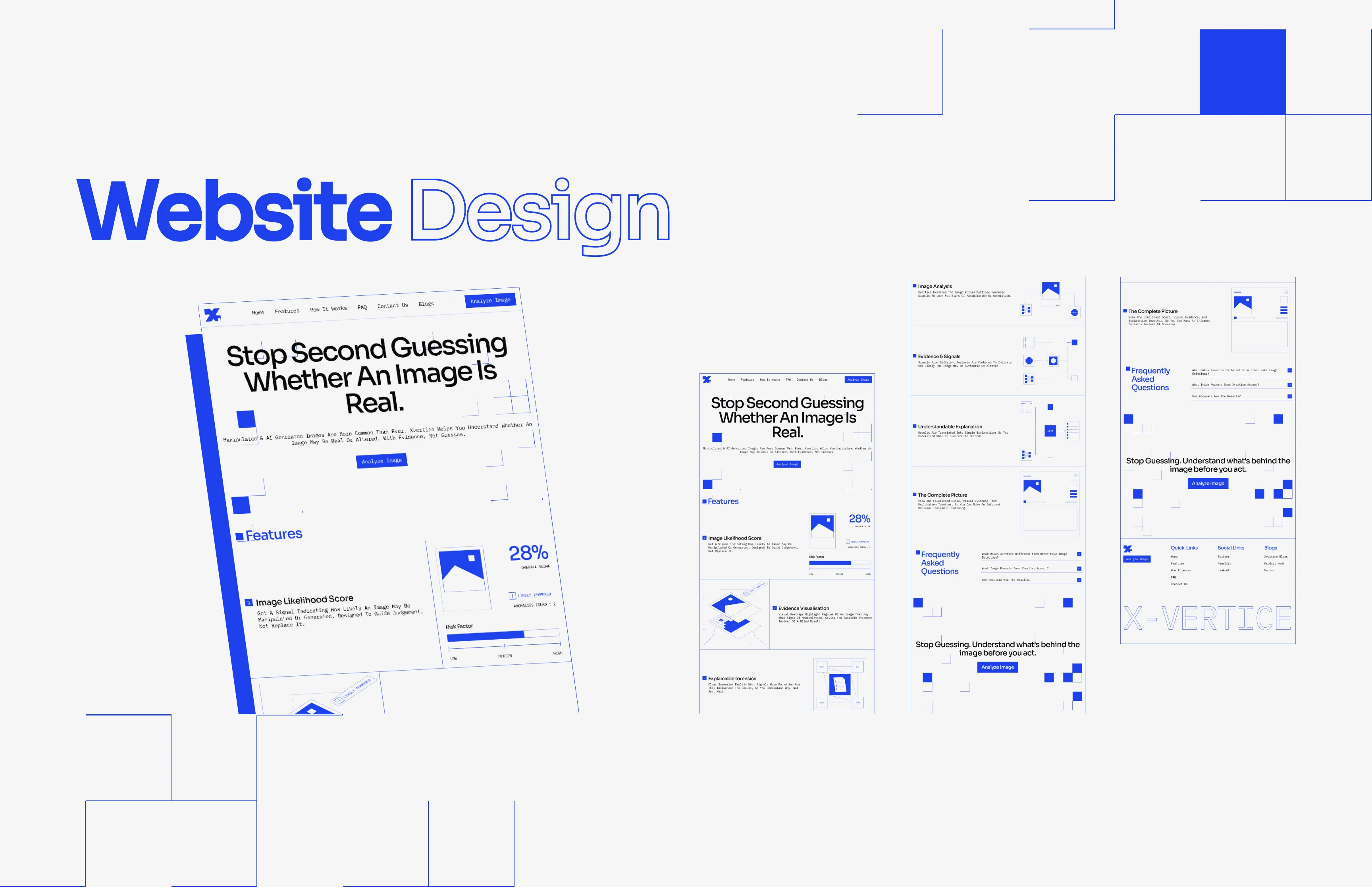
x-vertice.framer.website
Like this project
Posted Oct 11, 2026
Created brand identity and visual style for X-Vertice's fake image detection product.
Likes
0
Views
0
Timeline
Nov 1, 2025 - Jan 9, 2026