Utkrusht Platform UI Redesign

Krish Prajapati



About the Client
Utkrusht is an innovative technical hiring platform that is redefining how companies evaluate software engineering talent.
Target Audience
Tech teams and hiring managers at growing companies who need to identify high-quality engineers efficiently, without the clutter of biased, unreliable, or overly lengthy hiring loops.
Industry
B2B SaaS / HR Tech
Scope
UI Redesign, Design System, Onboarding Flow Optimization.
Key Problems
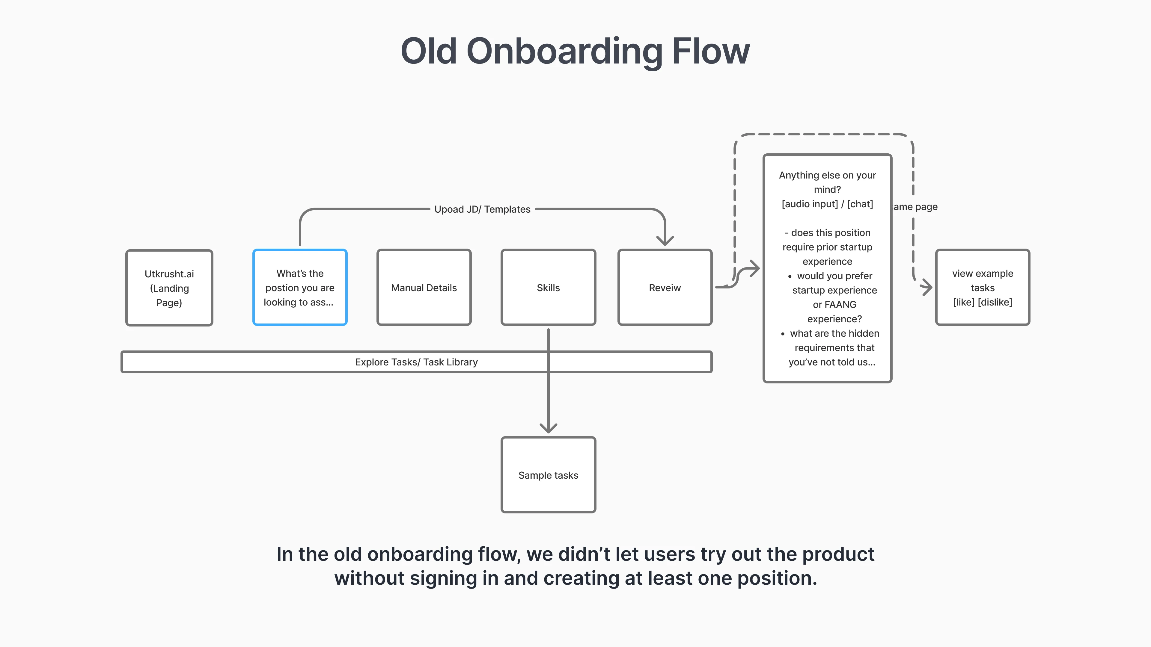
High Drop-off Rates in Onboarding
The user onboarding flow was too long and tedious, causing significant drop-offs before users experienced the platform's core value.
Cognitive Overload and Dead Ends
Key screens lacked visual hierarchy and clear CTAs. Users felt lost and unsure of their next actions.
Outdated and Generic Visual Identity:
The AI-driven HR tech platform's interface felt outdated. The generic UI did not convey its high-tech value to enterprise clients.
Inconsistent UI and Lack of a Design System
The platform lacked a documented design system, causing visual inconsistencies and a disjointed user experience, complicating product scaling.
Research & Discovery
I conducted a competitive analysis of TestGorilla, a leading platform, to understand industry standards and find opportunities for Utkrusht.
This analysis provided clear validation for the redesign strategy, highlighting several key takeaways:
Frictionless, Exploratory Onboarding
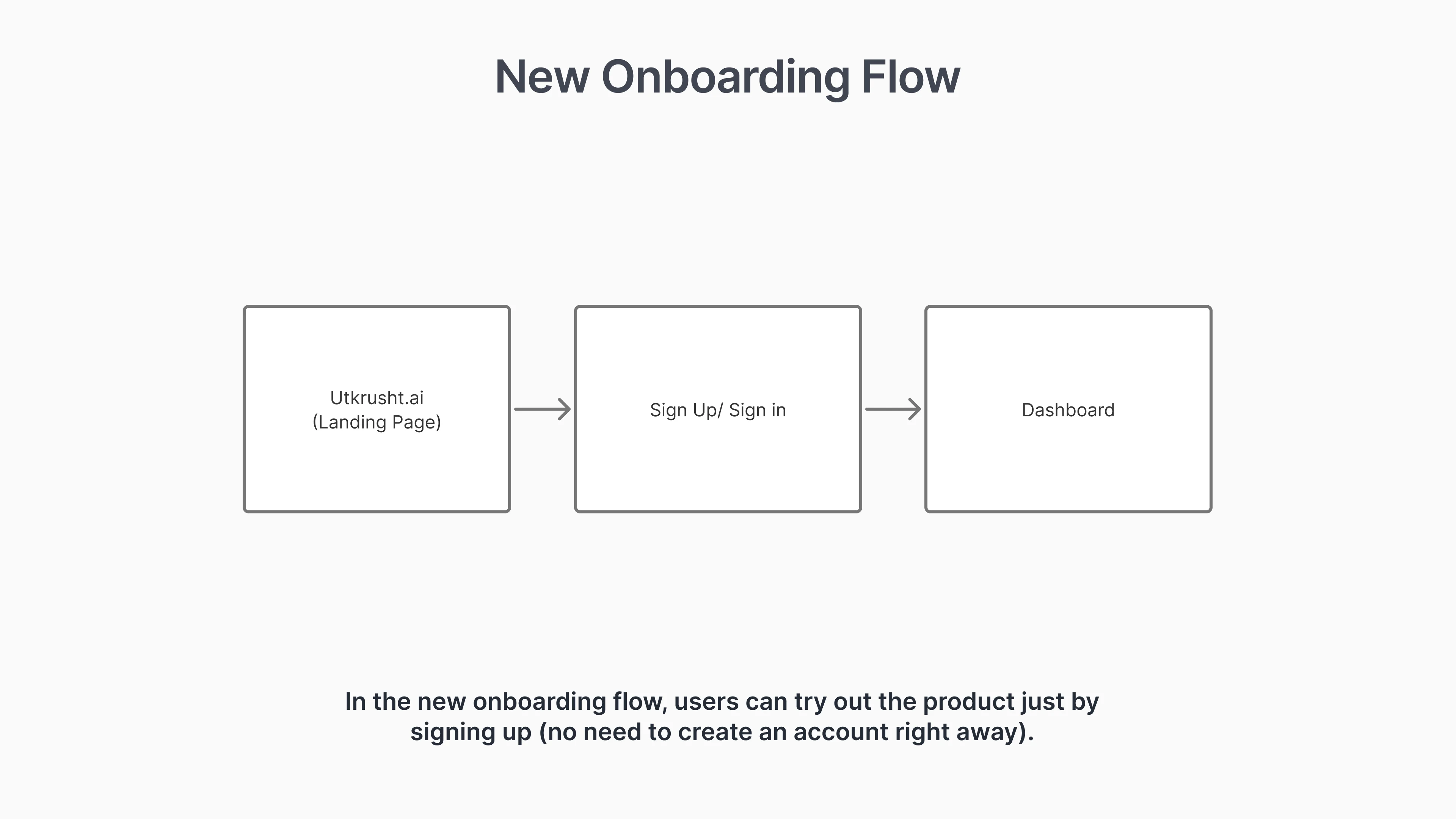
TestGorilla's onboarding is streamlined (Email Signup → Verification → Dashboard). It lets users skip rigid steps and explore the product freely.
Contextual Guidance & Nudges
TestGorilla uses in-app nudges to guide users, explain prerequisites, and provide clear CTAs when needed, preventing them from feeling lost in an open dashboard.
Information Architecture in Data Reports
TestGorilla candidate reports use clear visual hierarchy. Key info is at the top, with performance graphs and matrices supporting it.
Approachable Visual Identity
Despite being a B2B enterprise tool, the UI was clean, simple, and slightly playful, removing the intimidating feel often associated with testing software.
Key Insights
Frictionless, Exploratory Onboarding
Users want quick access to the platform. We cut onboarding screens to reduce Time-to-Value and let users "learn by doing" in the dashboard.
Contextual Guidance & Nudges
Instead of upfront tutorials, Utkrusht needed a system of progressive disclosure - guiding users step-by-step through their first tasks using strategic UI nudges.
Information Architecture in Candidate Reports
Technical hiring depends on data interpretation. Utkrusht's candidate reports were needed to designed for better scannability, using visuals to simplify complex engineering metrics.
Approachable Visual Identity
Utkrusht needed a modern, professional, and user-friendly look to replace its outdated style.
The Design System
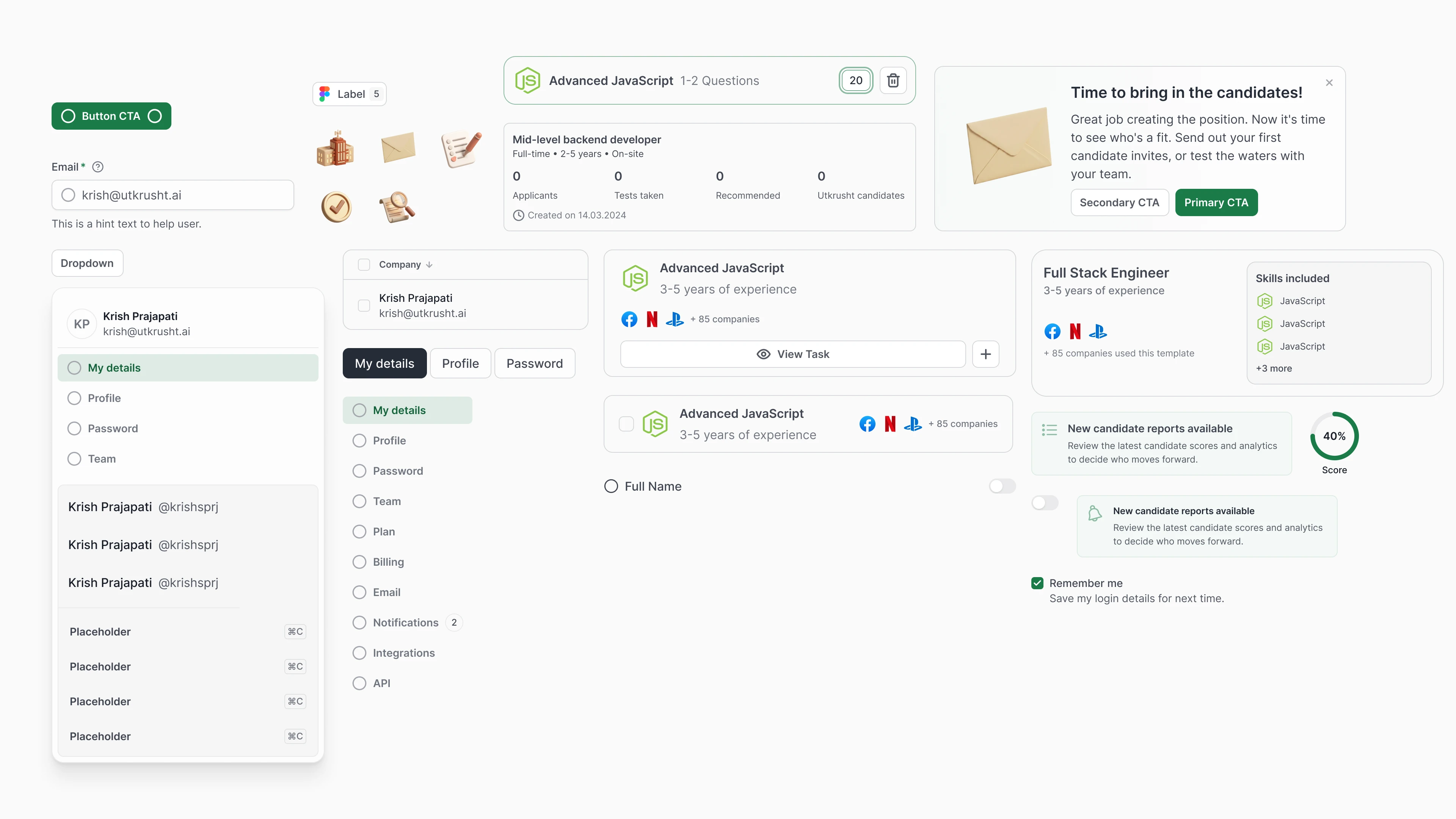
I built a scalable design system to fix visual inconsistencies and speed development. Inspired by modern SaaS frameworks, it features a clean, minimal style with reusable components. This single source of truth made screens cohesive and developer handoff smooth.
Typography
Component Library (Atoms & Molecules.
Complex UI Patterns (Organisms)
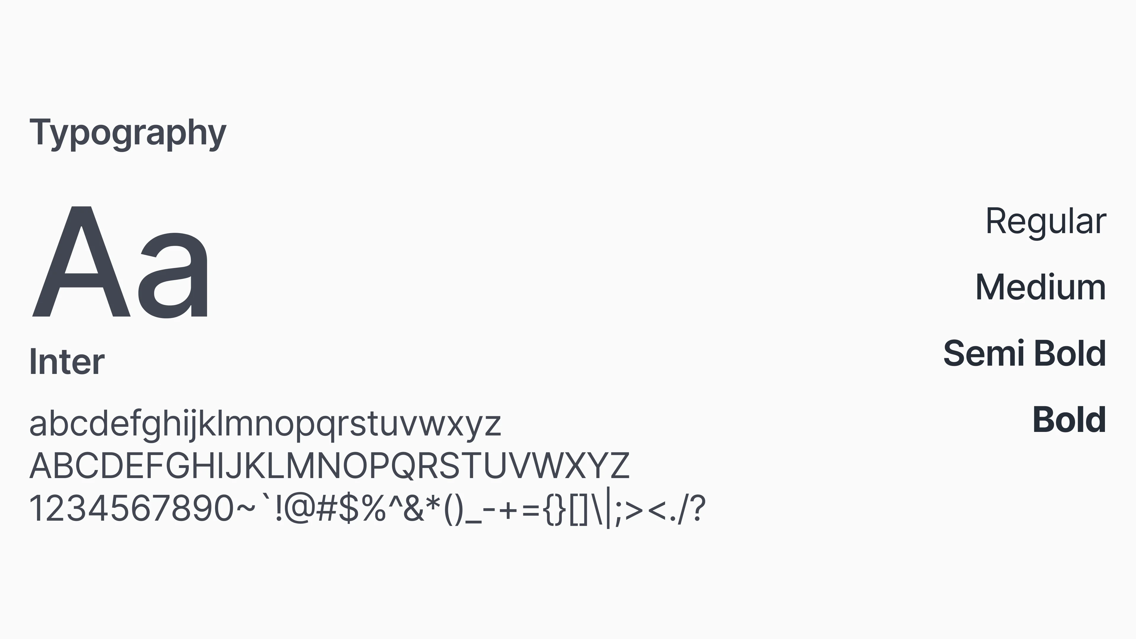
Typography
Primary Typeface
Inter is used for body copy and supporting information. Its clean, contemporary letterforms provide readability. It keeps longer text, descriptions, and everyday communication clear and accessible.
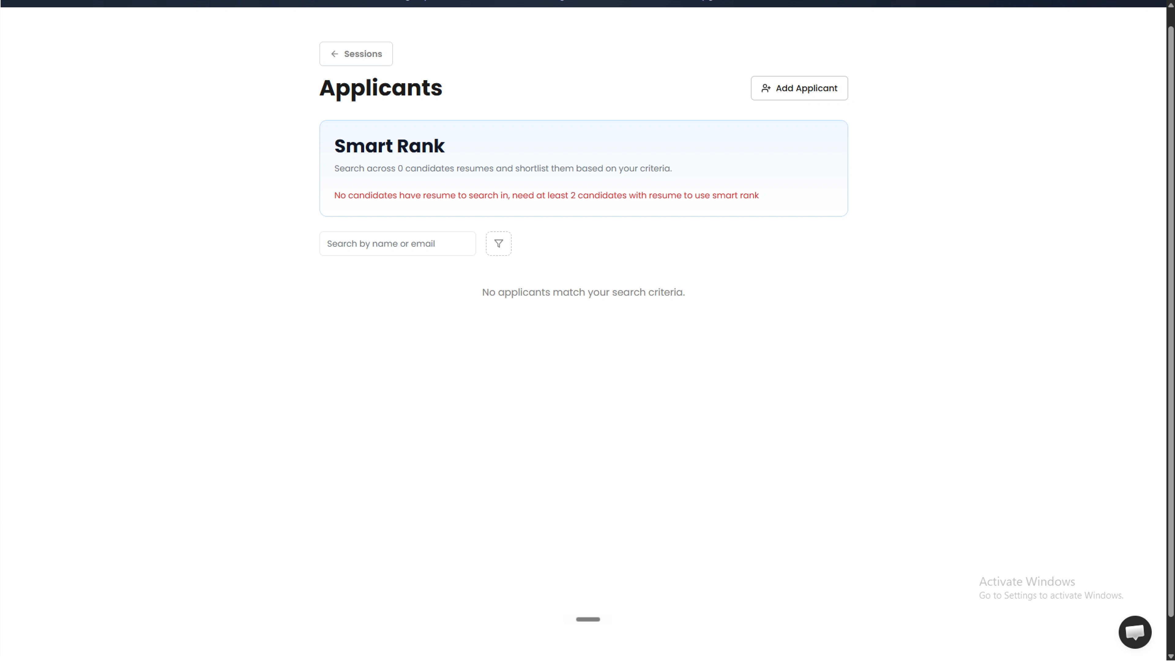
Before redesign, Utkrusht's interface was cluttered and outdated.
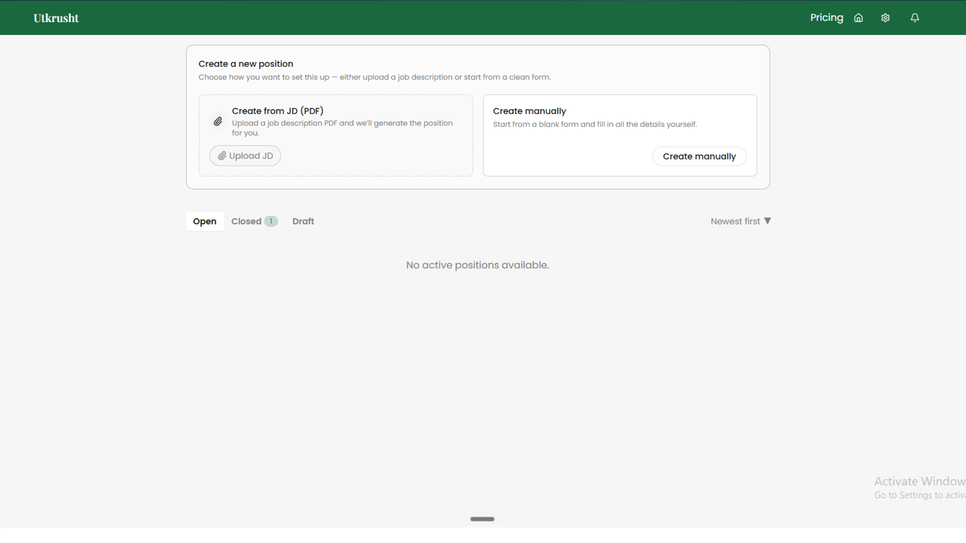
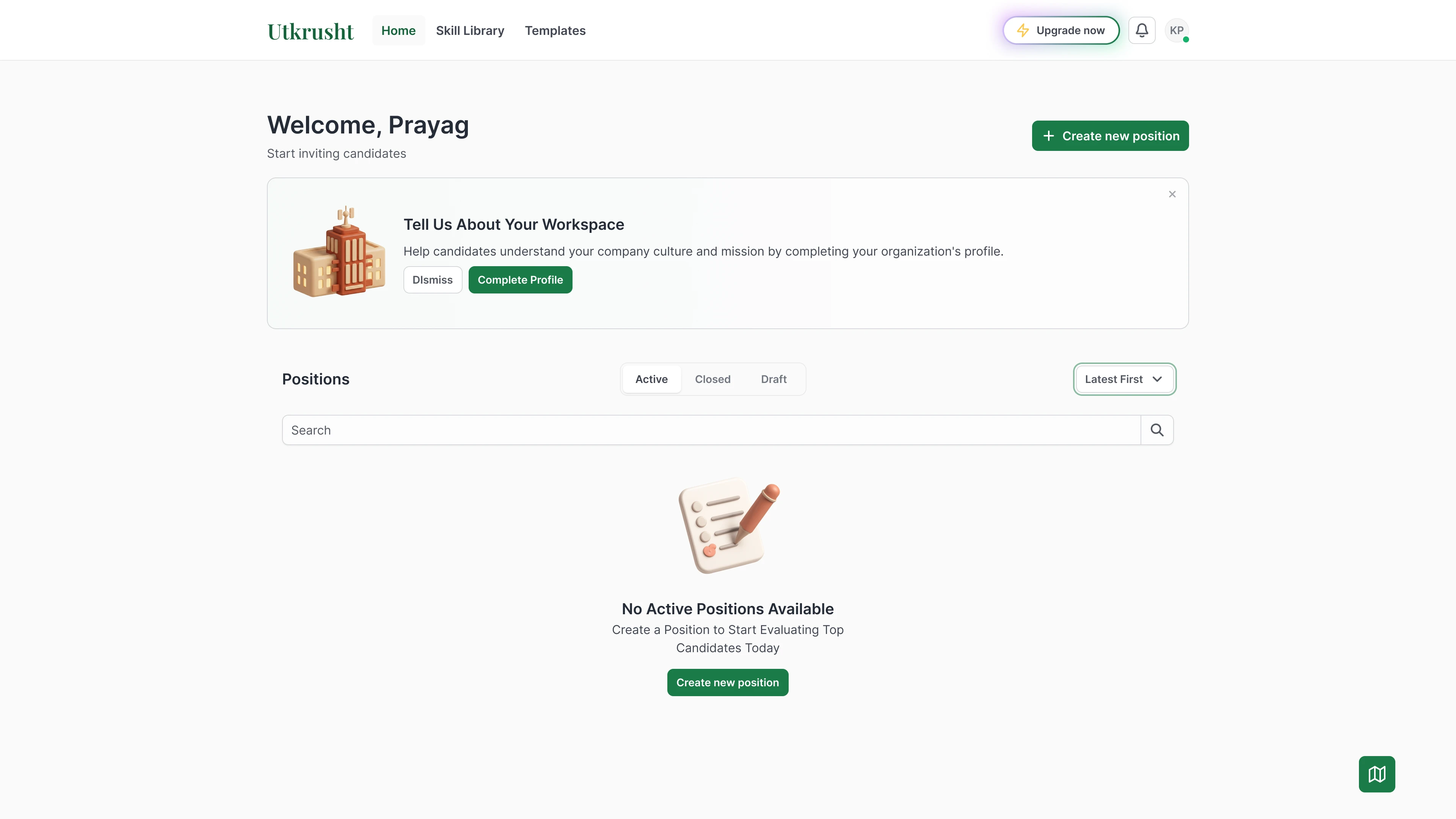
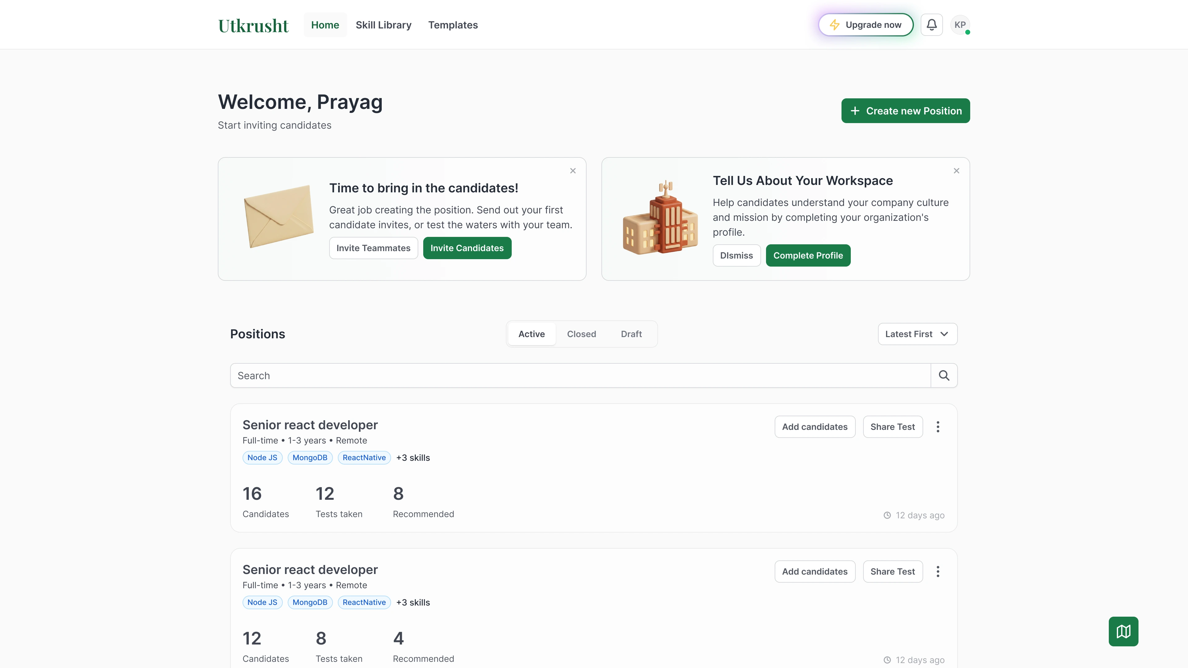
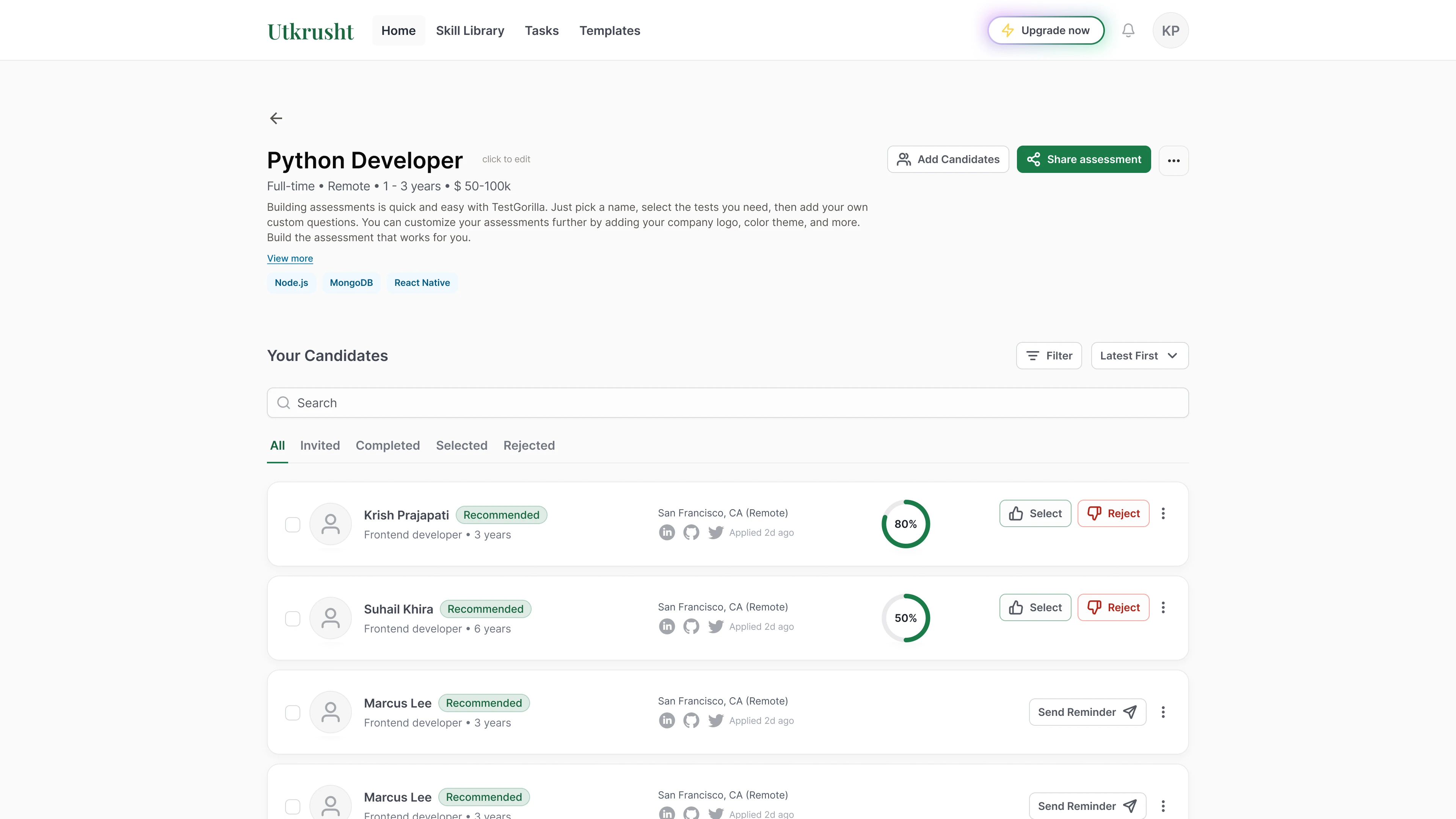
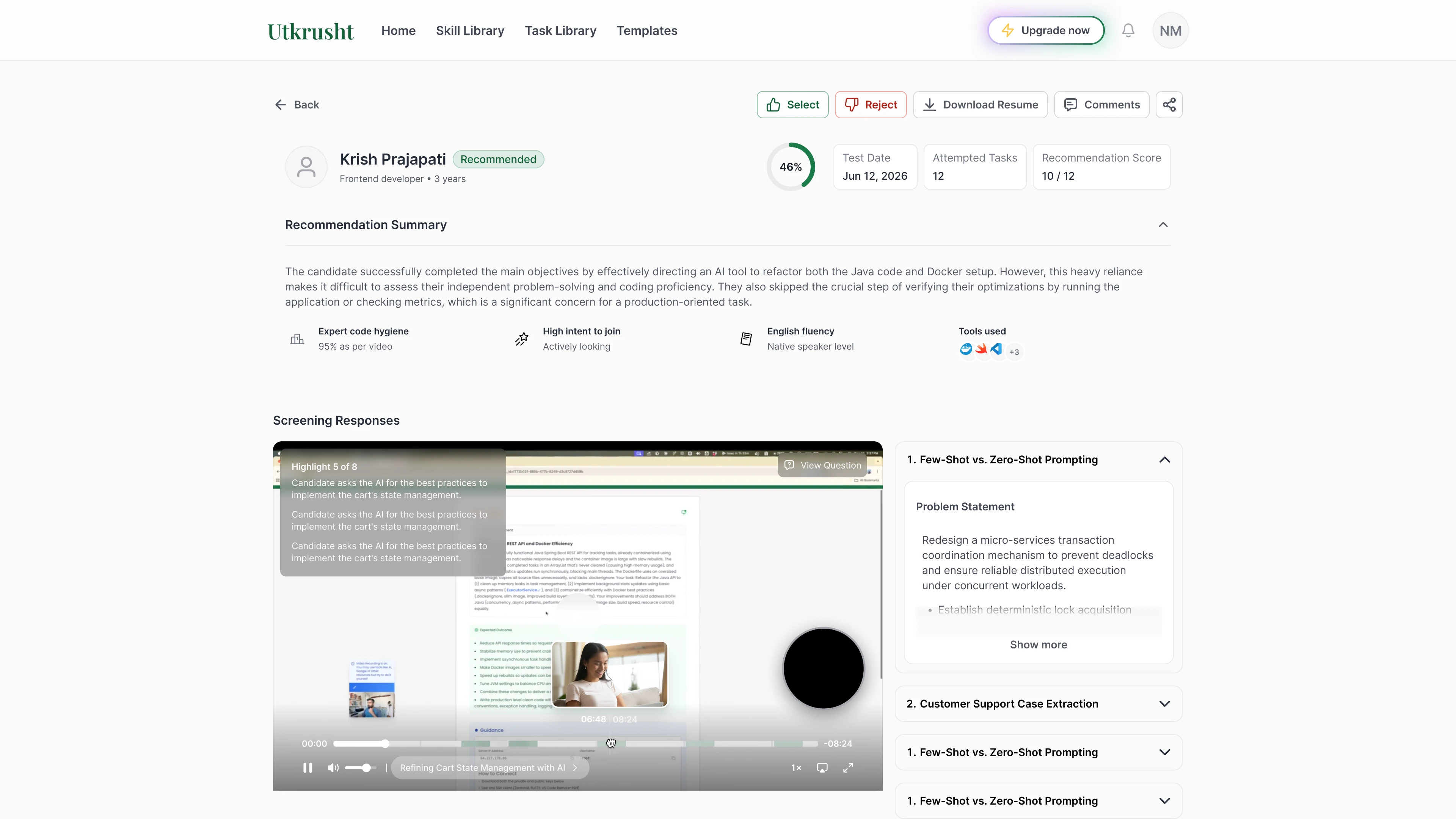
After redesigning the user experience at Utkrusht, this is the new look
Like this project
Posted Oct 11, 2026
Redesigned Utkrusht's UI to enhance onboarding and create a design system.
Likes
0
Views
0
Timeline
Mar 1, 2026 - Jun 16, 2026
Clients
Utkrusht