

Gambaru is a specialty coffee shop located along Route 40 in Bariloche, Argentina. The goal was to create a name and visual identity inspired by Japanese culture, emphasizing craftsmanship, dedication, and the human touch behind high-quality products. The project aimed to move away from minimalism and embrace the expressive, chaotic nature of Japanese graphic culture, with a one-month timeline aligned with the construction and launch of the food truck.
2
6
351






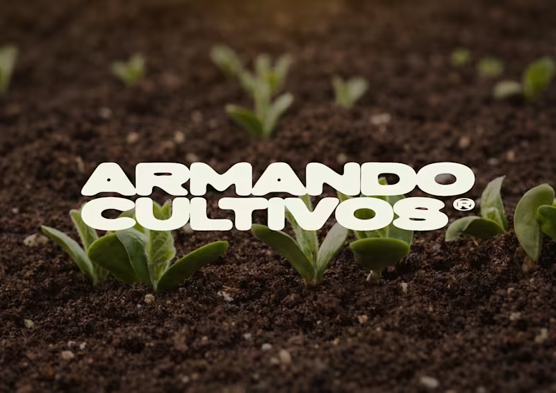
Armando Cultivos is a brand focused on the development of living substrates and organic soil solutions for growers and producers. The goal of the project was to build a strong and professional visual identity that communicates expertise, approachability, and technical knowledge, while preserving the recognition of the “Armando” character and evolving it into a more functional, scalable, and contemporary system. The identity needed to balance organic and technical elements and remain flexible across multiple formats, products, and future brand extensions.
1
1
242
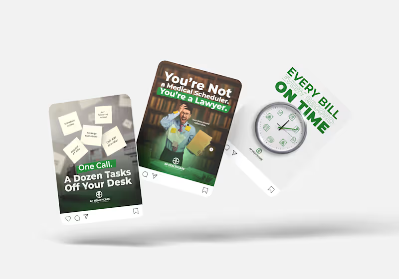
Strategic Social Media Design for Healthcare, Technology & Housing Brands This project showcases a selection of social media content created for companies operating in the healthcare, technology, and housing sectors. Each piece was designed with a strategic focus on brand positioning, audience engagement, and visual impact. By combining advanced photo compositing, motion-inspired graphics, and clean visual systems, the content delivers clear messaging while maintaining a strong and consistent brand identity across digital channels. The goal was not only to create visually appealing content but also to support broader marketing objectives such as brand awareness, lead generation, and audience growth.
0
44
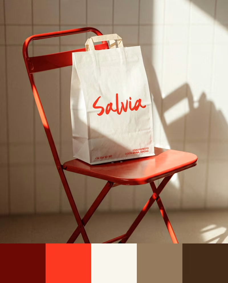
When we design color, the first question is where the brand is going to live and what it’s competing against visually.
Azulejo’s cobalt blue carries the Spanish ceramics that give it its name. Salvia’s red comes from their original food truck — it already set them apart before they had a storefront. In Broots’ segment, brown and beige had saturated the shelf, so we went with green and pink. Tu Tarta’s orange is visible from a block away.
Here are the palettes from 4 recent projects. Different industries, different problems, different answers.
#Branding #BrandDesign #BrandStrategy #ColorPalette
1
7
274