

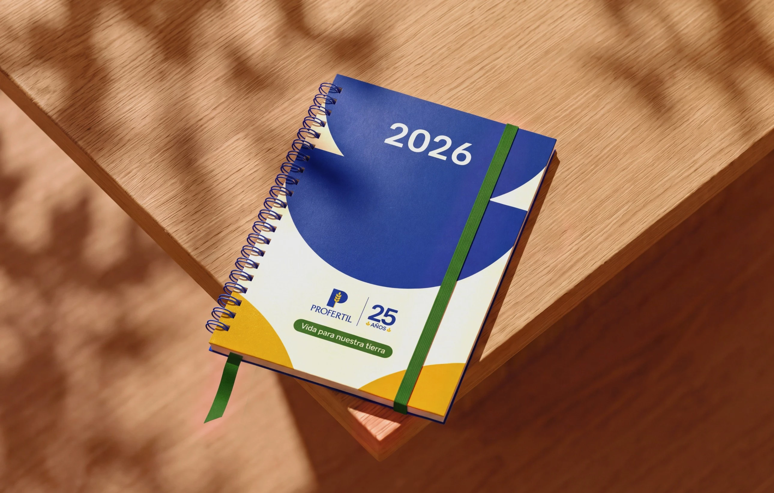
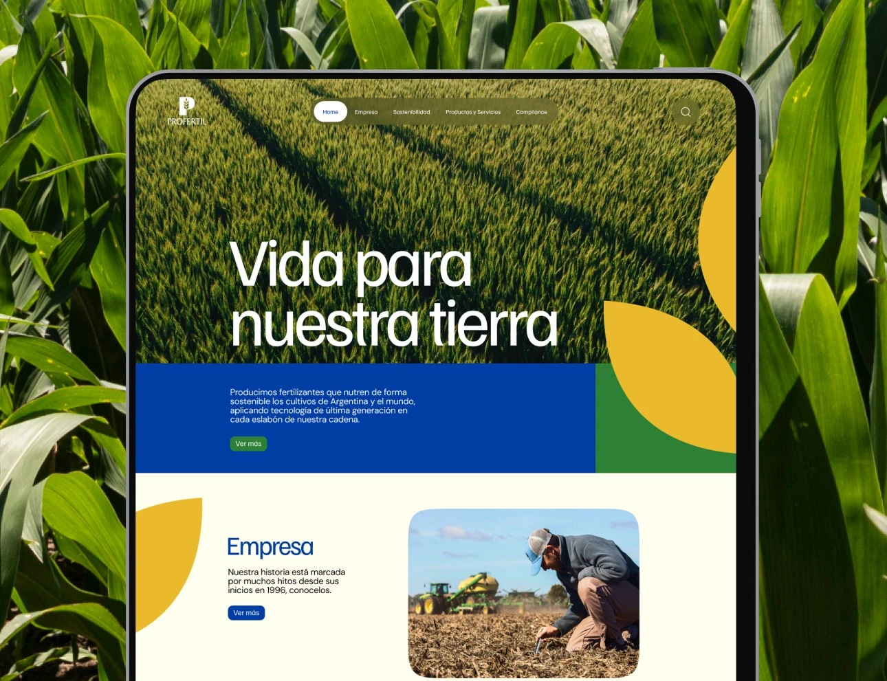
Visual identity and brand system for Profertil by Bong Studio.
Profertil is Argentina's leading fertilizer producer and one of the largest in Latin America. They came to us in their 25th year, with a new shareholder structure formed by Adecoagro and ACA, to bring order to a brand that had been growing on its own for years without a clear structure.
We started by studying how the company had used its brand over those 25 years, looking for what already worked so we could keep it and push it further. Along the way we found underused pieces, like colors with strong symbolic weight that nobody was making the most of.
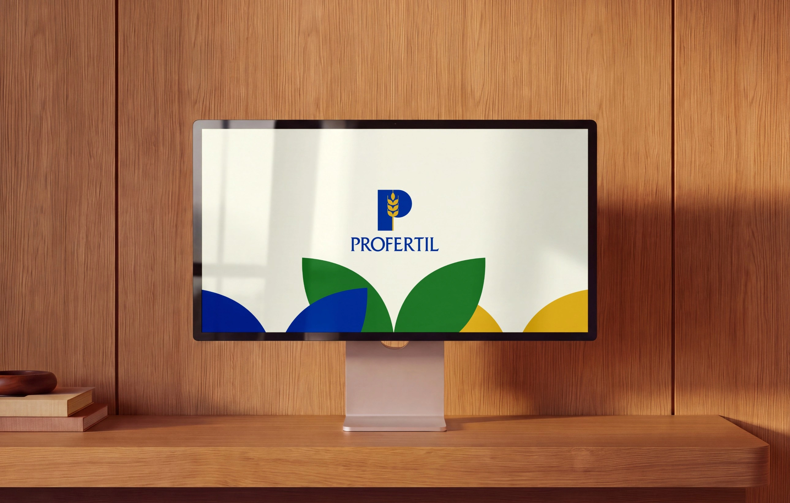
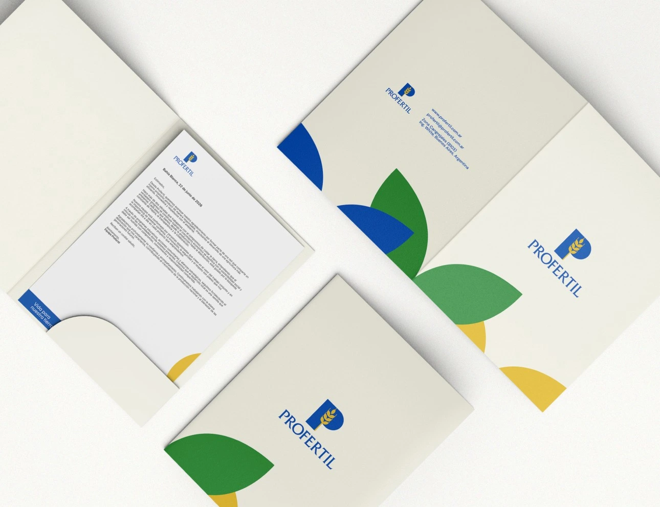
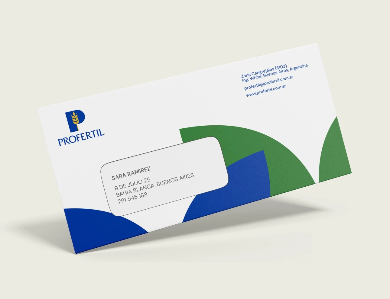
The 129-page manual was going to reach people with very different levels of design knowledge. Working with Profertil's Communications team, we built it as a navigable document where any day-to-day question gets answered in a few clicks, from which typeface to use to where to download the assets for a presentation. We developed a color system of curated pairs that gives the team freedom inside the rules, and a set of masks that add composition pieces and shape a visual language of its own. We also built small apps so employees can get the most out of the brand's visual assets.
Profertil now has a centralized brand system that every supplier applies the same way, with a documented logic and an architecture to keep growing.
Full case: Profertil by Bong Studio










0 likes · 2 views · Nov 2, 2026
Visual identity and brand system for Profertil by Bong Studio, with a navigable manual, curated color pairs and a visual language of its own.

