Bong Studio
Brand strategy & systems for growing brands.



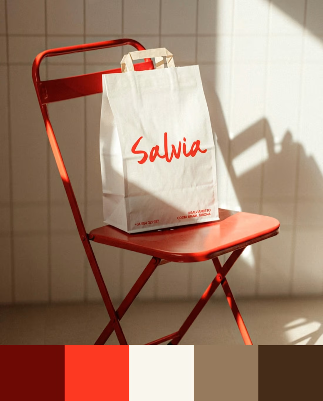
When we design color, the first question is where the brand is going to live and what it’s competing against visually.
Azulejo’s cobalt blue carries the Spanish ceramics that give it its name. Salvia’s red comes from their original food truck — it already set them apart before they had a storefront. In Broots’ segment, brown and beige had saturated the shelf, so we went with green and pink. Tu Tarta’s orange is visible from a block away.
Here are the palettes from 4 recent projects. Different industries, different problems, different answers.
#Branding #BrandDesign #BrandStrategy #ColorPalette
1
7
190
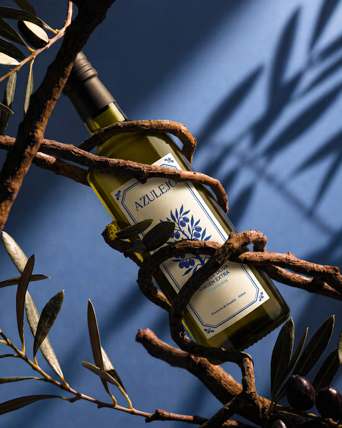
Azulejo. Extra virgin olive oil, Spain.
The name comes from the glazed ceramic tiles that have covered the walls of southern Spain for centuries. Blue and white, geometric, repeated endlessly across courtyards, churches and village kitchens.
The visual identity draws from that same language. One color, repeating forms, a system you recognize before you read it. The entire branding comes from there, from a material that already existed, waiting for someone to put it on a bottle.
Branding, visual system and art direction by Bong Studio.
2
9
212
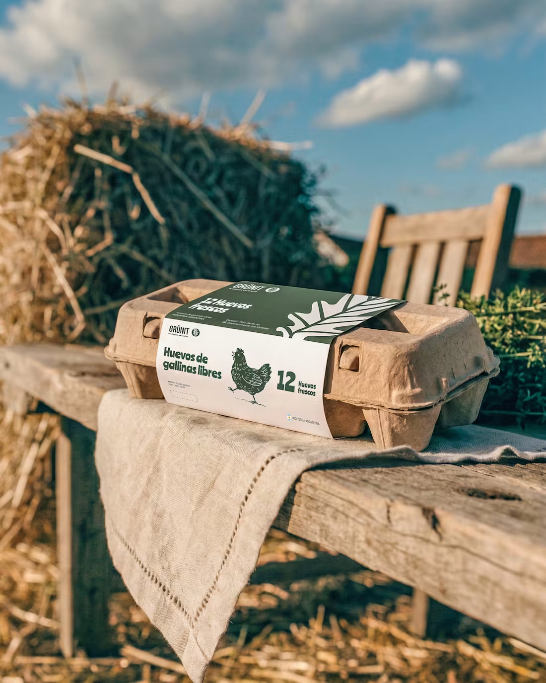
They called us for a label. We delivered a scalable system.
Grünit is a family business that makes eggs, honey and walnuts on their own farm. They called us to redesign a single package. A clear, contained job.
But the more we got to know them, the more we saw it. The warmth this family puts into the work on the farm wasn't reaching the shelf. And one label was never going to transmit that. Grünit needed a language of its own.
So we designed the label in the scope, but built to scale across the whole line, so eggs, honey, walnuts and whatever comes next all speak the same family voice.
More than the brief asked for? Yes. We did it because we connected with who they are. At Bong we work prioritizing scalability and message. Grünit gave us a fun, different project. We gave them a system. It was a pleasure. 🥚
9
28
477
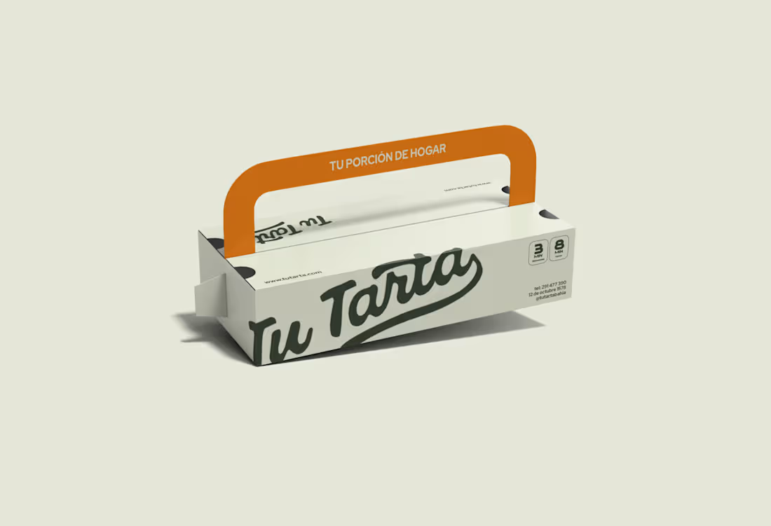
Tu Tarta Brand Identity Design
1
12