The network for creativity
Join 1.25M professional creatives like you
Connect with clients, get discovered, and run your business 100% commission-free
Creatives on Contra have earned over $150M and we are just getting started
Back to feedPost

Azulejo. Extra virgin olive oil, Spain.
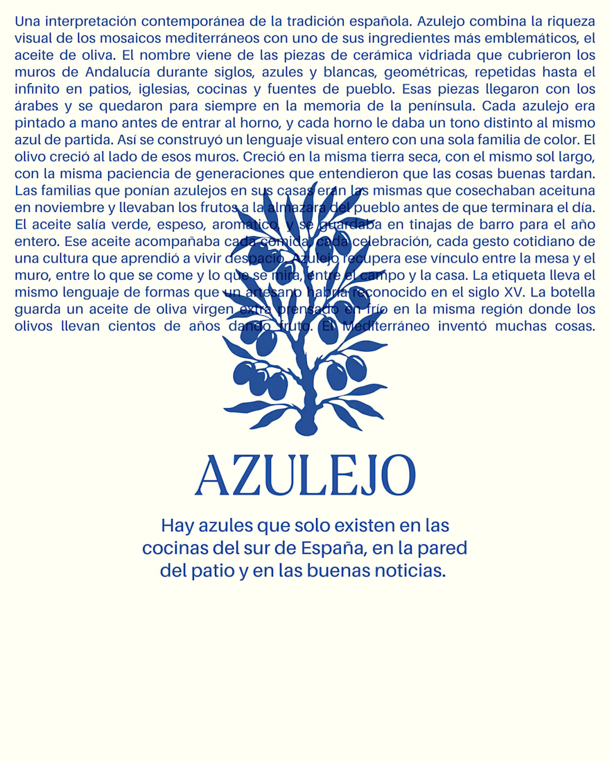
The name comes from the glazed ceramic tiles that have covered the walls of southern Spain for centuries. Blue and white, geometric, repeated endlessly across courtyards, churches and village kitchens.
The visual identity draws from that same language. One color, repeating forms, a system you recognize before you read it. The entire branding comes from there, from a material that already existed, waiting for someone to put it on a bottle.
Branding, visual system and art direction by Bong Studio.


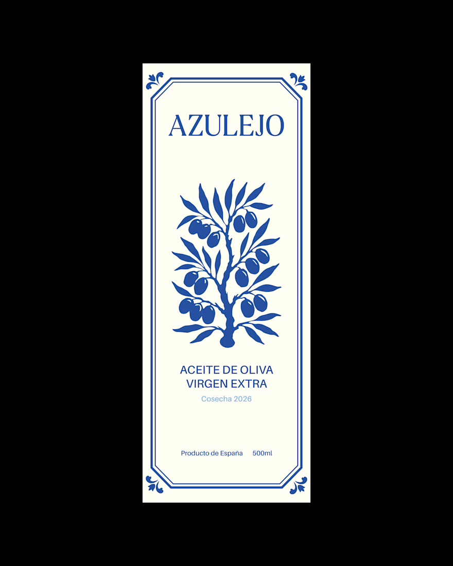
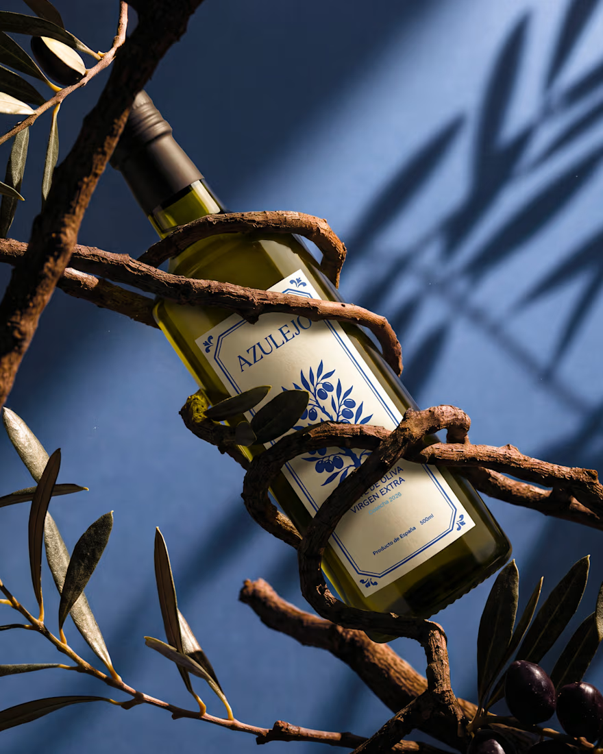
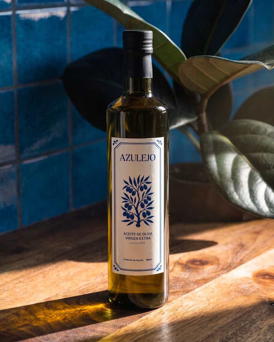

I really like how the identity transforms a cultural reference into a recognizable visual system. It feels familiar before the audience even reads the label.
I can relate to this approach I recently explored a similar idea through a typeface project inspired by traditional...

Very well done, you captured it
The network for creativity
Join 1.25M professional creatives like you
Connect with clients, get discovered, and run your business 100% commission-free
Creatives on Contra have earned over $150M and we are just getting started





Related posts

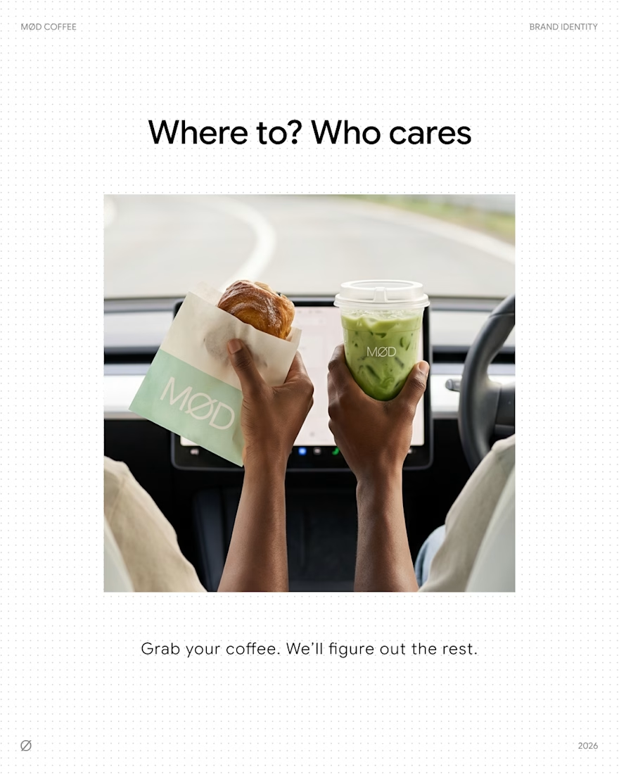
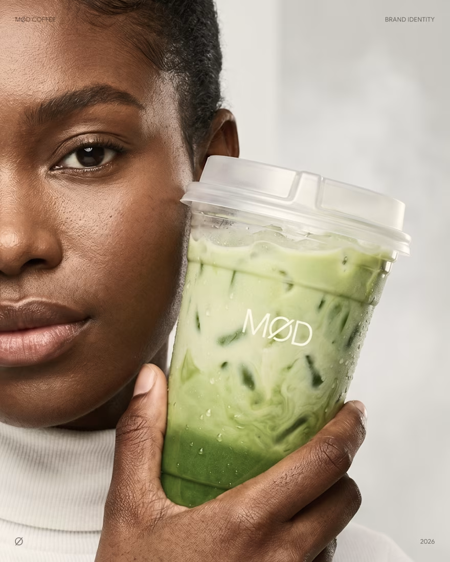
MØD Coffee. Matcha Cafe Brand Identity & Packaging
MØD is a matcha cafe brand built on one line: coffee, tuned to your mood.
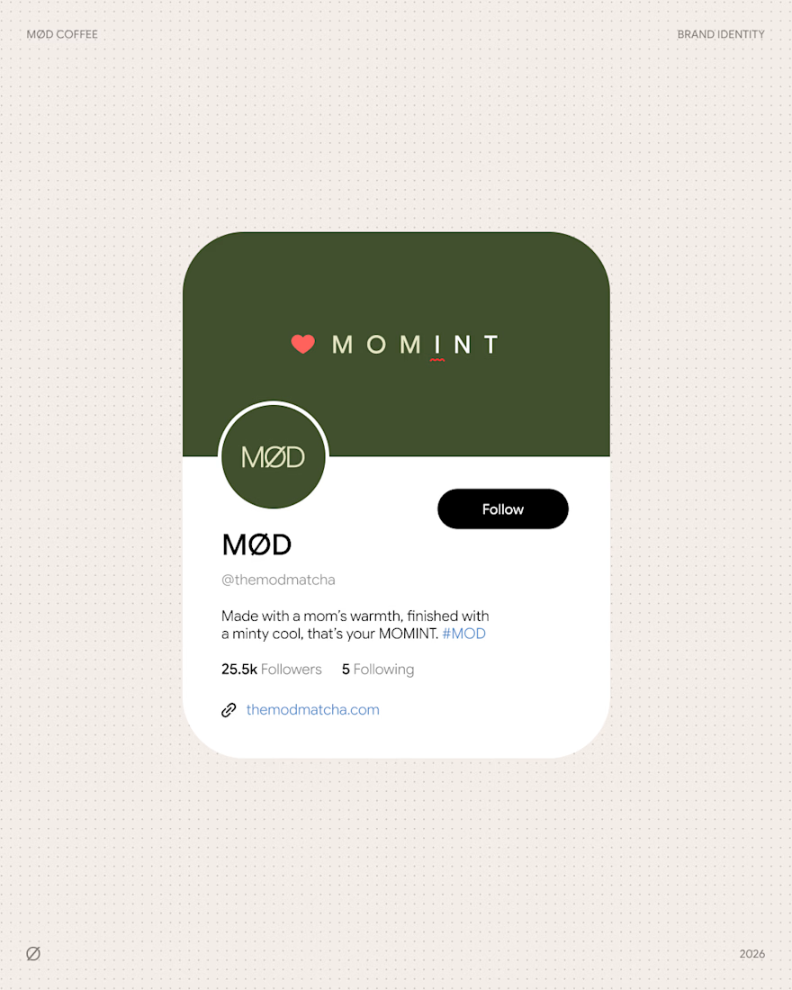
The identity carries an easy, unhurried voice across every touchpoint. "Where to? Who cares" on the go. "Grab your coffee. We'll figure out the rest." on the counter. Signature drinks like MOMINT bring it to the menu: made with a mom's warmth, finished with a minty cool.
Scope: logo, cup and bag packaging, website, social media.
Full case study: MØD Coffee
Which slide would make you order?😊
branddesignpackagingdesignbrandingLogo DesignPackaging DesignBrand DesignAdobe IllustratorAdobe PhotoshopFigma

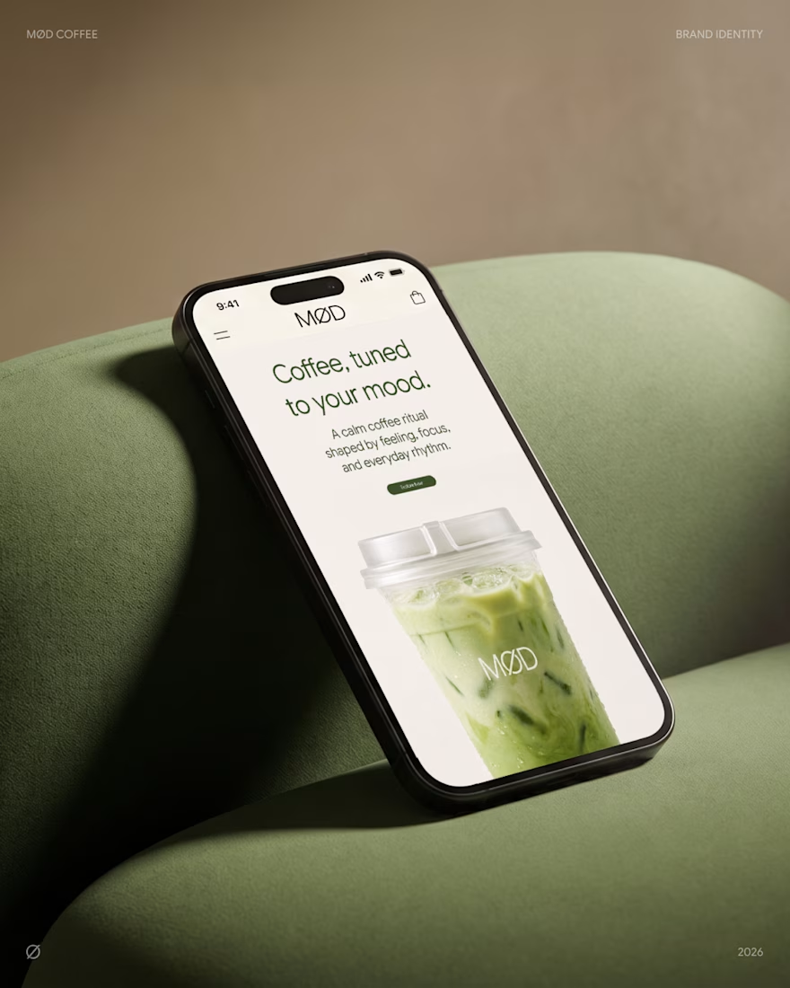

love the mobile mockup 👍

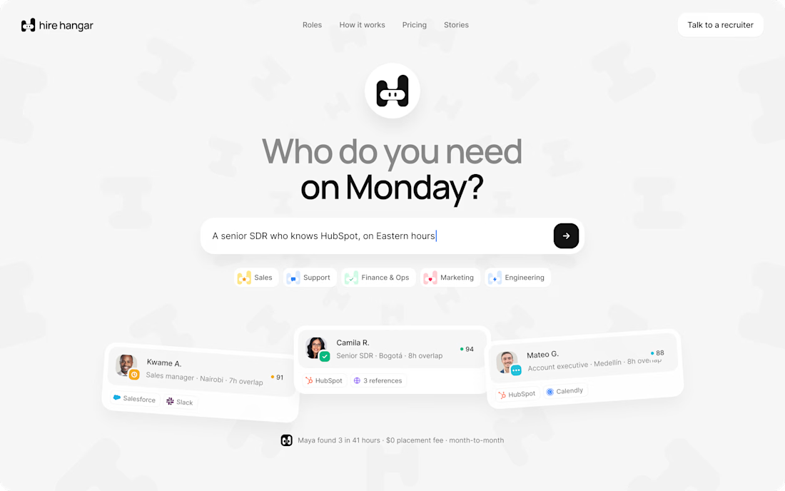
A good landing page shouldn’t make you work to understand it.
Been working on a new project where the goal was simple:
Make a complex product feel simple, clear, and easy to explore.
Less explaining.
Less clutter.
More visual hierarchy.
A clearer path to the next step.
Still working through the details, but this one is coming together nicely.
Full case study soon.
This pairs well with the Hire Hangar screenshot because the design itself demonstrates the point—you don't need to reveal the whole project yet.



Appreciated @Mehdi Hassan
keep on rocking

It's been a while since I made one of these, but here's my latest design. A thrilling victory by George Russell at Baku!
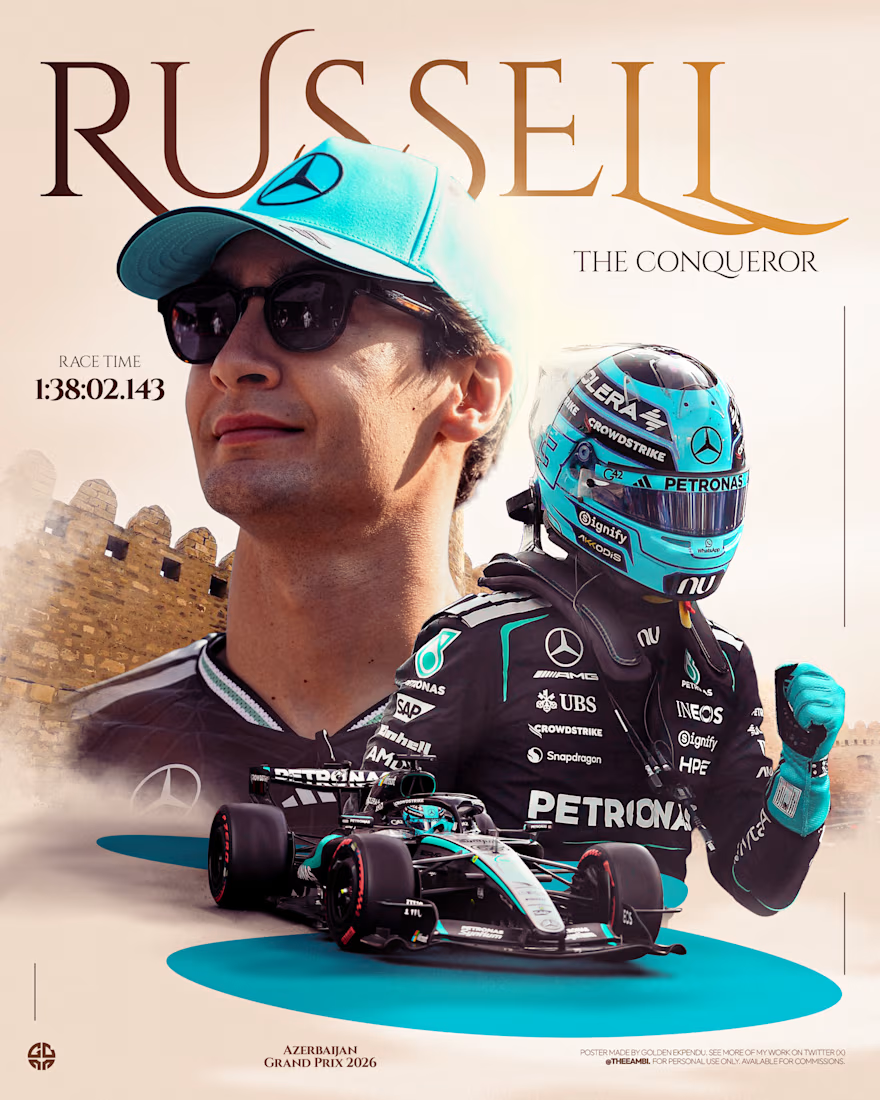


that serif RUSSELL wordmark with the baku walls behind is so good