The network for creativity
Join 1.25M professional creatives like you
Connect with clients, get discovered, and run your business 100% commission-free
Creatives on Contra have earned over $150M and we are just getting started
Back to feedPost

Text on album covers is tacky? Whatever 🤌🏼 Vienna Starlight Boom 😒
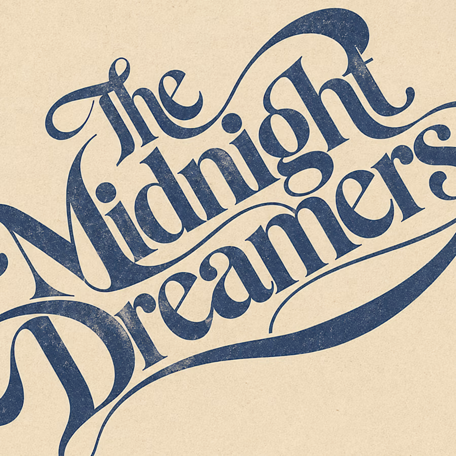
Typography can ABSOLUTELY make an album cover.
During the pandemic, I got obsessed with album cover design. I'd spend hours looking at covers, researching the designers behind them, and trying to understand the decisions and creative processes that made them work.
It was one of those design rabbit holes I could never get tired of. 💀
I'm bringing that interest back with a new cover inspired by the music I love, including Neil Young's Harvest, Bandalos Chinos' Paranoia Pop and Uncle Acid & The Deadbeats' Vol. 1.
Looking at these alongside other great album covers, one thing stands out: typography CAN be the image!
I took inspiration and designed one as well!
What's an album cover where the typography is impossible to separate from the artwork? Show me your favorites.
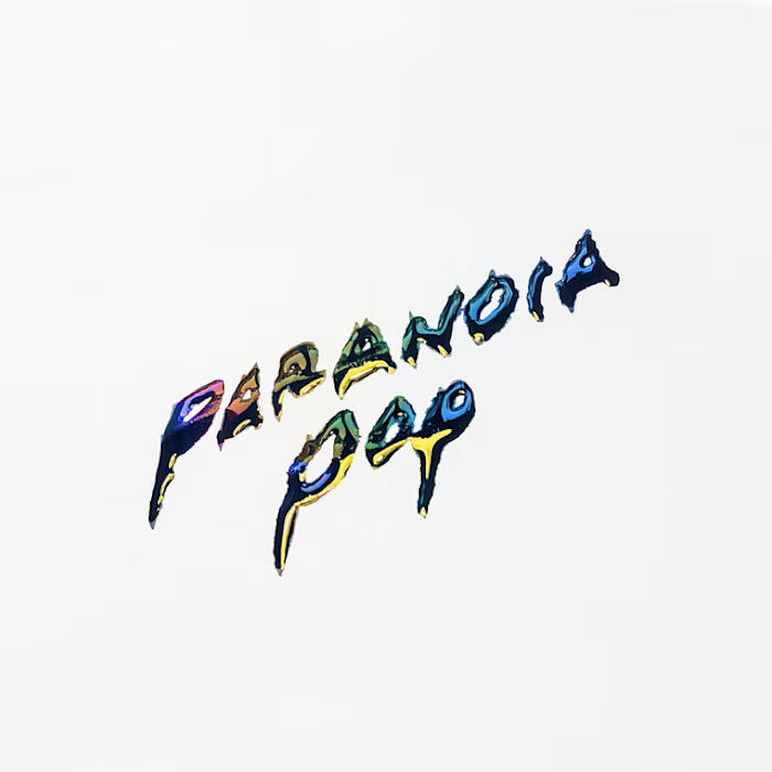
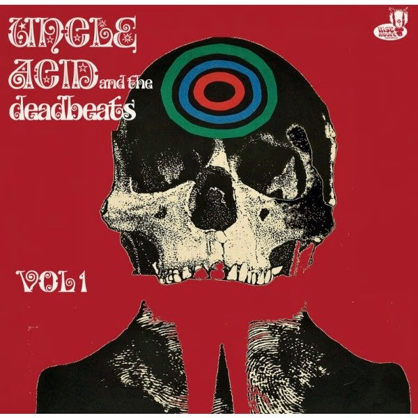
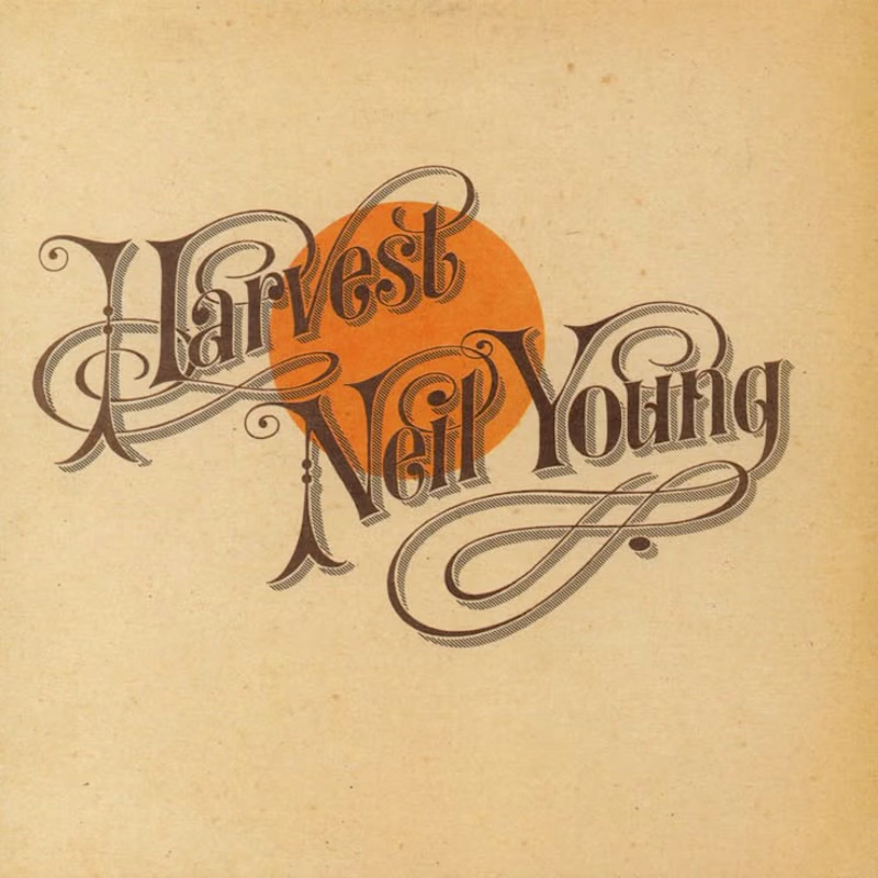

Reid Miles' Blue Note covers are my pick, where the cropped oversized lettering carries as much mood as any photo could. Your Paranoia Pop treatment has that quality too, the letterforms feel poured into the image rather than placed on it.
The network for creativity
Join 1.25M professional creatives like you
Connect with clients, get discovered, and run your business 100% commission-free
Creatives on Contra have earned over $150M and we are just getting started
Related posts

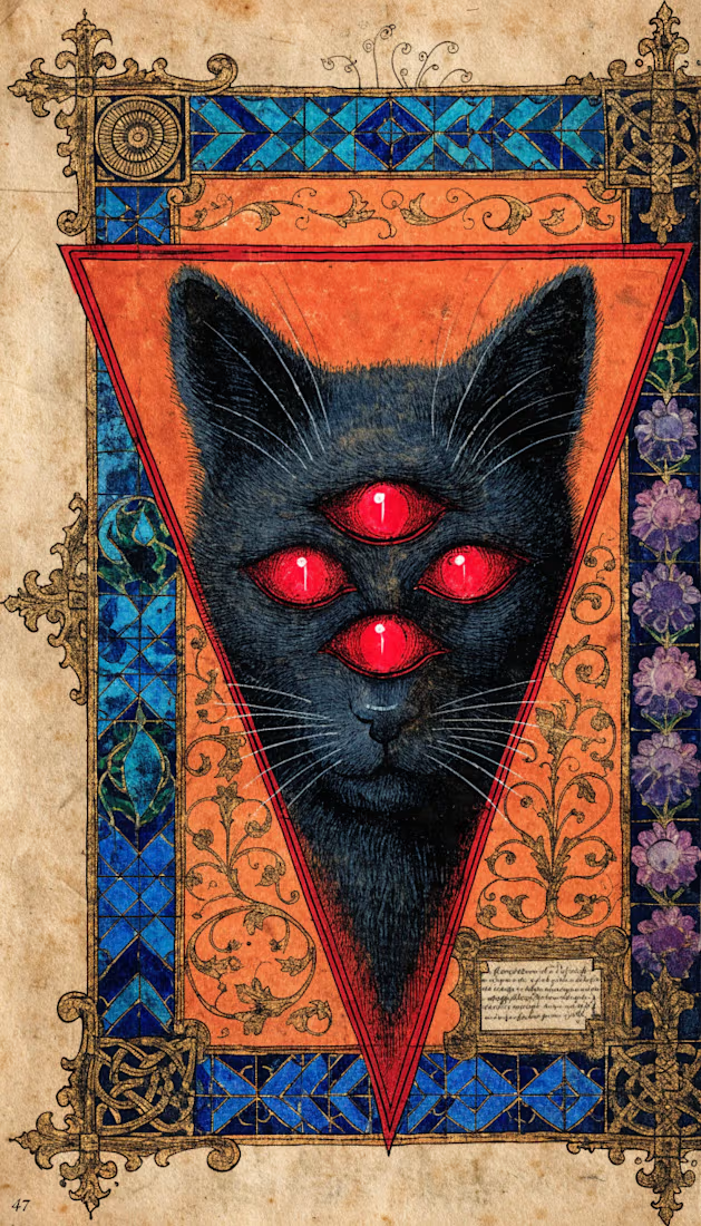
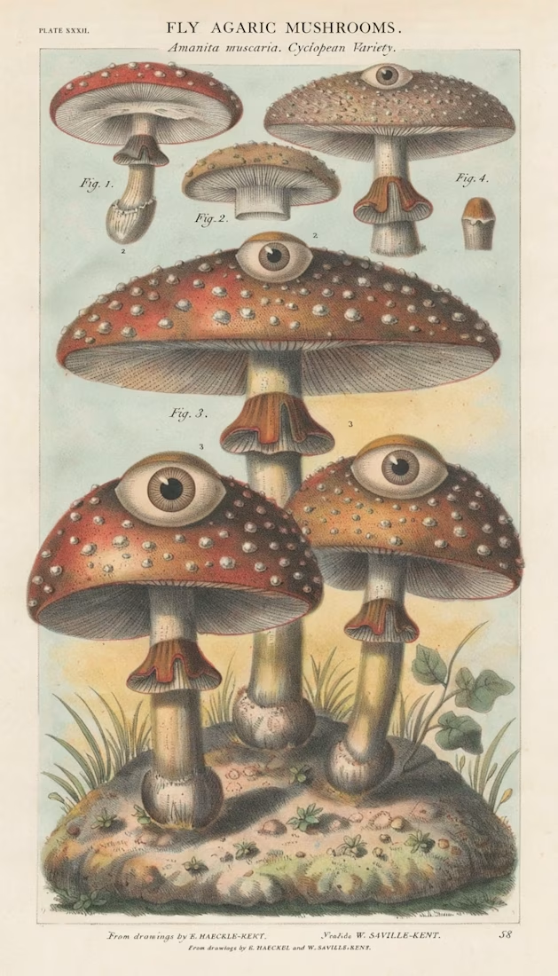
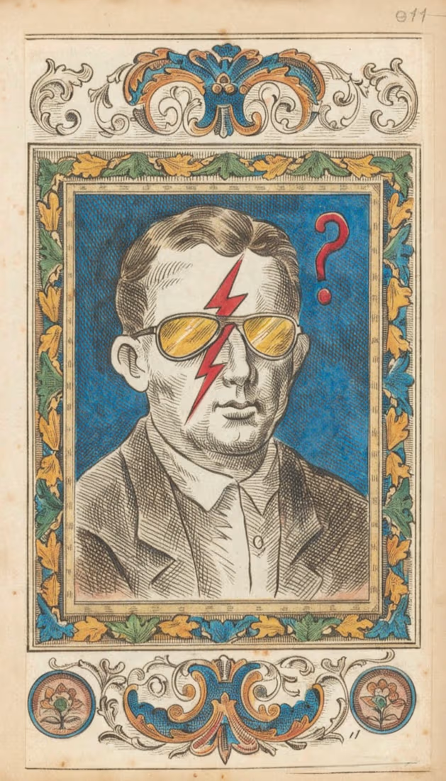
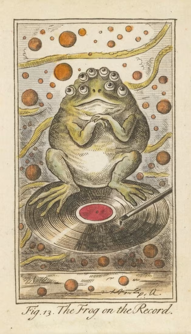
Project Title: Surreal World 🌀✨
Description: Hey everyone! Here is my submission for the Recraft Challenge — a poster series called "Surreal World"! 🎨
For this project, I dove deep into the Public Domain Image Archive and gathered vintage 18th and 19th-century illustrations from various talented artists of that era — think old-school book engravings, scientific botanical plates, and classical etchings.
JPGЕщё 3
I wanted to give these historical artworks a fresh, weird, and fun twist by mixing them with modern surrealism, bold colors, and psychedelic vibes. With Recraft, I blended classic cross-hatching textures and aged paper looks with funky symbols, neon contrasts, and dreamlike patterns.
JPEGЕщё 4
Hope you enjoy this little trip where history meets surreal imagination! Let me know what you think! 👇✨
https://www.recraft.ai/project/4a9a153e-3e4f-457c-8b35-d6cc58a07655

The cross-hatching and aged paper against those neon pops is a fun tension. Did you set one shared palette rule across all four posters, or let each illustration pick its own accent?


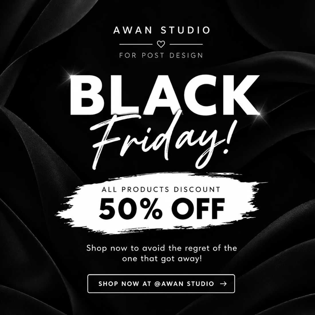

Sales are Booming

Which cover would make you click: A or B?
2 voted
50%
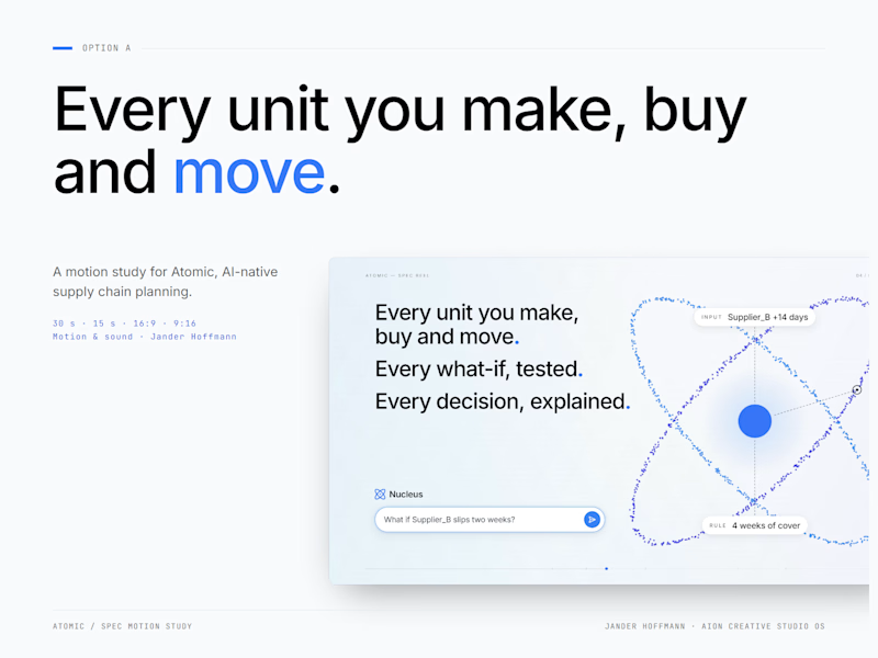
2 voted
50%
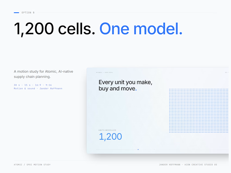
4 votes
Closed

Both are great