The network for creativity
Join 1.25M professional creatives like you
Connect with clients, get discovered, and run your business 100% commission-free
Creatives on Contra have earned over $150M and we are just getting started
Back to feedPost
Taste Test


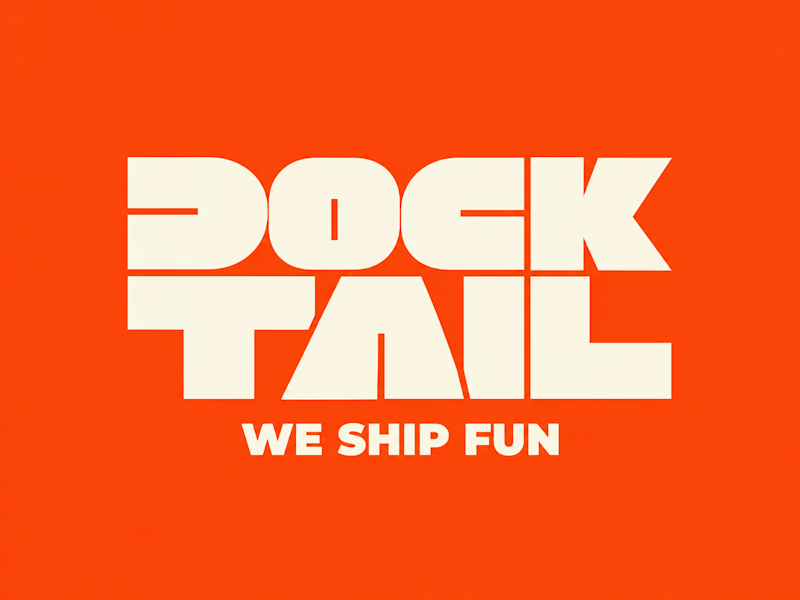
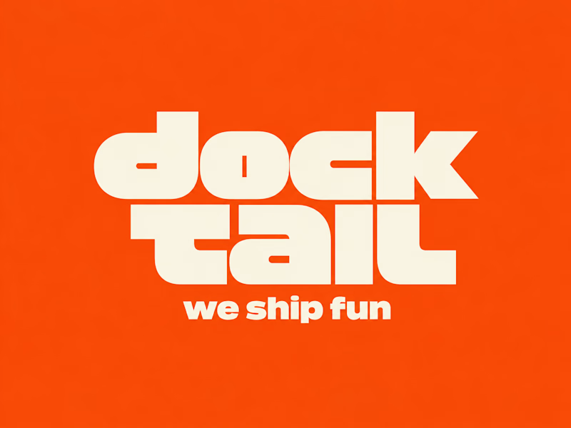
DockTail approached me with a fun idea: make us look nothing like what we do.
As strange as it sounds, I think this is one of the most exciting creative challenges. When branding a business, the primary objective is usually to communicate what it does. But what happens when you deliberately take that away?
After a few days of brainstorming, experimentation, and using Curative Intelligence, I arrived at these two concepts.
One is ALL CAPS, the other is all lowercase. Both carry the same personality, but express it through two entirely different approaches.
Now I'm curious: Which one do you like more?
22 voted
65%
12 voted
35%
34 votes
Closed

Second one!!

Just like you said "I am voting for this" 😏

What a fun brief! Making a brand look nothing like what it does sounds tricky but so exciting. Curious which direction they went with.


This>That

Nice!

Love this brief — making a brand deliberately not say what it does is a brave test of personality over explanation. The lowercase version feels friendlier and more approachable to me, while the all-caps one reads bolder and more confident. Both work, but the lowercase one fits 'we ship fun' a little better.

Cool

Nice work

The option 1 looks great

First one- more practically, but second one is great for design contest. I the bouth
The network for creativity
Join 1.25M professional creatives like you
Connect with clients, get discovered, and run your business 100% commission-free
Creatives on Contra have earned over $150M and we are just getting started



Related posts

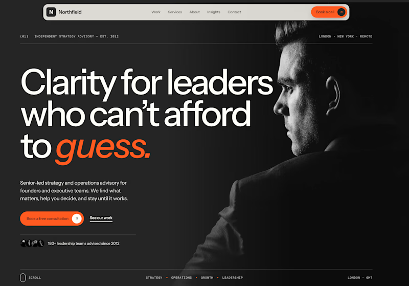
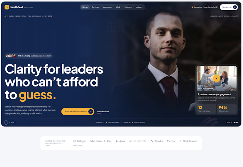
Exploring two different hero directions for a new project.
Same message, two completely different visual approaches.
Which one makes a stronger first impression?
A or B? Curious to hear your thoughts!

36 voted
90%
4 voted
10%
40 votes
Closed

Both are strong. I lean towards the dark version, because the orange accent on the italic "guess." pops and the profile portrait gives it a more editorial, confident feel. The navy one reads a bit more corporate, which could suit a more conservative audience. Nice exploration!

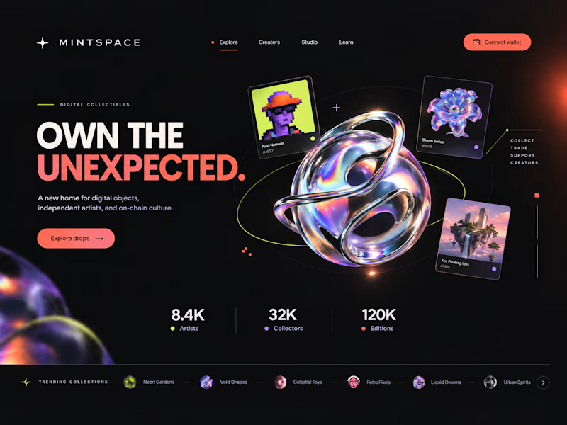
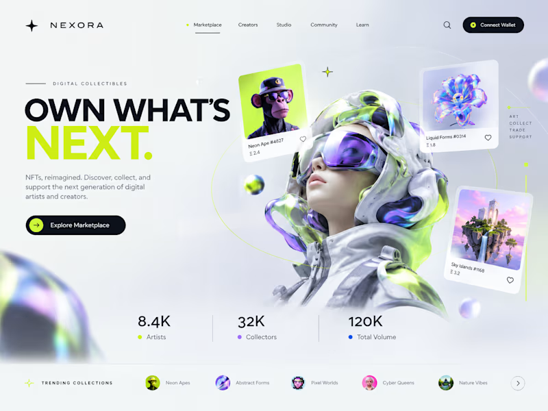
Two directions. One NFT marketplace.
Which visual direction would you choose?
🖤 A — Dark & Futuristic
🤍 B — Bright & Minimal
Both explore the future of Web3, but with completely different visual identities.
Drop your vote in the comments: A or B?
#UIUXDesign #WebDesign #NFT #Web3 #ProductDesign

10 voted
29%
25 voted
71%
35 votes
Closed

Strong design, well done

If a logo had to tell what a brand does, Apple would be a fruit stand.
New on our blog: why comparing "logo + guidelines" with a branding process is comparing two different products, how to tell whether you need a new logo or a new brand, and why sometimes the professional move is to turn the work down.
A logo is the signature. The story is everything else. Read it here: https://ander.agency/blog-posts/branding-is-not-a-logo