AI VIsual Designer Projects in BrazilAI VIsual Designer Projects in BrazilIn addition to being a creator and Kittl platform expert, I’ve been actively using the system for both personal and client projects since last year, diving deeply into the platform’s integrated AI tools and capabilities.
To be honest, even though I’ve previously worked with Motion Design, Video Editing, and even Photography, this side of the creative process was never really my strongest skill nor something I particularly enjoyed professionally. However, ever since @Kittl introduced video workflows inside Kittl Flows, I’ve started creating templates there, and it has been an incredibly interesting journey so far.
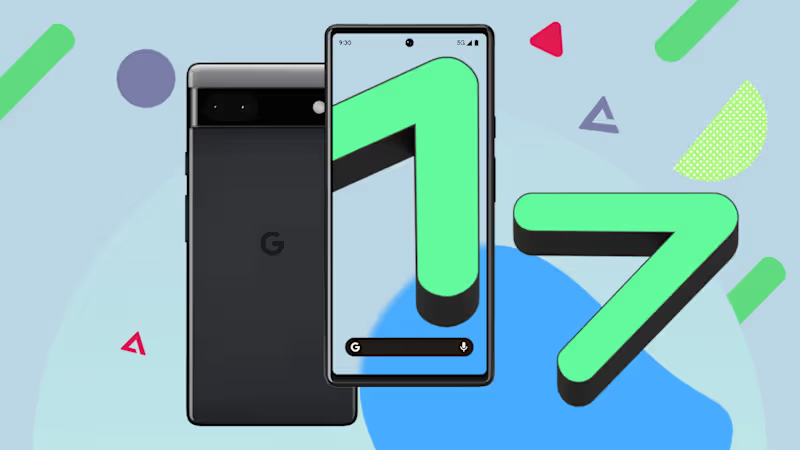
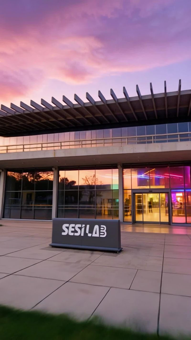
Especially with the latest briefs released. These are some of the video and templates I created this week, and I hope they’ll soon be published in the library. Android 17 Visual Concepts
A collection of custom visuals created for Android 17-related stories, exploring new features, interface changes, AI tools, privacy updates, and the overall Android experience.
These images were designed to turn technical topics into clear, engaging, and click-worthy visuals. My process combines concept development, photo manipulation, compositing, device integration, lighting refinement, and detailed Photoshop work to create polished editorial images.
The goal was to make Android 17 feel visually interesting and easy to understand.
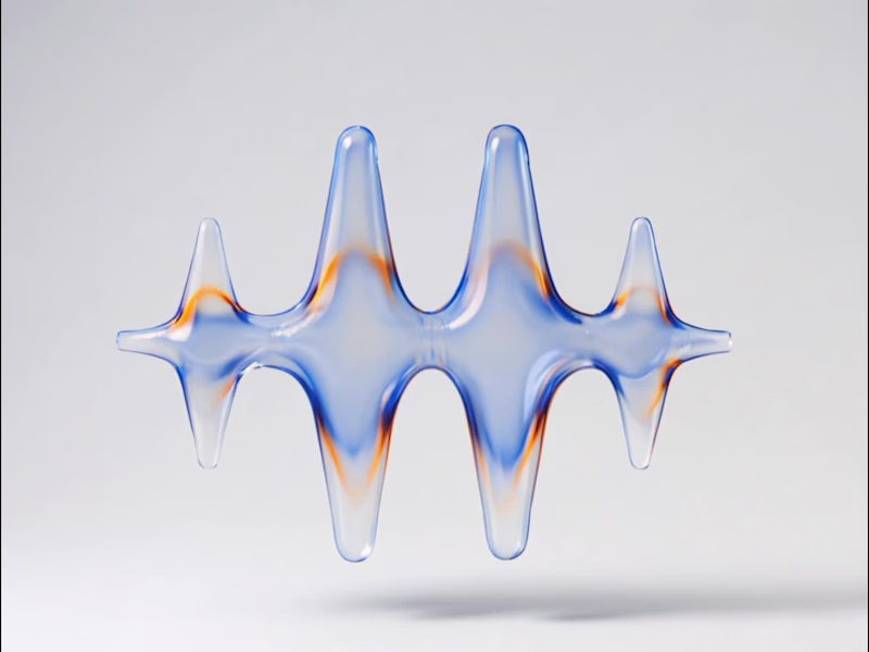
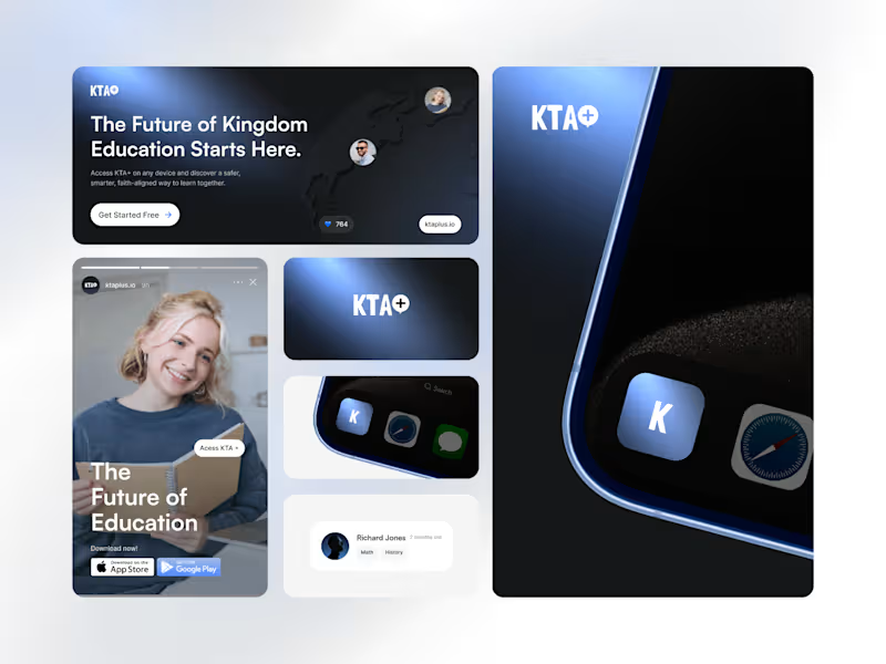
The first one was built around a product update announcement. Instead of a generic "new feature" post, we led with the brand asse, a 3D version of the logo rendered with a glassmorphism finish, purple neon depth, the kind of visual that makes people stop and think the company is bigger than it is. The "arrasta para o lado" mechanic turned a single post into a swipeable reveal, which keeps engagement higher without needing to explain anything.
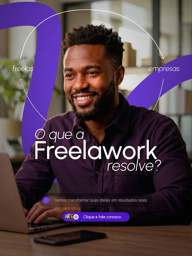
The second one answered the question most first-time visitors have but nobody asks out loud: okay, but what does this actually solve? We structured it around both sides of the marketplace, freelancers and companies, visible in the frame at the same time. The copy is direct, the CTA is low-friction, and the image does the work of showing the product is for real people, not a landing page concept.
Together they cover the two things any marketplace needs to communicate early: credibility and clarity. One tells you the platform is evolving. The other tells you why it exists.