The network for creativity
Join 1.25M professional creatives like you
Connect with clients, get discovered, and run your business 100% commission-free
Creatives on Contra have earned over $150M and we are just getting started
Back to feedPost
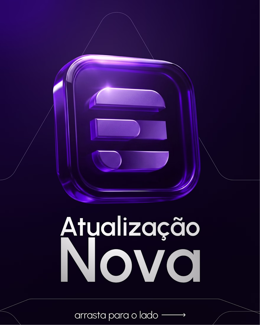
The first one was built around a product update announcement. Instead of a generic "new feature" post, we led with the brand asse, a 3D version of the logo rendered with a glassmorphism finish, purple neon depth, the kind of visual that makes people stop and think the company is bigger than it is. The "arrasta para o lado" mechanic turned a single post into a swipeable reveal, which keeps engagement higher without needing to explain anything.
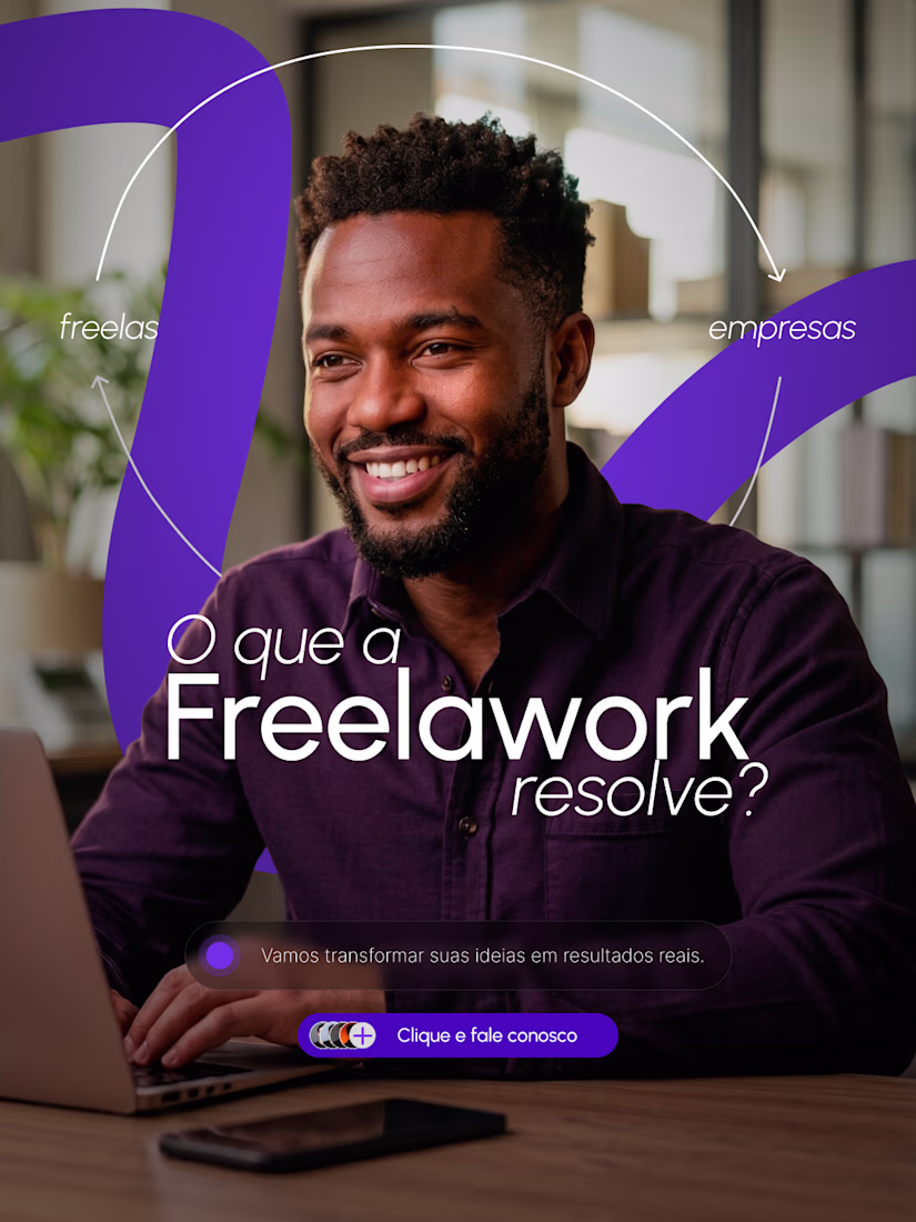
The second one answered the question most first-time visitors have but nobody asks out loud: okay, but what does this actually solve? We structured it around both sides of the marketplace, freelancers and companies, visible in the frame at the same time. The copy is direct, the CTA is low-friction, and the image does the work of showing the product is for real people, not a landing page concept.
Together they cover the two things any marketplace needs to communicate early: credibility and clarity. One tells you the platform is evolving. The other tells you why it exists.
The network for creativity
Join 1.25M professional creatives like you
Connect with clients, get discovered, and run your business 100% commission-free
Creatives on Contra have earned over $150M and we are just getting started
Related posts
Website redesign + Reservation and Payment automation with @Base44 for Riga based private practice of Physiotherapist & Physical Preparation coach Raivis Miezans.
Before:
→ Outdated web design & functionality
→ No automation systems
→ Inefficient layout and structure
→ Only in Latvian
🔗 Website: https://miezans.lv/
After:
→ Fresh design
→ Improved layout and structure
→ Reservations automation (Google Calendar)
→ Payment system automation (Stripe)
→ Localised in Latvian and English
🔗 Website: https://miezans-motion-pro.base44.app
Step-by-step process:
1. Old website's copy, structure and functionality analysed by Claude.
2. Claude assisted detailed prompt for Base44.
3. Base44 generated a fully functional layout in one go including Google Calendar and Stripe integration for reservation and payment automation.
4. Design refined using Figma files and code-based prompts.
Raivis Miezans:
“I went through the website - it's clean and organised. Reservation process is clear and simple. Since I don't have an administrator, having people register through the website would make my life easier, 1000% - I want this automation like, right now!"
amazing before/after!
Putting this out there 👋
I’m opening up for freelance work and looking to connect with founders, startups, and teams that need help shipping.
I can help with:
→ Building React/Next.js applications
→ Turning Figma designs into polished production experiences
→ Redesigning and improving existing products
→ Frontend architecture and UI development
Over the last 3+ years, I’ve worked with startups to design and build products, most recently leading the redesign and frontend development of SpacesOS- from product UI to the marketing website.
If you’re building something and need an extra pair of hands, or know a founder who could use help, I’d really appreciate an introduction.
Happy to chat (New here)🤝
Beautiful execution.
A playful logo reveal created for the Bark Punk brand.
Designed a bold and memorable logo for an alternative bar, focusing ona distinctive visual identity that reflects the venue's unique personality and atmosphere.
This logo is absolutely insane - bold, energetic, and instantly memorable. The color, shape, and wild character work perfectly together.
Trending
Claude
Claude has entered the design space. How are you using Claude Design?
Contra University
Learn from expert creatives how to earn more using next-gen AI tools.
fifaworldcup2026
The World Cup is here and the whole world's watching. How are you designing for the world stage?
creativeaiflow
Creative AI workflows are evolving. What tools do you use, and what are their strengths and weaknesses?
freelancerlife
Freelancer life is wins, pivots, and everything in between. What’s yours right now?