Brand Identity & Content Creation | Video & Motion
- 5.0
- Rating
- 19
- Followers
Brand Identity & Content Creation | Video & Motion


Freelance Logo, Brand and Motion Designer


Brand Identity Designer & Creative Director | Visual systems
Brand Identity Designer & Creative Director | Visual systems

Graphic Designer & illustrator
Graphic Designer & illustrator

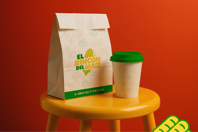
Packaging Designer & Illustrator for Hire
Packaging Designer & Illustrator for Hire


View more →
Branding, Web Desing & Streetwear Design Expert
Branding, Web Desing & Streetwear Design Expert
Crafting brand essence with design
Crafting brand essence with design


Video Editor and Designer for Startups & Brands
Video Editor and Designer for Startups & Brands