Cúcutateve | Rebranding on Behance


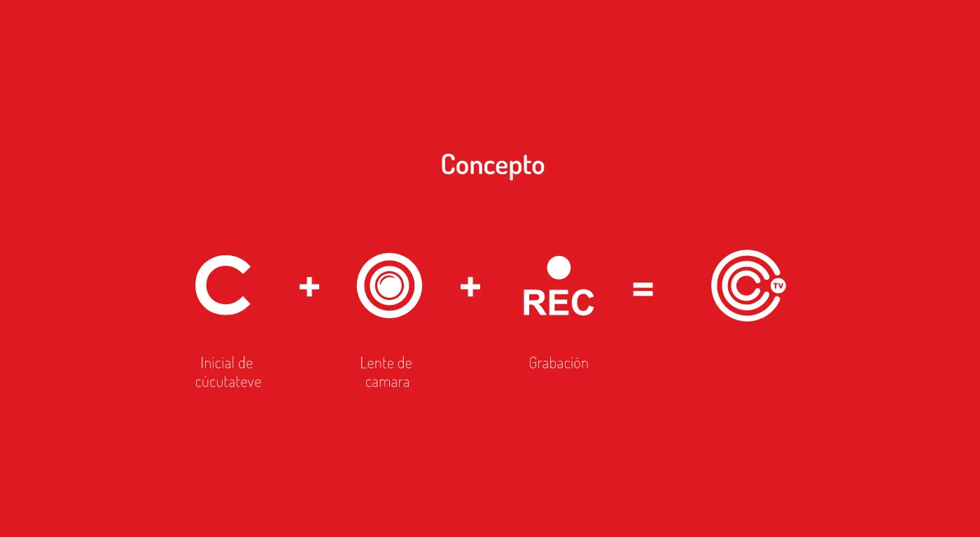
In this new project, I bring to you the brand CÚCUTATEVE which is a television channel in the city of Cúcuta (Colombia), this is a real work that will soon be implemented within the company, this being the final result.
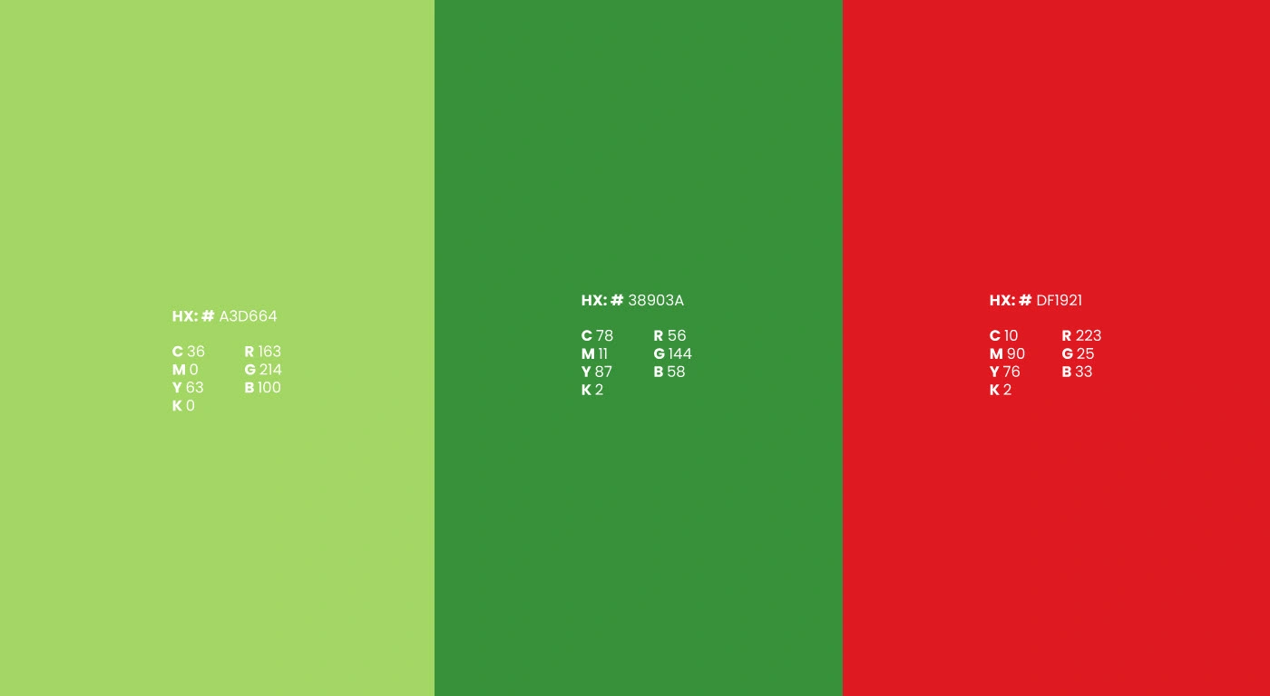
The objective with this brand, is not only to make a rebranding, but also to give it a new vision with its visual image, so that it can be more versatile when working with it and reach the viewers in a more attractive way. The rebranding of this brand was done using the same range of colors with which they had been working, although these were modified in their saturation, red was established as the predominant color within the visual identity, giving seriousness and value to the brand.
The purpose of this new identity is to be competent and project it into the future.
Like this project
Posted Nov 24, 2023
The objective with this brand, is not only to make a rebranding, but also to give it a new vision with its visual image.
Likes
0
Views
3


