Brand Design Projects in Americana
Brand Design Projects in Americana
Sign Up
Post a job
Sign Up
Log In
Filters
2
Projects
People
Message
11
Paulo Alonso
Niobium Brand Mark
11
113
Message
0
Raphaelle Melo
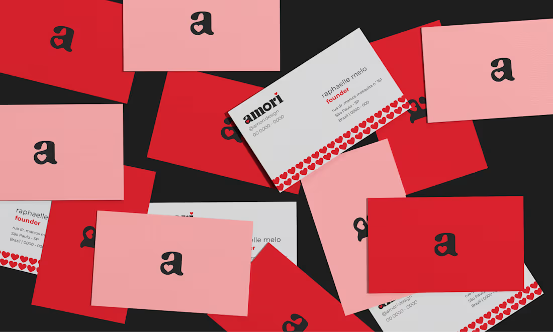
brand logo | amori studio de design :: Behance
0
18
Message
0
João Carlos
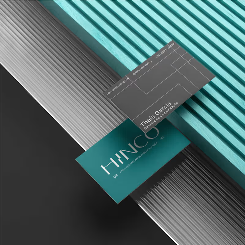
HINCO - Visual Identity Design
0
5
Message
0
Nilson Britto
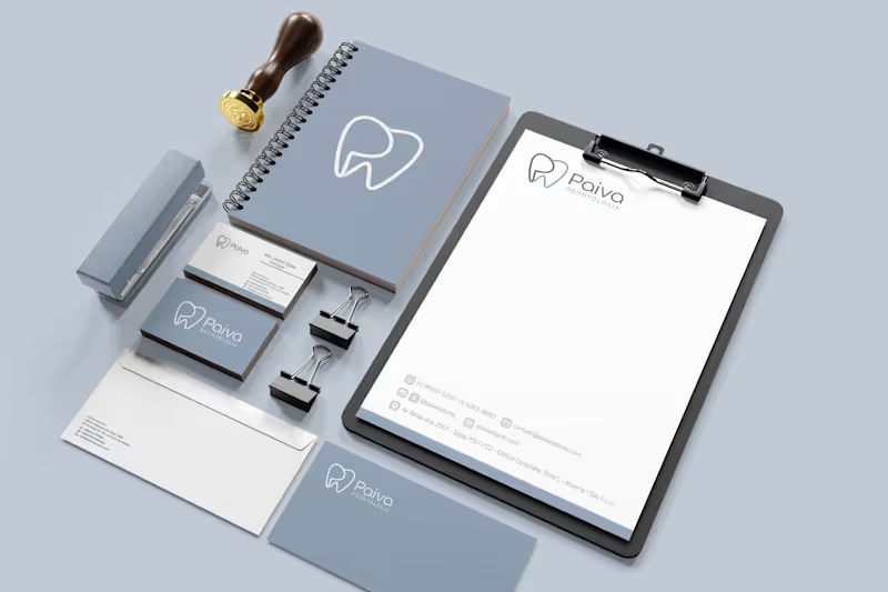
Visual identity for Paiva Odontology
0
5
Message
2
Diego Toda de Oliveira
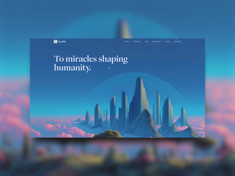
Brand and Website for Parable
2
35
Message
0
Julia Colin
Creating a refined visual identity for Olivia, a jewelry brand
0
15
Message
10
Carolina Zeferino
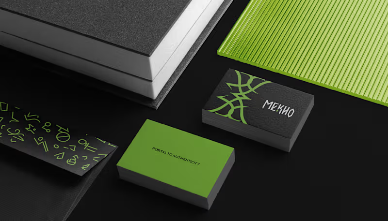
Language can be a portal, where each word opens a passage to new worlds. Yet in the language school market, many brands still communicate in similar ways. With MEKHO, the goal was to move away from traditional academic imagery without losing credibility or structure. The challenge was to translate depth and authenticity into a consistent visual system for digital environments. The logotype features angular strokes to convey precision. The symbol combines stylized bat wings, representing guidance, with a form that suggests a coded sign, reinforcing language as a system to be deciphered. The palette builds authority through dark tones, while green acts as a calculated contrast, signaling sophistication and direction. The result is an identity that positions MEKHO as an immersive brand focused on real communication.
5
10
108
Message
0
Larissa Motta
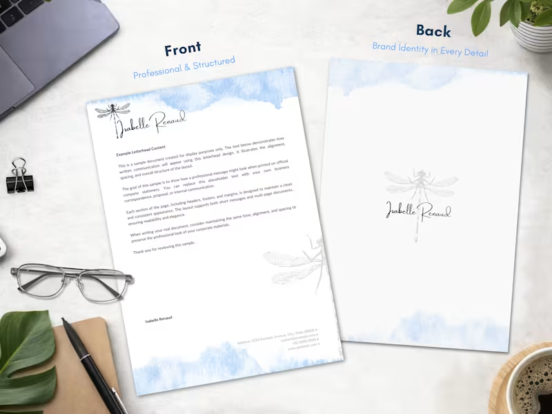
Professional Custom Letterhead Design
0
109
Message
1
Lucas Salvador
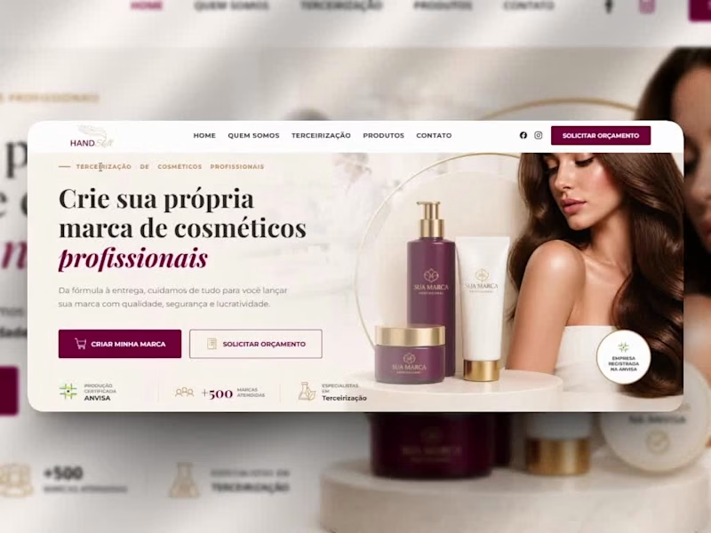
Same brand. Different world. Took HandSkill's website from outdated to premium — without changing who they are. The old site had the right ingredients: strong brand colors, real product photography, clear navigation. But it felt stuck in 2015. No hierarchy, no conversion focus, no visual confidence. The redesign kept the identity and elevated everything else: → Editorial hero layout with product staging → Typography that commands attention → Social proof bar above the fold → Clear CTA that actually converts Built with HTML, CSS, and AI-assisted design — delivered fast, without sacrificing craft. Before → After. Swipe. What do you think — which element made the biggest difference, the typography or the product staging?" #webdesign #redesign #brandidentity #beforeandafter #landingpage #uidesign #cosmetics
3
1
98
Message
0
Lucas Santos Lima
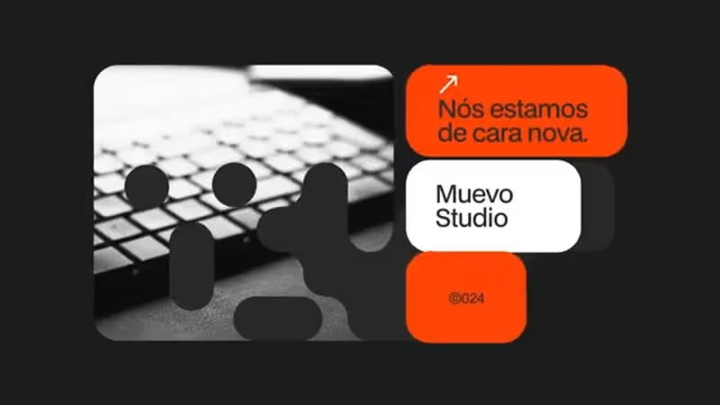
PROJETO MUEVO
0
5
Message
0
Esther Ferreira
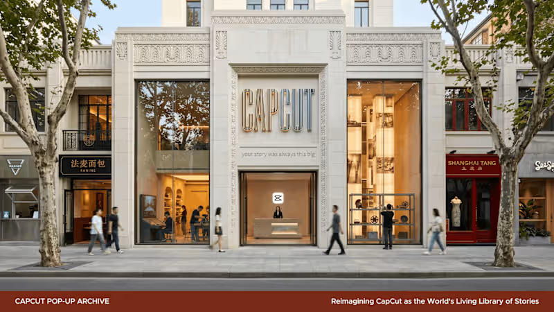
Every great story starts with an opening. A book. A door. A cut. This is CapCut reimagined as a cultural institution — a living archive where the wordmark is a library you can scan, every letter a world waiting to be opened. Direction A: CapCut as a Cultural Institution. Documentation of the creative process (https://docs.google.com/document/d/16CI7fgi6uu0x_cCtcaJV9dBuxTXVXYgHGIfsfvXyRjg/edit?usp=sharing)
0
125
Message
0
Luan Zucherato
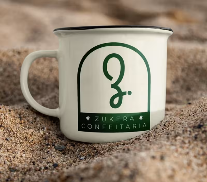
Zukera Rebranding
0
36
Message
0
Beatriz Carvalho
Rebranding - Academic Project
0
16
Message
0
Paulo Alonso
Rizoo Brand Mark
0
11
Message
1
João Carlos
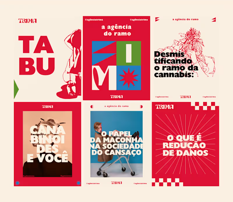
TRIMA - VISUAL IDENTITY
1
9
Message
0
Nilson Britto
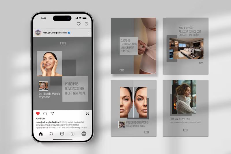
Instagram Strategy & Visual Identity for RM Cirurgia Plástica
0
7
Explore projects