Creating a refined visual identity for Olivia, a jewelry brand
Julia Colin
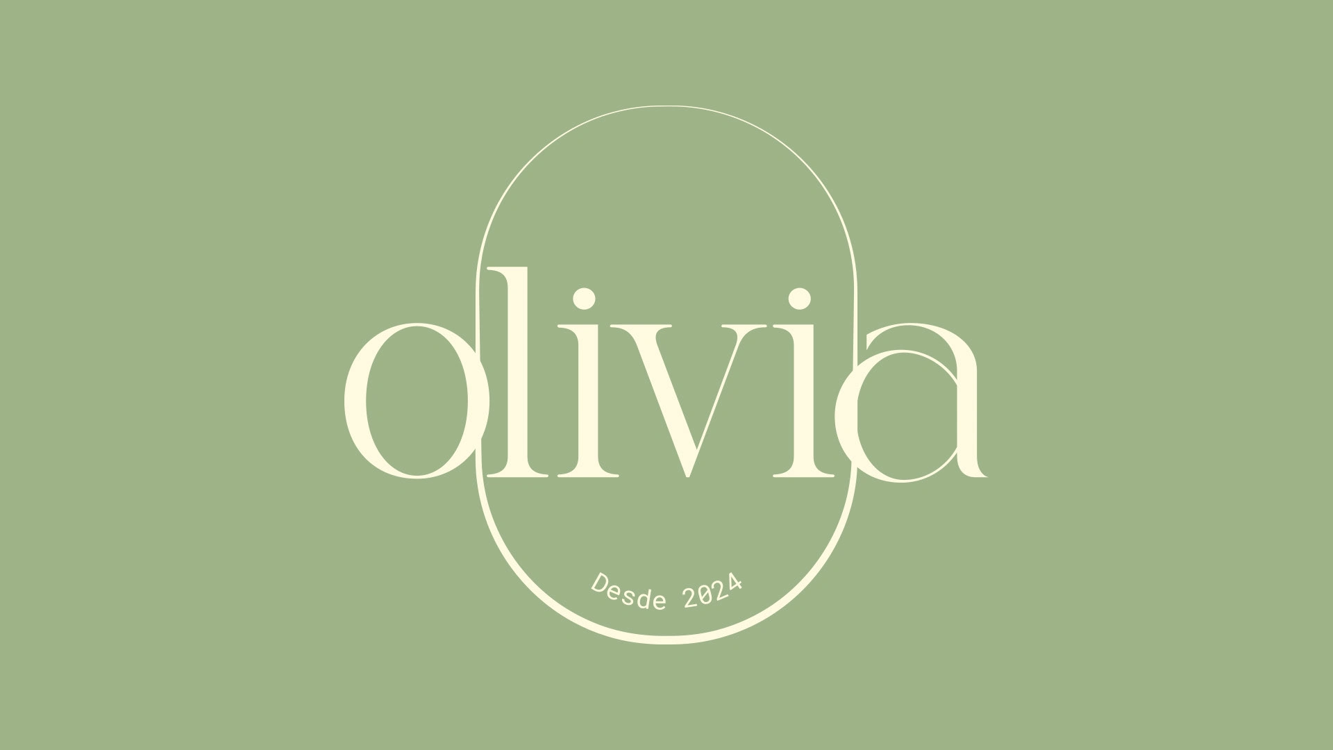
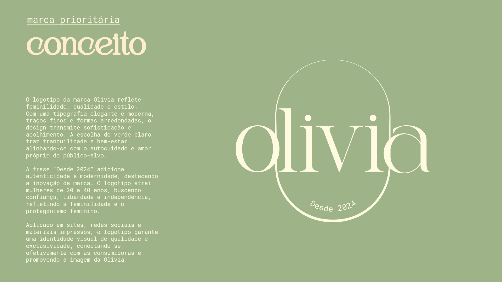
The Concept
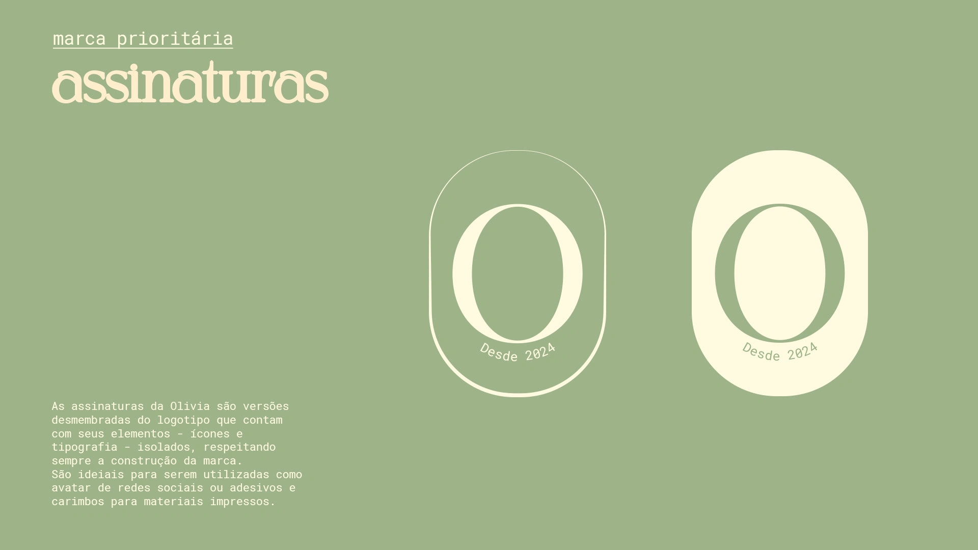
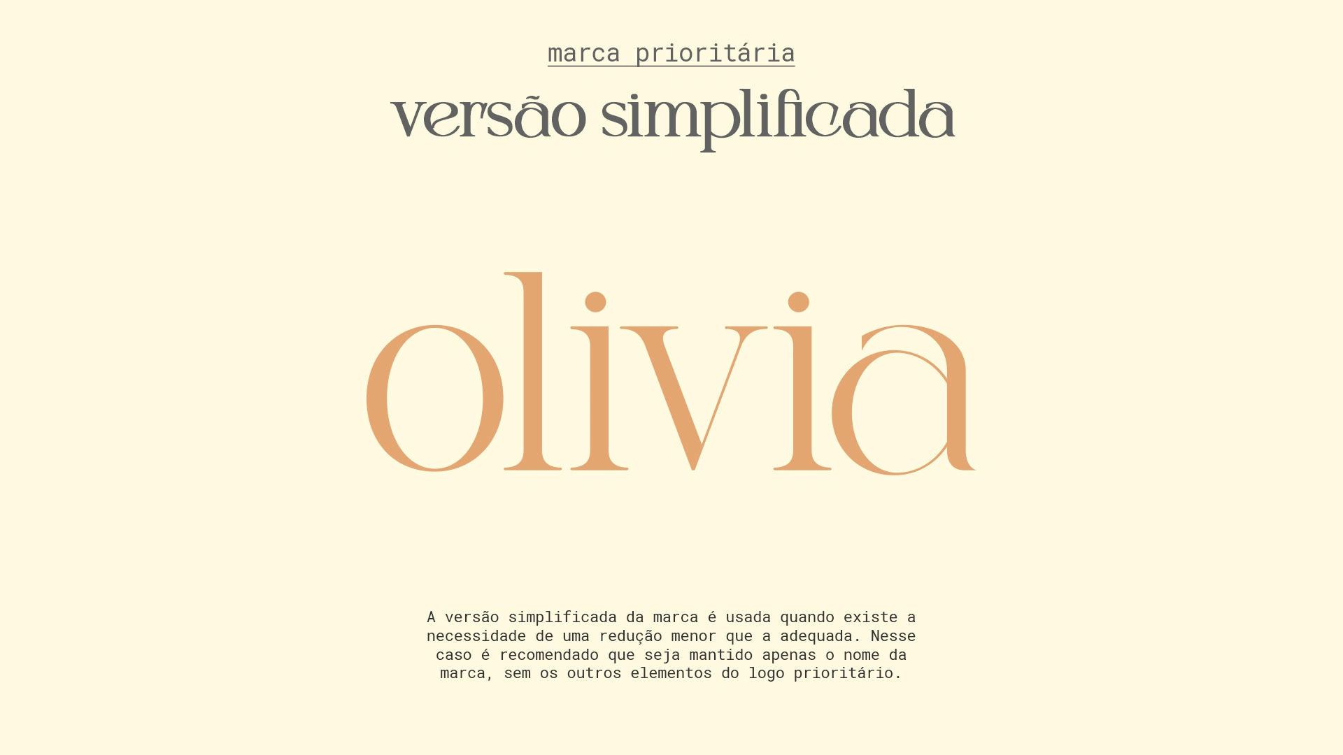
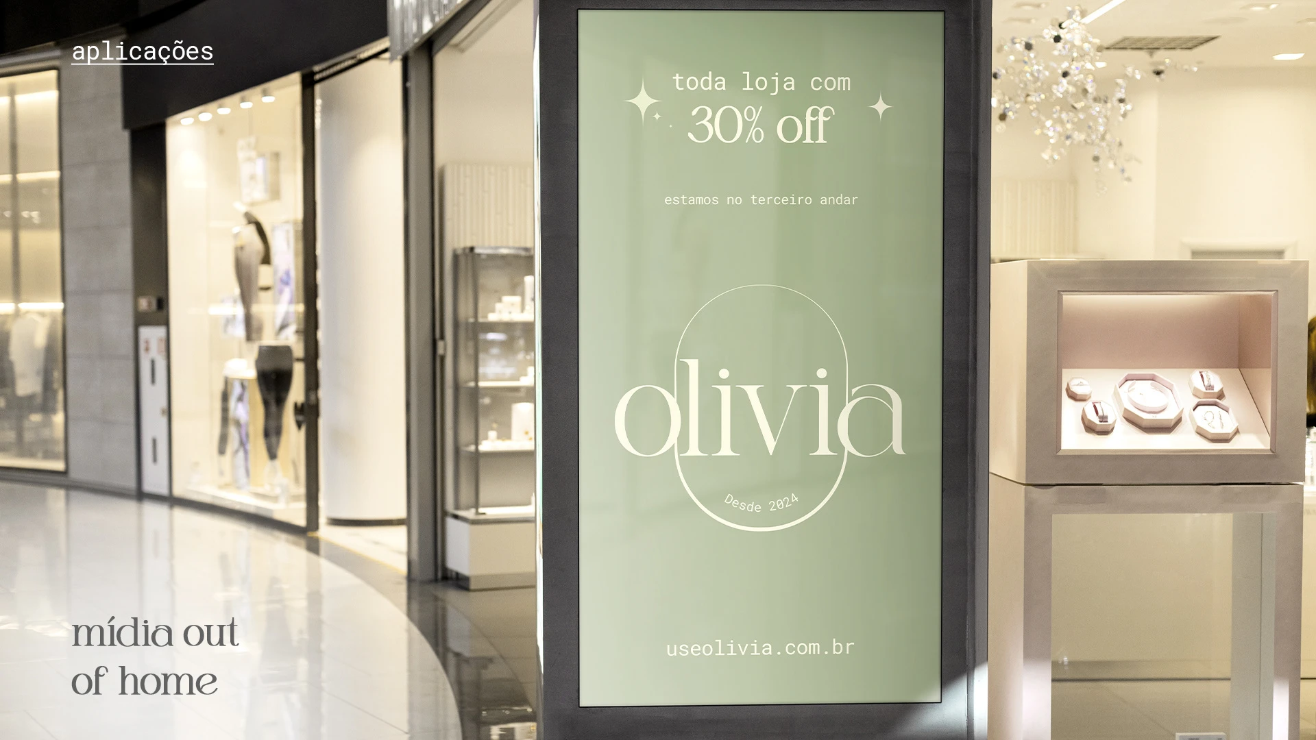
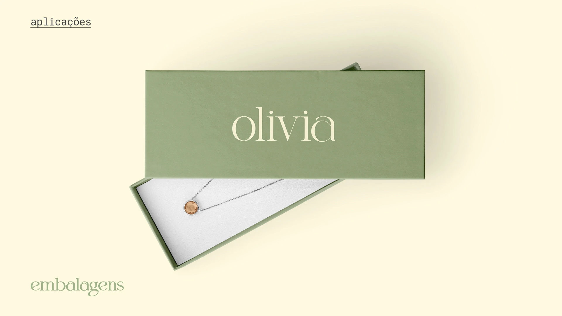
The Olivia brand logo reflects femininity, quality, and style. With elegant and modern typography, fine lines, and rounded shapes, the design conveys sophistication and warmth. The choice of light green evokes tranquility and well-being, aligning with the self-care and self-love of the target audience.
The phrase "Since 2024" adds authenticity and modernity, highlighting the brand's innovation. The logo appeals to women aged 20 to 40, seeking confidence, freedom, and independence, reflecting femininity and female empowerment.
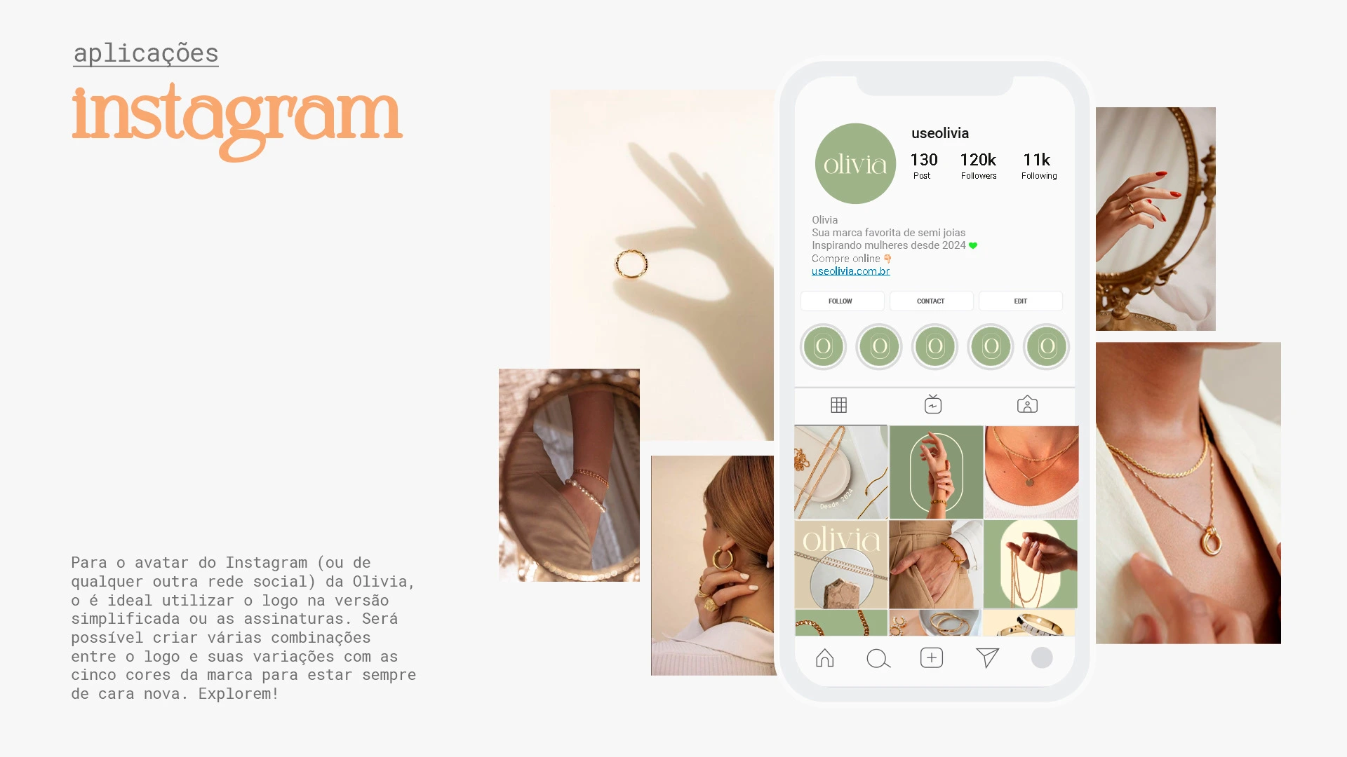
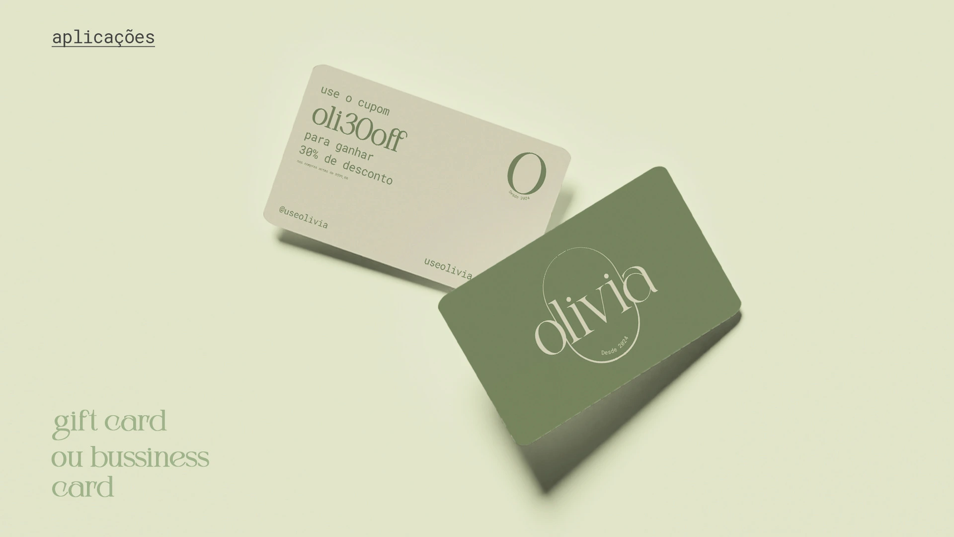
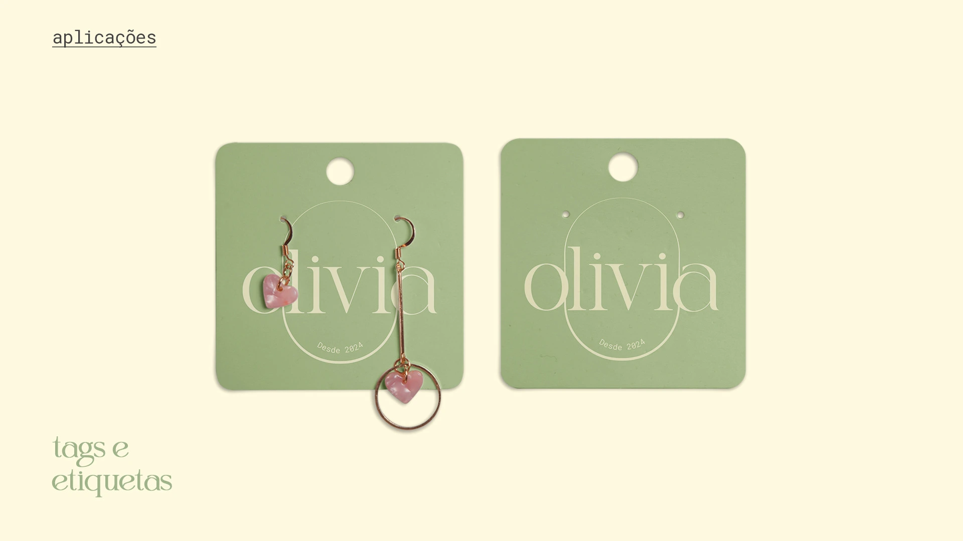
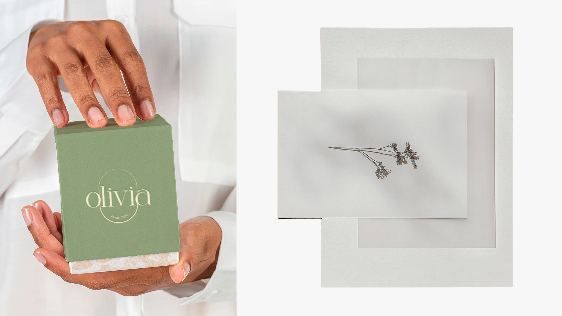
Applied on websites, social media, and print materials, the logo ensures a high-quality, exclusive visual identity, effectively connecting with consumers and promoting Olivia's image.
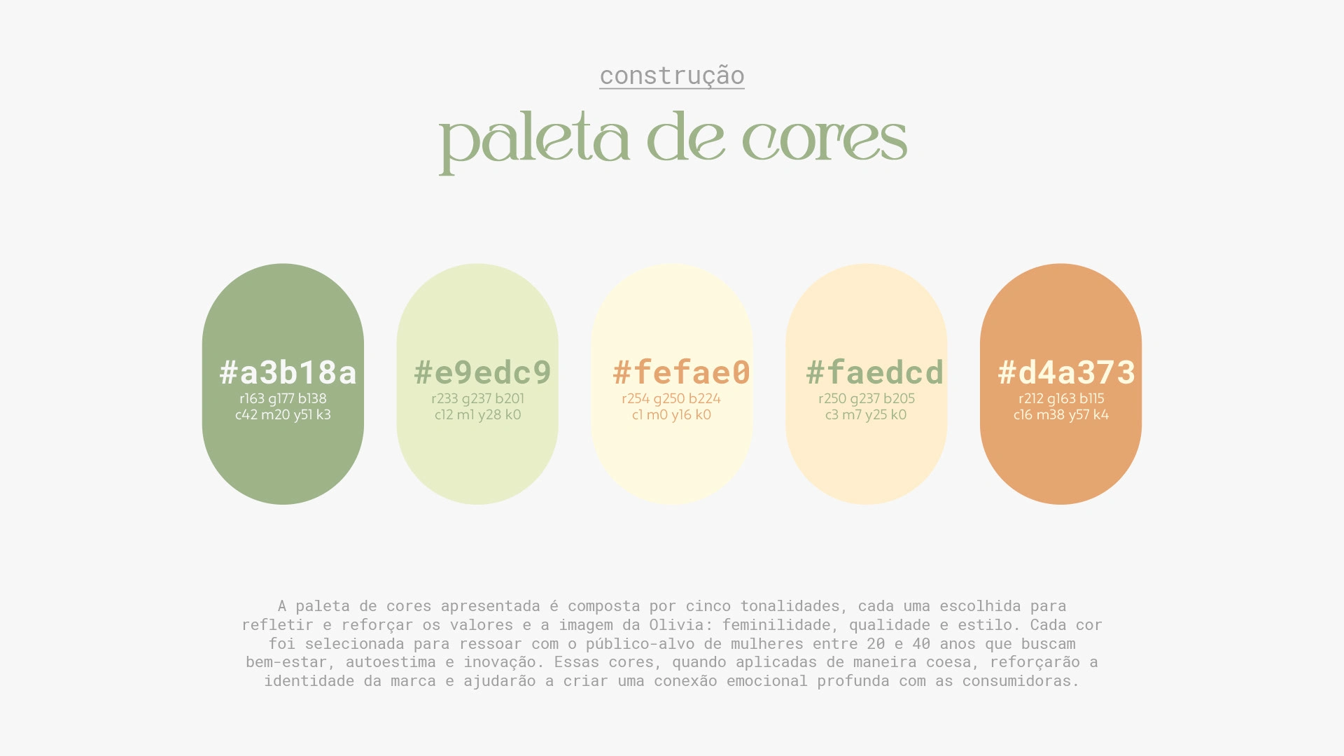
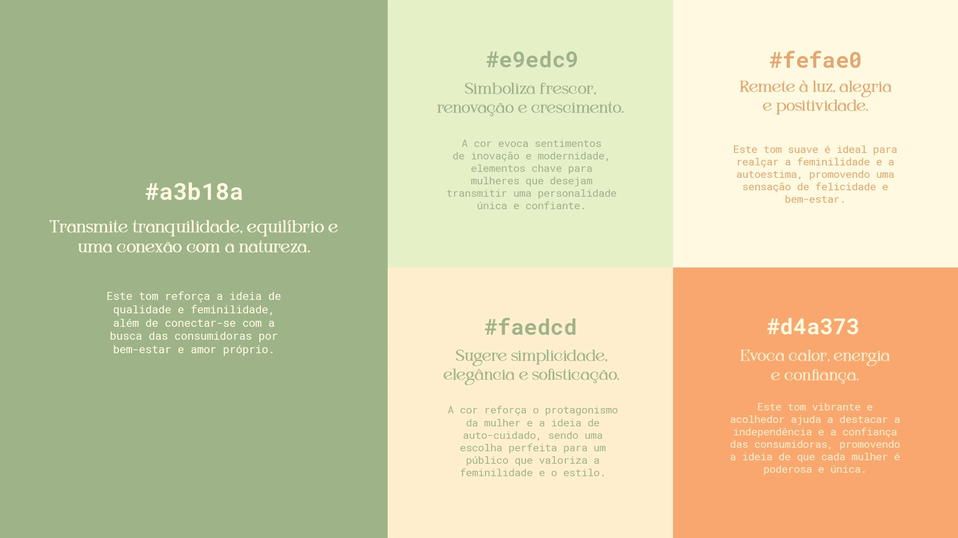
Color Palette
The presented color palette consists of five shades, each chosen to reflect and reinforce Olivia's values and image: femininity, quality, and style. Each color was selected to resonate with the target audience of women aged 20 to 40, who seek well-being, self-esteem, and innovation. When applied cohesively, these colors will strengthen the brand identity and help create a deep emotional connection with consumers.
Like this project
Posted Dec 9, 2024
This is how I designed the elegant visual identity of Olivia, a jewelry brand that blends timeless sophistication with modern allure.
Likes
0
Views
12