TRIMA - VISUAL IDENTITY
João Carlos
Trima, an advertising agency specializing in serving cannabis clients. How to convey confidence by leaving the obvious?
We developed Trima's branding to adequately convey disruptive credibility. A solid brand, however, reflective and surrealist.
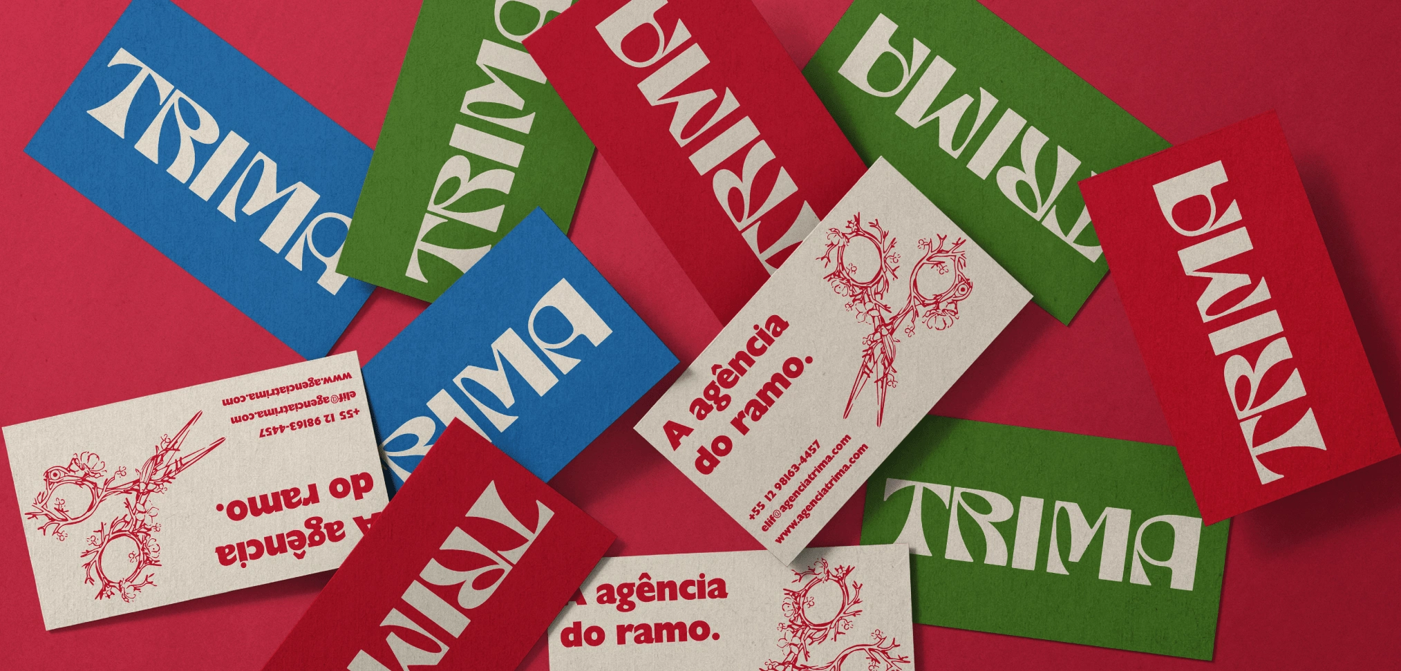
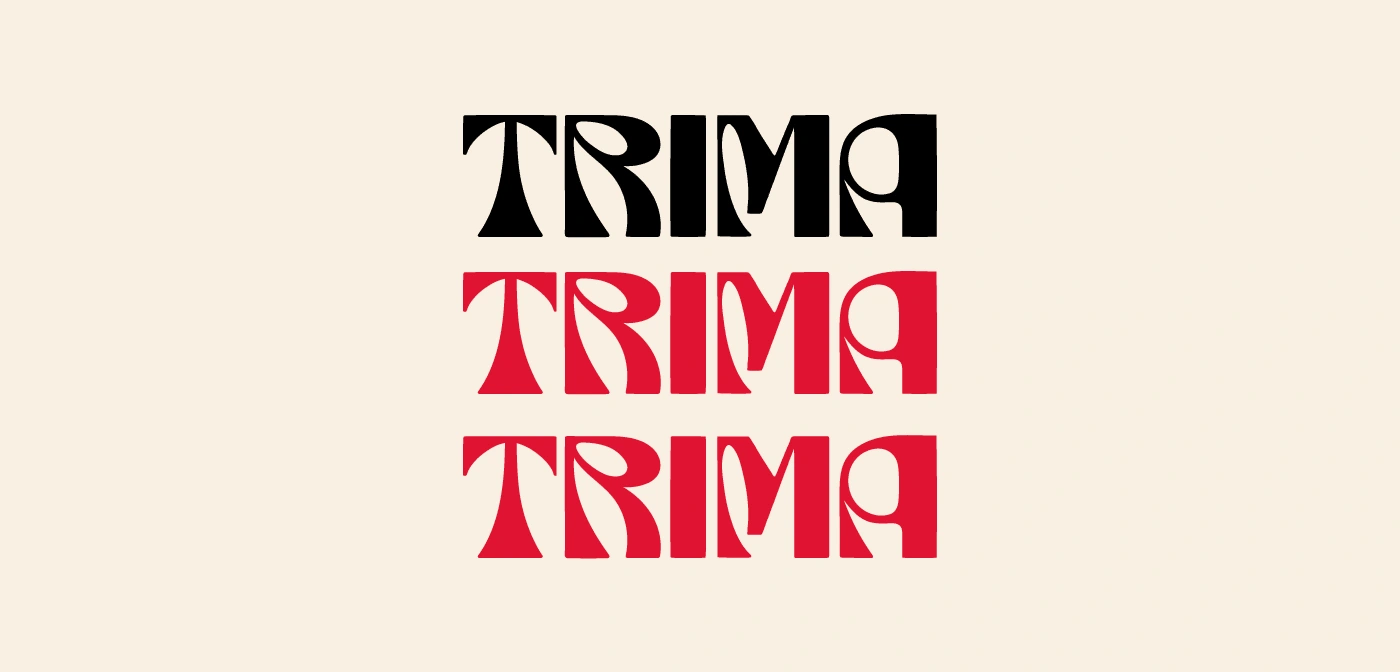
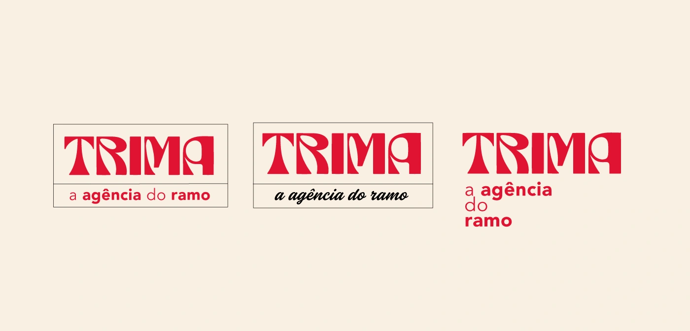
The TRIMA brand logo features an alternative font with specific characteristics. It's a solid, thick font with straight edges and rounded details. All letters are written in capital letters and are joined together to form a cohesive block.
Symbolically, the TRIMA brand logo conveys an image of strength, solidity and modernity. The alternative font, with its pronounced thickness and robust shapes, suggests a reliable and impactful brand, however the rounded parts break the pattern, giving the brand a more innovative and relaxed tone. The straight ends and rounded corners combine the feeling of stability with a hint of boldness, but in the end, even though they are opposite patterns, they were used in a harmonious way, demonstrating balance.
The letters united in a block symbolize the union, cohesion and integrity of the TRIMA brand.
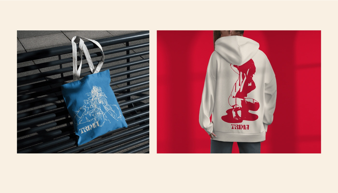
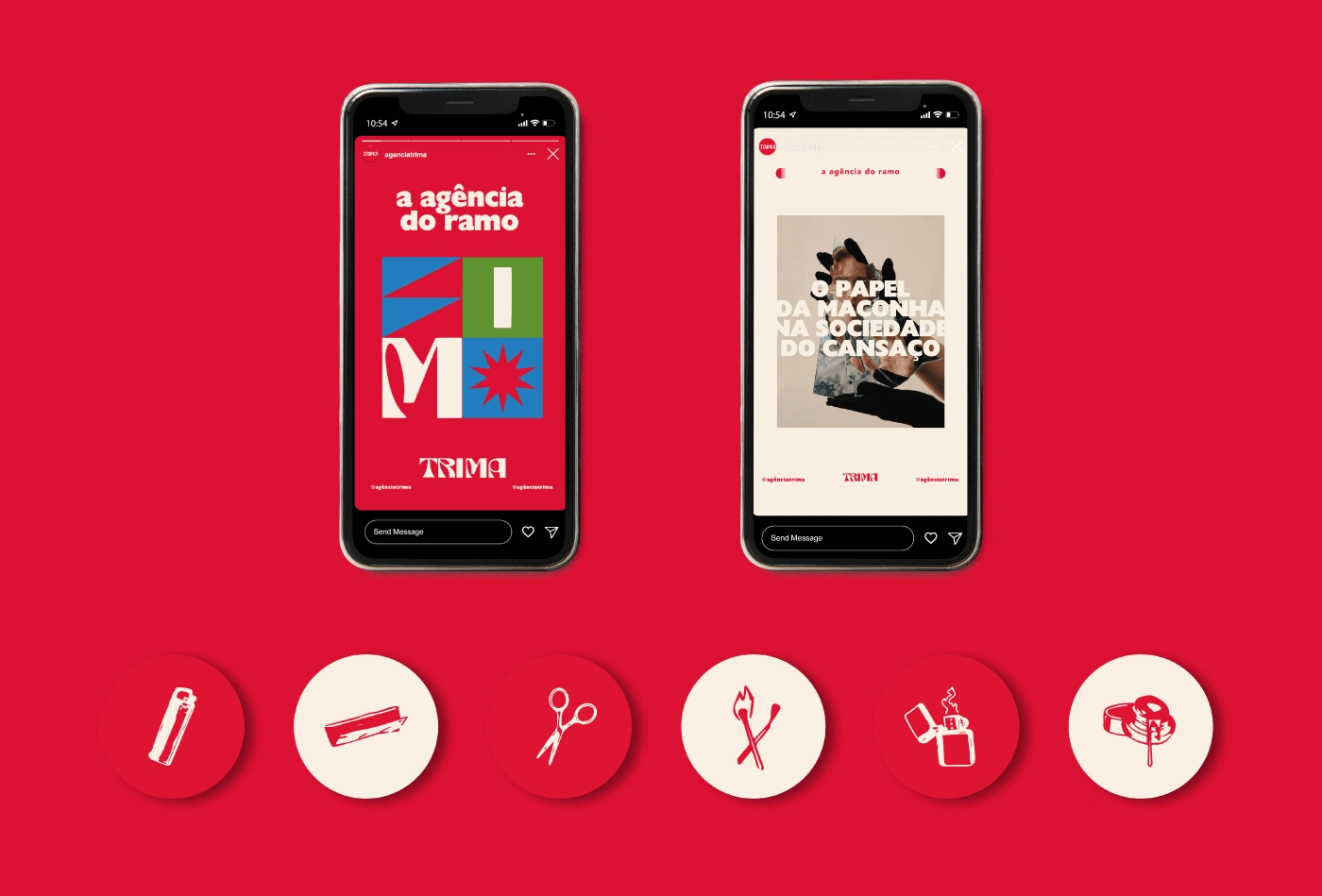
A series of ideas were developed for illustration that goes beyond the feeling of “existential breezes” precisely so as not to address the theme of “the world of marijuana” in an obvious way, some more arthritic and abstract languages were explored, the objective is to go beyond this reflective feeling and surrealist, bringing another relaxed tone to the brand.
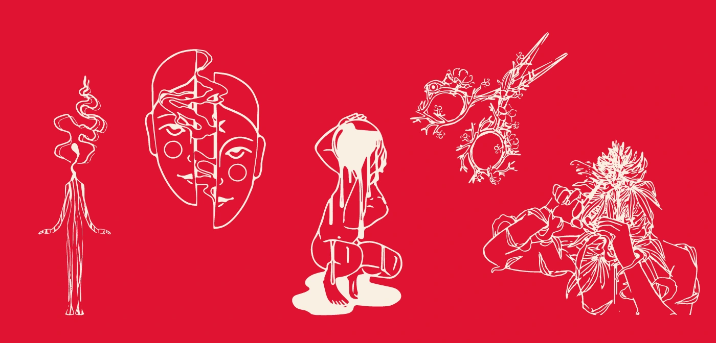
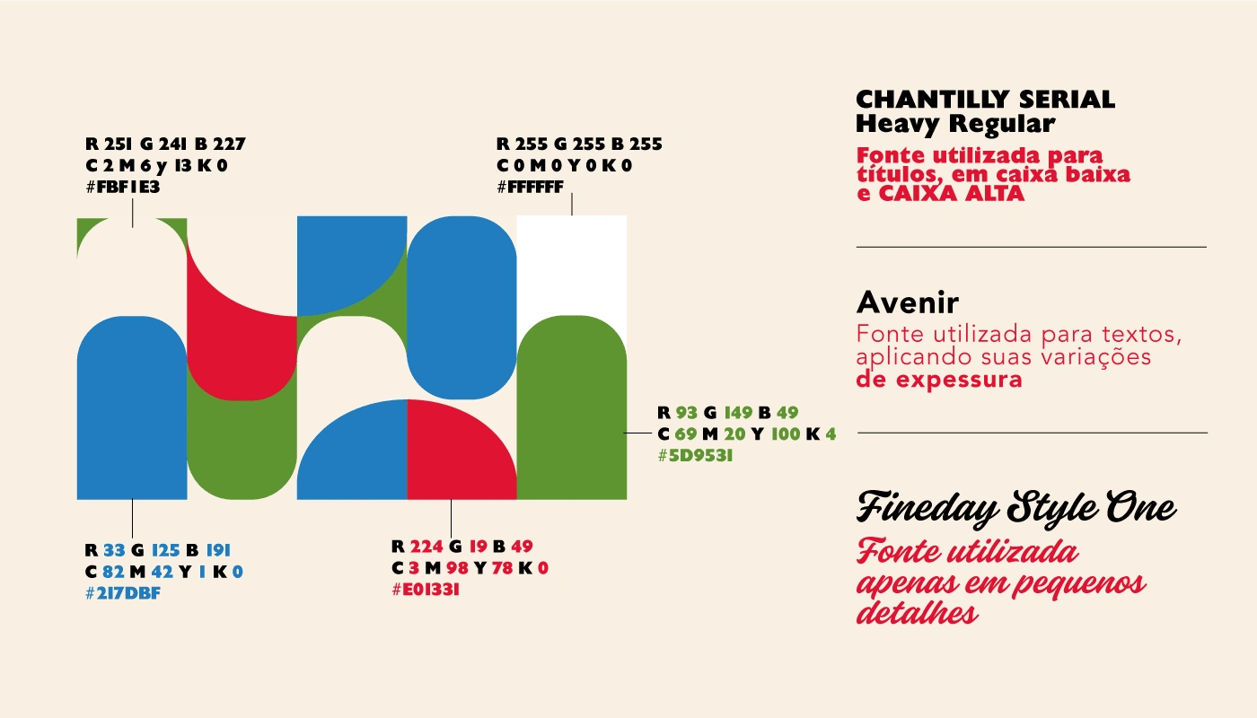
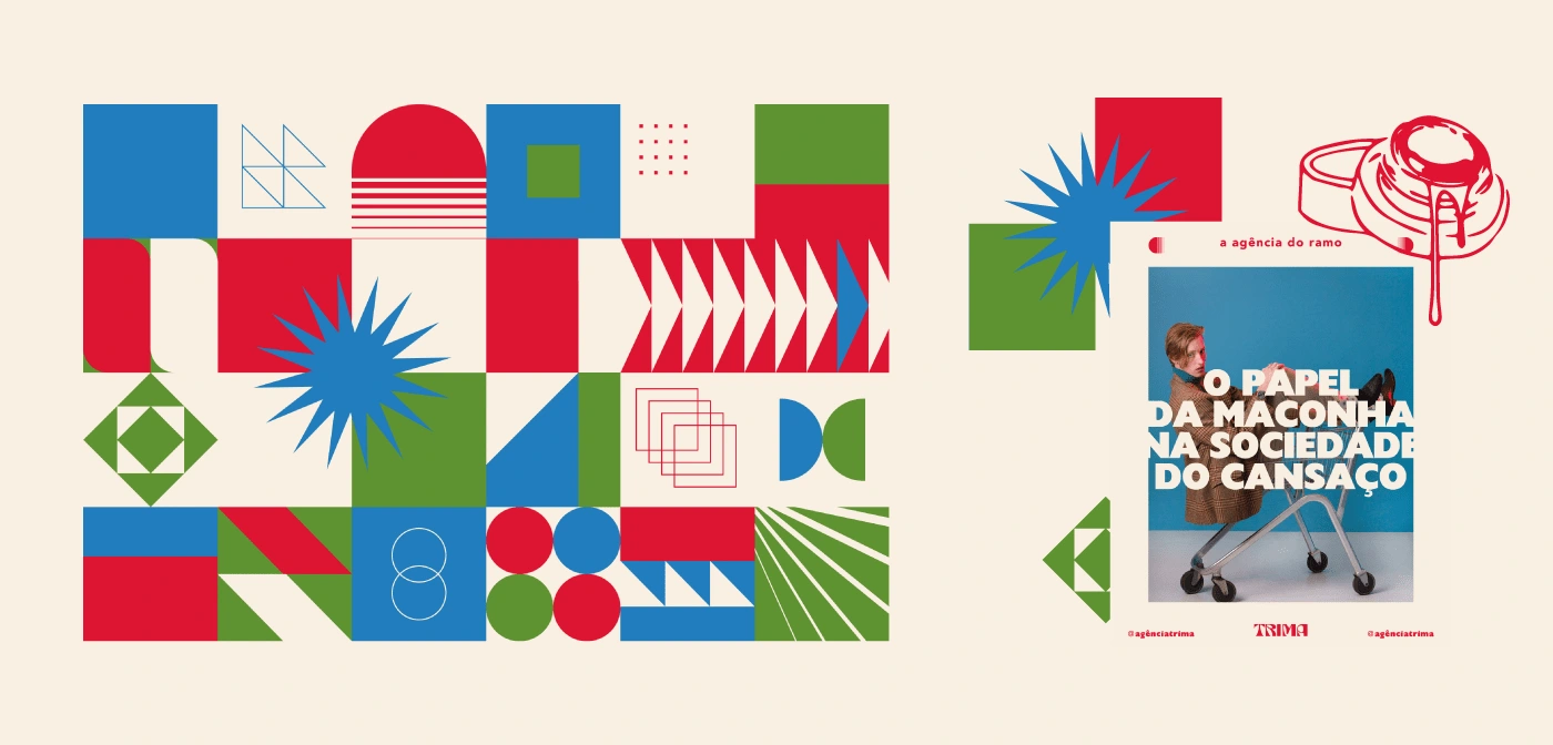
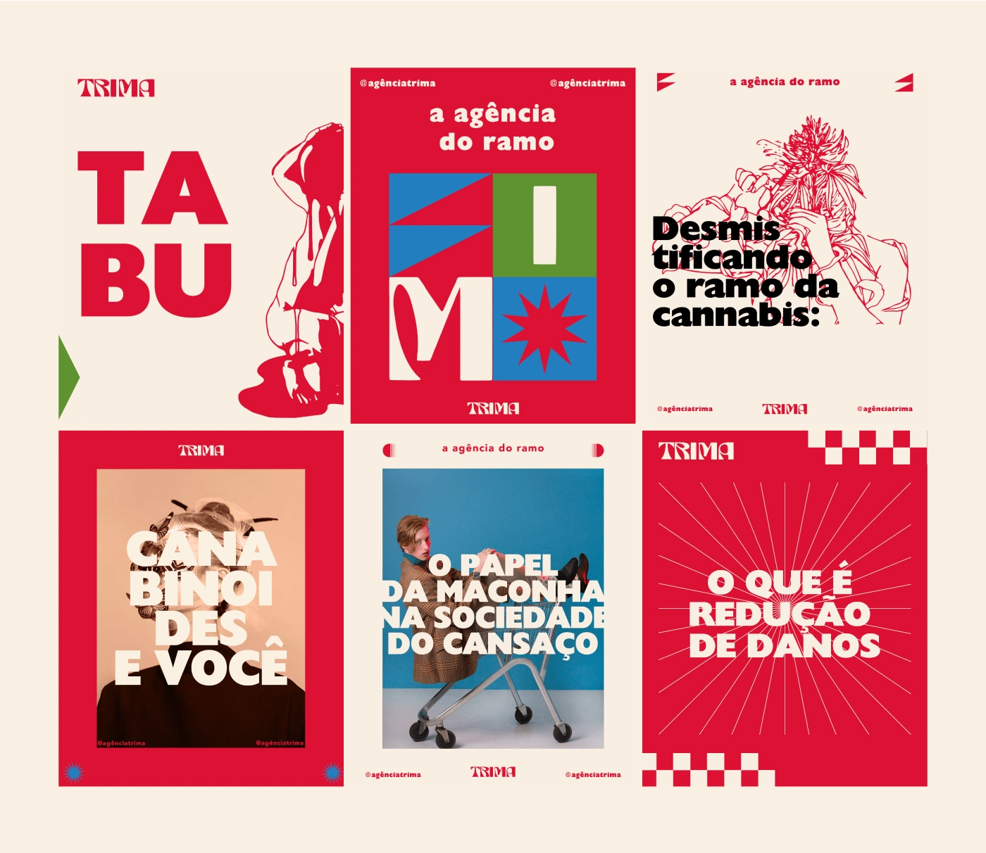
The simplicity and clarity of the graphic elements, along with the careful selection of colors, reflect the Bauhaus emphasis on functionality and accessible design. The ULM-inspired use of clean lines and smooth curves evokes a sense of innovation and progress. In Art Deco, straight lines, symmetry and stylized geometric shapes, such as zig-zags, chevrons and foliage motifs, can be incorporated. By developing graphic elements inspired by these three influential design trends, there is an undeniable invitation to explore experimentation and creativity, while maintaining a connection with the pioneering history of design.
Like this project
Posted Mar 10, 2025
Trima, an advertising agency specializing in serving clients in the cannabis industry.