HINCO - Visual Identity Design
João Carlos
ABOUT THE BRAND
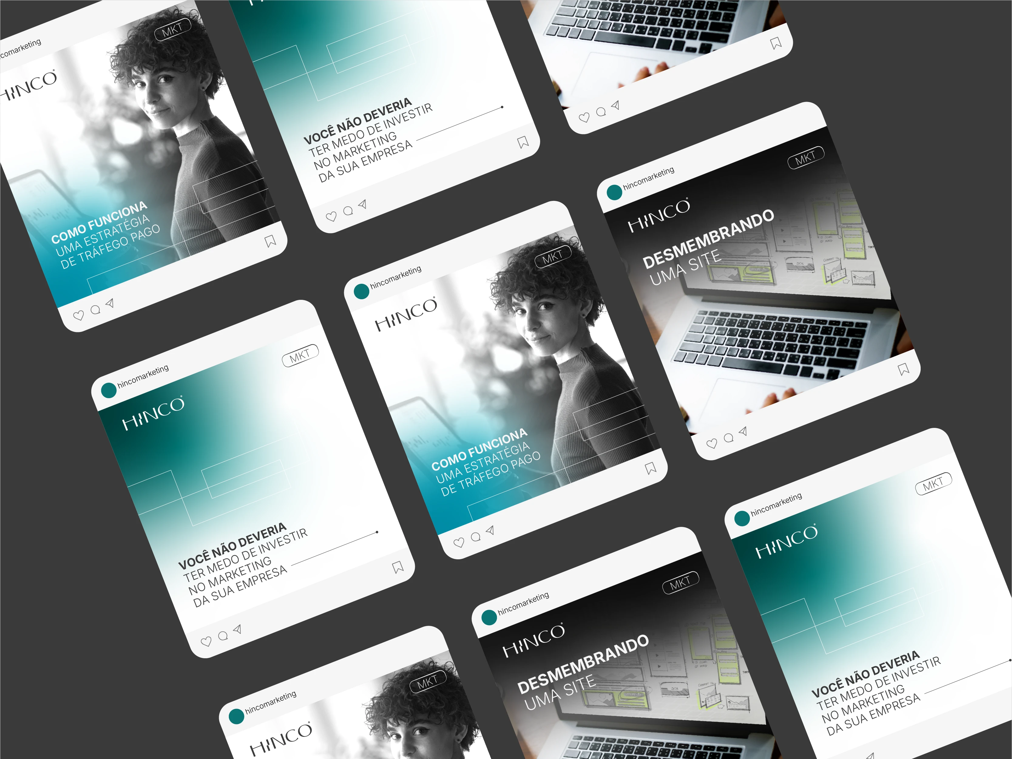
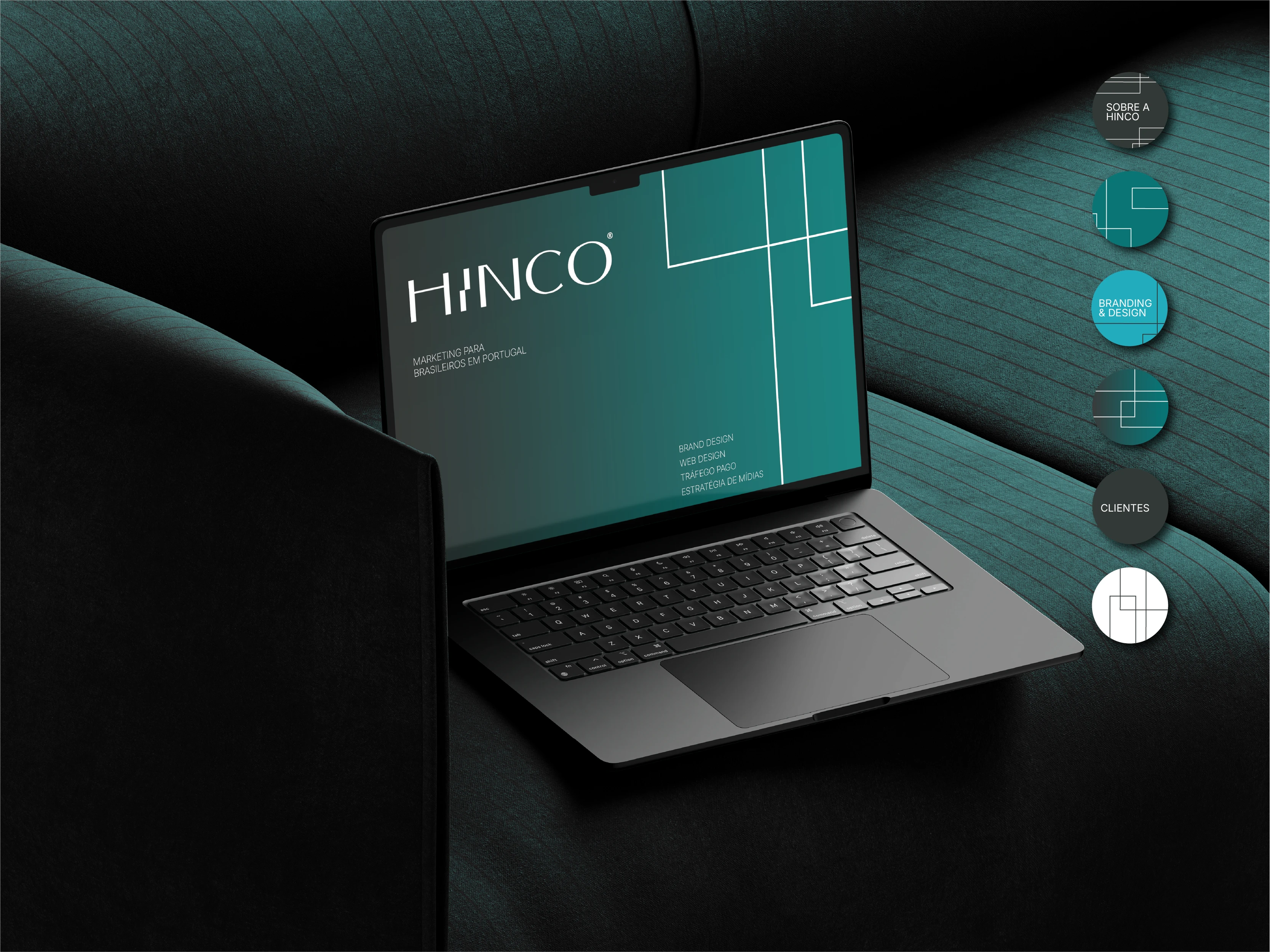
HINCO is a marketing company that supports entrepreneurs to grow and stand out. It offers branding, design, websites, social media management and paid traffic services. The mission is to help Brazilians in Portugal overcome the challenges of doing business abroad, as well as supporting Portuguese people who want to strengthen their businesses.
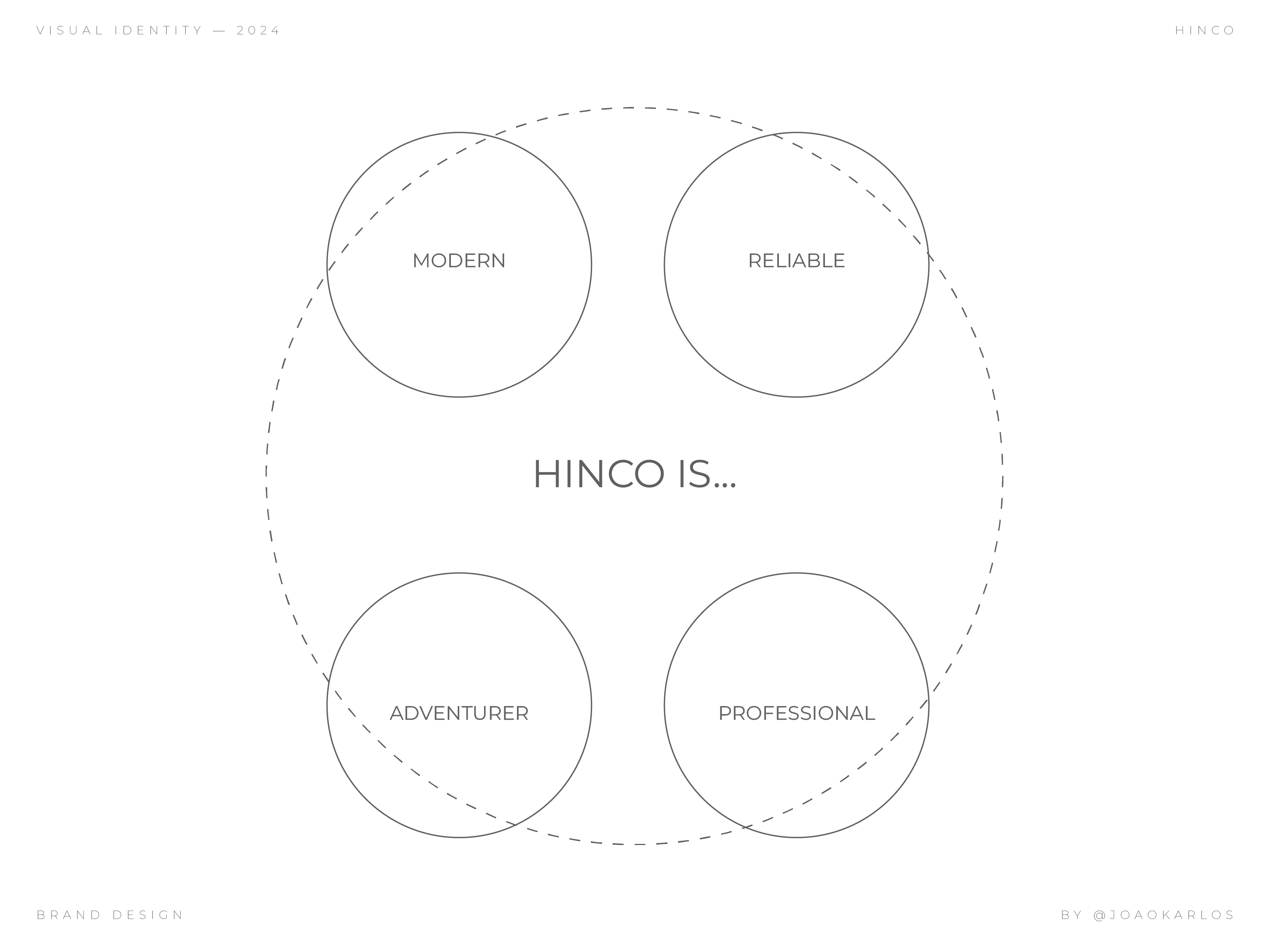
Brand attributes.
Attributes are the values and feelings that the brand conveys. These brand attributes and personalities are translated into colors, shapes, fonts, elements, symbols, icons and their application forms.
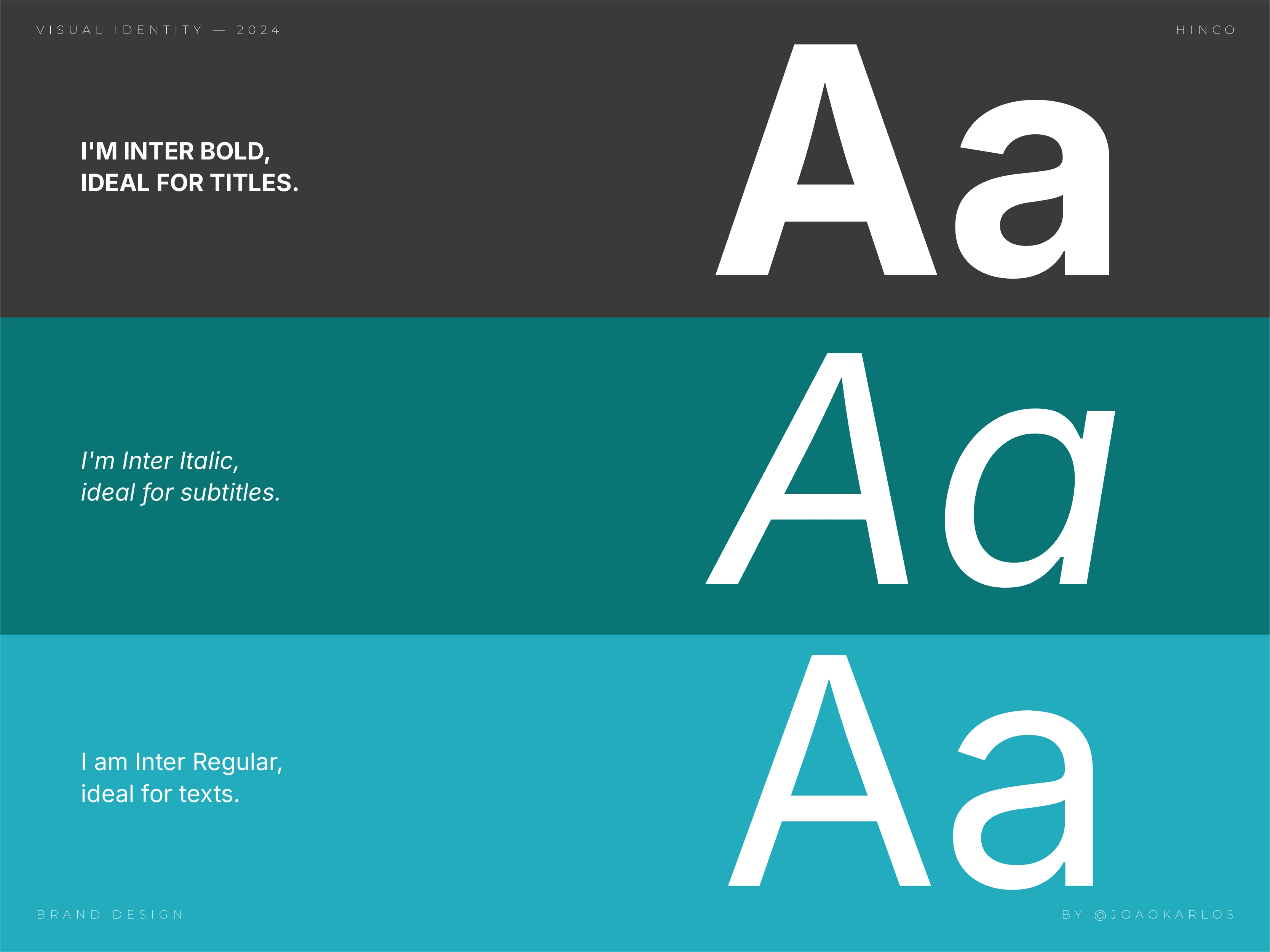
Typography.
Typography has the power to graphically represent a company's values and positioning, as well as awaken feelings and perceptions in the public. For HINCO's Visual Identity, the typeface family chosen to support the brand's communication and tone of voice was INTER.
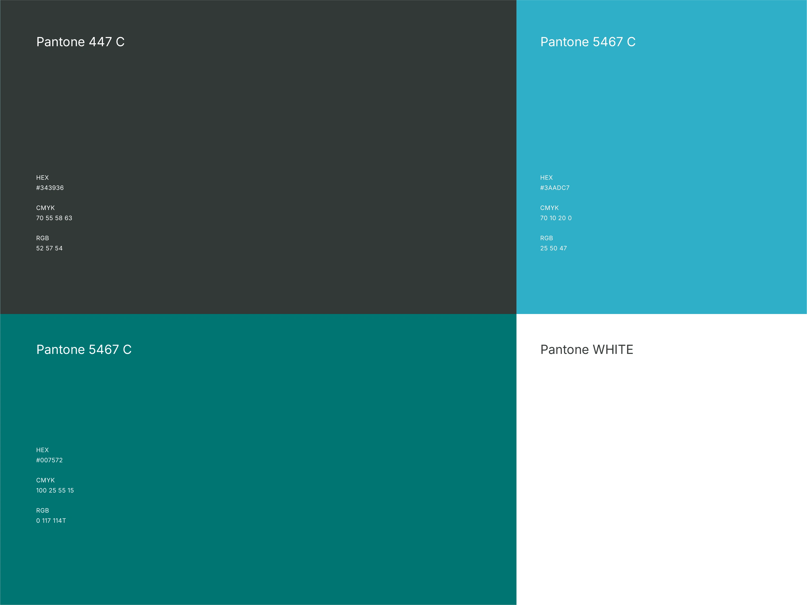
Colors.
Here is the harmonic pattern of colors according to the brand attributes. These colors will be used in any and all types of material in the brand extension, knowing that ensuring color fidelity helps maintain brand consistency.
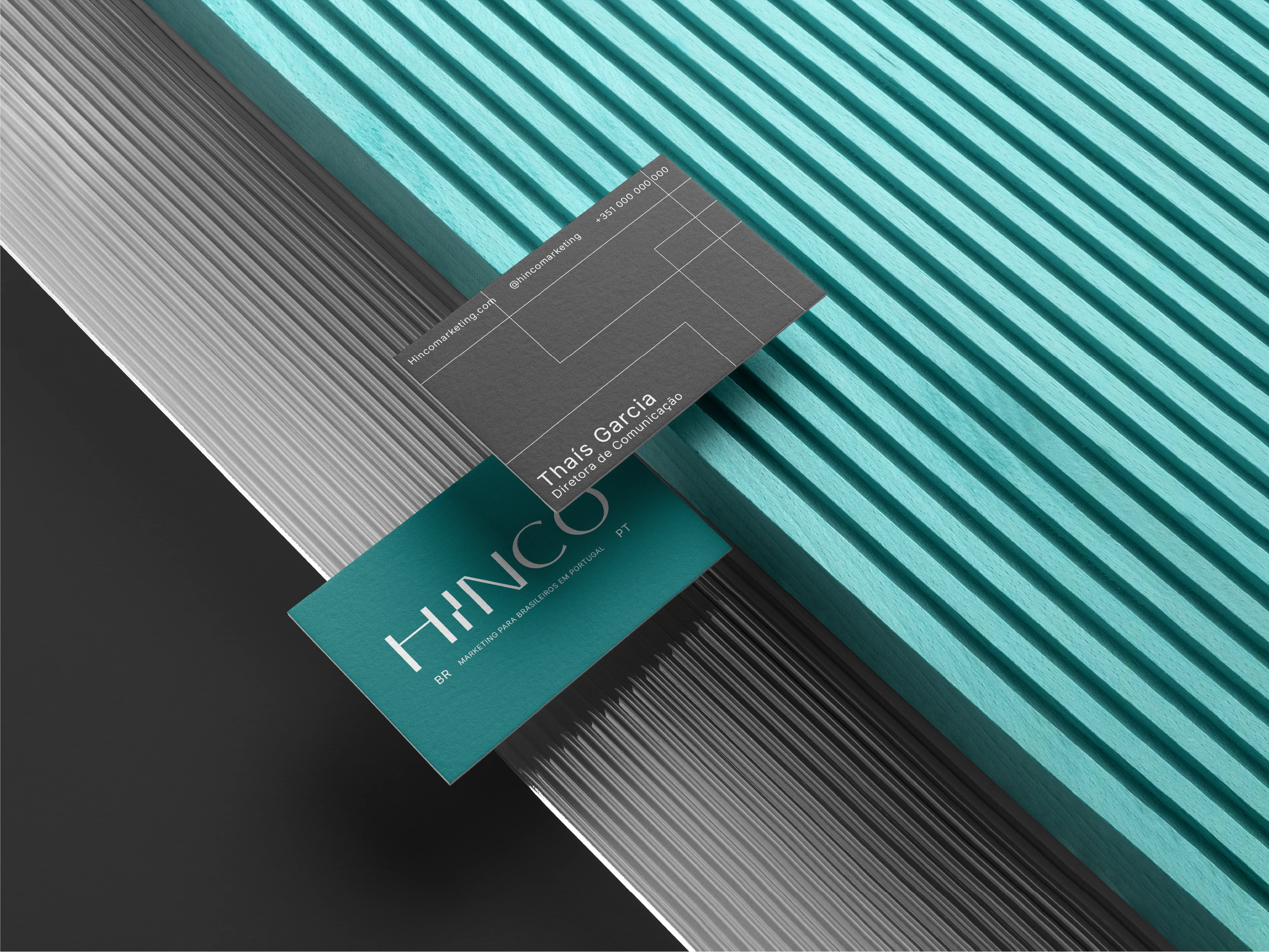
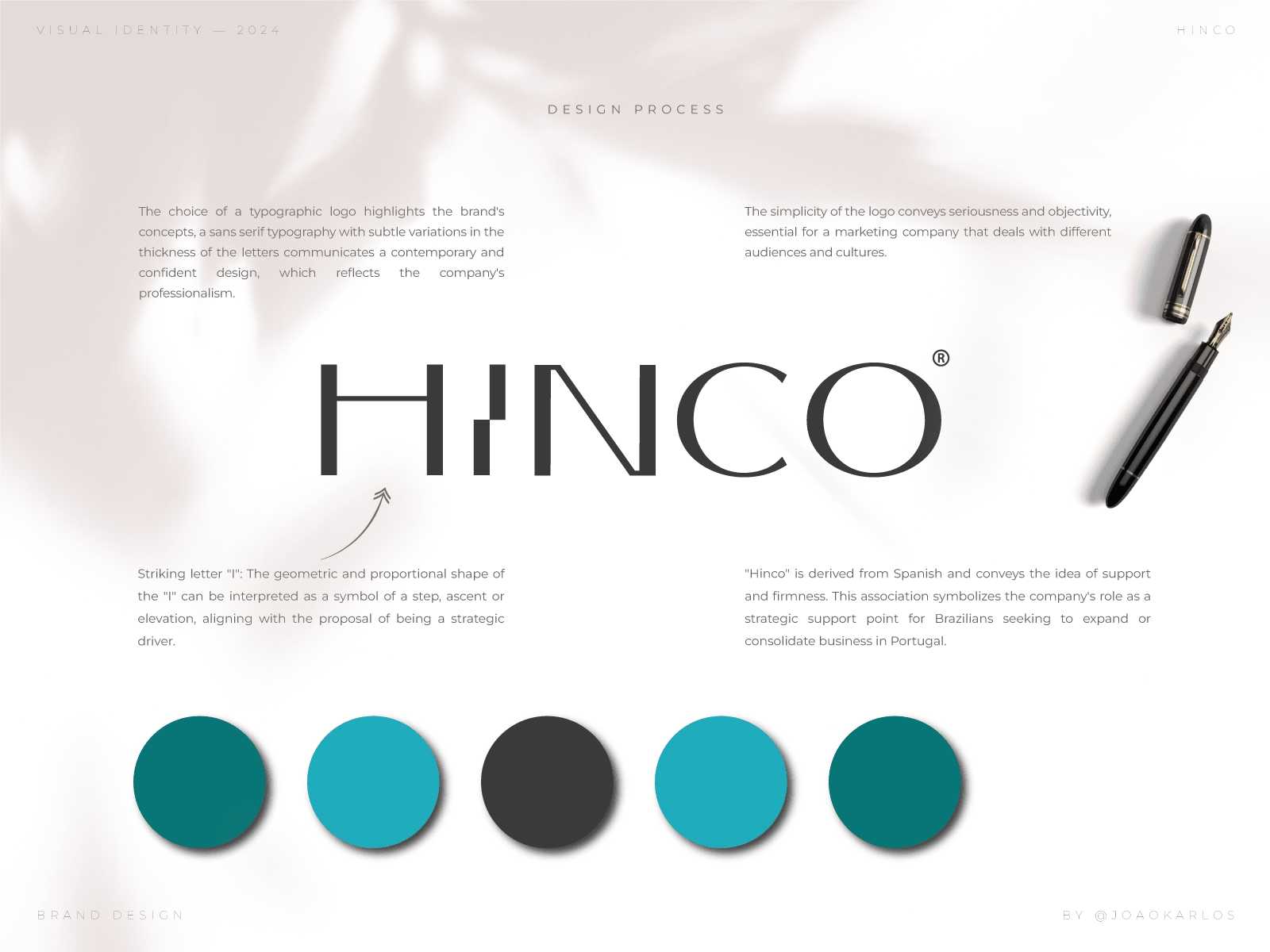
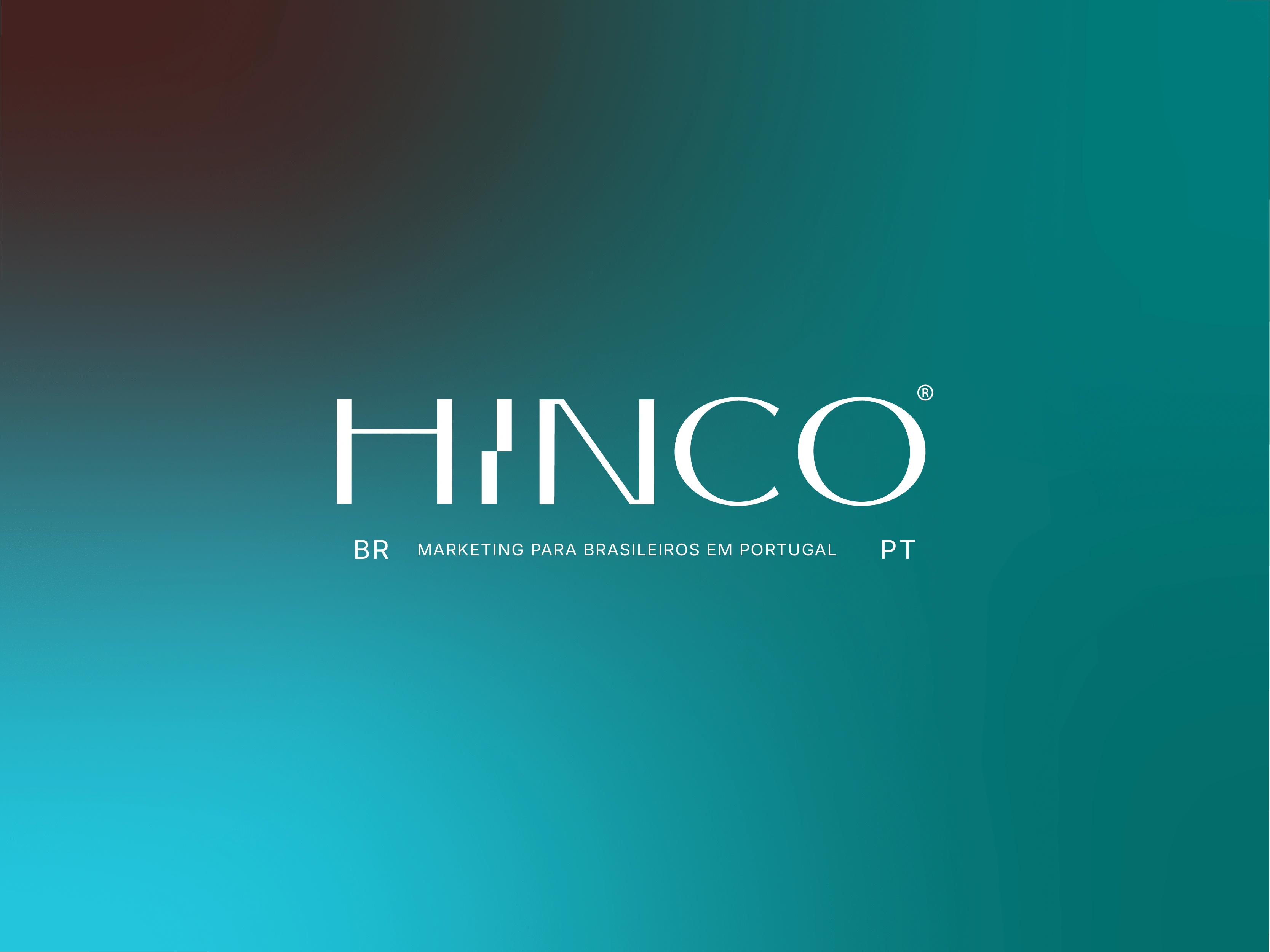
Logo.
This is the main element of the brand, the one we first come into contact with. It consists of the name and tagline.
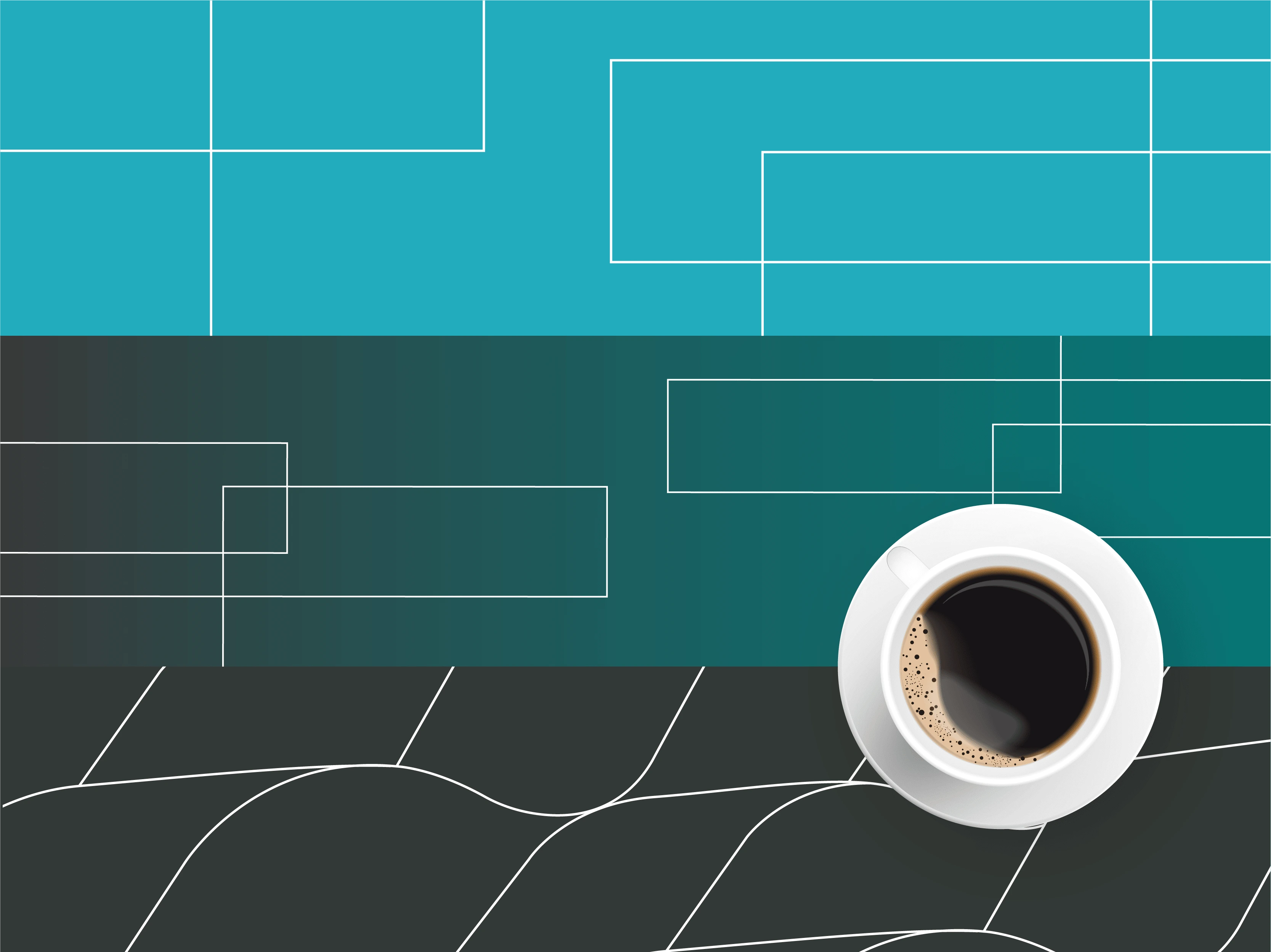
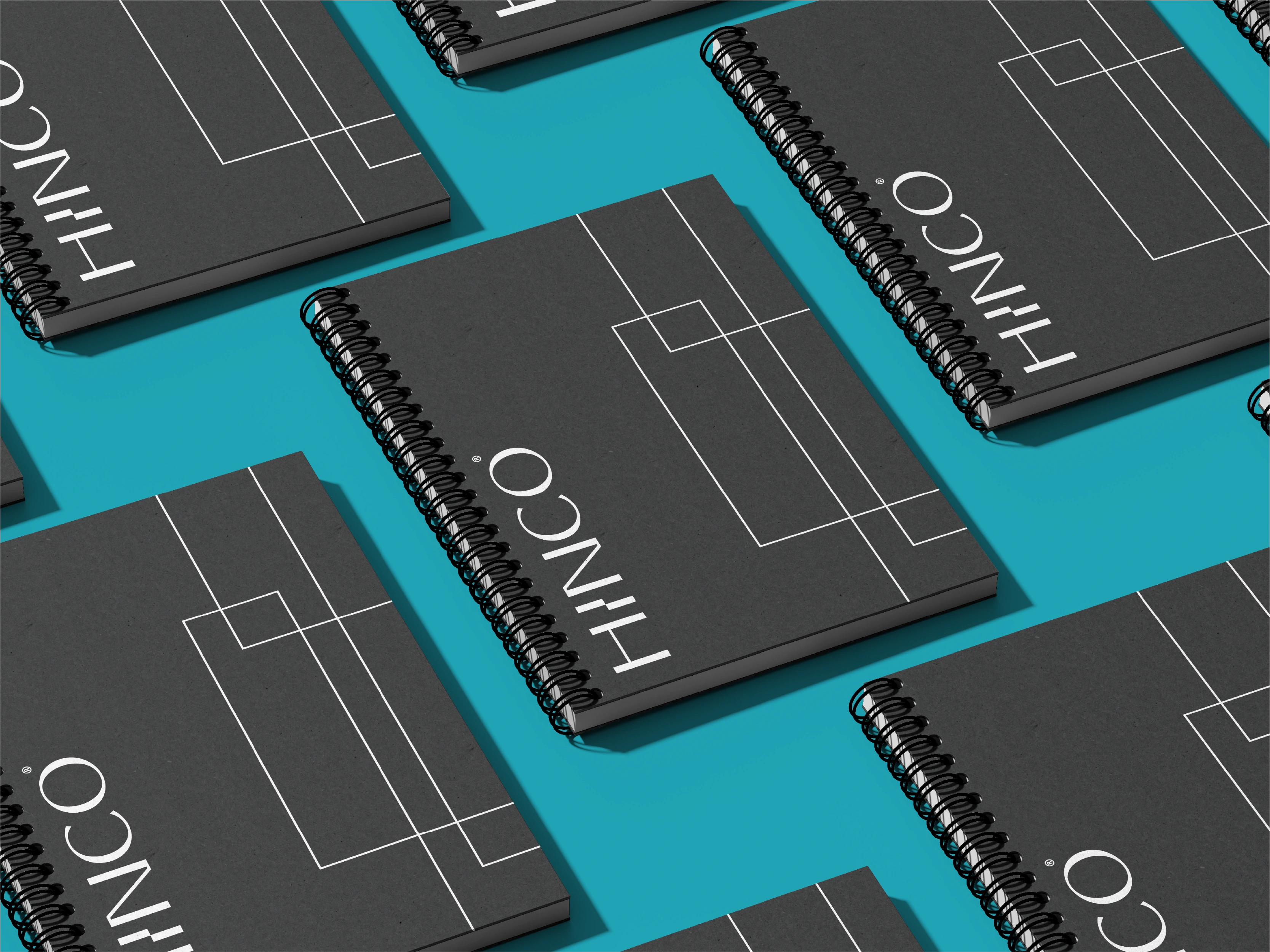
Pattern
The pattern is the standard of the Visual Identity. An exclusive brand print that should be used in its entirety in marketing materials, stationery, packaging, etc.
Like this project
Posted Apr 16, 2025
HINCO is a company that supports entrepreneurs to grow and stand out. It offers branding, design, websites, social media management and paid traffic services