


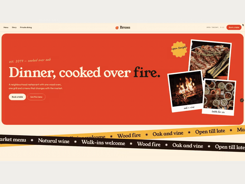


This started as a simple question I couldn’t shake off.
What if the Starbucks website felt less like a corporate platform and more like the experience of actually being in a Starbucks?
So I treated this as a personal exploration, not a client brief. I focused on mood, rhythm, and storytelling instead of cramming information into predictable sections.
I played with:
- Editorial layouts that breathe and guide the scroll naturally
- Floating, transparent product visuals that move subtly with the page
- Warm coffee-inspired tones that feel calm and premium
- Micro-moments that make the site feel alive, not static
This project reminded me how much design improves when you slow down and design for feeling, not just function.
Would genuinely love to hear thoughts or feedback from other designers.
11
36
574


DWELL — A Coffee Brand, Human by Design
DWELL is a fictional specialty coffee brand I built from scratch in one weekend, using Envato as my entire toolkit: logo, packaging, signage, sound, and a promo reel.
My "Human by Design" moment: I started in Envato's AI video generator asking for a cozy café, and it gave me something technically fine but completely soulless, a generic bar with no point of view. So I rejected it and made the call to build the reel from real Envato stock footage instead. The same judgment shaped everything: I pushed the logo past a generic coffee-cup icon into an arch with a coffee branch that actually means something, and matched every logo colour to its surface for contrast.
Tools used, all Envato: AI Video Generator, Image Generator, Mockup tool, Envato Music, Sound Generator, and stock footage, finished in Canva and CapCut.
AI got me 80% of the way there, fast. The last 20% knowing what to reject, when to change course, and what actually had soul, was human. That's DWELL.
1
2
261