Freelancers in ZaandamFreelancers in Zaandam
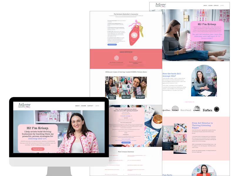
I help creators build authority through websites that sell.
$100k+
Earned
80x
Hired
5.0
Rating
313
Followers
I help creators build authority through websites that sell.
Arts & Entertainment(1)
Make your brand standout
$10k+
Earned
4x
Hired
4.9
Rating
464
Followers
Make your brand standout
Arts & Entertainment(2)
Brand Systems & Communication Designer
1x
Hired
45
Followers
Brand Systems & Communication Designer
Arts & Entertainment(1)
Webflow Designer & Developer, Next-Gen SEO & AEO Templates
New to Contra
Webflow Designer & Developer, Next-Gen SEO & AEO Templates
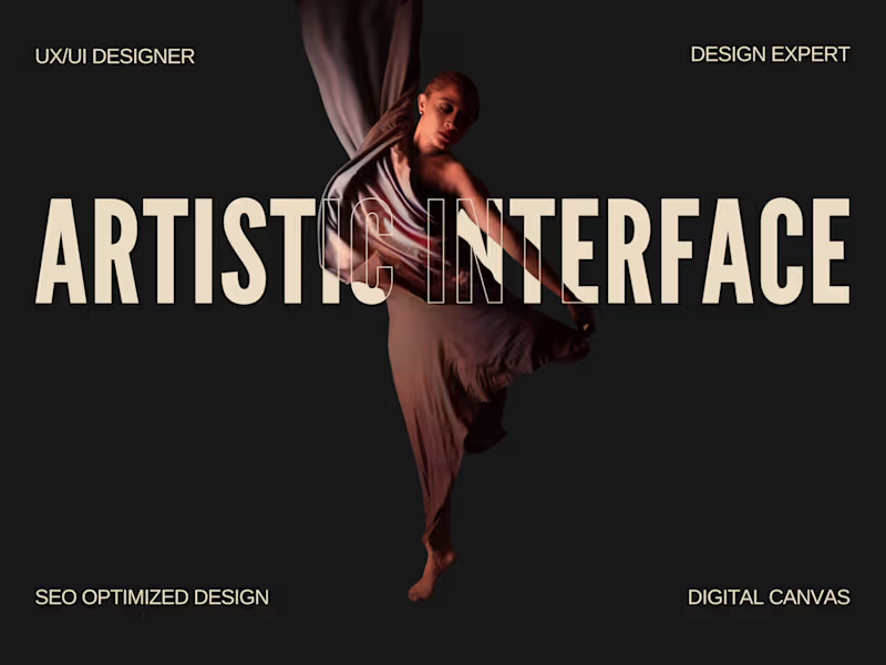
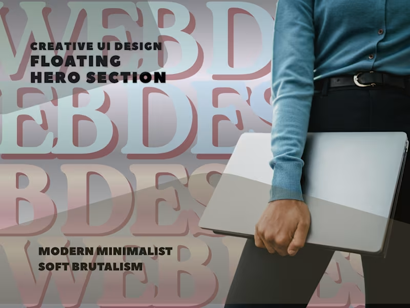
Cover image for How to Design a Floating
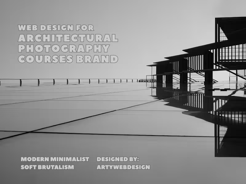
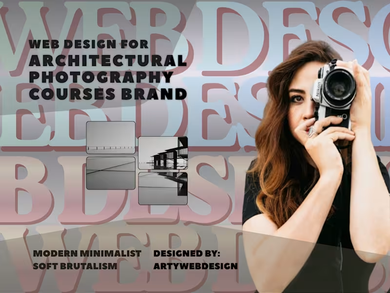
How to Design a Floating Glassmorphism Hero Section? This UI design breakdown explores utilizing abstract layered shapes, modern typography, and clean asymmetric layouts to take your web design projects to the next level. Perfect for UI/UX designers, web developers, and digital creators looking for fresh web layout inspiration. This design showcases a creative approach to a blog or digital growth website's primary hero section. Below is an analytical breakdown of its UI/UX components: Layout Structure & Composition The Asymmetric Grid: The layout breaks away from standard, rigid website grids by employing two main card blocks overlapping a dynamic background. Floating Mechanics: The design uses a visual layering technique where content blocks "float" over multi-colored geometric pills and shapes in the background, giving the layout physical depth and a three-dimensional feel. Visual Style & Aesthetics Modern Minimalist-Soft Brutalism: Combining thin, clean borders on cards with heavy typography and a playful background lends it a trendy, modern tech-blog appearance. Muted Color Palette: The background utilizes semi-transparent pastel tones (soft blues, sage greens, warm yellows, and lilacs). These colors complement rather than distract from the main readability zone. Typography & Hierarchy Heading Block: The left card contains a prominent, bold serif heading reading "Digital Growth Blog: Website Trends and News for Success." The choice of a strong serif face adds editorial credibility to a tech-forward layout. Body Copy: A clean, legible sans-serif font is used for the sub-text and secondary content on the right, ensuring information architecture balances high-impact headers with easy-to-read descriptions. UI Elements & Accents Card Containers: Content is separated into two elevated glass-like cards featuring subtle drop shadows and crisp micro-borders. Background Pill Elements: Soft, rounded rectangular shapes of varying opacity float behind the text cards to direct user eyes down and across the screen dynamically. 🚀 Available for freelance projects. Click the "Message" button on my profile to get in touch directly through the Contra platform. 🎯
0
39
Arts & Entertainment(1)
Framer Expert
$5k+
Earned
2x
Hired
7
Followers
Framer Expert
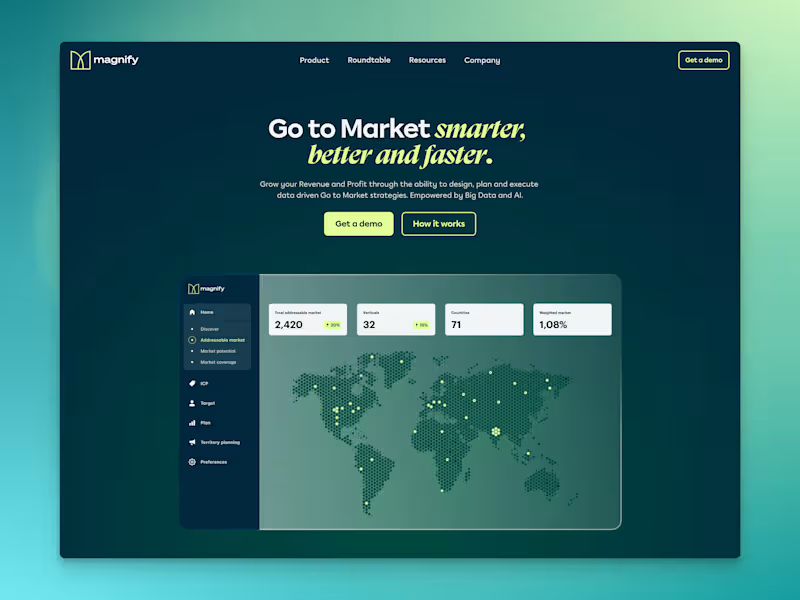
Cover image for Magnify
Cover image for RocketX
Placeholder project card media
View more →
Arts & Entertainment(1)
Product & Icon Designer
5.0
Rating
23
Followers
Product & Icon Designer
Arts & Entertainment(1)