The network for creativity
Join 1.25M professional creatives like you
Connect with clients, get discovered, and run your business 100% commission-free
Creatives on Contra have earned over $150M and we are just getting started
Back to feedPost


How to Design a Floating Glassmorphism Hero Section?
This UI design breakdown explores utilizing abstract layered shapes, modern typography, and clean asymmetric layouts to take your web design projects to the next level. Perfect for UI/UX designers, web developers, and digital creators looking for fresh web layout inspiration. This design showcases a creative approach to a blog or digital growth website's primary hero section. Below is an analytical breakdown of its UI/UX components:
Layout Structure & Composition
The Asymmetric Grid: The layout breaks away from standard, rigid website grids by employing two main card blocks overlapping a dynamic background.
Floating Mechanics: The design uses a visual layering technique where content blocks "float" over multi-colored geometric pills and shapes in the background, giving the layout physical depth and a three-dimensional feel.
Visual Style & Aesthetics
Modern Minimalist-Soft Brutalism: Combining thin, clean borders on cards with heavy typography and a playful background lends it a trendy, modern tech-blog appearance.
Muted Color Palette: The background utilizes semi-transparent pastel tones (soft blues, sage greens, warm yellows, and lilacs). These colors complement rather than distract from the main readability zone.
Typography & Hierarchy Heading Block: The left card contains a prominent, bold serif heading reading "Digital Growth Blog: Website Trends and News for Success." The choice of a strong serif face adds editorial credibility to a tech-forward layout.
Body Copy: A clean, legible sans-serif font is used for the sub-text and secondary content on the right, ensuring information architecture balances high-impact headers with easy-to-read descriptions.
UI Elements & Accents
Card Containers: Content is separated into two elevated glass-like cards featuring subtle drop shadows and crisp micro-borders.
Background Pill Elements: Soft, rounded rectangular shapes of varying opacity float behind the text cards to direct user eyes down and across the screen dynamically.
🚀 Available for freelance projects. Click the "Message" button on my profile to get in touch directly through the Contra platform. 🎯


The network for creativity
Join 1.25M professional creatives like you
Connect with clients, get discovered, and run your business 100% commission-free
Creatives on Contra have earned over $150M and we are just getting started





Related posts

A few things we’ve been working on this month.
Different industries, different problems, but the same goal: making complex products feel simple, clear, and trustworthy.
Fintech → Investment Banking → Geospatial AI
More projects are still in progress.
Full case studies coming soon.


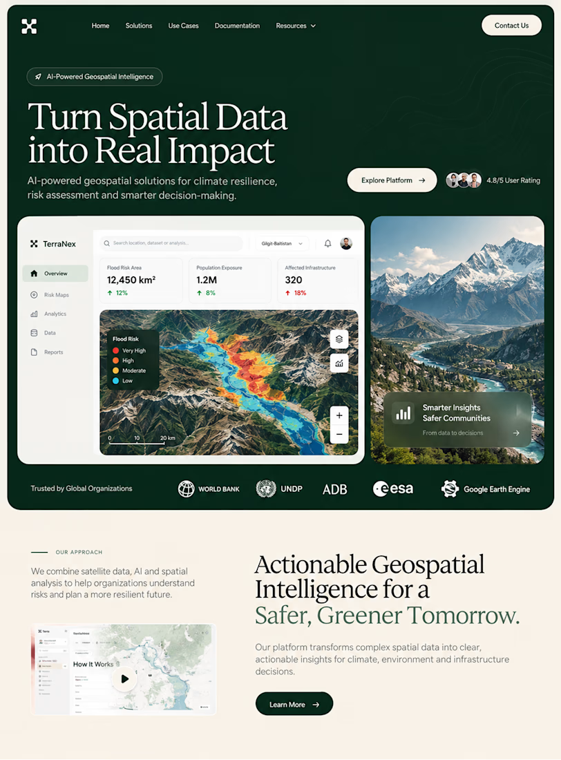
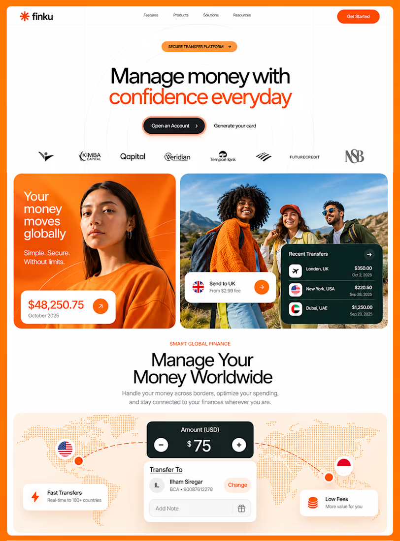
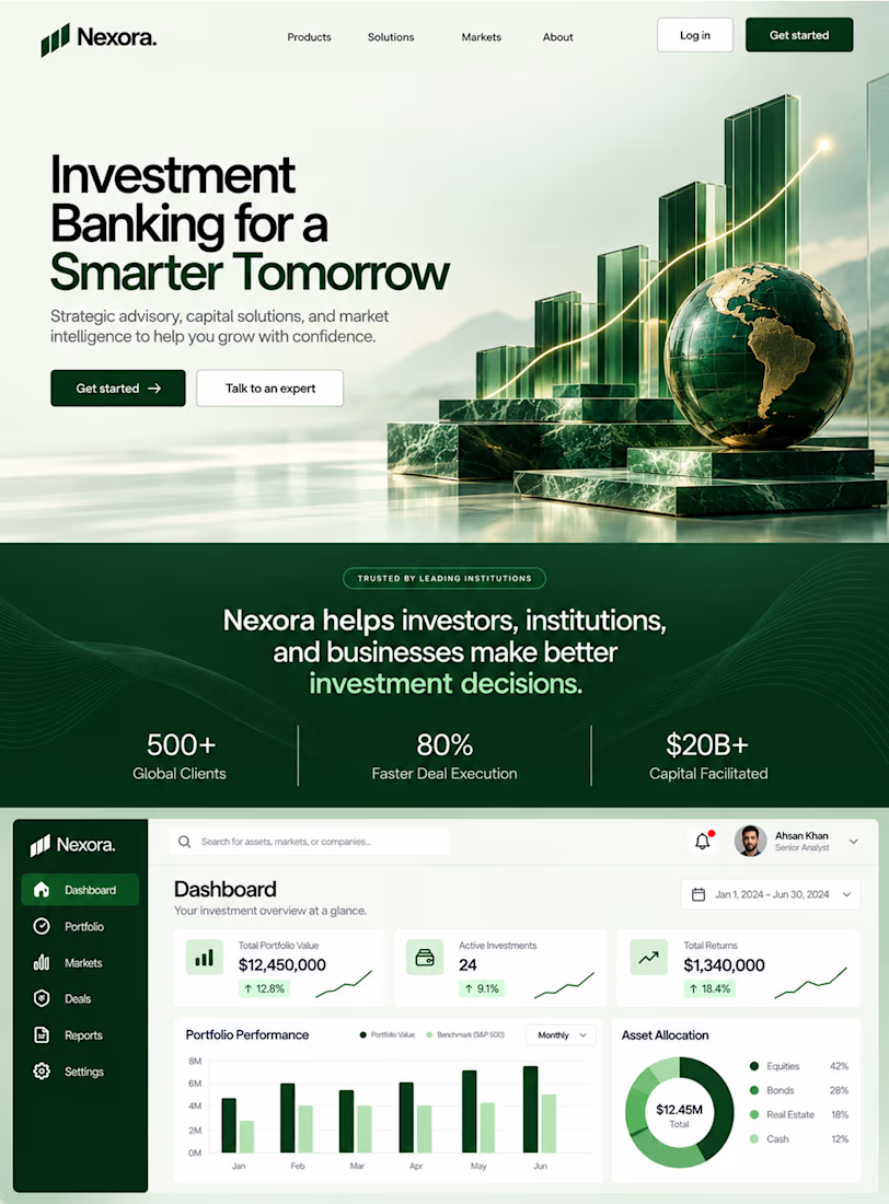

This is the kind of work I enjoy seeing — simple, focused, and actually thought through.

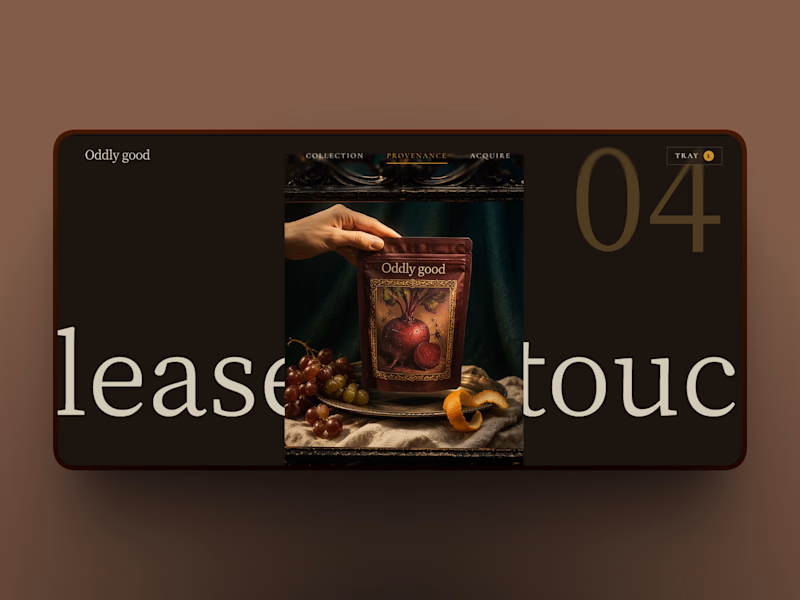
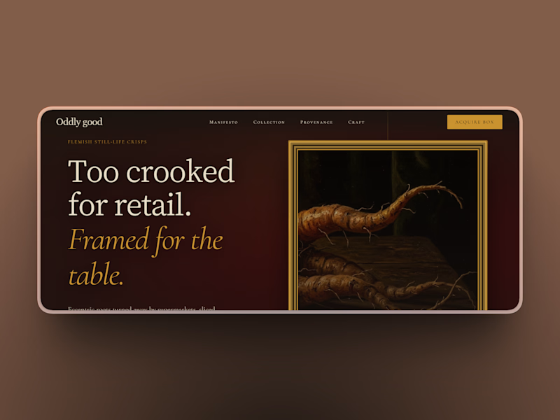
Same prompt. Two builders.
One site made with Lovable, one with Google AI Studio. A Flemish still-life snack brand, gilt frames, GSAP scroll, the works.
Which one is better?
33 voted
67%
16 voted
33%
49 votes
Closed

A three-card tarot spread where every face is unique procedural sigil-art, woven into one reading.
I built this project to test a three-card tarot spread where every face is unique procedural sigil-art, woven into one reading. The goal was simple: push interactive browser rendering using HTML5 Canvas and see how smoothly the system responds to direct user interaction.
WHAT I WAS TESTING:
I wanted to focus on two core engineering aspects:
Procedural generation of unique runic card sigils from mathematical formulas
Dynamic typography and card flipping choreography without heavy 3D frameworks
THE TECHNICAL SIDE:
The card faces render directly onto an HTML5 Canvas using polar coordinate trigonometric curves and procedural geometry. Every draw call is computed dynamically without image textures or external SVGs.
Everything runs in the browser using HTML5 Canvas, Procedural Sigil Geometry, Seeded Randomness. No plugins, no heavy dependencies, and no external tracking.
WHAT I LEARNED:
Balancing procedural symmetry with organic irregularity was the main hurdle. Pure mathematical curves looked too synthetic, so adding minor pseudo-random offsets gave the sigils their handcrafted appearance.
Finding the sweet spot between mathematical precision and tactile visual feedback took several iterations, but the end result runs consistently at 60 FPS.
TRY IT YOURSELF:
The live experiment is deployed on Netlify. You can open it in any modern browser, interact with the controls, and test the response times.
If you are working on similar 3D, physics, or creative web projects and want to collaborate, message me here on Contra.


cinematic💯 . Nice work😍