The network for creativity
Join 1.25M professional creatives like you
Connect with clients, get discovered, and run your business 100% commission-free
Creatives on Contra have earned over $150M and we are just getting started
Back to feedPost
Taste Test
Same prompt. Two builders.
One site made with Lovable, one with Google AI Studio. A Flemish still-life snack brand, gilt frames, GSAP scroll, the works.
Which one is better?
33 voted
67%
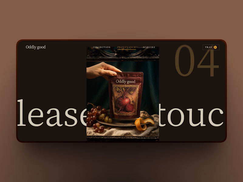
16 voted
33%
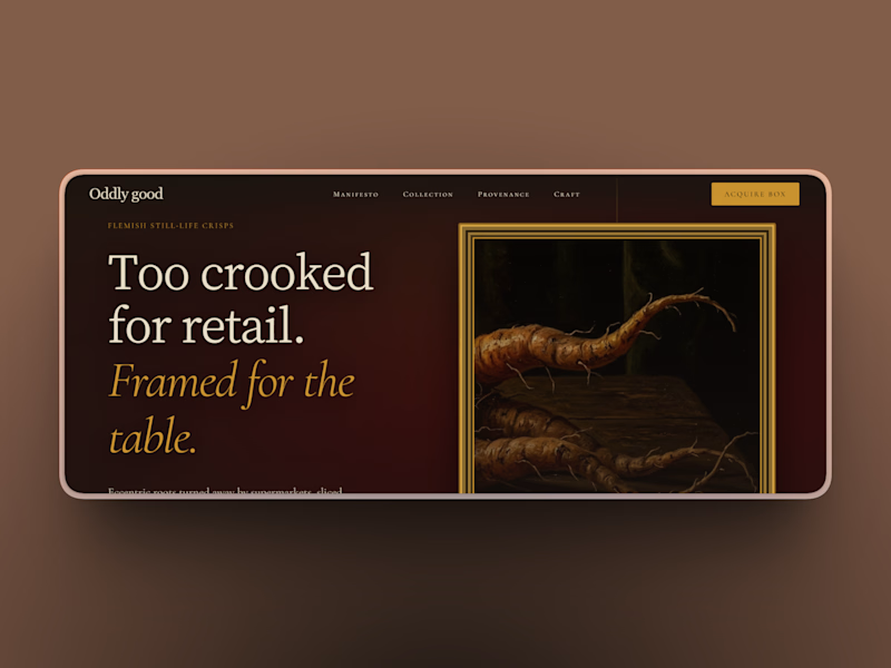
49 votes
Closed


Lovable

Went with Google AI Studio. The "Too crooked for retail" headline has more personality for me.


Wonderful design !

Google AI Studio definitely nailed the editorial hierarchy and 'gilt frame' aesthetic here! The typography alignment on Lovable feels a bit too cluttered for a museum/Flemish art vibe.

Lovable is a clear win. What is your opinion?

Google AI Studio is better. You can read the text immediately see the framed vegetable, and understand what the product is without getting confused.

Lovable always make it all


Will go for lovable

Google flow feels better

Interesting test. The scroll animation on the second one feels more polished to me, but the first nails the brand mood.

Lovable is so much better; almost seems more..... lovable 😂

Both are awesome !

Should I be the bad guy and say none of them. Sure they look slightly aestheticly pleasing at first glance, but after that, it's just a mess. So many things to fix!!

Another "branding has been taken to whole another level" for sure!


lovable one for me, that giant scroll type is great

loveable has a modern look

Looks great and premium
The network for creativity
Join 1.25M professional creatives like you
Connect with clients, get discovered, and run your business 100% commission-free
Creatives on Contra have earned over $150M and we are just getting started











Related posts

Two camera distances for the same Movable Ink cut. One leans in, one shows the whole layout. 1 or 2.
10 voted
50%
10 voted
50%
20 votes
Closed

2 is more stunning the animations feels unique and that's unbelievable 🎉🎉🔥🔥
great job Blahomyr❤️❤️

What does trustworthy finance look like to you?
A) Rootbook: Finance that feels like a well-kept garden.
B) Altair: The smarter way to manage your assets.
Two finance brands I’m designing, two completely opposite worlds. Which one gets your money?
28 voted
61%
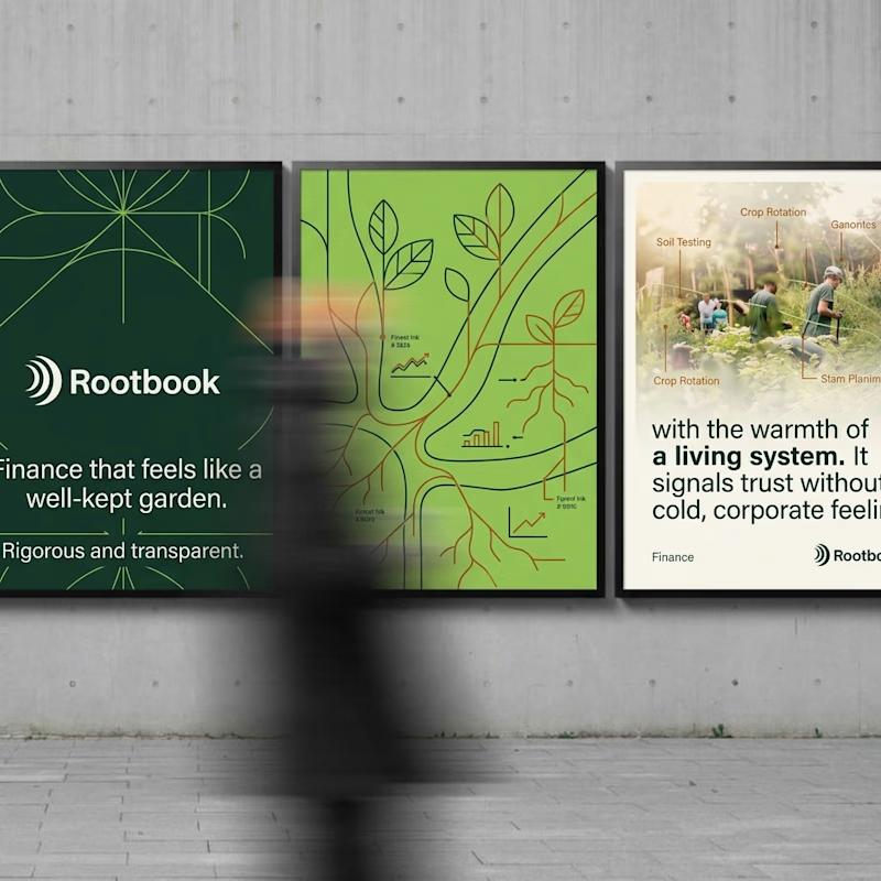
18 voted
39%
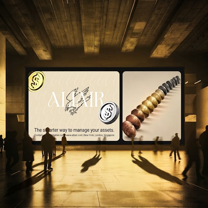
46 votes
Closed

Rootbook wins for me. A finance brand that feels like a well kept garden is such a refreshing idea.

Poster Club turns a simple event template into your own print. I built two working Flutter versions and recorded the same editing flow in each.
Print Room: calm, editorial, with a mounted canvas and bottom tools.
Cutout Playground: bold, playful, with loose prints and tools at the edge.
Which one would you rather use?
What made the difference?
Grab it for free:
https://contra.com/products/cUHBysMu-poster-club-free-flutter-ab-ui-kit


37 voted
60%
25 voted
40%
62 votes
Closed

Print Room looks great!!