The network for creativity
Join 1.25M professional creatives like you
Connect with clients, get discovered, and run your business 100% commission-free
Creatives on Contra have earned over $150M and we are just getting started
Back to feedPost
Taste Test

Poster Club turns a simple event template into your own print. I built two working Flutter versions and recorded the same editing flow in each.
Print Room: calm, editorial, with a mounted canvas and bottom tools.
Cutout Playground: bold, playful, with loose prints and tools at the edge.
Which one would you rather use?
What made the difference?
Grab it for free:
https://contra.com/products/cUHBysMu-poster-club-free-flutter-ab-ui-kit


37 voted
60%
25 voted
40%
62 votes
Closed


Thanks

Cutout Playground is more powerful thats nice 🎉🎉
Great job Dusko🔥🔥
Thanks
Pardon Dusko❤️

Print Room looks great!!
tnx

Cutout playground looks better
thanks

Good work
Thanks

Love how you explored two different visual directions for the same concept. The contrast between the calm editorial style and the playful playground is really nice! 👏
Thank you

both are good keep one design for next event
Thank you

Cutout Playground looks so fun to use, but Print Room feels calmer for longer edits. Cool that you built both in Flutter to compare.
Thank you!

Print Room for me. The clean bottom controls keep the screen organized and make it super easy to focus on tweaking the poster text.
Thank you!

Great design!
I feel the Print Room would work beast for selecting colors in a more accurate way, as the Cutout Playground could make the eye mistake the real life color of the print because of the contrast.
But they both look great!
Thank you! Great advice

print room. clean and simple yet the messaging is so that's why.
Thank you!

Print room looks more natural to me
Thank you!

Print room feels just right
Thank you!

I’d probably go with Print Room. The calmer layout keeps the focus on the poster itself, while the tools still feel easy to reach. Both have a strong personality though.
Great job Dusko🔥🔥
Thank you!

Nice work, Dusko!
Thank you!

This is a really polished presentation. Nicely done!
Thank you!

Print Room for me. The editorial calm lets the poster do the talking, and the bottom tools stay out of the way.

Print room one
The network for creativity
Join 1.25M professional creatives like you
Connect with clients, get discovered, and run your business 100% commission-free
Creatives on Contra have earned over $150M and we are just getting started



Related posts

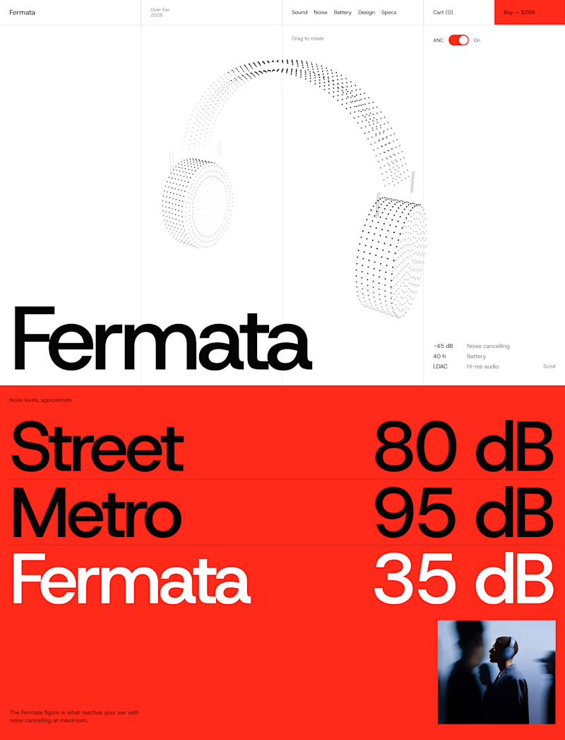
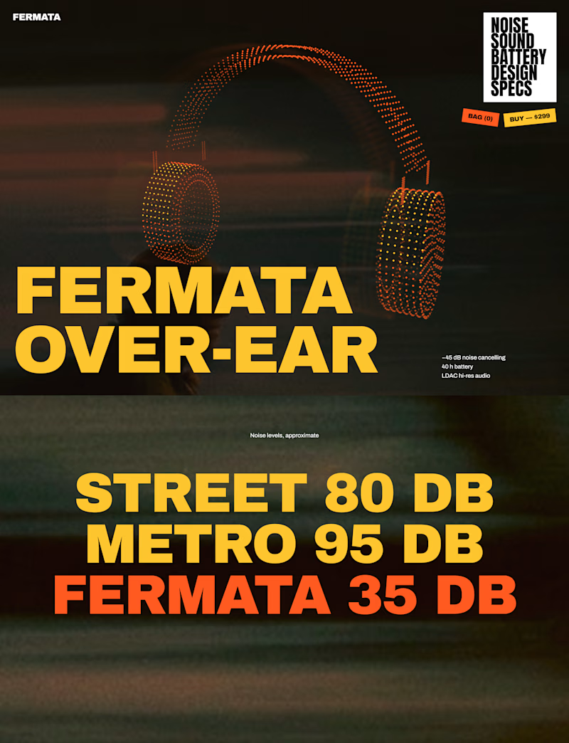
🎧 FERMATA — new over-ear headphones, coming soon.
A — Swiss poster: red, light blue, white and black. Clean grid, one grotesk typeface, product as a stipple 3D model.
B — Night edition: black, yellow and orange. Heavy condensed type, motion-blurred city photography, sticker details.
Both will have a scroll-driven 3D headphone (particles) as the hero.


56 voted
79%
15 voted
21%
71 votes
Closed


The Red Color Scheme looks nice

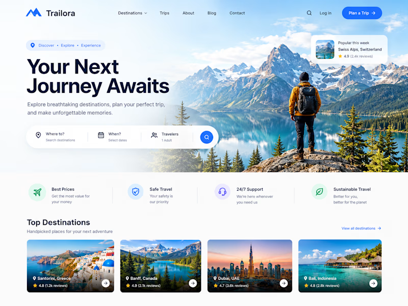
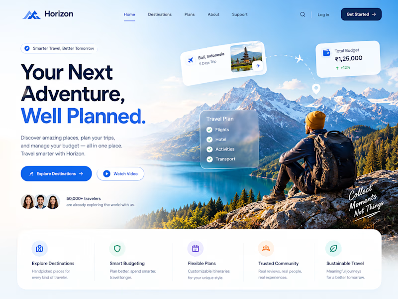
Two designs. One idea. Two different ways to experience travel. ✈️
What if planning your next trip felt less like managing a checklist and more like discovering a story waiting to unfold?
Trailora makes discovery feel effortless, while Horizon turns travel planning into a smarter, more structured experience.
Same industry. Different design directions.
Which direction would you choose: the freedom to explore or the confidence of a well-planned journey?
25 voted
71%
10 voted
29%
35 votes
Closed

Both are lovely! The second one feels more like an adventure, which fits travel well.


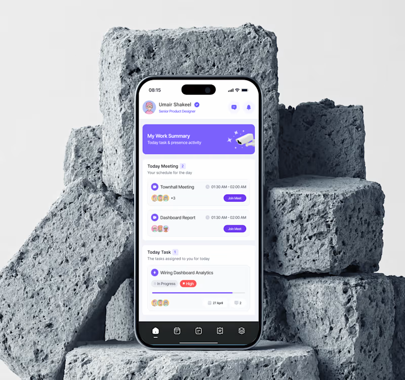
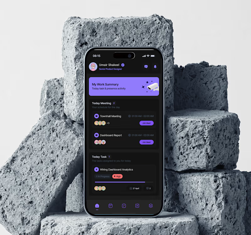
Dark mode for evenings, but light feels easier for daily use. Both look clean though!