The network for creativity
Join 1.25M professional creatives like you
Connect with clients, get discovered, and run your business 100% commission-free
Creatives on Contra have earned over $150M and we are just getting started
Back to feedPost
Taste Test

Two camera distances for the same Movable Ink cut. One leans in, one shows the whole layout. 1 or 2.
10 voted
50%
10 voted
50%
20 votes
Closed

2 is more stunning the animations feels unique and that's unbelievable 🎉🎉🔥🔥
great job Blahomyr❤️❤️


Super nice


i love both!

Both work, but I lean toward the wider shot. Seeing the whole layout makes the flow easier to follow.

Cracking work, Blahomyr!

2 is more easy on the eyes.
It allows the viewers to see what the product is about without necessarily being led, like the first sample.

Going with 2 here. The full layout reads the whole story at once, and the animation feels more cinematic from that distance.
The network for creativity
Join 1.25M professional creatives like you
Connect with clients, get discovered, and run your business 100% commission-free
Creatives on Contra have earned over $150M and we are just getting started






Related posts

WIP - Brand Identity
Which one?
9 voted
47%
10 voted
53%
19 votes
Closed
B is more suitable for these textures ❤️❤️
Great job Gaber🎉🎉🔥🔥


Two directions, one identity. 🖤❤️
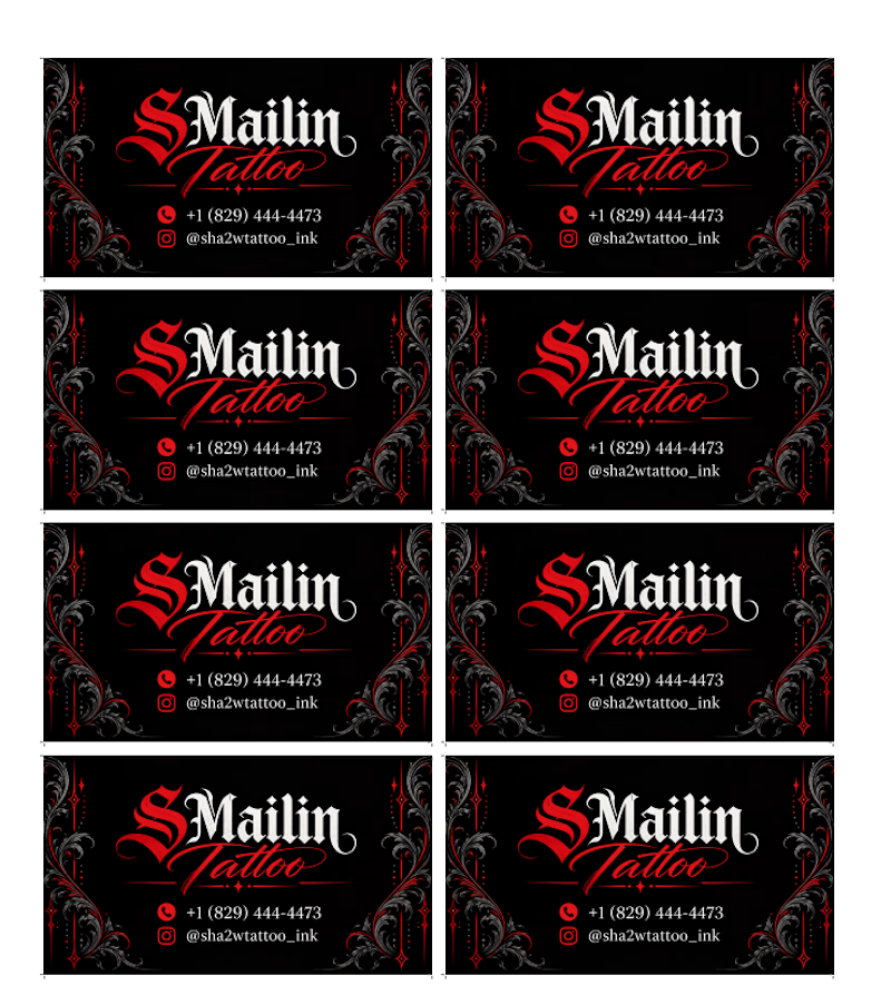
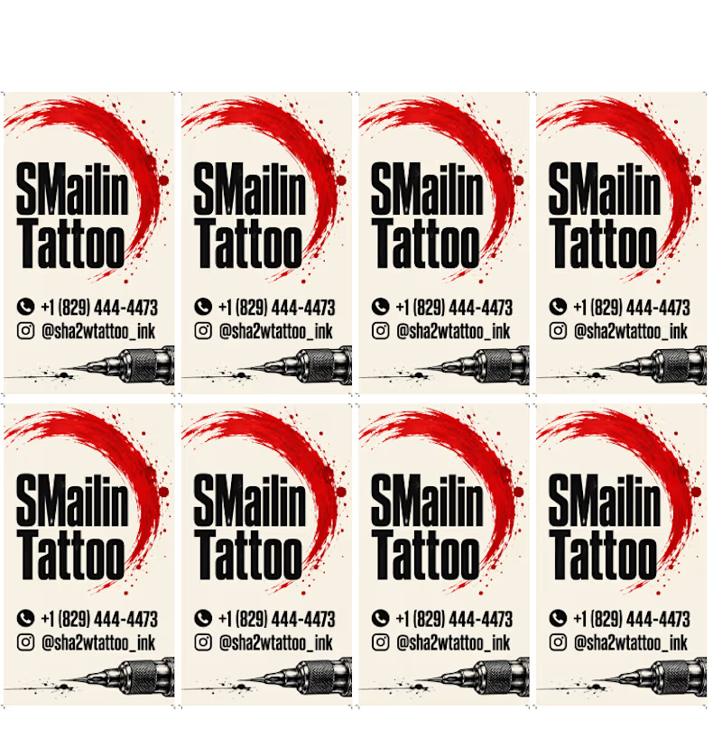
Horizontal and vertical business card concepts for SMailin Tattoo, exploring bold contrast and clean layouts.
Which one would you choose?
🅰️ Horizontal
🅱️ Vertical
Vote A or B in the comments! What would you improve? 👇
#GraphicDesign #BusinessCardDesign #BrandIdentity #TattooStudio #DesignFeedback
1 voted
25%
3 voted
75%
4 votes
Closed
Same Design.com promo, two crops. Square keeps the desk tight, wide gives the room its light. 1 or 2.
11 voted
73%
4 voted
27%
15 votes
Closed