The network for creativity
Join 1.25M professional creatives like you
Connect with clients, get discovered, and run your business 100% commission-free
Creatives on Contra have earned over $150M and we are just getting started
Back to feedPost



Love this!

It is giving earlier windows vibe.

Old window vibes

and pairing it with a brutalist, tactile gray shifts the narrative entirely.

Grey is the new white for sure! I love the pop of blue with this as well. They compliment each other so well


This is good

Wow nice work

Goated broo

100%

Amazing!

Love this! Reminds me of computer startup screens, which is a cool aesthetic

Awsome


Nice work👏🔥

Nice Job

This looks awesome!

On point

Perfect palette, Sam!

amazing work

Happy Monday💕 great minds.

solid as usual my man

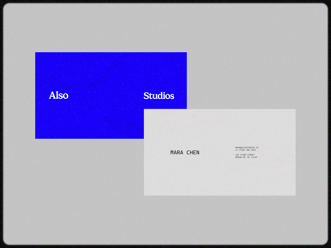
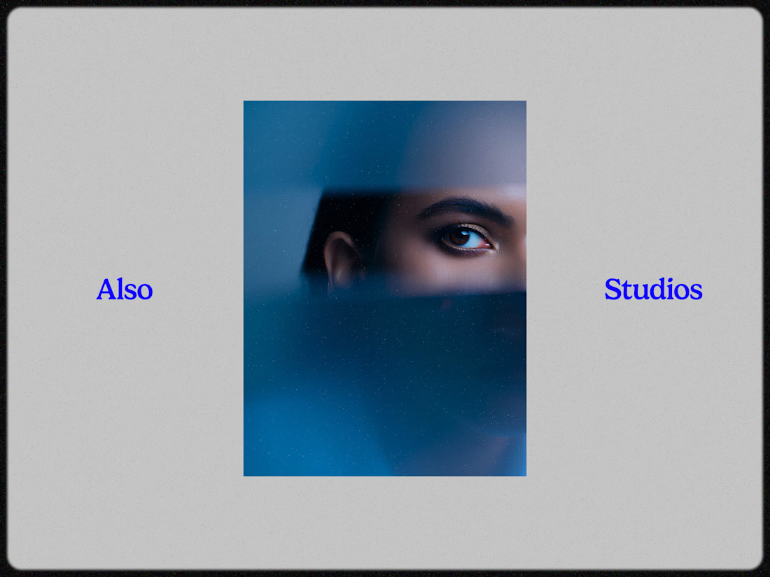
The grey-and-royal-blue palette for Also Studios is such a sharp choice — it feels premium and timeless without being stiff. The photography integration with the type system is seamless. Really clean brand identity work!

Loving the minimalistic approach to this logo. It’s modern and timeless.

Yes it is

It seems to be trendy in hospitality industry as well, these kind of aesthetics are very nice but I feel a bit saturated.


Fr, grey set a more neutral tone than white does.


Love it

nice design

Nice!

we calling white grey or grey white ?
The network for creativity
Join 1.25M professional creatives like you
Connect with clients, get discovered, and run your business 100% commission-free
Creatives on Contra have earned over $150M and we are just getting started





Related posts


Does an AI brand still need to look like an AI brand?
Lupr helps small and growing businesses adopt AI without the complexity, so the identity needed to do the same.
We built a clean, approachable system around movement, connection and continuous improvement, without leaning on the usual futuristic tech clichés.
The idea was simple: make AI feel like useful business infrastructure, not something you need to be an expert to understand.
As AI becomes part of everyday business, do you think brands still need to visibly signal “AI”?
Full case study below 👇


Great design it feels alive 🎉🎉❤️❤️

Light or dark, which one wins? ☀️🌙
Same site, two moods. Warm stone and lacquer red, or the same build after dark.
Both are hand-built with a 3D paper crumple, real physics, a stick-figure film drawn in code, and a receipt that gets a bicycle kick. 🔊 Sound on.
Tell me which you'd ship: light or dark? 👇
26 voted
59%
18 voted
41%
44 votes
Closed

I really like how the light version looks, but it has some legibility issues. Since readability is more important for users than visual appeal, I think the dark version is the better option.
BTW, I initially voted for the light version, but after analyzing both options more closely, I changed my mind 😄

A few things we’ve been working on this month.
Different industries, different problems, but the same goal: making complex products feel simple, clear, and trustworthy.
Fintech → Investment Banking → Geospatial AI
More projects are still in progress.
Full case studies coming soon.


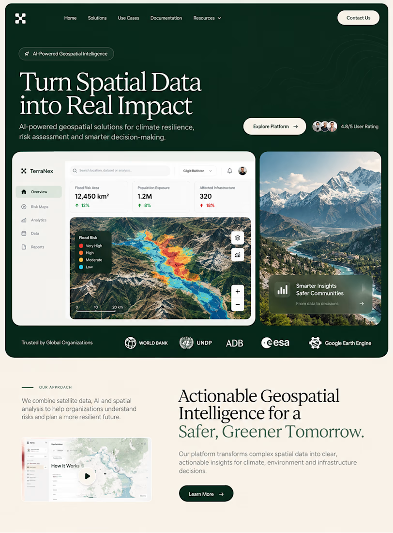
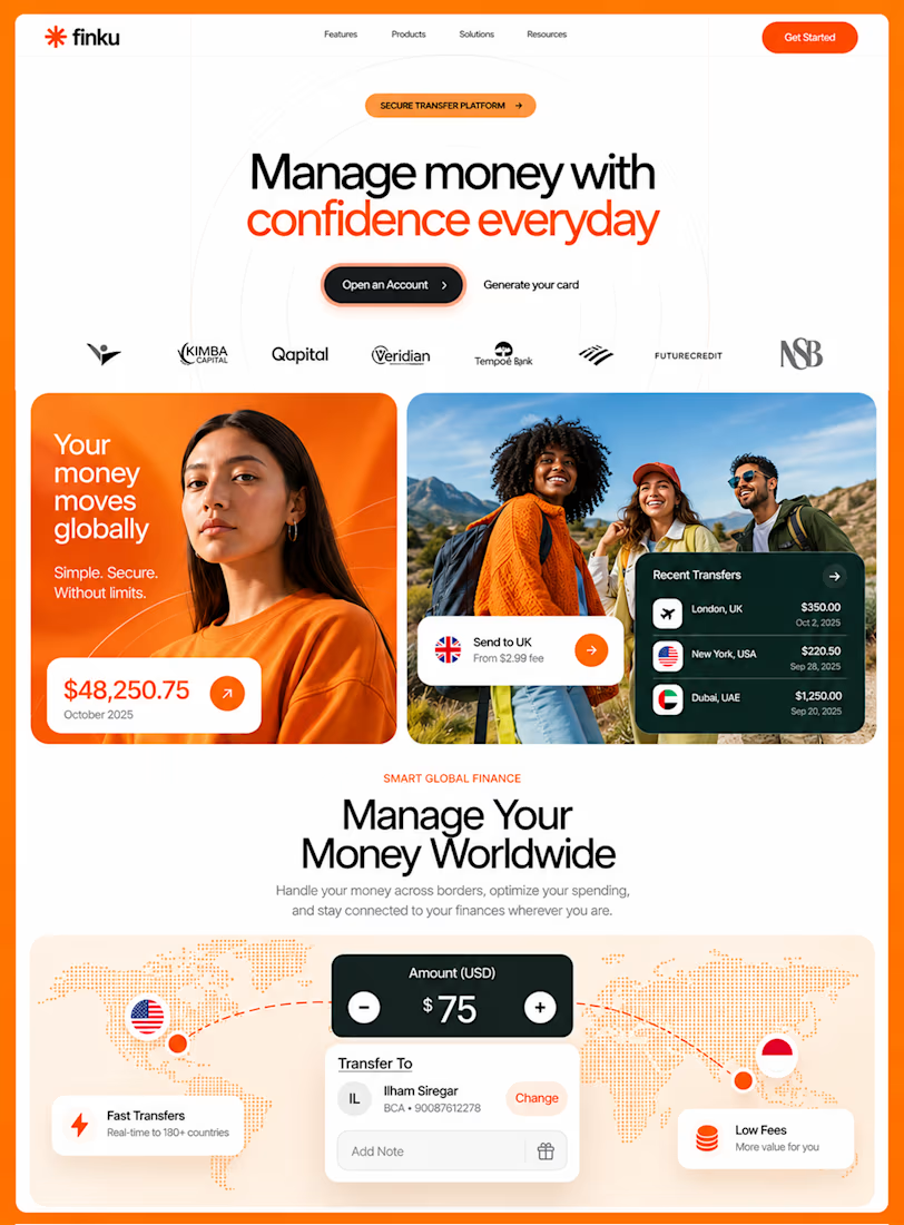
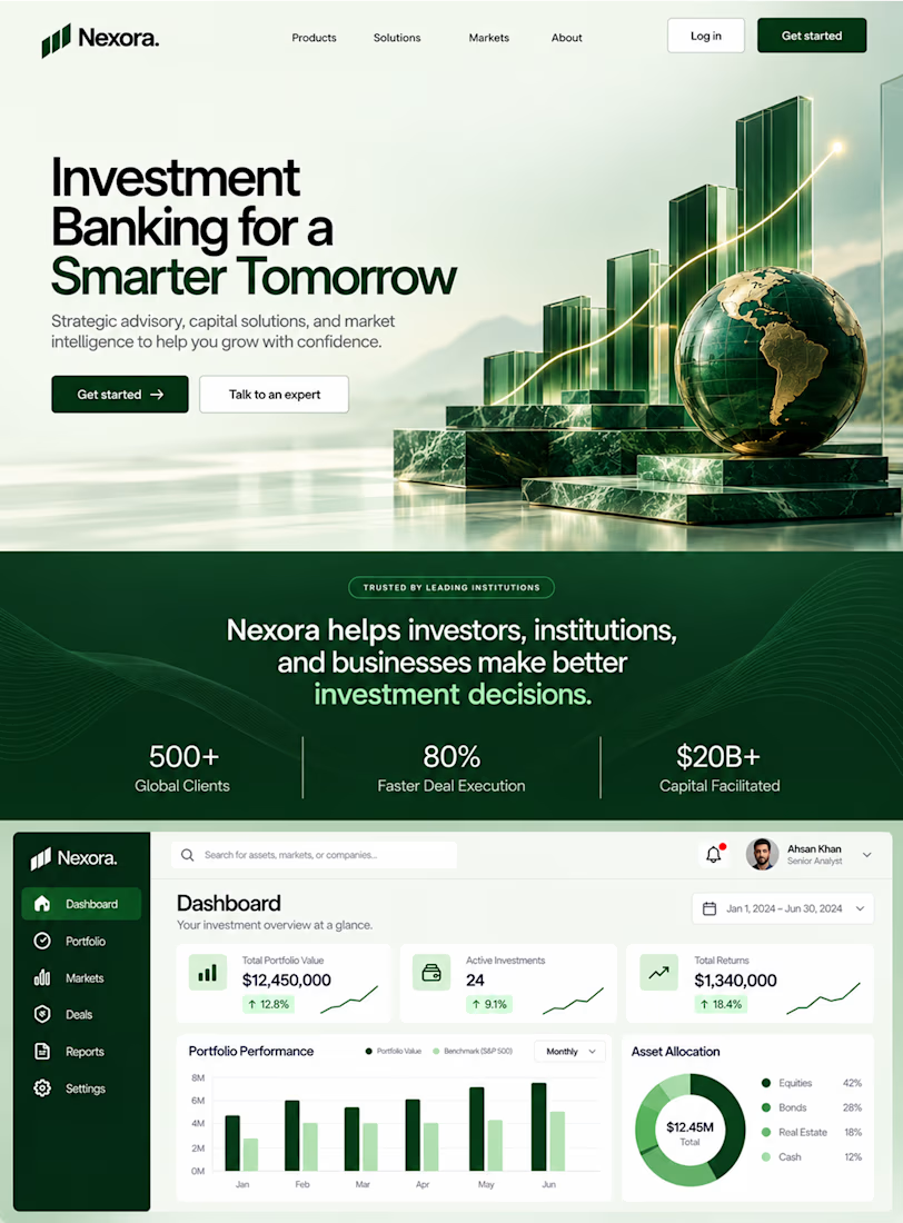

This is the kind of work I enjoy seeing — simple, focused, and actually thought through.


