
pro
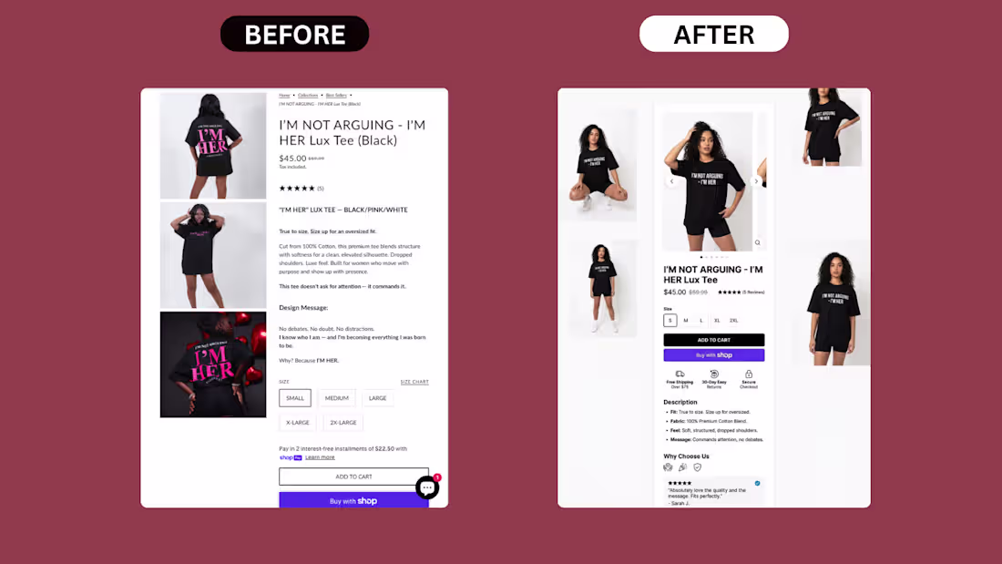
Something simple but efficient. Mobile PDP rebuild for a Shopify apparel brand:
What was wrong with the original:
1. Images stacked vertically, eating mobile real estate
3 lifestyle shots stacked on top of each other forced buyers to scroll 4+ times before reaching the buy section. Mobile attention dies fast.
2. Title in all caps, hard to scan
"I'M NOT ARGUING - I'M HER LUX TEE (BLACK)" on one line in caps. Caps look loud but read slower. Buyers skim, they don't decode.
3. Description wall before the buy decision
5 paragraphs of brand voice — "This tee doesn't ask for attention," "Design Message," "Why? Because I'M HER." — placed between the price and the size selector. Cold buyers stopped reading.
4. Size buttons cramped, no visual hierarchy
Size options shown as plain rectangles with no spacing logic. Felt secondary.
5. Add to Cart was an outlined button
Looked passive. The "Buy with Shop" button below it was more prominent than the primary CTA.
6. Reviews buried
5 reviews shown only as stars near the top. The actual review text was nowhere to be found on mobile.
7. No trust signals near the buy decision
No shipping. No returns. No security. Buyers had to scroll the footer to find any reassurance.
What we shipped:
– Rebuilt the image gallery into a horizontal carousel with thumbnails (less scroll, more product)
– Restructured the title into proper case for faster scanning
– Moved the description into a clean bullet block: Fit, Fabric, Feel, Message
– Surfaced reviews directly on the PDP with a real customer quote + name + verified badge
– Redesigned size selector with clear spacing and proper touch targets
– Made Add to Cart the dominant CTA (solid black, full width)
– Kept Shop Pay button as a clear secondary option
– Added a horizontal trust row right under the buy section: Free Shipping Over $75, 30-Day Easy Returns, Secure Checkout
– Built a "Why Choose Us" section to handle objections before the buyer leaves
Sometimes a PDP doesn't need a redesign. It needs the same content, restructured for how buyers actually scan on mobile.
Is your Shopify PDP built for the way buyers read, or just the way you wrote it?
DM if your mobile PDP needs a sharper layout.
1
90
Most personal brand sites are just digital business cards.
This one runs itself.
I built a Webflow site and a custom CMS for Gaby Castellanos. Marketing strategist, creative force, and by her own positioning, the Queen.
The brief: a site as bold as she is, that she can fully manage herself without touching code or calling a developer.
The design had to earn attention. Oversized typography. A black canvas with one sharp red accent. Hand-drawn annotations instead of stock photos. Every section built to feel like her, not a template.
The achievements section isn't a list. It's a scroll-animated timeline where each milestone checks itself off as you move down the page. Storytelling with motion built in.
Then the part that actually matters long term: a custom CMS.
Her events calendar, organized by month with dates and links.
Her projects and products, each with a clean card and its own detail view.
Her solutions, opening into smooth horizontal case panels.
She adds an event, it appears. She launches a product, it goes live. No developer in the loop.
Most personal sites look good on launch day and go stale a month later.
This one was built to stay alive.
If you want a website built to convert and easy to run, reach me out.
2
128
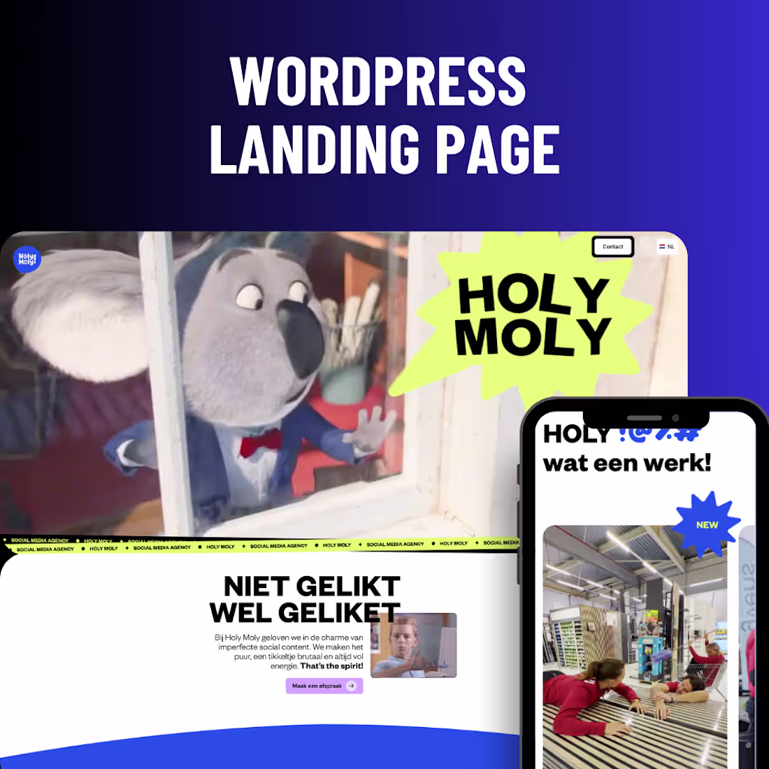
Project Overview
Holy Moly is an Utrecht-based social media agency that produces bold, deliberately unpolished short-form content for brands like Karwei, Triodos, and Bauhaus. They needed a website that matched the irreverent energy of their work, showcased a heavy library of video output, and converted brand-side visitors into booked calls — across both Dutch and English audiences.
Our Approach
Designed a high-energy, motion-led brand site reflecting their "niet gelikt, wel geliket" positioning
Built a custom WordPress + Elementor implementation with reusable, editable sections
Engineered a video-first portfolio using self-hosted MP4 clips and lightbox playback for fast, frictionless viewing
Implemented a bilingual (NL/EN) structure with a clean language switcher
Optimized media-heavy pages for performance with SVG assets, font-display swapping, and external CSS delivery
The Solution
The final site leads with personality: animated marquees, looping reels, and a clear service breakdown guide visitors from first impression to contact without friction. Client logos and behind-the-scenes footage build credibility, while a single, repeated call-to-action keeps the conversion path obvious. The result is a fast, scannable site that feels as distinctive as the content the agency produces.
Services Provided
UI/UX Design
Website Design
WordPress Development
Conversion Rate Optimization (CRO)
Performance Optimization
Responsive Development
CMS Setup
Tech Stack
WordPress, Elementor, HTML, CSS, JavaScript, SVG, self-hosted video, YouTube embeds, multilingual setup, Google Fonts:
1
128
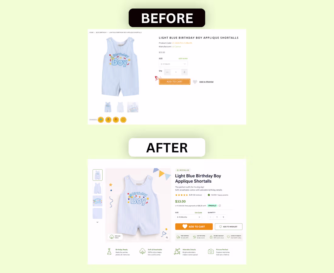
Before / After of a Shopify PDP we rebuilt for a kids clothing brand last month:
What was actually wrong with the original:
1. The page didn't sell — it just listed
It treated visitors like they were already convinced. No emotion. No benefits. No proof. Just SKU, price, and a button.
2. Hierarchy was inverted
The product code was more visible than the product name. Social share buttons got more attention than reviews (which didn't exist).
3. Zero objection handling
Parents buying kids clothes online have specific concerns: fabric quality, sizing, return policy, shipping speed. None of it was answered.
4. The Add to Cart felt broken
The dashed border made it look like a dev placeholder. Buyers hesitate when buttons don't feel finished.
5. No proof. Anywhere.
A store with no reviews above the fold is leaving conversions on the table from the first scroll.
What we shipped:
– Rebuilt the entire above-fold for emotional + rational buying
– Added a "Bestseller" tag above the title for instant social proof
– Wrote a 2-line emotional benefit line under the product name
– Pulled in real reviews above the fold with a star rating + review count
– Added a "10,000+ happy parents" trust badge
– Enabled Afterpay for payment flexibility on impulse buys
– Built a 4-icon benefit row: Birthday Ready, Soft & Breathable, Adorable Details, Picture Perfect
– Added a horizontal trust row: Free Shipping, Easy Returns, Secure Checkout, Loved by Parents
– Replaced the broken-looking CTA with a clean, high-contrast Add to Cart button
– Restructured the image gallery with larger product imagery and a "100% Soft Cotton" tag on the photo
Most Shopify PDPs aren't broken because of the theme. They're broken because nobody asked: "If I landed here cold, would I buy?"
Is your PDP selling, or just listing?
1
178
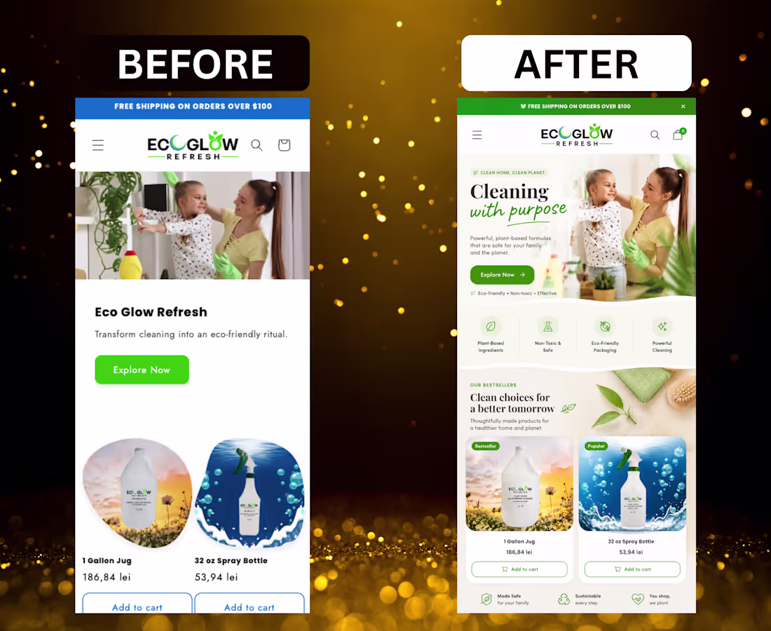
Most ecommerce brands sell products.
The best ones sell a lifestyle.
This homepage felt generic, flat, and forgettable — even though the product itself had strong potential.
So I redesigned it for conversion.
Here’s what changed:
Repositioned the brand emotionally
Instead of “eco cleaning products,” the new direction sells a cleaner, healthier home lifestyle.
Turned the hero into a story
The BEFORE looked like a basic catalog section.
The AFTER creates warmth, family safety, and emotional connection instantly.
Rebuilt the hierarchy for mobile
Clearer eye flow. Bigger value prop. Better spacing. Faster understanding.
Upgraded product perception
The products now feel premium, intentional, and trustworthy — not generic white-label cleaners.
Added invisible trust engineering
Plant-based. Non-toxic. Eco-friendly. Safe for family.
The reassurance is layered naturally into the design.
Improved the visual merchandising
The new product cards feel curated instead of randomly placed.
Made the brand feel alive
Organic shapes, softer transitions, editorial composition, and cleaner art direction make the storefront feel human.
Increased perceived brand value
The BEFORE looked like a small Shopify store.
The AFTER feels like a modern DTC eco brand.
Pretty design gets attention.
Emotional positioning gets conversions.
DM if you want to optimize your Shopify.
2
3
247
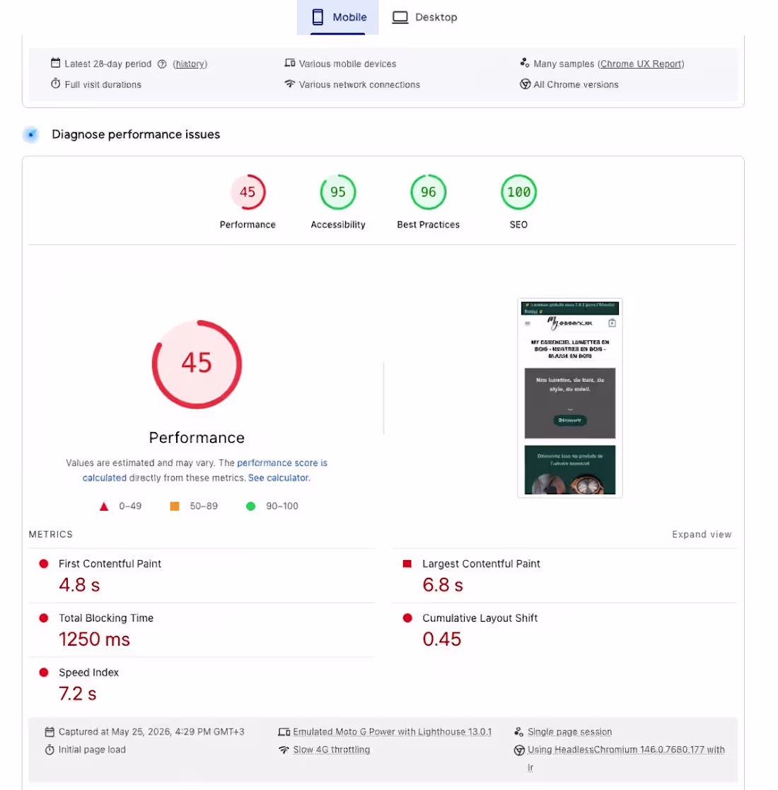
From 45 to 90 on PageSpeed. Same website. Same hosting.
This is what a real performance optimization looks like on a WooCommerce store.
Before:
Performance score: 45 (red).
First Contentful Paint: 4.8s.
Largest Contentful Paint: 6.8s.
Total Blocking Time: 1250 ms.
Speed Index: 7.2s.
Cumulative Layout Shift: 0.45.
Every single metric in the red. The site was bleeding conversions on mobile before anyone even saw a product.
After:
Performance score: 90 (green).
First Contentful Paint: 1.7s.
Largest Contentful Paint: 3.5s.
Total Blocking Time: 0 ms.
Speed Index: 2.7s.
Cumulative Layout Shift: 0.
Every metric either green or nearly there. Same theme. Same hosting. Same products. The difference was purely technical optimization.
What changed? No magic plugin. No "install this one tool and watch your score jump." It was a combination of proper image optimization, cleaning up render-blocking resources, eliminating unnecessary scripts, fixing layout shifts, and restructuring how assets load on mobile.
Most WooCommerce store owners don't realize their site is slow because they test it on their fast Wi-Fi with a powerful laptop. Their customers are on 4G, on a mid-range phone, scrolling between five other tabs.
That 4.8 second first paint wasn't just a bad number on a report. It was real people leaving before they ever saw a product. Real revenue lost every single day.
Performance isn't a vanity metric. It directly impacts conversions, SEO rankings, and how much you're actually paying per visitor from ads.
A slow site doesn't just feel bad. It costs money.
If your store loads in over 3 seconds on mobile, you're not competing. You're just paying for traffic and watching it leave.
2
223
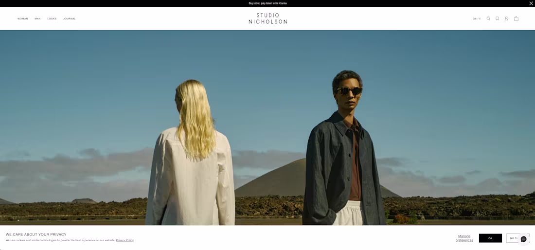
Shopify Fashion Store
Developed a premium Shopify storefront inspired by modern luxury fashion brands, focused on minimalism, typography, and elevated product presentation. The goal was to create a refined shopping experience that reflects the brand’s clean aesthetic and premium identity.
Scope of the project:
-Custom Shopify development
-Minimal luxury-inspired UI/UX
-Advanced product collection structure
-Responsive mobile optimization
-Editorial-style layouts and typography
-SEO basic optimization
-CRO optimization for improved conversions
-Optimized navigation and shopping flow
-High-end product presentation
-Performance optimization and faster loading speeds
-Brand-focused visual storytelling
The final result is a sophisticated Shopify ecommerce experience that feels clean, modern, and conversion-focused while maintaining a premium fashion aesthetic.
0
197
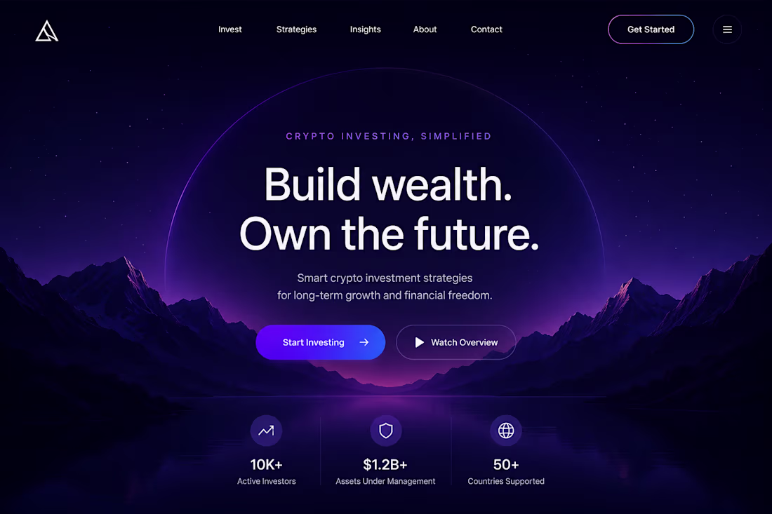
WordPress Crypto Landing Page
Designed a modern crypto investment landing page for a WordPress website with a completely different creative direction focused on atmosphere, depth, and futuristic branding.
1
196
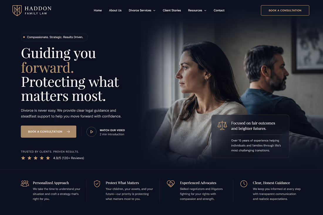
Custom Webflow Landing Page
Designed and developed a premium Webflow website for a modern divorce & family law firm focused on trust, clarity, and professionalism. The goal was to create a high-end digital presence that feels approachable while still communicating authority and experience.
Scope of the project:
-Custom Webflow landing page design
-8-section conversion-focused page structure
-Premium dark UI with elegant gold accents
-Responsive layout optimized for desktop & mobile
-High-converting hero section with strong CTA placement
-Service overview & legal process sections
-Client testimonials and trust-building components
-Resource/blog preview section for SEO positioning
-Fully structured visual hierarchy and typography system
-Clean modern interactions inspired by luxury legal brands
The final result is a polished, conversion-oriented Webflow experience that positions the firm as trustworthy, modern, and highly professional while maintaining an emotional and human-centered approach.
0
162

WIX → Framer Migration
Redesigned and migrated landing page from WIX to Framer with a focus on premium visual direction, performance, and conversion-driven UX.
Scope of the project:
-Full landing page redesign
-Custom Framer layout & responsive structure
-Improved visual hierarchy and typography
-Modern dark UI with interactive-style elements
-CRO improvement
-Faster loading experience and cleaner animations
-Rebuilt brand presentation to feel more premium and scalable
The result is a sleek, high-end consulting landing page that feels significantly more modern & polished.
1
157