
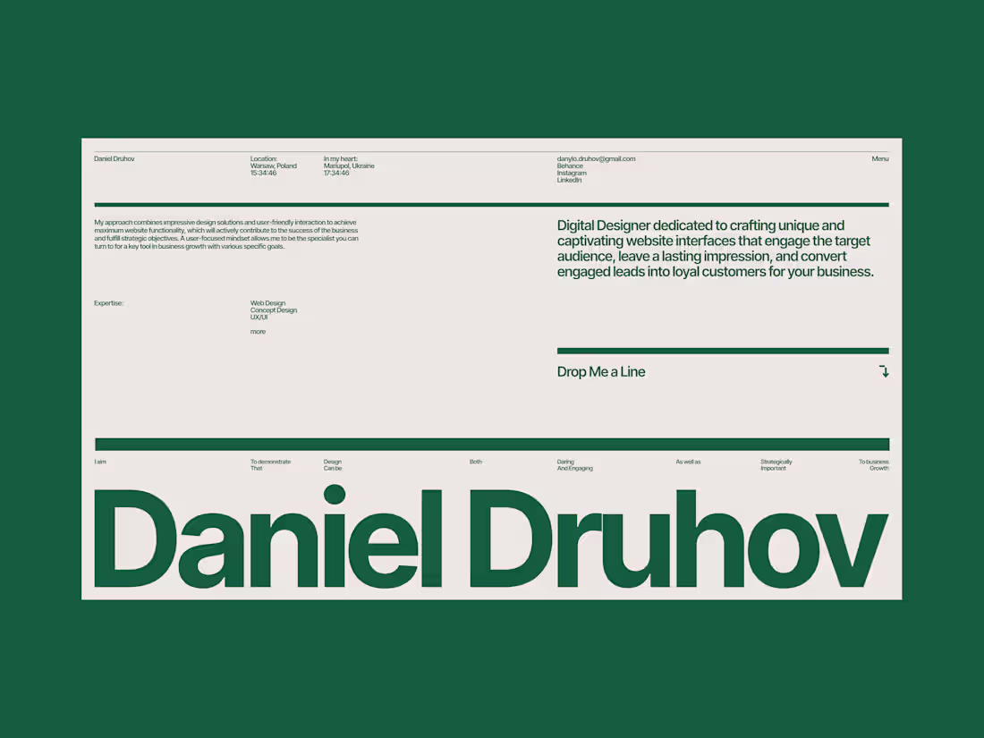
Danylo Druhov
Design and Webflow development built for real use.
- $1k+
- Earned
- 1x
- Hired
- 5.00
- Rating
- 40
- Followers
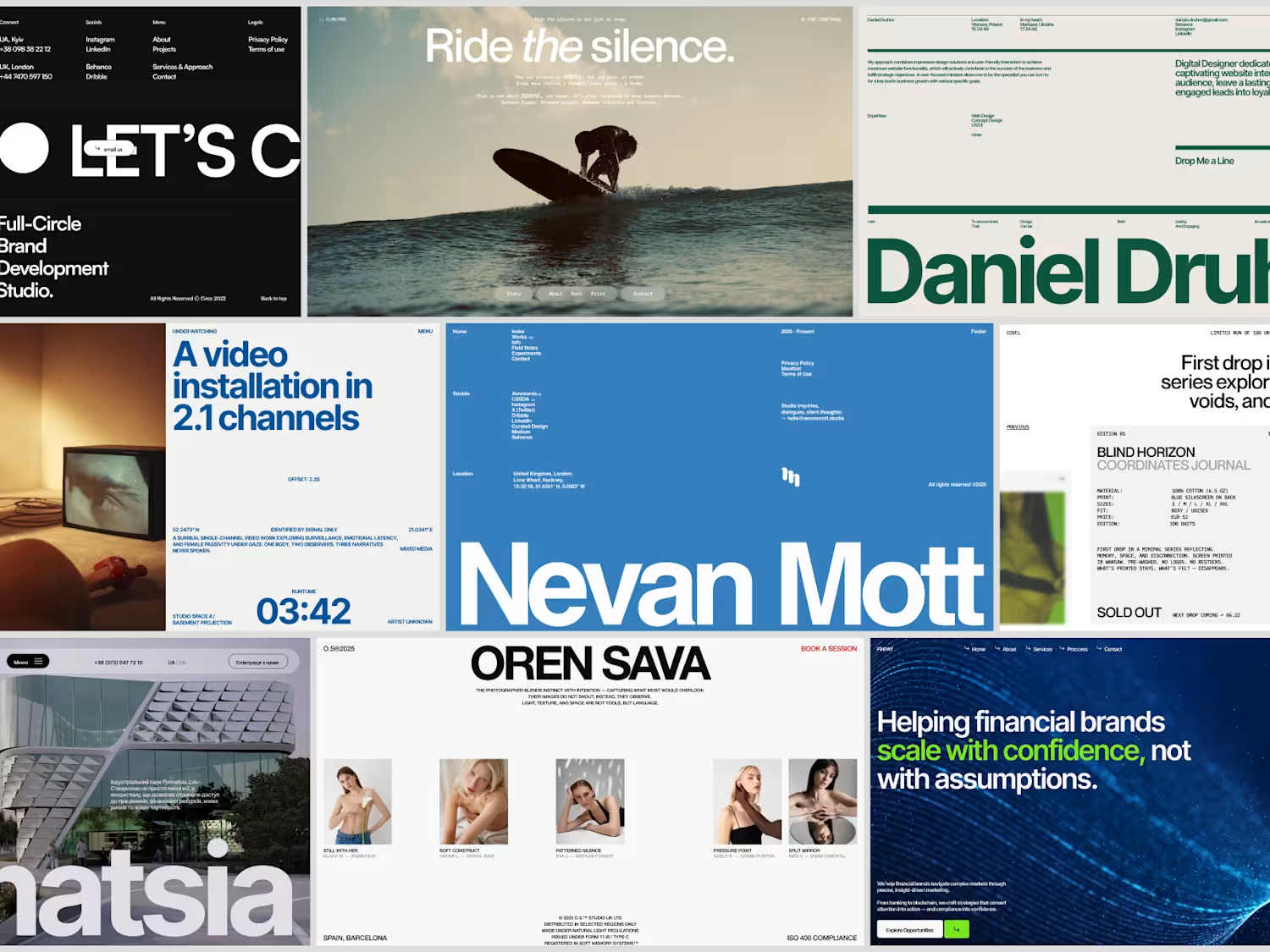
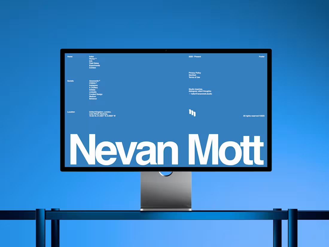
You already know how I feel about navbars and footers so this time I'm sharing a footer 💙
Take a look at the balance, typography, and color. One glance and it's immediately clear — this belongs to a serious website. That kind of confidence doesn't come from decoration, it comes from decisions.
This footer is from Nevan Mott's portfolio and it even got noticed by the Footer Design gallery, (https://www.footer.design/) which honestly made my day some time ago 😊
Curious what you see in it, guys!
2
3
264
Website Design for MISCHKA Agency
5
27
Recently had a chance to work on a finance-focused project and this was one of the hero-section concepts built around the company’s goals, positioning, and existing brand elements.
Wanted to keep the balance between a clean financial feel and something a bit more dynamic visually. Strong readable typography, accent-driven CTA’s, layered glassmorphism elements, and a moving background that gives the whole screen a more alive and modern atmosphere without making it feel overloaded.
Overall, I think the result came out pretty clean, user-oriented, and flexible enough to scale naturally across the rest of the website!
Would honestly love to explore more projects in this space 👀
9
8
594
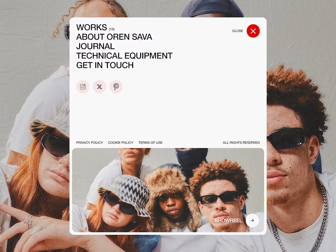
Menus always felt like their own little design world to me. Probably some of my favourite parts to work on in almost any project. Same with footers, actually ✨
Most sections on a website need structure and logic, but menus are one of the few places where you can still play with composition, interaction, rhythm, and overall mood without hurting usability.
This one was more of an open menu exploration.
Large typography, socials, legal blocks, layered imagery, oversized spacing, and the showreel section at the bottom acting almost like a second focal point instead of just another button.
Small thing, but it makes the whole menu feel way more alive and dynamic 👀
Always loved treating menus as more than navigation — one of the few places where you can leave a stronger creative fingerprint on the whole experience!
5
5
686
Website Design for NOAR Studio
5
29
UMBA — Award Winning Military Accelerator Website
3
17
Didn’t want this concept to just sit unused, so I decided to bring it to life in Webflow. Experimented with GSAP animations, hover states, and small interaction details to see how it would feel beyond static design 🙌
Feels like a completely different piece now.
Would love to hear your thoughts 👀
4
5
800
Color palette does way more than most people think.
It’s not just about making something look good or “designy”, it actually shapes how people perceive your product, your brand, and even you as a person!
Before someone reads a single line of text, they already feel something, and a big part of that comes from color. It sets the tone instantly and quietly defines what kind of experience they’re about to have, you know?
Some time ago I was exploring different concepts for my portfolio. Same layout, same typography — only the palette changes.
And it’s crazy how different it feels:
The 1st version feels more structured and calm, the 2nd and 3rd leans more into a creative direction, and the last one honestly feels like a Pentagon designer took over 😂
So yeah, color isn’t decoration. It’s one of the core tools that defines the mood and first impression of your work.
Worth keeping in mind when you design your next site 👀
2
7
753
Landing Page Design & Development for BraveBrand
4
17
This is my portfolio from 2025.
Designing for yourself is always the hardest part - balancing clarity, restraint, and expression isn’t easy when you’re both the client and the designer.
I kept it simple: one screen, minimal structure, clear positioning and strong emphasis on the work, where everything is easy to navigate and understand.
Looking back, it still holds up.
Planning to revisit and update it soon.
Curious to see how long it will take this time 😂
4
6
710
Website Design for a marketing agency Vocado, focused on strong visual identity, layout composition, and a balance between expression and clarity.
3
482
Website Design for an interior design studio, combining a minimal visual direction with a premium, composition-driven layout.
3
430