The network for creativity
Join 1.25M professional creatives like you
Connect with clients, get discovered, and run your business 100% commission-free
Creatives on Contra have earned over $150M and we are just getting started
Back to feedPost
Menus always felt like their own little design world to me. Probably some of my favourite parts to work on in almost any project. Same with footers, actually ✨
Most sections on a website need structure and logic, but menus are one of the few places where you can still play with composition, interaction, rhythm, and overall mood without hurting usability.
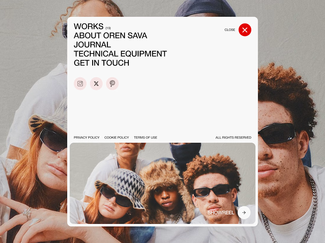
This one was more of an open menu exploration.
Large typography, socials, legal blocks, layered imagery, oversized spacing, and the showreel section at the bottom acting almost like a second focal point instead of just another button.
Small thing, but it makes the whole menu feel way more alive and dynamic 👀
Always loved treating menus as more than navigation — one of the few places where you can leave a stronger creative fingerprint on the whole experience!


Looks amazing✨

Thank you :)))


Great visuals!
Thank you!
welcome
The network for creativity
Join 1.25M professional creatives like you
Connect with clients, get discovered, and run your business 100% commission-free
Creatives on Contra have earned over $150M and we are just getting started

Challenges
View all


Related posts


In recent days I’ve been practicing designing around an image.
Sometimes an image can have great potential and reinforce the message we want to convey. I’m not saying this is the correct way to prepare a strategy, it’s simply an exercise. As a result, I created these three hero section designs, which I’ve published in the Figma community where they can be freely used for experimentation.
If you use them, I’d love to see the outcome, so make sure to tag me!

So beautiful


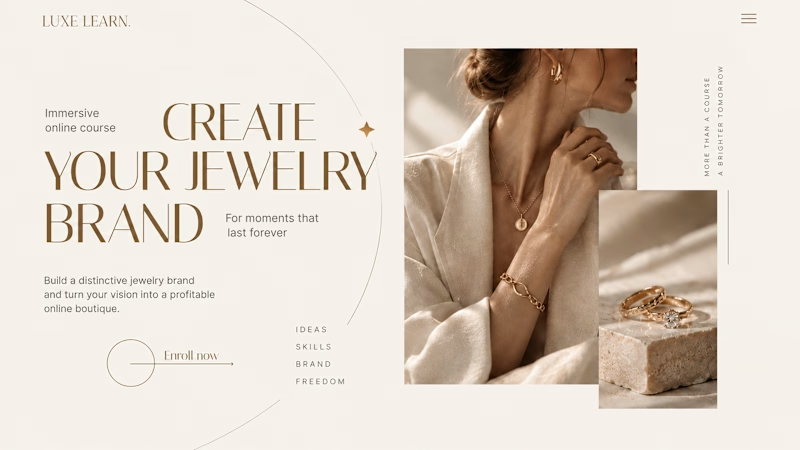
Same course. Same content. But two completely different feelings ✨
Which version would you choose?
27 voted
59%

19 voted
41%
46 votes
Closed

Option 2 is more practical ❤️❤️