The network for creativity
Join 1.25M professional creatives like you
Connect with clients, get discovered, and run your business 100% commission-free
Creatives on Contra have earned over $150M and we are just getting started
Back to feedPost
Brand new case study up! Had loads of fun with this one
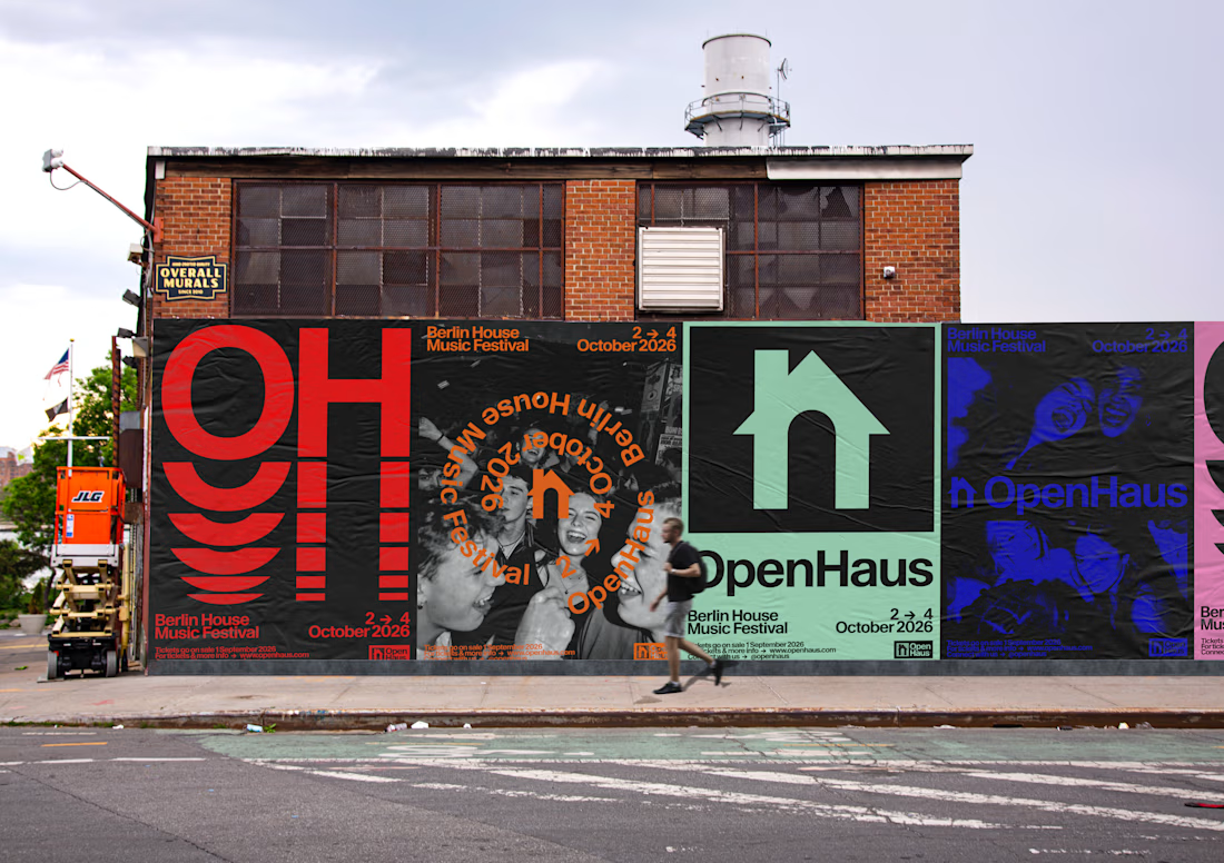
OpenHaus is a vibrant house music festival, made for anyone and everyone. The visual identity leans into bold, saturated color paired with bold typography and structured, grid-based layouts. It feels colorful and inviting on the surface, but stays grounded by a level of restraint that gives it a more considered feel.


Looks nice 👍🏻

Thank you!

Love this case study! OpenHaus as vibrant house music festival for everyone - and that bold saturated color + bold typography + grid system totally nails it! That OH wall mural is fire, feels so colorful and inviting! Checking full case study!
❤️❤️❤️

The red OH lettering on that brick wall mockup hits hard.


the h that doubles as a little house is such a good fit for a house music festival. curious how it holds up really small, like on a wristband or ticket

Lovely work, very polished
Thank you! 🤍

Super clean design!
thank you 💓💓

Great art🎉🎉
thank you 🤍🤍
Pardon Nadia❤️
The network for creativity
Join 1.25M professional creatives like you
Connect with clients, get discovered, and run your business 100% commission-free
Creatives on Contra have earned over $150M and we are just getting started





Related posts

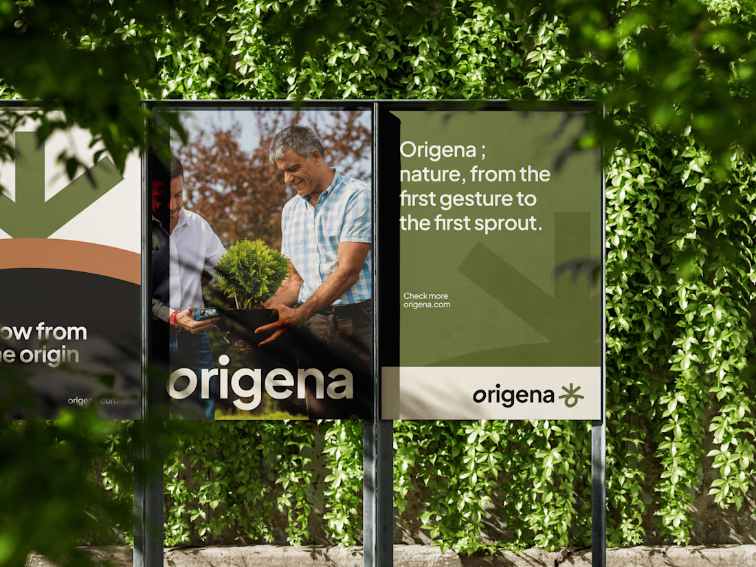
This is another completed Branding made for Origena. Most garden brands go one of two ways: sterile big-box retail, or hand-lettered cottagecore. Origena sits between them. The name comes from origin the belief that growing things is less about buying a plant and more about understanding where it came from and what it needs next.
The symbol is the whole idea compressed: a sprout reaching up, a seed curled below, and the horizon line of soil between them. It works as a standalone mark, an oversized graphic device on apparel and tote bags, and a cropping element across signage.


Looks amazing!

I designed and built the website for The IBT Group, a process transformation consultancy from Australia. 30 years in the field, 37 countries, more than 6,000 people trained, and clients like PepsiCo, Rolls-Royce and HSBC
They came with an AI-generated draft: one long page that took five minutes to read and showed every service at once. For a company that sells clear processes, the site did the opposite
The idea is structure cut out of chaos. The hero runs a film of frosted glass channels carved through rough stone that turn into a top-down process map, and the headline ends on "Purpose. Speed. Integrity." in an italic serif
Before that I tried a dark version with a dotted globe and a light one with a night city photo. Both looked like every other consulting site, and the second left me one thing to keep: the serif accent
On the live site Process Mining is a pinned block whose tabs switch as you scroll, the Lean Six Sigma belts run from White to Diamond, and each solution got its own page instead of a paragraph on the home page
Live site: theibtgroup.com

Vladyslav, this is super clean work! Transforming an AI-generated long page into a proper site for a 30-year consultancy like The IBT Group is no small task. Love the "Purpose. Speed. Integrity." direction - feels very premium and matches clients like PepsiCo and Rolls-Royce....


Another project wrapped up! ✨ And this one was a little different for us.
For the first time, we designed and built an entire Kajabi website in Dutch. And here's the thing – nobody on our team speaks Dutch. 😅
Was it a little intimidating at first? Absolutely.
But we had an incredibly patient client who provided all the content we needed, and we focused on what we do best: design, development, and creating a great user experience.
The result? A beautiful website, a fully set-up course platform, and a client who's 100% happy with the outcome.
A little reminder from this project: Don't be afraid to take on something you've never done before.
Trust your skills, trust your experience, and sometimes just say yes to the challenge. You might surprise yourself.


Well done! Looking forward to seeing more of your Kajabi work.