Website Design for Architectural Photography Academy

Arty Web Design


Website Design for Architectural Photography Courses
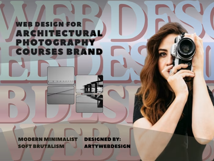
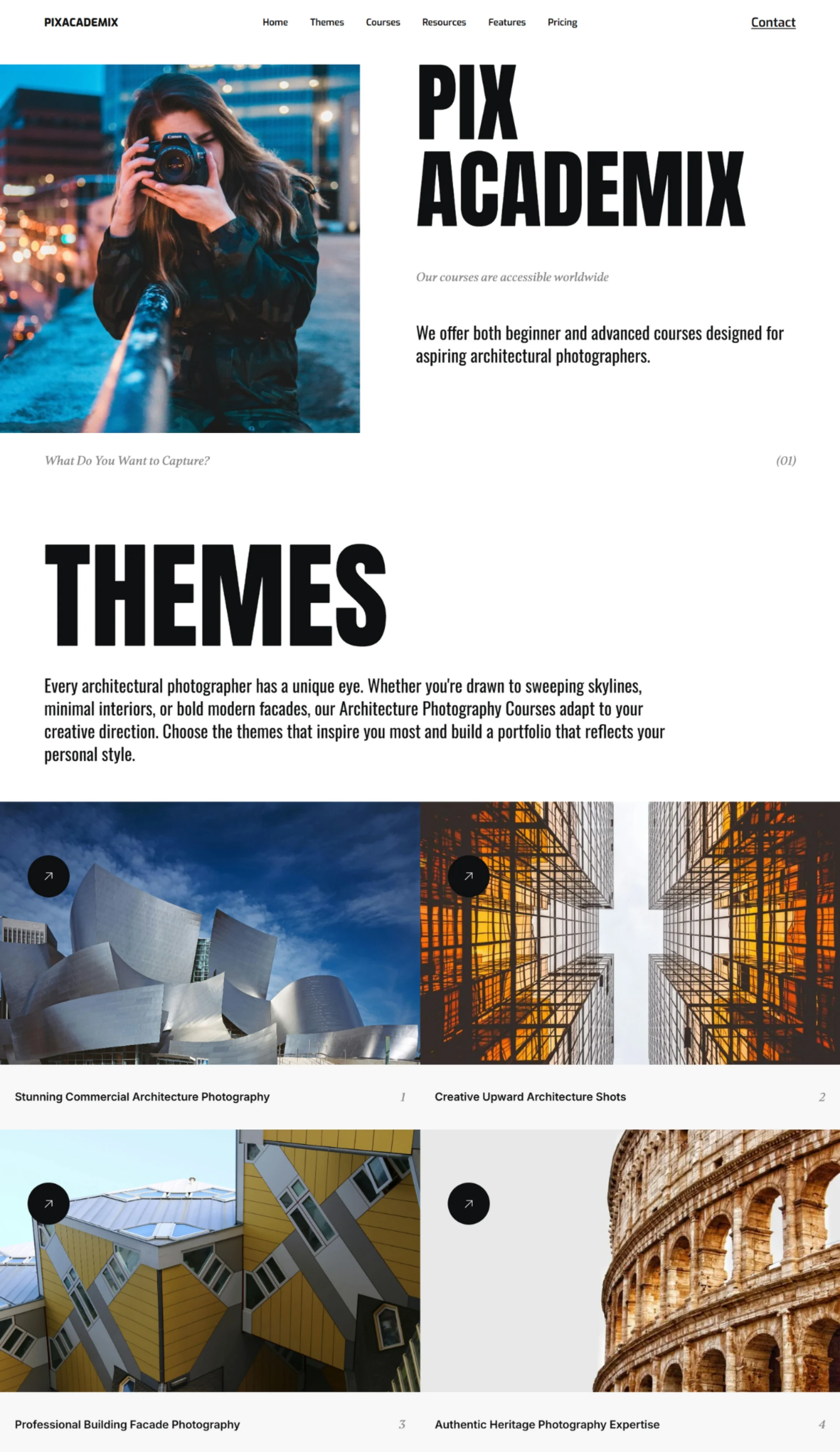
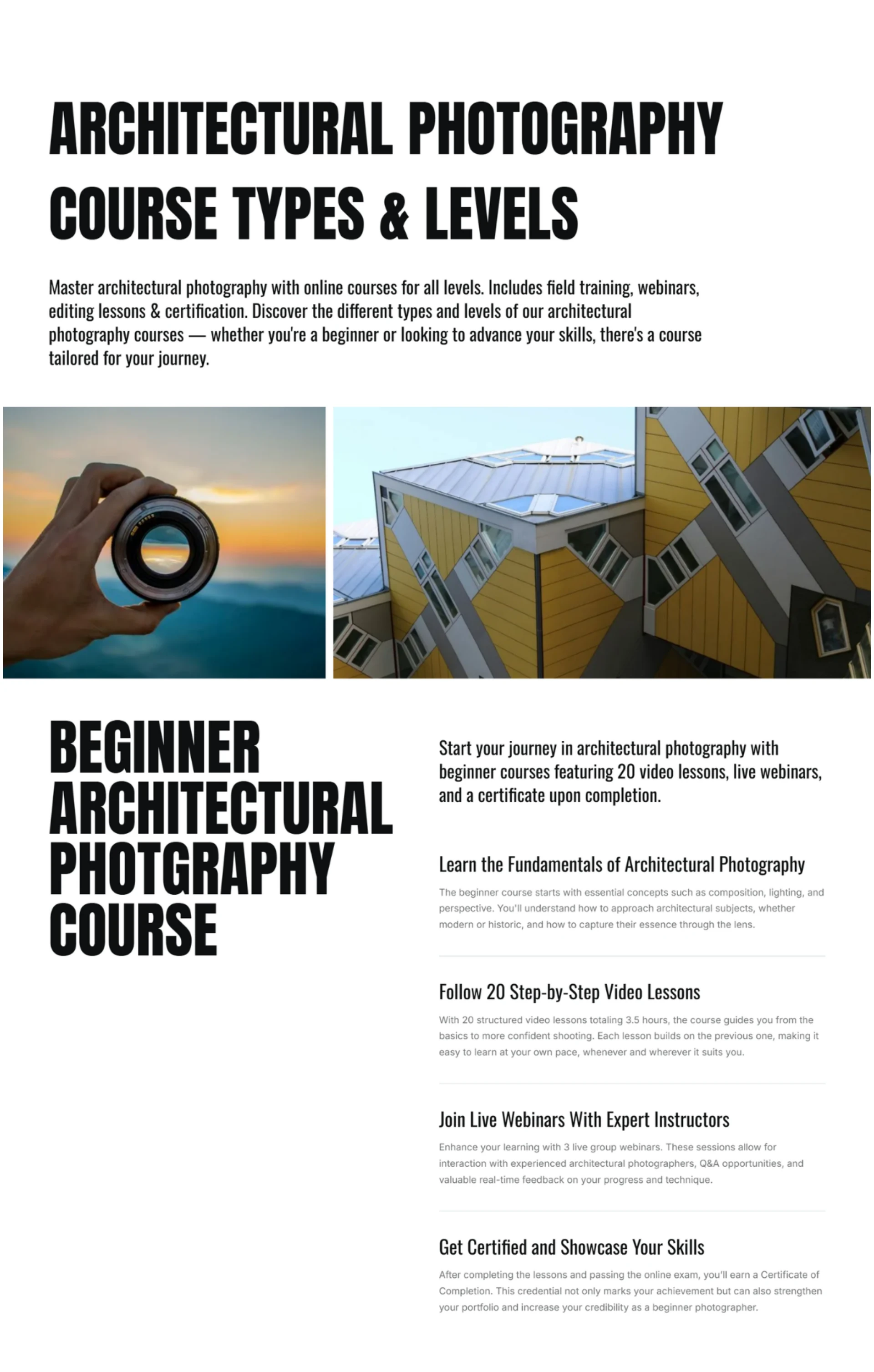
The website acts as a landing and promotional page for an online academy specializing in architecture photography courses. It clearly states that it serves photographers of all skill levels (beginner to advanced), helping them build a portfolio, master technical editing (Lightroom/Photoshop), and learn the business side of the craft (marketing and career development).
Key Content Sections
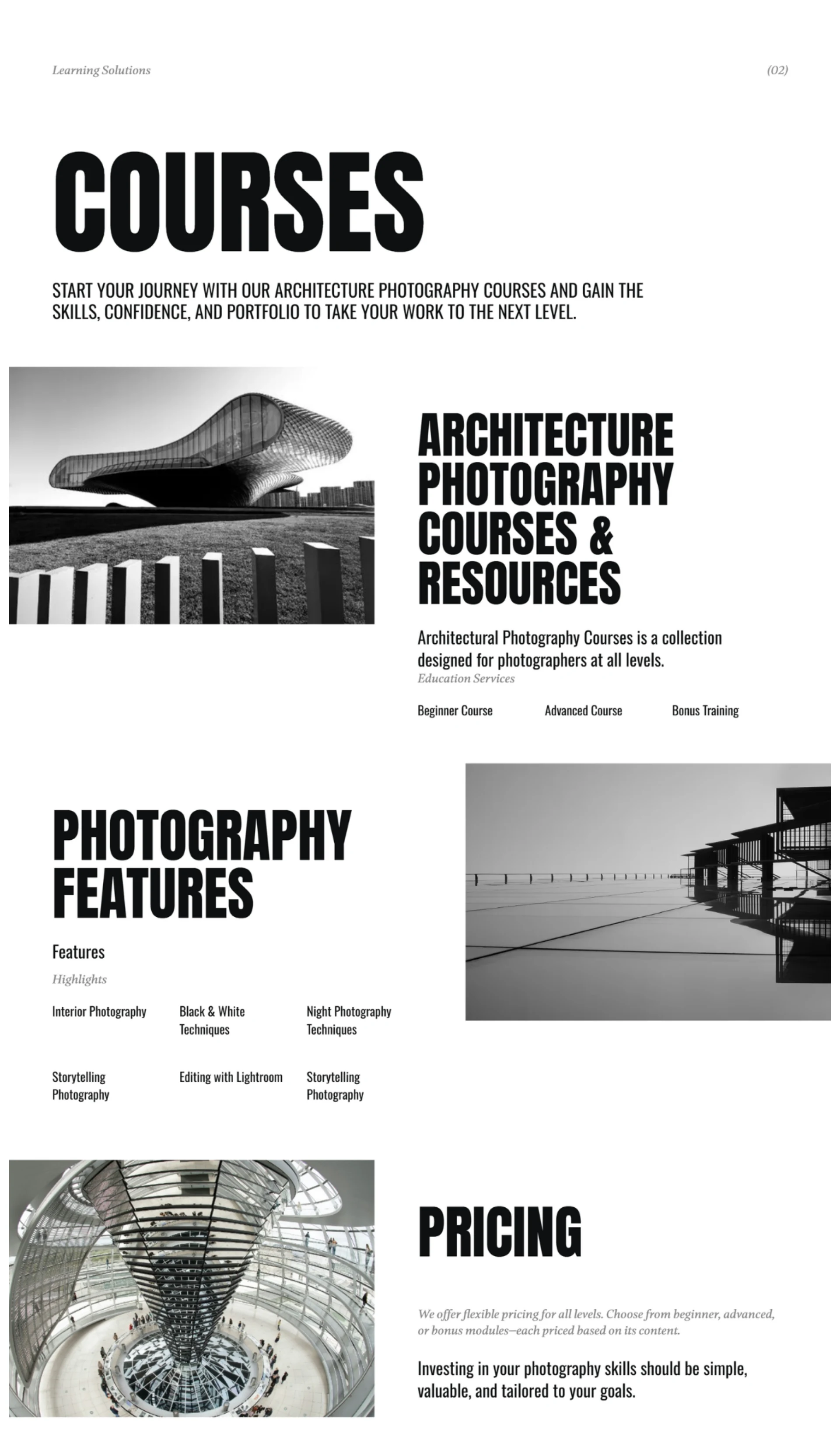
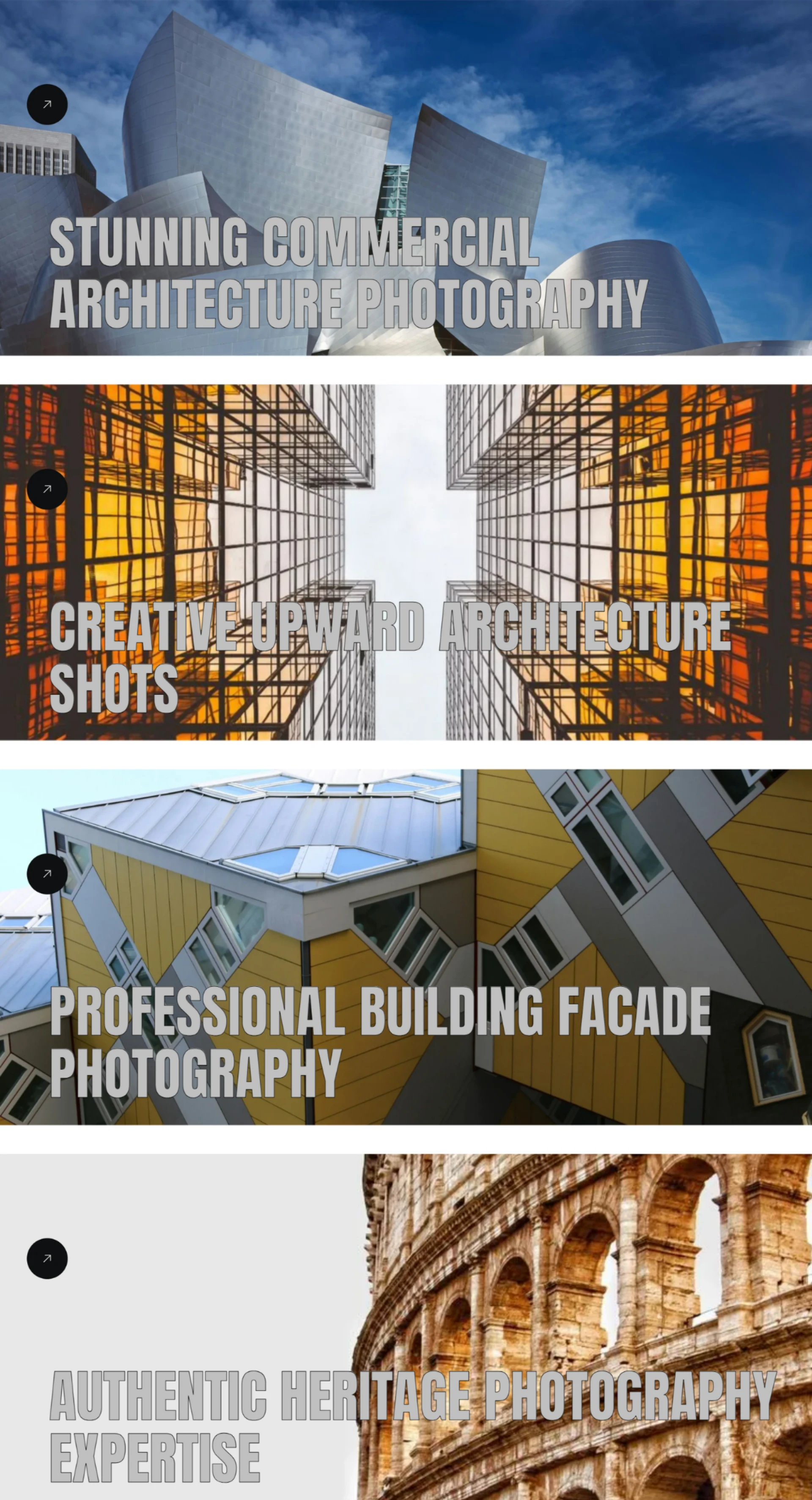
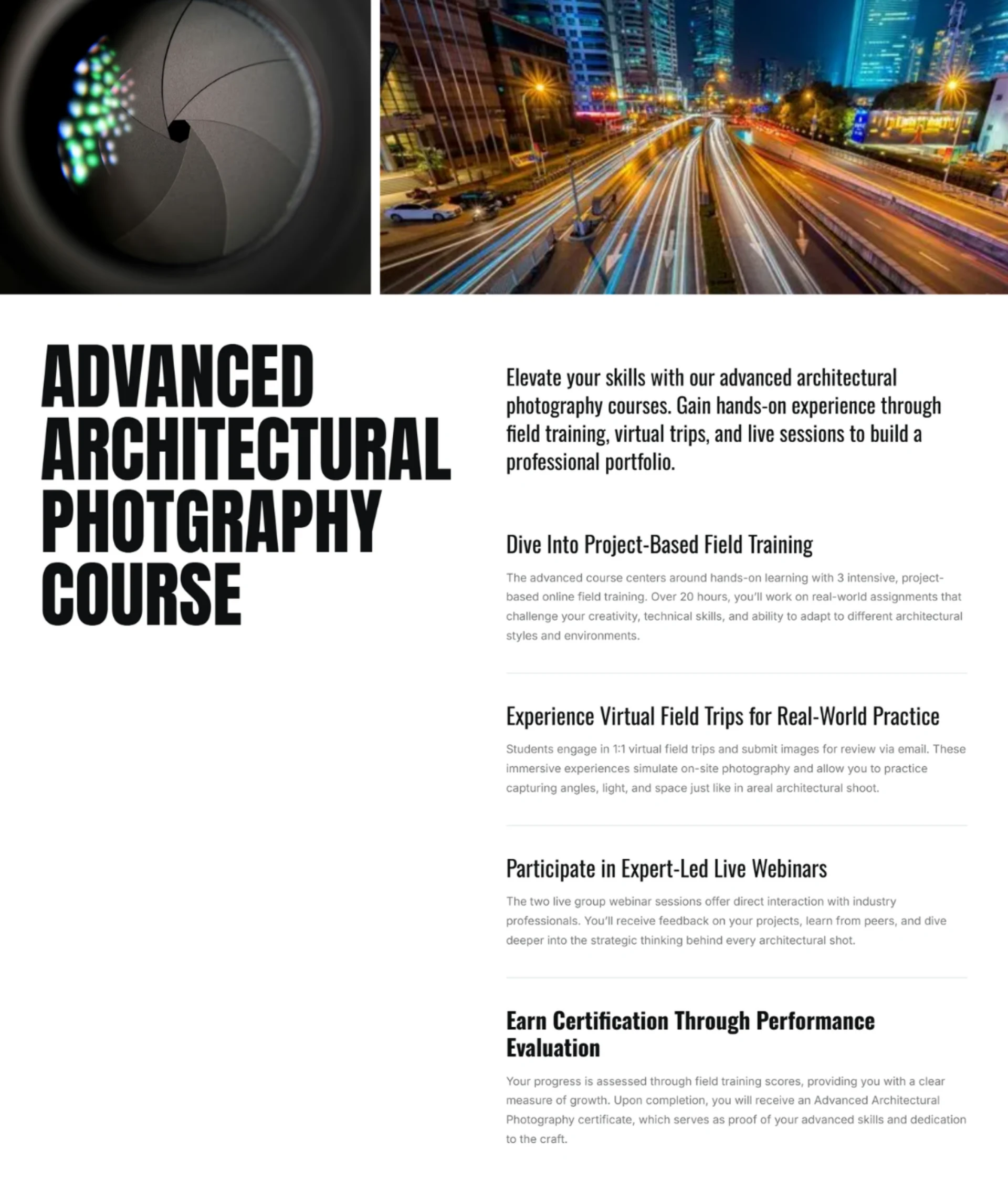
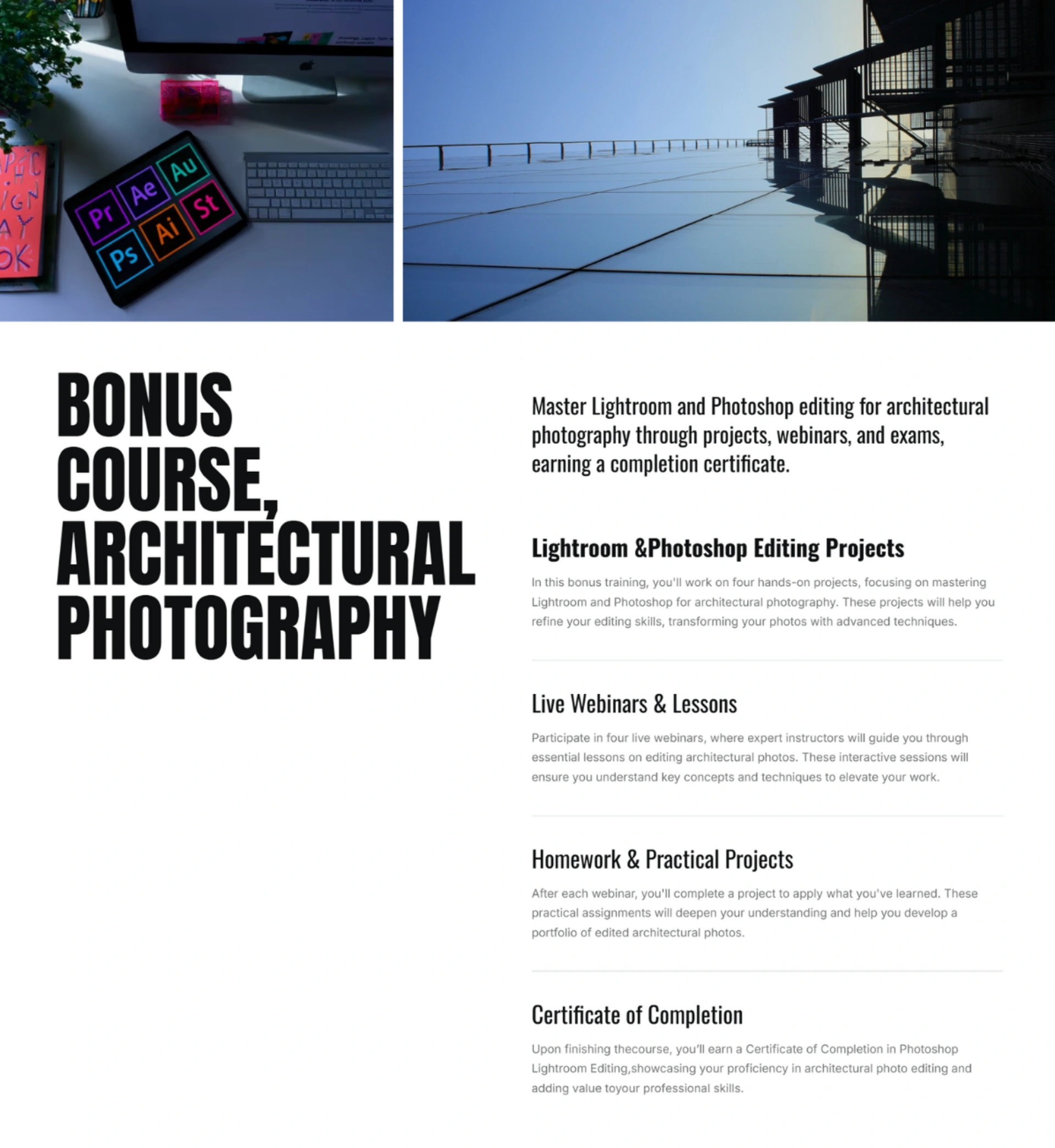
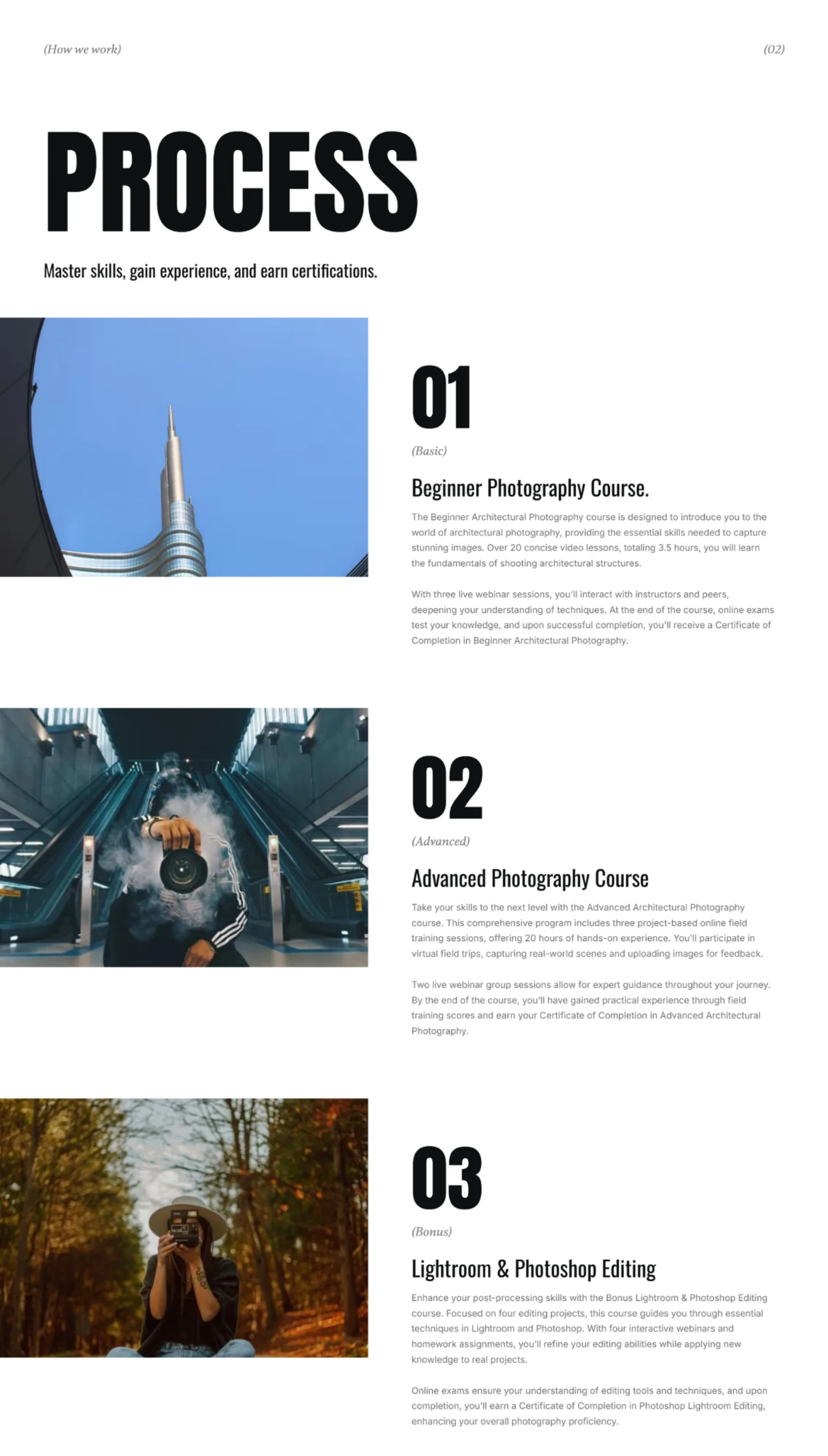
Themes: Highlights specific architectural niches (commercial, upward shots, facades, and heritage). Courses & Learning Solutions: Outlines the core curriculum (Beginner vs. Advanced).
Features: Showcases topics like interior photography, night techniques, and editing.
Social Proof / Inspiration: Integrates relevant quotes about photography and architecture.
UI (User Interface) & Visual Design Style
The UI leans heavily into a modern, minimalist, portfolio-driven editorial aesthetic. This style is highly appropriate for a photography school because the design itself needs to feel visually sophisticated and artistic.
Layout & Webflow Aesthetic: Being built on Webflow, the site utilizes clean grids, spacious layouts, and smooth structural transitions. It has an "editorial magazine" feel.
Typography: It utilizes clean, structured sans-serif typefaces alongside distinctive stylistic choices (such as structural numbering (01) and (02) for sections). The typography relies on strong scale contrasts—large headers draw the eye immediately, followed by neatly contained body text.
Color Palette: The color palette appears neutral and restrained (likely utilizing black, white, and muted greys/tones). This allows the photography or implied imagery to take center stage without the interface colors clashing with the artwork.
Visual Hierarchy: Excellent use of numbers, clear sections, and distinct content cards (e.g., separating the four main themes) that prevent the page from looking like a wall of text.
UX (User Experience) Design Analysis
The navigation bar covers all the essential bases (Home, Themes, Courses, Resources, Features, Pricing, Contact).
The footer beautifully mirrors the main navigation with a deep-link structure broken down into categories, making it effortless for users to locate specific sub-topics.
Logical Flow: The page introduces the concept → breaks down creative paths (themes) → explains educational tiers (courses) → lists feature highlights → shows pricing → concludes with an inspirational quote slider. This matches a standard customer conversion funnel perfectly.
Niche Personalization: By asking, "What Do You Want to Capture?" and breaking it down into four distinct themes, the UX immediately encourages interaction, helping users self-segment into the exact type of architecture photography they care about.
🚀 Available for freelance projects. Click the "Message" button on my profile to get in touch directly through the Contra platform. 🎯
Like this project
Posted Aug 14, 2026
The website serves as an online academy for architecture photography classes, allowing students to enhance their marketing and develop their portfolios.