The network for creativity
Join 1.25M professional creatives like you
Connect with clients, get discovered, and run your business 100% commission-free
Creatives on Contra have earned over $150M and we are just getting started
Back to feedPost

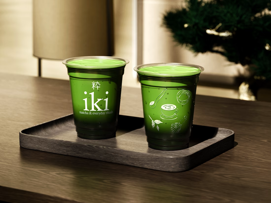
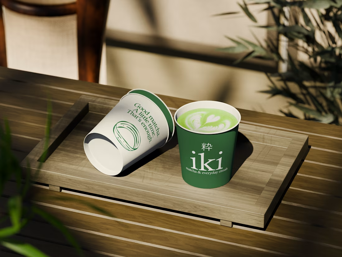
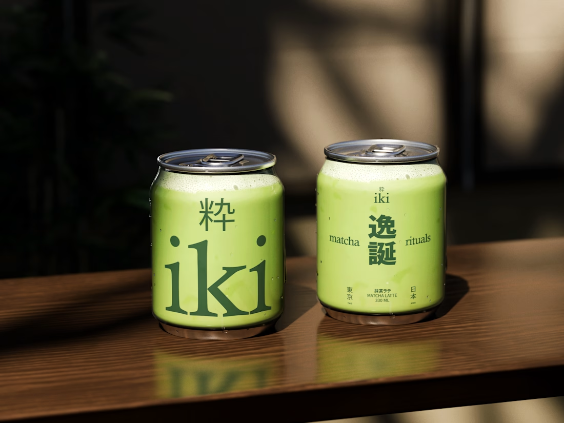
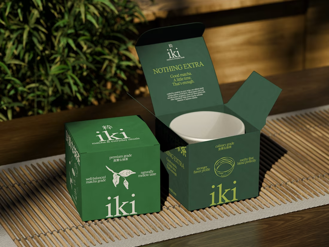
more visuals from iki, a matcha shop i’ve been working on 🍵
the project is getting close to its final stage, and it’s been really interesting to see how the initial concept has gradually turned into a complete brand.
from the strategy to the visual identity, every decision has helped shape a more cohesive and distinctive world for iki.
almost there. excited to share more of the final result soon

love these designs, so mindful in their minimalism!

Beautiful work!

That's really great brand design max the design visuals color palettes are great nice job Max🎉🎉🎉🔥🔥🔥


Love how the brand is coming together. The matcha-inspired direction feels cohesive and full of personality.

Love how the brand has evolved into such a cohesive world. The packaging looks so good🔥


Max, iki reads really calm from strategy through to the mark — the kind of brand that doesn't need to shout because the system carries it. As it heads to packaging and in-store, watch that the restraint holds on small substrates; a matcha system usually proves itself where the...

great work man

The kanji sitting above the Latin 'iki' looks like it could work as a mark on its own. On the small cans, how did you decide which of the two leads, or do they swap depending on the format?

The greens across the cups, cans and boxes all feel so calm and cohesive. Those cans especially look like something I'd grab without thinking twice.

Strong concept and thoughtful execution. The logo feels distinctive and communicates the brand identity clearly.

Amaizing

Love the colors!

Great work

The cup with no wordmark, just the whisk, scoop and bowl drawn in white, is the one I keep looking at. It says matcha ritual before you read a word. Is the kanji above the wordmark part of the final lockup or only on packaging?

iki looks so calm, love that it doesn’t go full japanese cliché. what did you design first, the mark or the packaging?


The lowercase iki in pale lime on that deep matcha green reads so calm, and seeing it hold up on both the cups and the slim cans is a nice touch 🍵

Love this! The way the initial concept evolved into a complete brand is so satisfying to see. iki's packaging is super clean and premium.


Omg those shadows look amazing 🔥

iki means two in turkish :)

Everything came together so well! The mockups and the vibe look great!

Looks cool, made a repost on this

The network for creativity
Join 1.25M professional creatives like you
Connect with clients, get discovered, and run your business 100% commission-free
Creatives on Contra have earned over $150M and we are just getting started







Related posts

One brand, three different directions.
Sharing some of the logo exploration for Ordinal Partners.
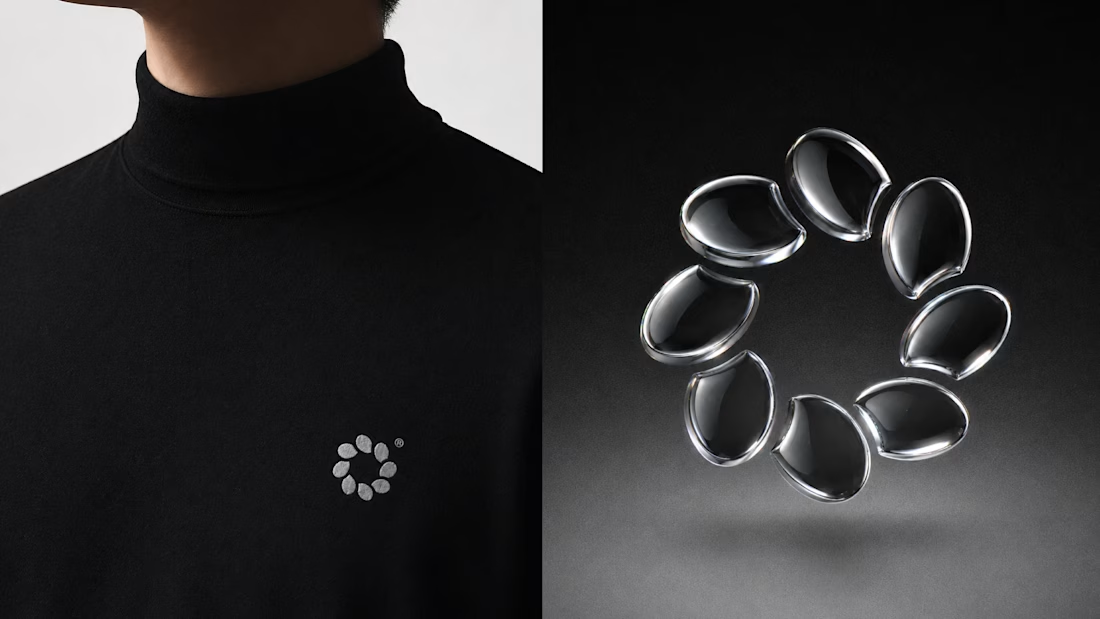
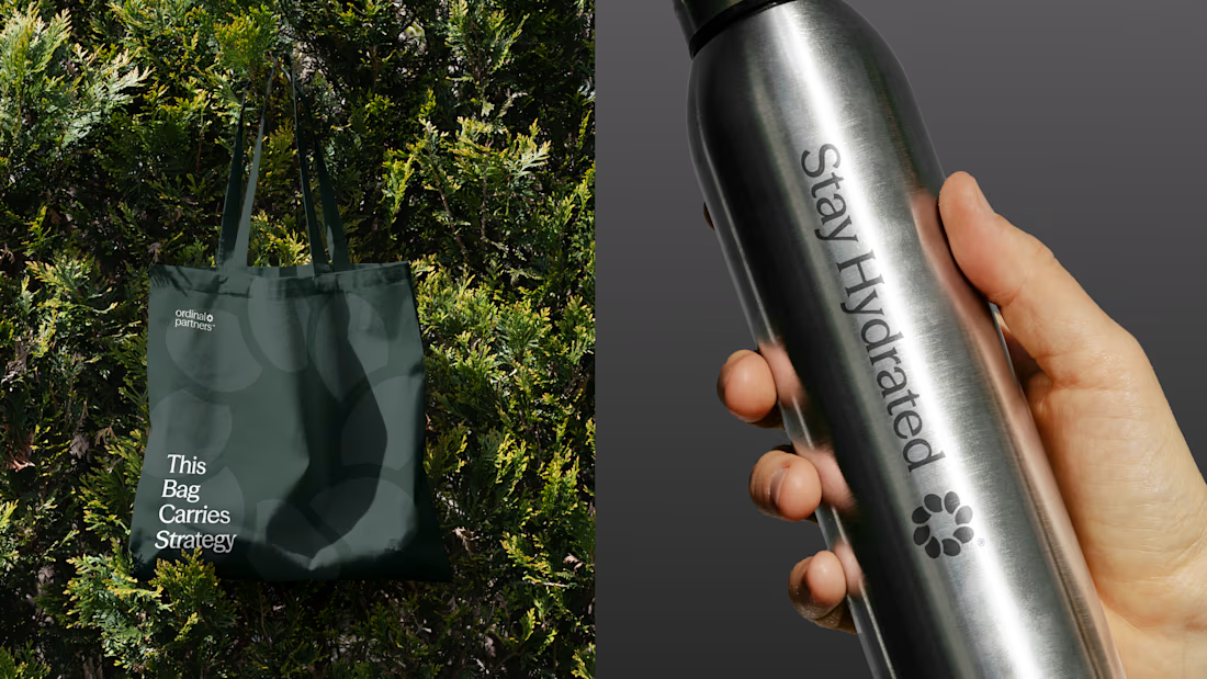
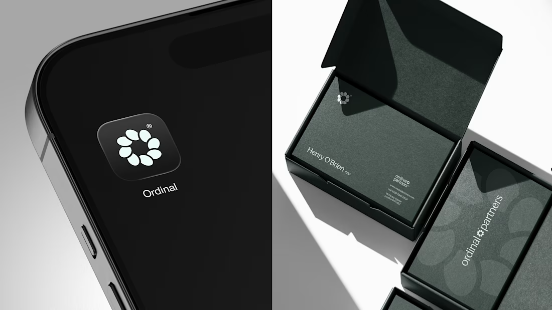
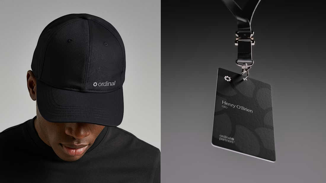

Visually appealing 🔥


Another set of mockups for Bakedwell


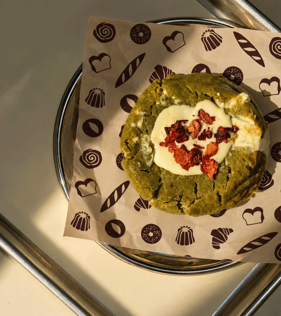
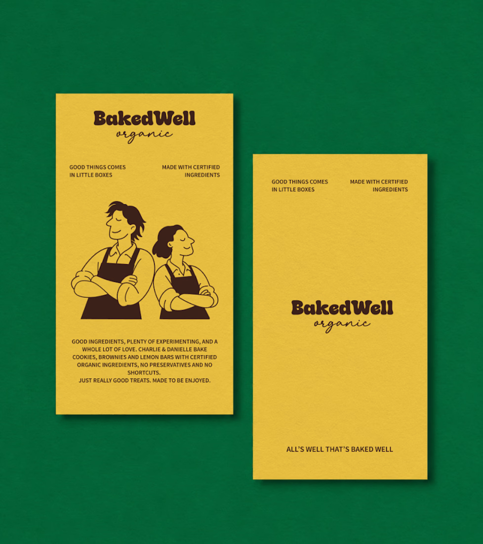
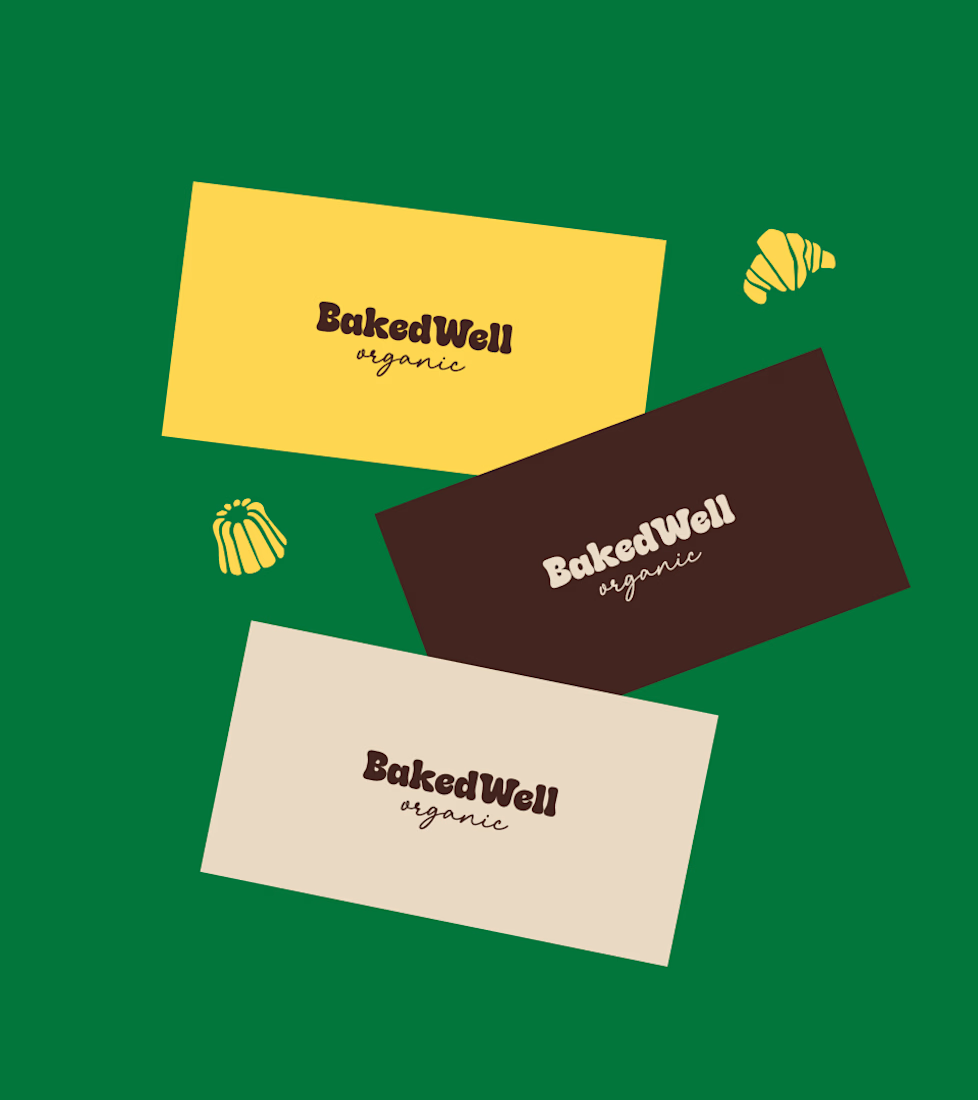
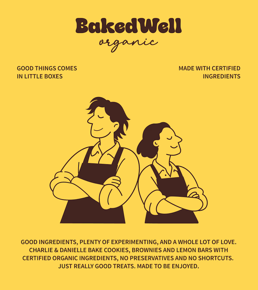

Forest green and mustard with the two bakers in flat illustration is a warm, confident pairing, and the cards read clearly. Contrarian take: the illustrated pair is the strongest asset here, stronger than the wordmark. If I owned BakedWell, I would put those two on the bag and the window and let the logo go smaller.

Recent work on MAE - Visual identity
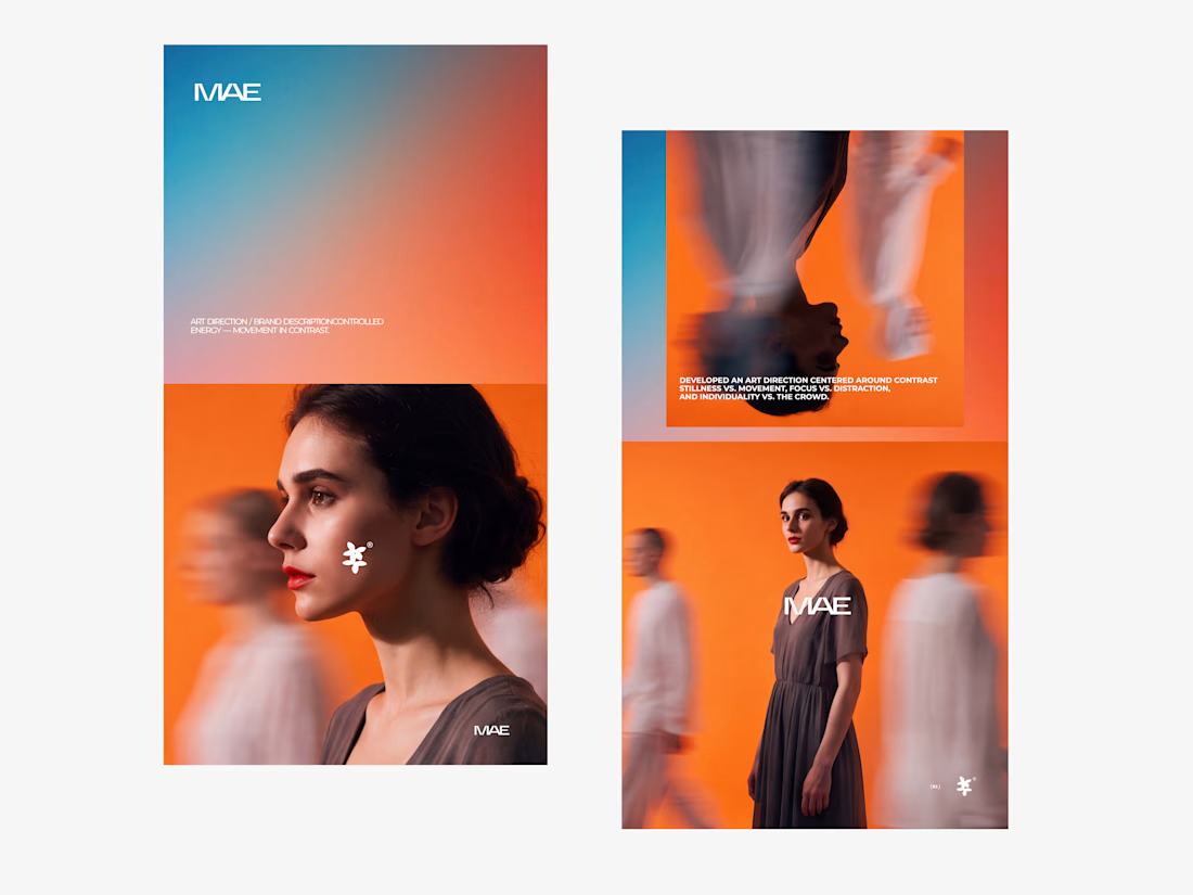
The motion blur on the figures gives the orange-to-blue gradient a reason to be there, and the small star mark stays readable on both the cheek and the shirt. Did the star come first as a standalone mark, or did it grow out of the photography direction?