The network for creativity
Join 1.25M professional creatives like you
Connect with clients, get discovered, and run your business 100% commission-free
Creatives on Contra have earned over $150M and we are just getting started
Back to feedPost
Another set of mockups for Bakedwell


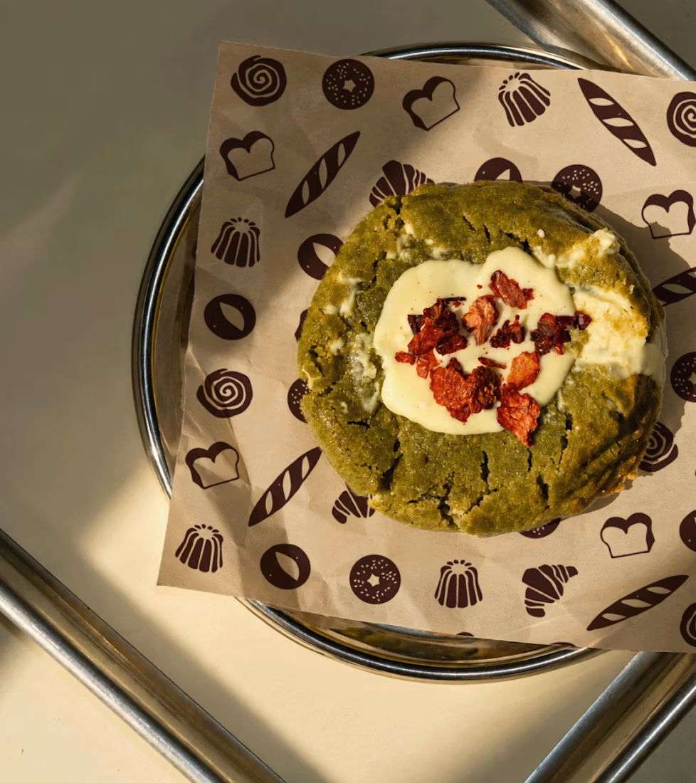
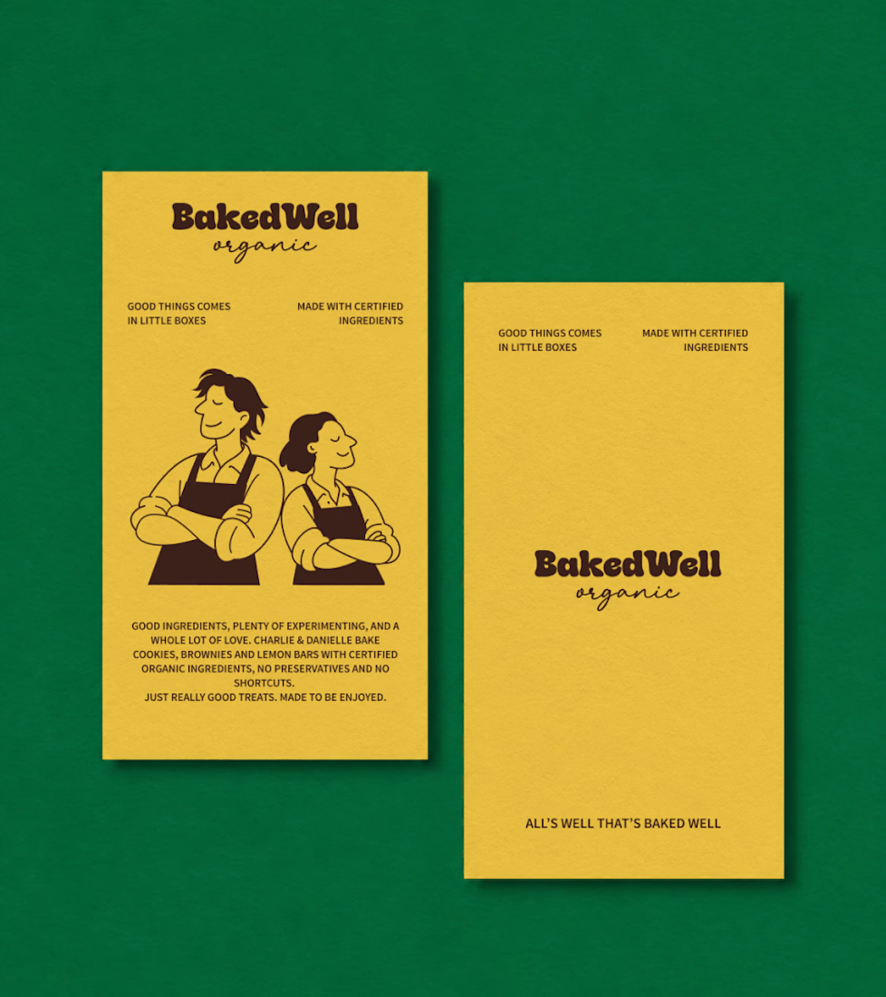
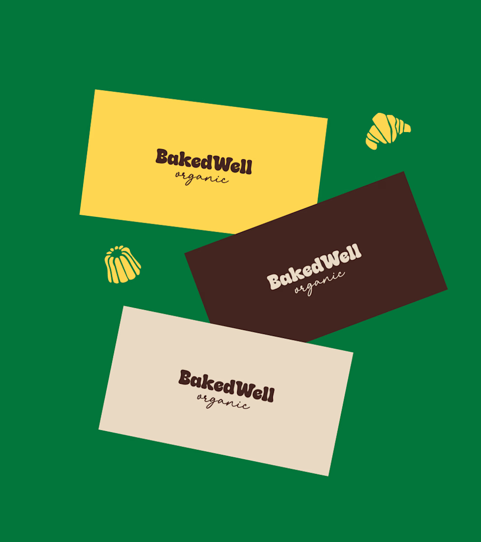
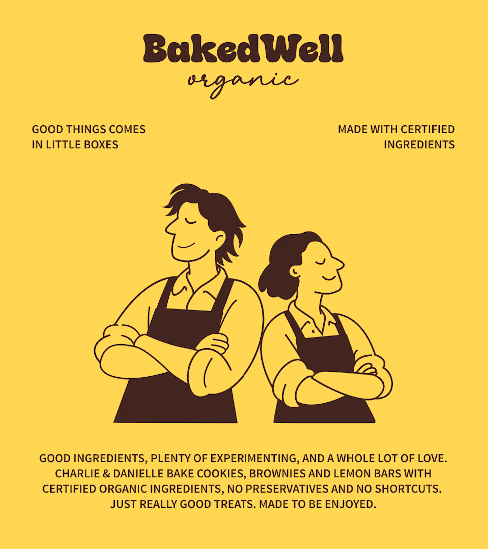

Love the colors!


Thanks Bella

The brown card as the formal piece and the yellow illustration as the friendly one gives BakedWell two clear moods on the same green base. Do you see the line-art bakers staying on as a recurring brand character beyond the packaging?
Yes Arthur, the two bakers are a recurring brand character.

lol this is so good man. notch demon idea is crazy creative
Thanks Naim

Thanks a lot, Agha.

Great logo design and branding 🎉❤️
Thanks Mostafa.
Pardon ❤️

Thanks Alaa!

Forest green and mustard with the two bakers in flat illustration is a warm, confident pairing, and the cards read clearly. Contrarian take: the illustrated pair is the strongest asset here, stronger than the wordmark. If I owned BakedWell, I would put those two on the bag and the window and let the logo go smaller.
Thanks Aditya!

The green-and-mustard palette gives Bakedwell a proper shelf presence — the illustrated bakers are the strongest asset and should carry over to the window decal and social, with the wordmark supporting rather than leading. Nice restraint on the type; that tighter tracking on the logotype reads much cleaner in small lockups.
Thanks Wisdom
Anytime, Karan. Glad the read landed - that shelf presence is the hard-earned part of a palette like that, and it shows. Keep pushing the character work on the bakers, it pays off across touchpoints.
Happy to hear it landed. The baked illustrations really do carry, and it's that kind of asset-led restraint that gives a brand room to grow. Keep pushing the work out - and feel free to tag me if you ever want a second pair of eyes on a direction.

Thank you

The design, especially the colors, looks so yummy!
Thank Akbar!
Appreciate it, Karan - really enjoyed the Bakedwell direction. The illustrated bakers plus that tighter wordmark tracking is a strong package. Keep pushing the system.

These mockups are making me hungry. The illustrations and that yellow and green combo tie it all together so nicely
Thanks Tabish

Such a beautiful and cohesive brand identity! Love the warm, organic aesthetic.
Thank you so much

The color combination of the brand kit is amazing, and I like the simple illustration makes it more elegant
Thank you

This feels like walking into a bakery where everyone knows your name. So warm.

Awesome!
Thanks Victrex, what did you liked about it?

amazing
Thanks Justin, what did you liked about it?
the colors, and illustration gives he brand a nice touch. Good job.

Really good to see this kind of work😍
Thanks Jihan! What did you liked about it?
Everything is perfect. Typoghaphy, color, presentation, illustrations, shapes.

loved the branding and color palette
Thanks Rishabh!

Those flat-illustration assets give the whole brand system so much tactile warmth compared to standard corporate packaging. Really charming execution!
Thank you Boluwatife

The typography and spacing are especially well done.
Thanks Alice

ADORABLE😍
Thanks Gargi, what did you love most about it?

Love the minimalistic approach.

nice work
Love how seamlessly the brand elements align with the core message. Highly professional and visually captivating work from start to finish!
Thanks Enayet

The two bakers as a recurring brand character is the smartest asset in this set. Packaging gets redesigned every few years, but characters compound across every touchpoint. Curious how you systematized them, are the bakers built as a proper character set with poses and expressions, or do you redraw them per application?

The colors are so attractive

Like the playful illustrations and bold colour palette!
Like the playful illustrations and bold colour palette!

Love the illustrations!
The network for creativity
Join 1.25M professional creatives like you
Connect with clients, get discovered, and run your business 100% commission-free
Creatives on Contra have earned over $150M and we are just getting started



Related posts


Upgoating this.....This is such impressive work!







AI Automation Platform and Workflow Automation & AI-Powered Solutions
An AI-powered automation platform designed to simplify business processes, automate repetitive tasks, and improve overall productivity.
The platform combines a modern, user-friendly interface with intelligent automation to help businesses streamline workflows, reduce manual effort, and work more efficiently.

The motion, the UI, everything's amazing, Incredible work