
1
8
26
555
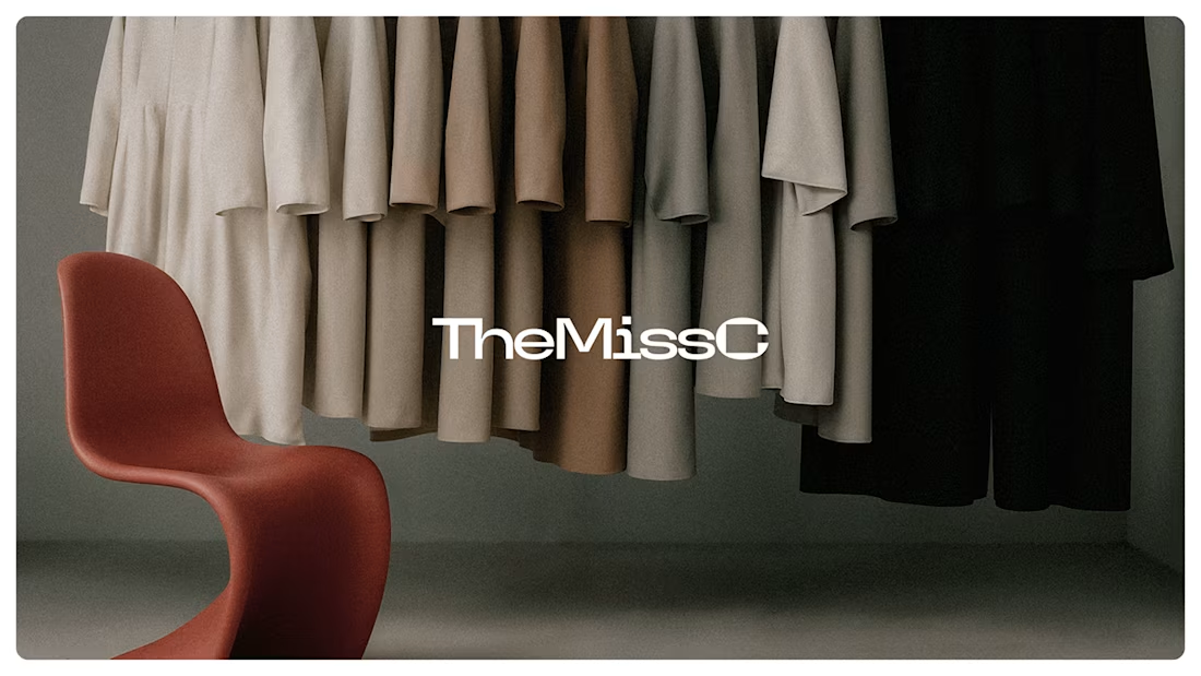
Visual Identity for TheMissC
2
9
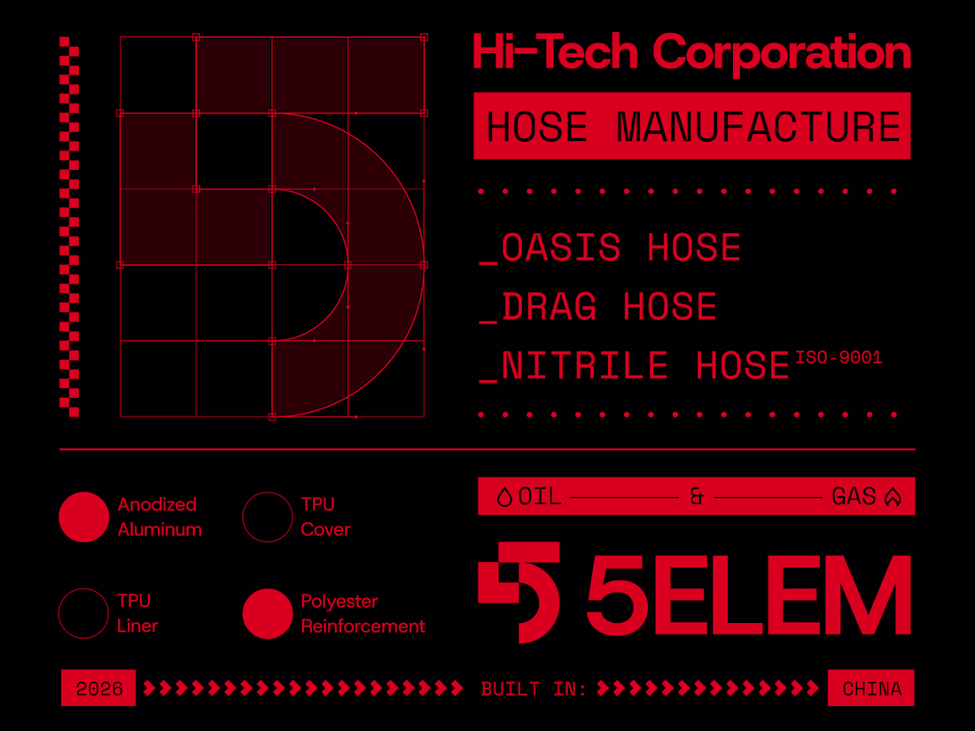
Brand exploration for 5Elem Hi-Tech, a leading Chinese manufacturer of high-tech industrial hoses.
With 40+ years of experience, the company delivers advanced solutions for oil & gas, fire safety, and agricultural sectors across 124 countries.
The visual concept reflects engineering precision and tech innovation through a contemporary industrial lens.
10
35
454
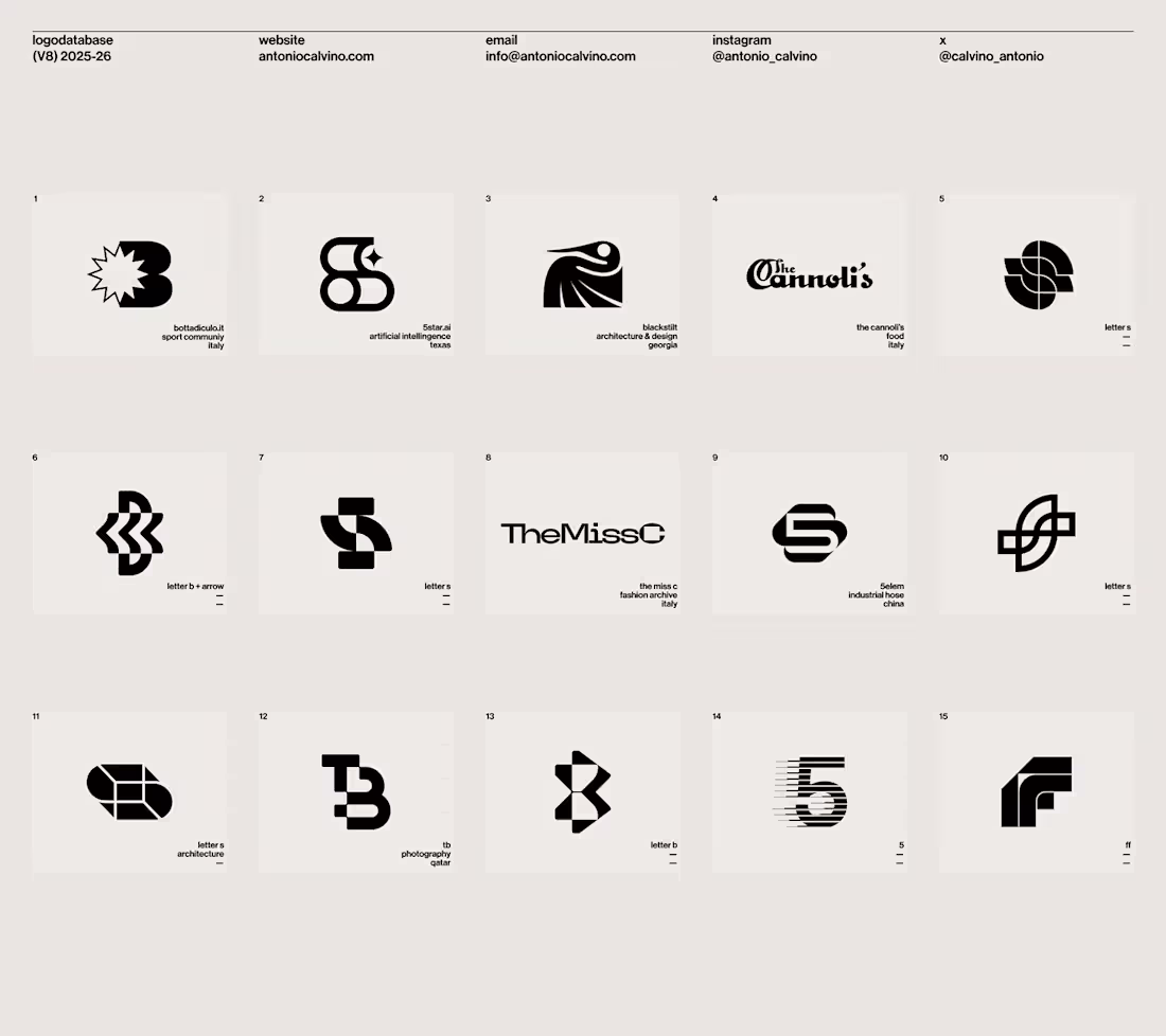
Logo Database (v8) 2025-26
3
14
Universal Music Group for Brands
29
230
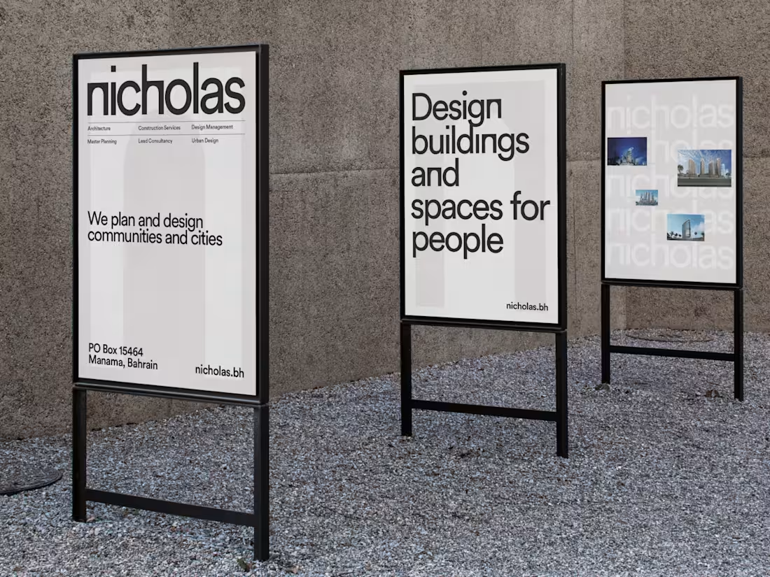
Nicholas Visual Identity
9
50

Jania Brand Identity
5
14
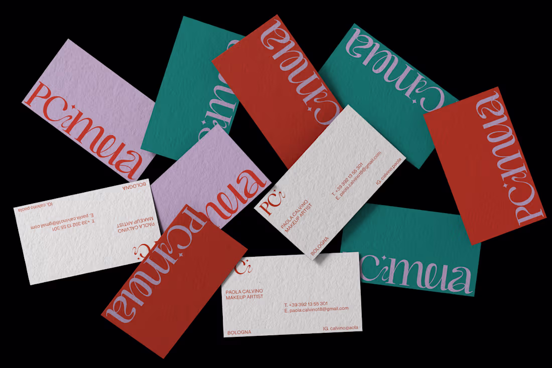
PCMUA Visual Identity
PCmua, a talented make-up artist based in Bologna, Italy.
A customized logotype has been designed featuring sinuous shapes with a sparkle at the center that divide in nome. The sparkle symbol will also be used as a frame for some of her visual content on social media.
The color palette chosen is young and vibrant, featuring pink, red, and emerald green. These colors are interchanged in all stationery and visual materials, creating a dynamic and versatile identity.
To emphasize the strength of PCMUA's makeup services, has been decided to use black and white imagery and video in some cases, highlighting only specific areas with the color. This creates a powerful contrast and draws attention to the makeup itself.
Check the case study: https://contra.com/p/mkqscUWo-p-cmua-visual-identity?r=antoniocalvino
33
102
963

SKILLREP rebranding
7
35
1
5
25
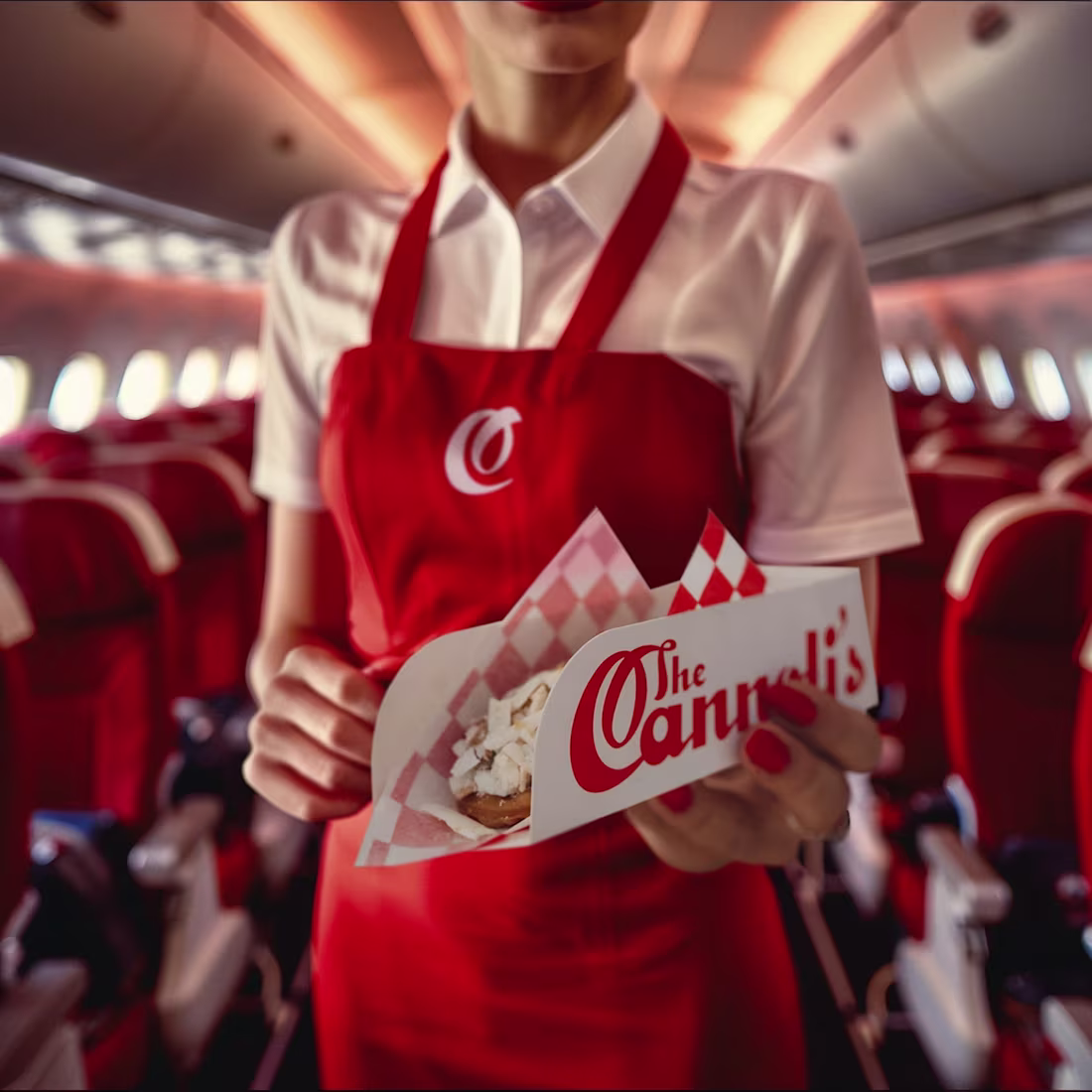
The Cannoli’s
6
46
Logo Database (V7) 2024-25
9
59

Logos Database (V6) 2023-24
4
18
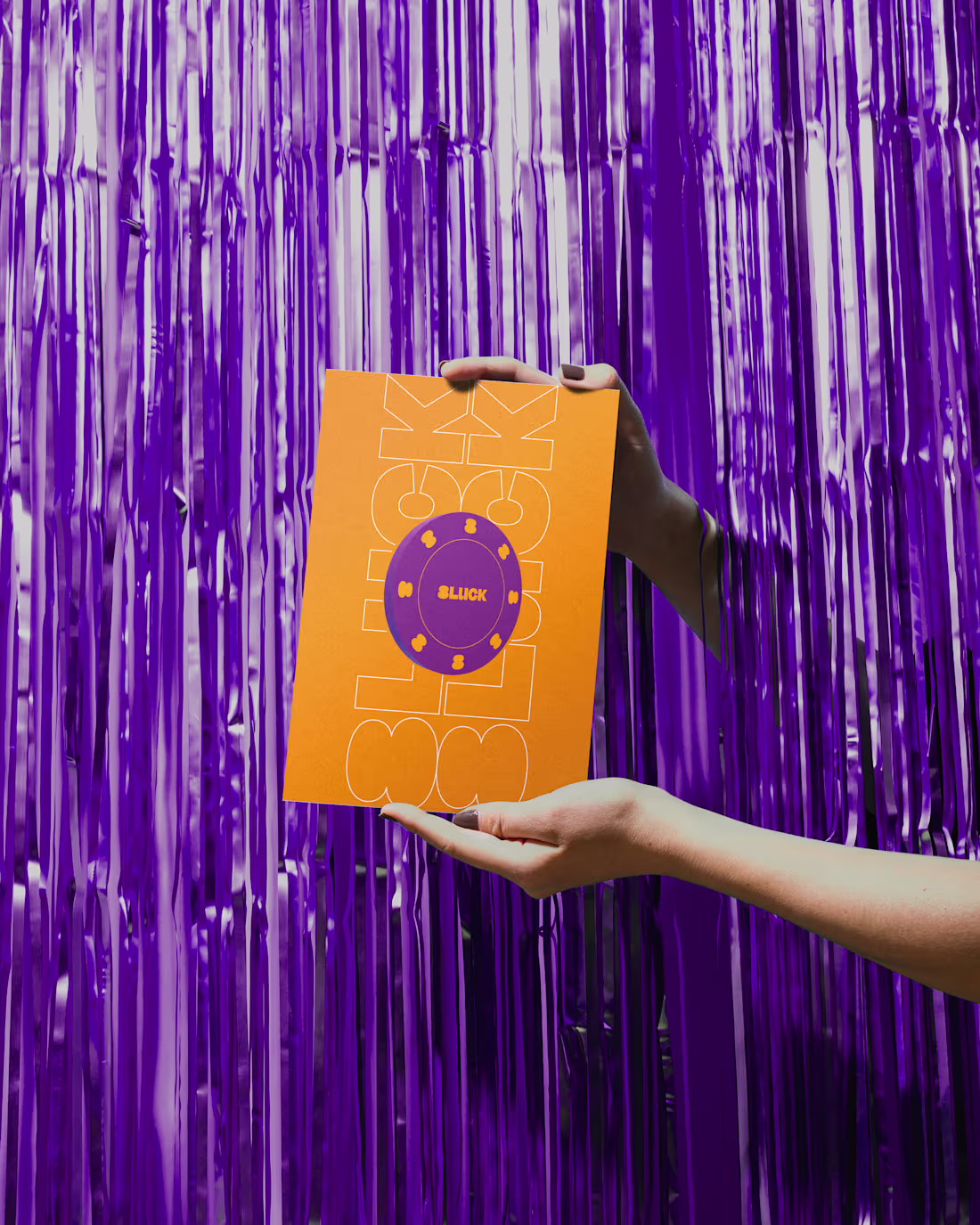
8Luck Visual Identity
5
16
Logos Database (V5) 2022-23
4
13
PCmua Visual Identity
7
20
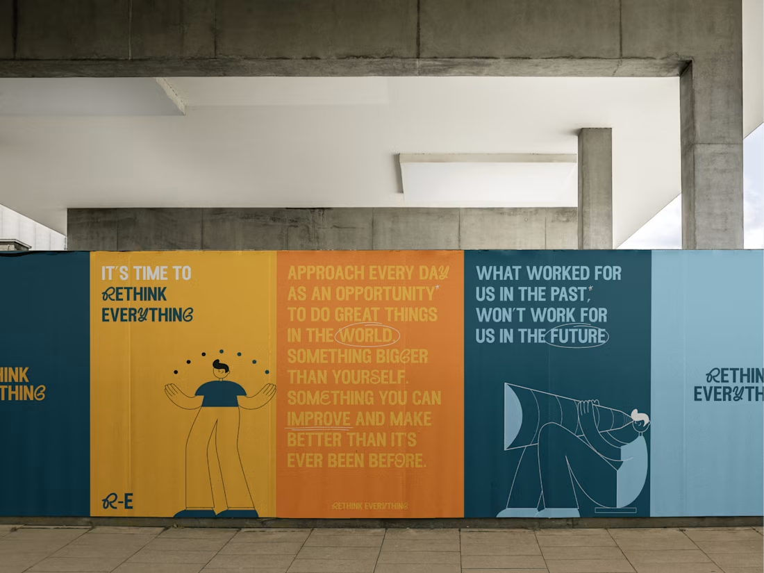
Rethink Everything
3
11
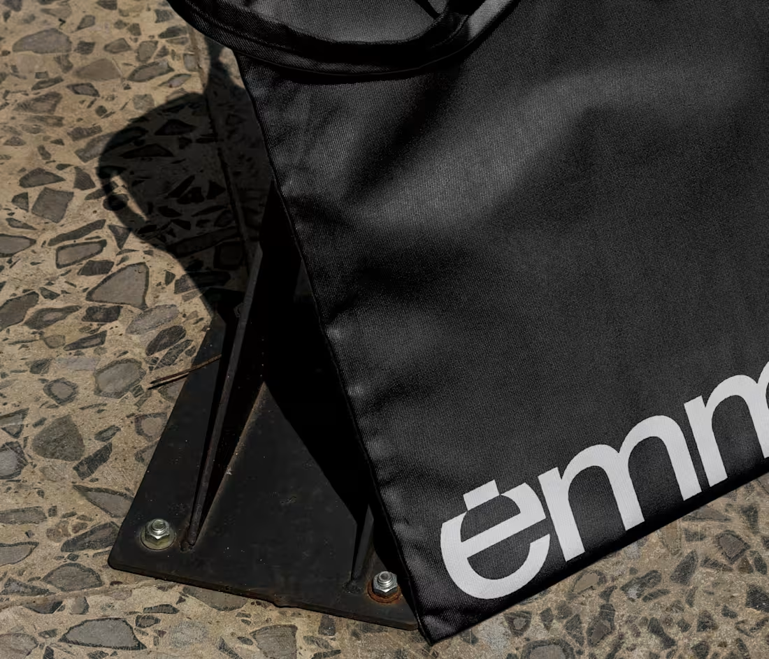
Emme Brand Identity
6
16
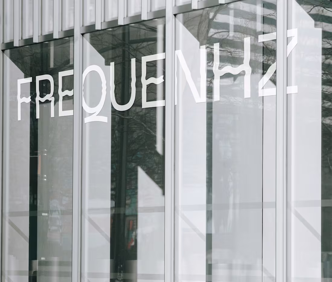
Frequenhz Media LLC
3
12
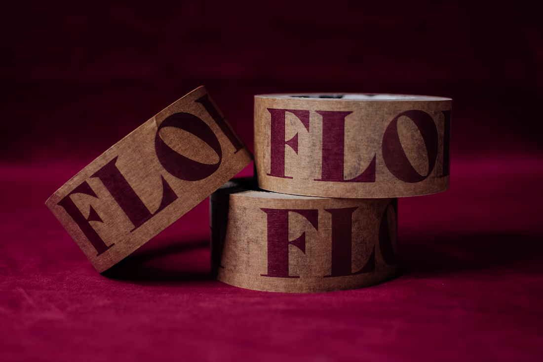
Floh Brand Identity
3
5
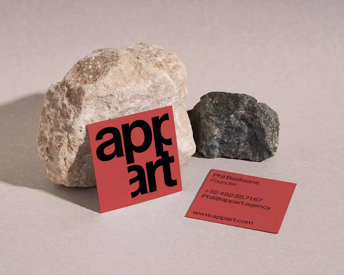
Appart Visual Identity
57
477
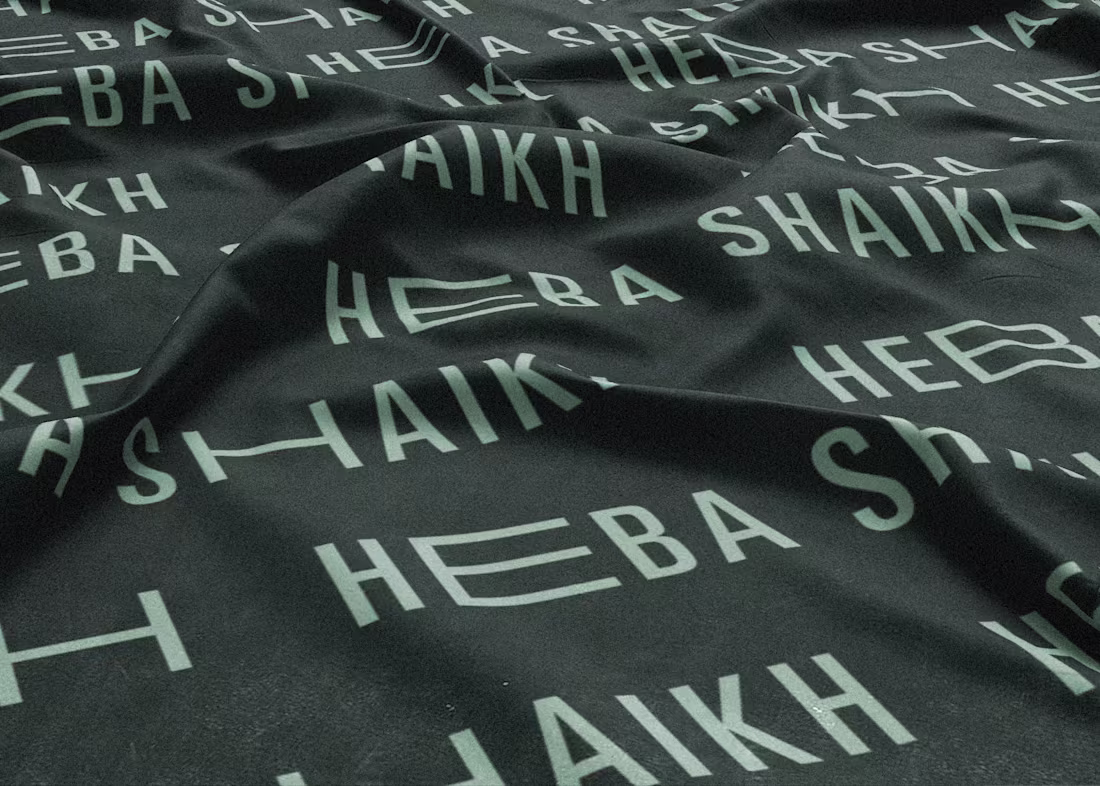
Heba Shaikh || Brand Identity
5
10
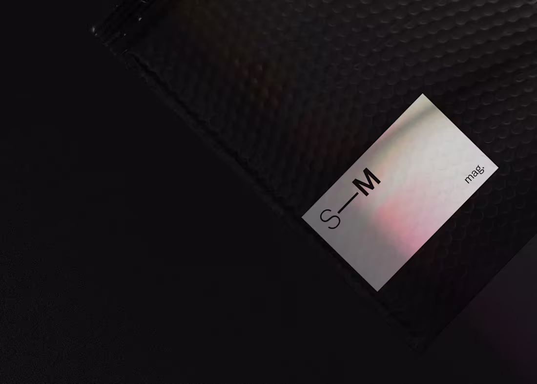
STUDIO—MARAN Identity
5
21