The network for creativity
Join 1.25M professional creatives like you
Connect with clients, get discovered, and run your business 100% commission-free
Creatives on Contra have earned over $150M and we are just getting started
Back to feedPost
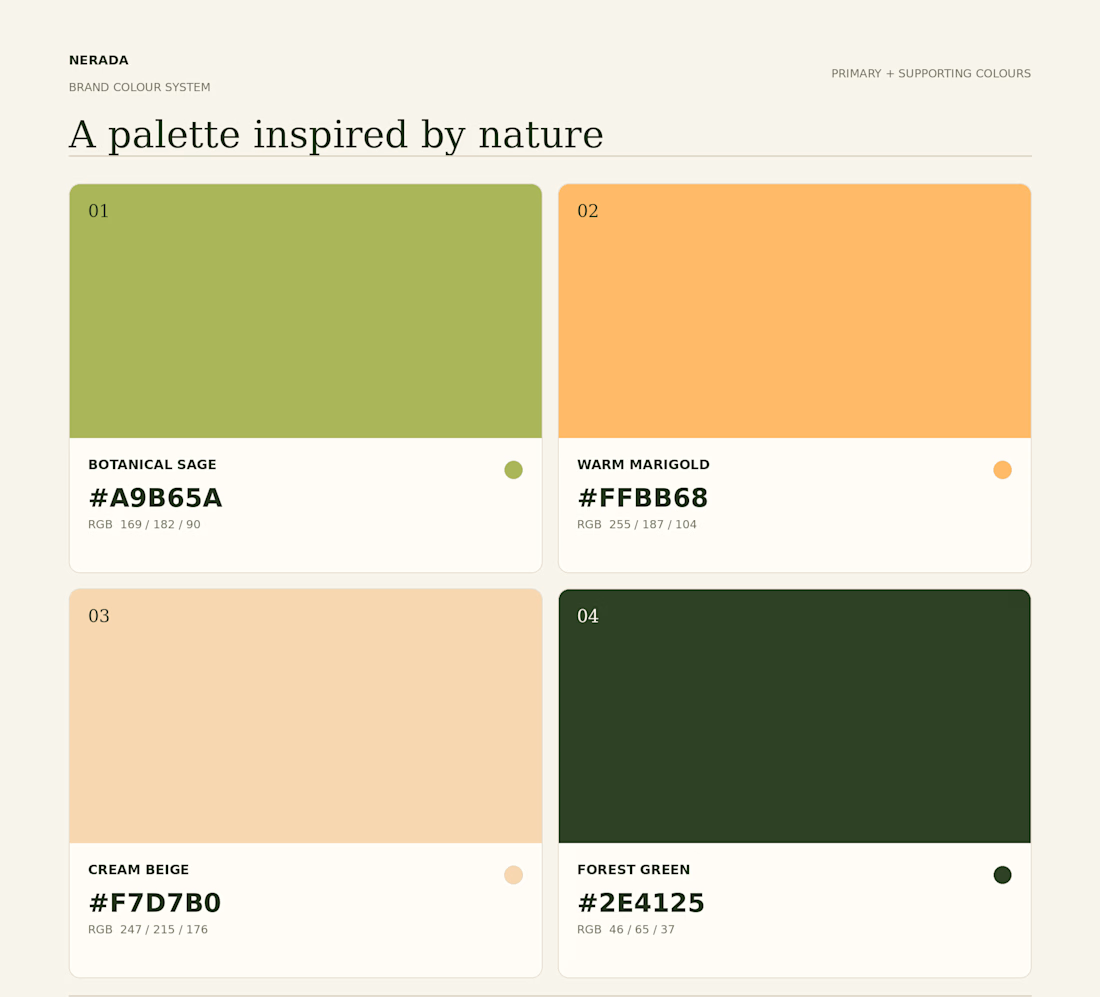
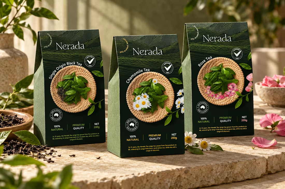
Created the complete brand identity for Nerada, a natural tea brand — developing the visual direction and design elements that shape how the brand looks and feels across every touchpoint. The goal was a clean, organic aesthetic that reflects the brand's natural positioning and builds a consistent, recognizable identity.


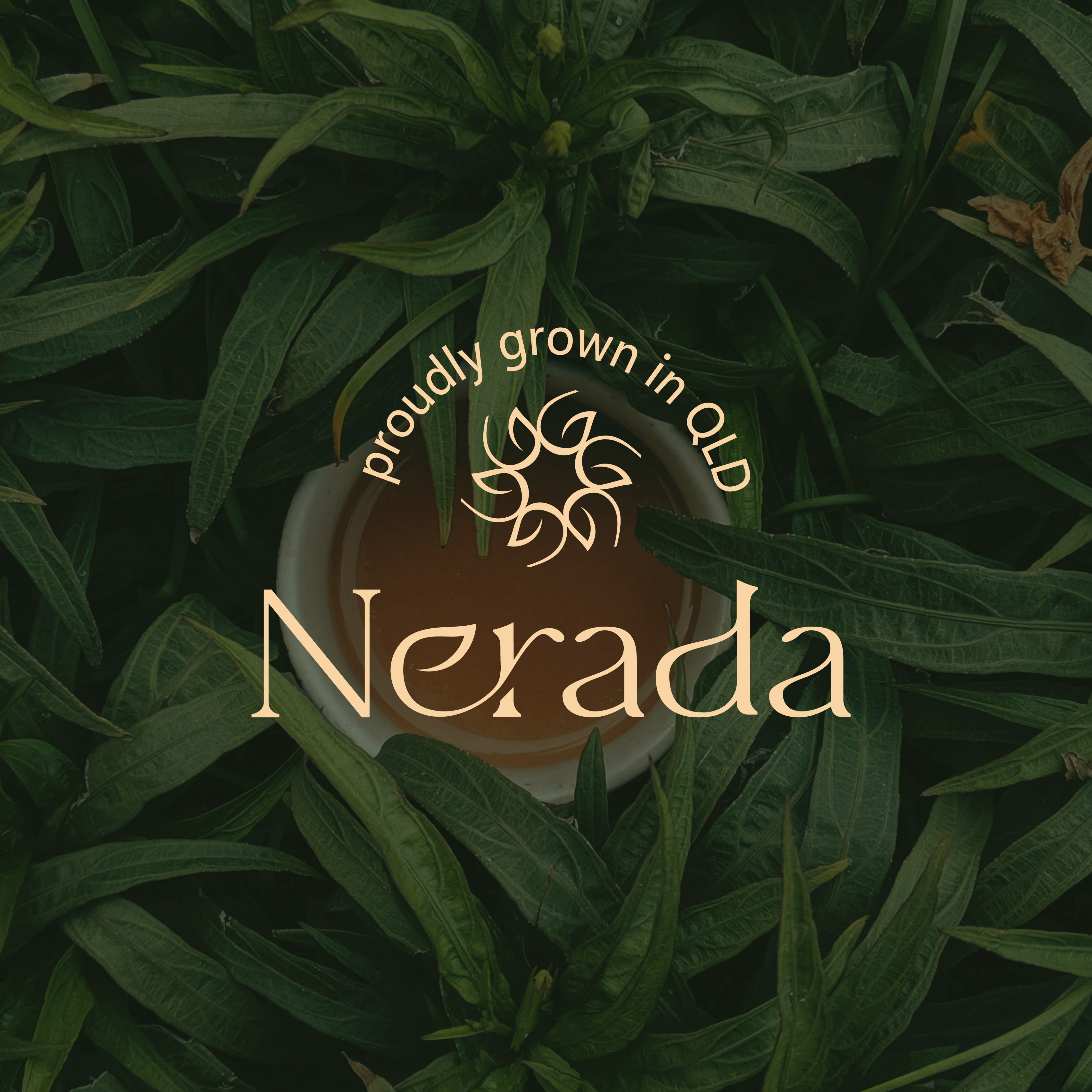

adore that logomark, it feels so natural & grounded.

Thank you ❤️


feels calm in a good way.. very tea
Thank you ❤️


feel premium
Thank you ❤️

Thank You❤️

Clean and organic fits a natural tea brand really well. Consistency across touchpoints is what makes a small brand look established.
Thank you ❤️


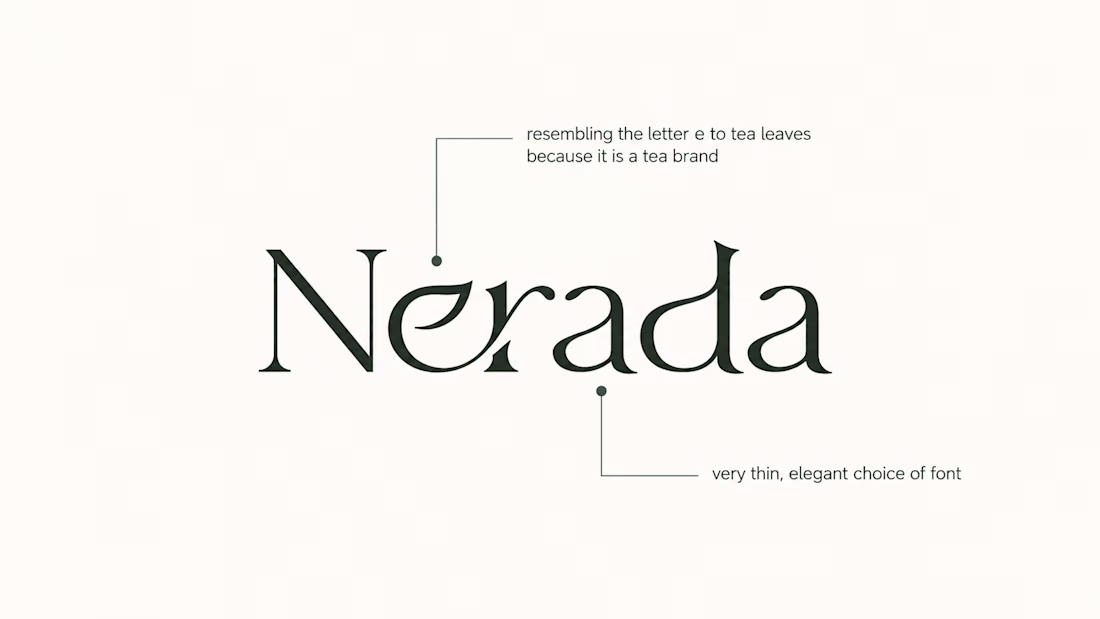
Love the soft curvy serif in the Nerada wordmark, and the "proudly grown" ring around it on the leaf shot 🍃
Thank you ❤️

Beautiful work!!
Thank you ❤️

The typos and coloration are just a perfect match for a brand like that.
Thank you ❤️

Keep up the great work! 💯
Thank you ❤️

Love the typography and earthy colors. The packaging looks beautiful!
Thank you ❤️

Such a beautiful, airy, and calming design! This packaging radiates a pure organic warmth. The botanical illustrations combined with the soft green tones capture the essence of a tranquil tea ritual perfectly. Absolutely serene and sophisticated work.
Thank you so much ❤️

So nice
Thank you ❤️
You're welcome 😊

Thank you ❤️

Typography was really amazing.
Thank you ❤️

Love the colour palette!
Thank you ❤️

The mark feels grown rather than drawn, which is exactly right for a natural tea brand. Packaging is where tea brands win or lose. Does the identity change tone across blends, or stay one voice with different colours?
The design stays consistent, with only the colours changing to suit each tea blend.
That is the right call. One voice, colour doing the blend work, means the shelf reads as a family instead of six different products. Thanks for answering, Rufana.

Those curved letters are lovely, Rufana! Which typeface did you use?
Thank you ❤️ This isn’t a single font. The “e” and “r” letters were combined, the “e” was modified into a leaf shape, and the other letters were slightly slanted.

Thank you ❤️
The network for creativity
Join 1.25M professional creatives like you
Connect with clients, get discovered, and run your business 100% commission-free
Creatives on Contra have earned over $150M and we are just getting started



Related posts

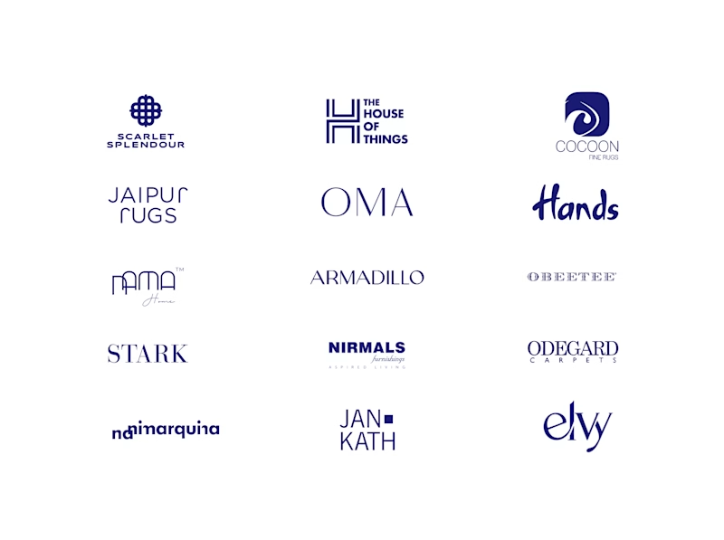
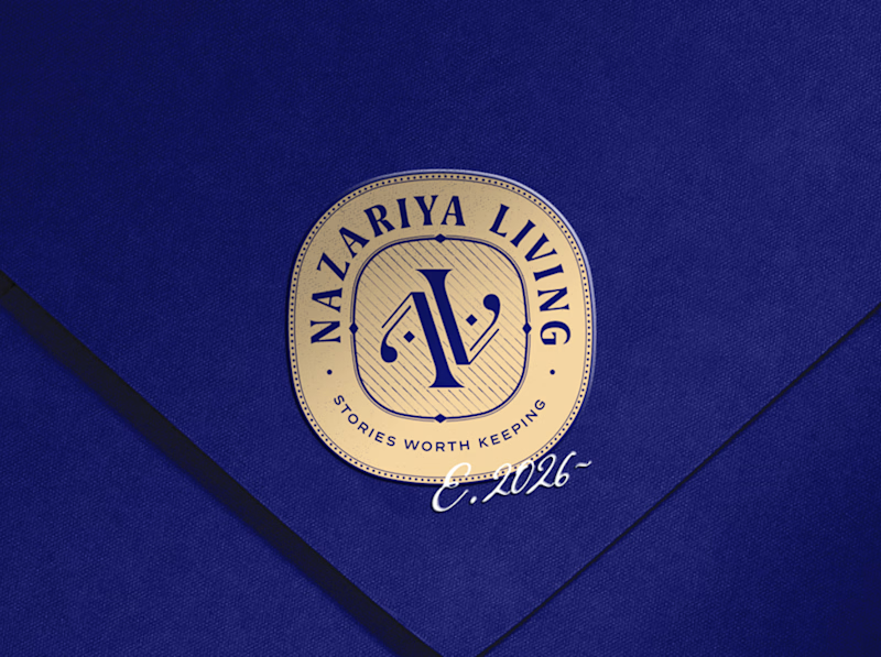
A little look at how Nazariya Living stands apart from its category.
On one side, familiar visual conventions. On the other, an identity with its own character, rooted in stories worth keeping.
We chose not to blend in. :)
Which side catches your eye?


3 voted
30%
7 voted
70%
10 votes
Closed

That side with all the competitor logos in one grid is the slide I'd steal for a client presentation. Nothing explains "why this direction" faster than showing the sea of sameness first. The navy seal wins easily after that.

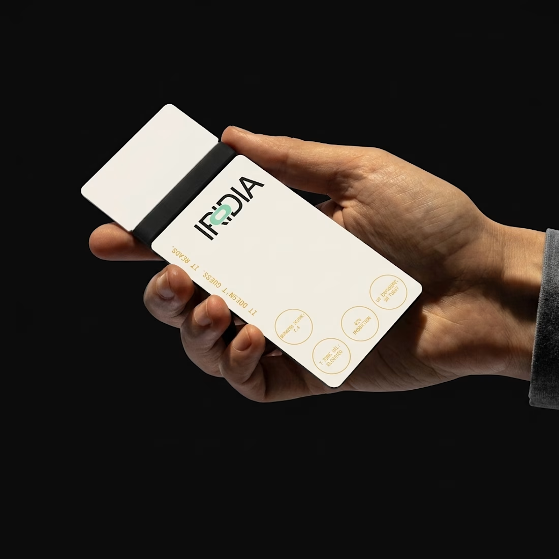
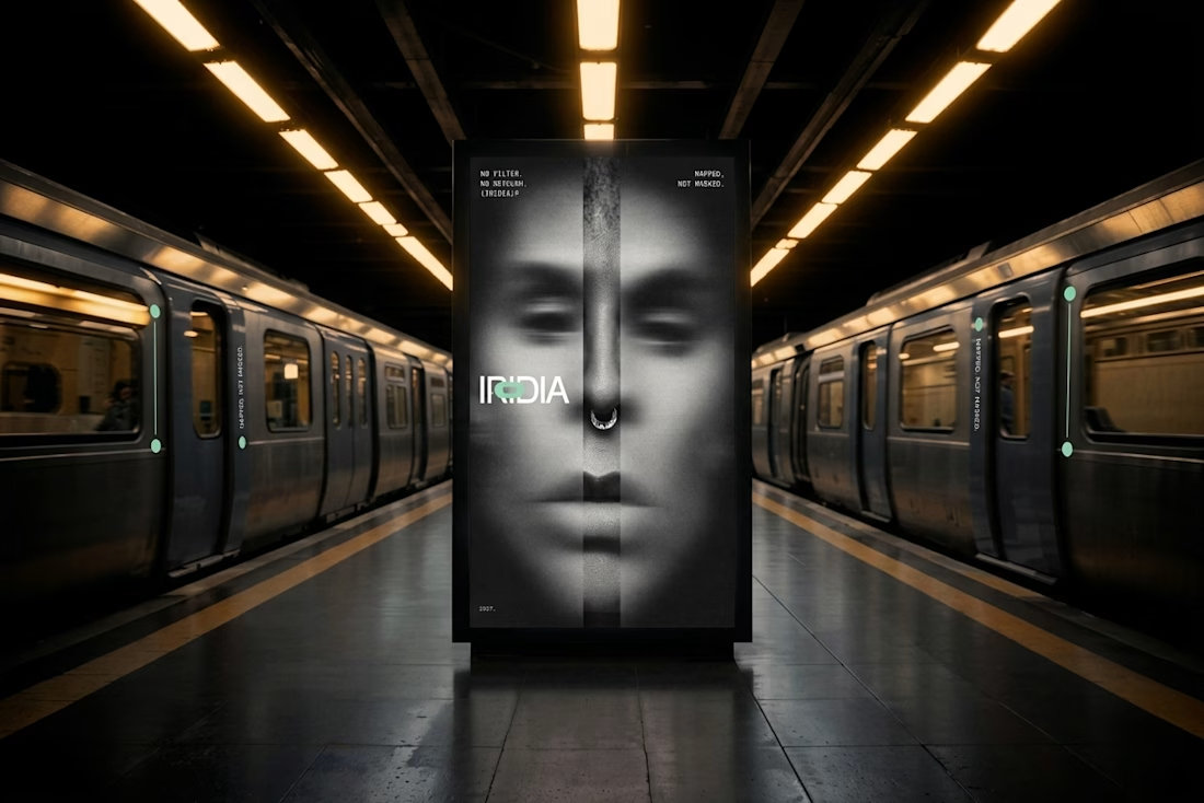
What do you do with a brand that’s 80% done and nobody asked for it?
I have a whole folder of them.
A name here, a palette there, a few campaigns that never saw daylight.
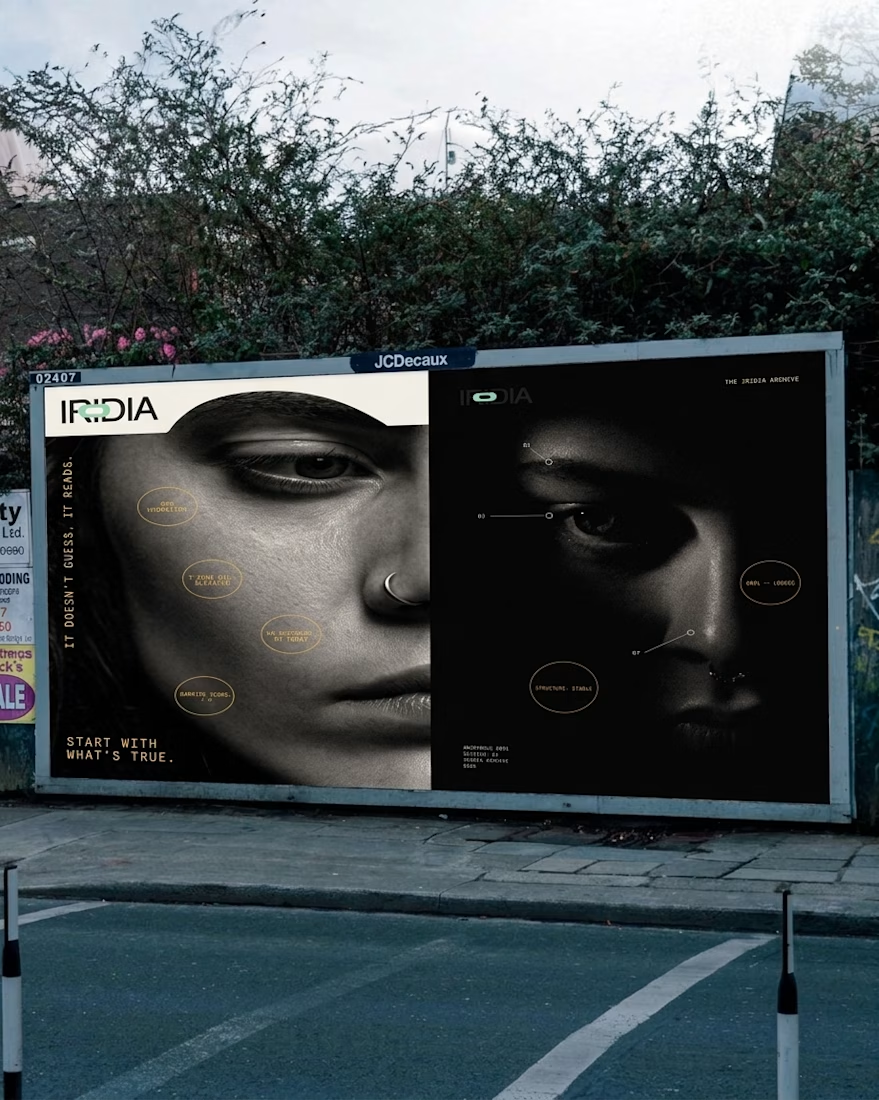
One of them finally got the full treatment. The Iridia case study drops soon.
What if your instant noodles were louder than your neighbors? 🔥
LOUD NOODLE is a brand with a big mouth, a red-hot palette and zero chill. The full case study is almost here.