The network for creativity
Join 1.25M professional creatives like you
Connect with clients, get discovered, and run your business 100% commission-free
Creatives on Contra have earned over $150M and we are just getting started
Back to feedPost
Taste Test

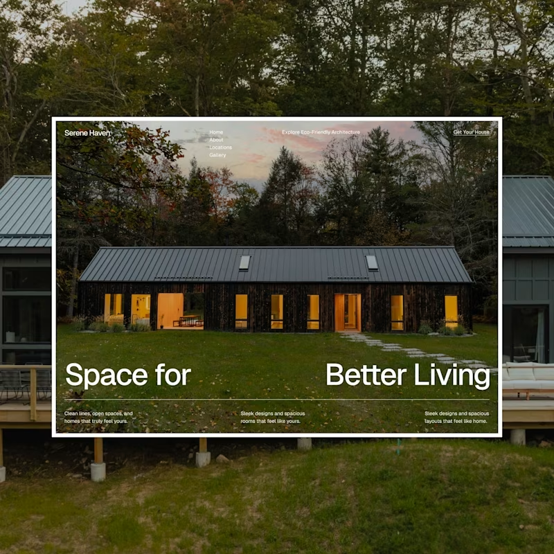
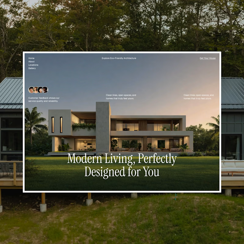
I have been playing around with two different hero section directions for an architecture/real estate landing page, and I honestly can't decide which one nails the vibe better. Both use the same layout structure, but the typography and photography give them totally different personalities.
Design A: Bold, modern sans-serif headline paired with a warm, rustic cabin. Feels grounded, cozy, and confident.
Design B: Elegant serif headline over a sleek concrete-and-glass villa. Feels luxurious, editorial, and refined.
Which one speaks to you? and tell me why?
Your feedback genuinely shapes what I build next, so thank you in advance for taking a second to weigh in!


42 voted
49%
43 voted
51%
85 votes
Closed


I’d go with Design B. The serif and villa pairing feels more premium and editorial, which fits the real estate space really well.
Thanks bruh


Nice design !
Thank u so much


I so much love B
thanks bruh🙌

these are cool designs
thanks bruh🙌

Great design🚀
thanks bruh🙌

Both directions work, but the typography in B gives the page a stronger premium architectural feel. The contrast makes the hero feel more confident.
Thanku

Welldone

I believe A is better because the alignment but if the hero title of the B in left alignment that will be the best option
thanks bruh🙌

They both look amazing
thanks bruh🙌

A feels more countryside than the B.
thanks bruh🙌

Great design Rashid!
thanks bruh🙌

both are looking good, hard to choose , still go with A
thanks bruh🙌
You're welcome 😊

A is my favourite
Thanks for vote


amazing work!
Thank you so much 😊

Option A looks cleaner and better


I can easily glance through the content on A compare to B that have the content scatter everywhere.

The both look good

Wow! So beautiful and professional work!👌


Design B for a premium real estate audience. The serif over the concrete and glass villa reads editorial and high end, which matches how luxury property buyers expect to be sold to. I would only reach for A if the brand leaned family and warmth over status.

the second design aline with the background looking nice


Loved them buddy
The network for creativity
Join 1.25M professional creatives like you
Connect with clients, get discovered, and run your business 100% commission-free
Creatives on Contra have earned over $150M and we are just getting started

Challenges
View all


Related posts

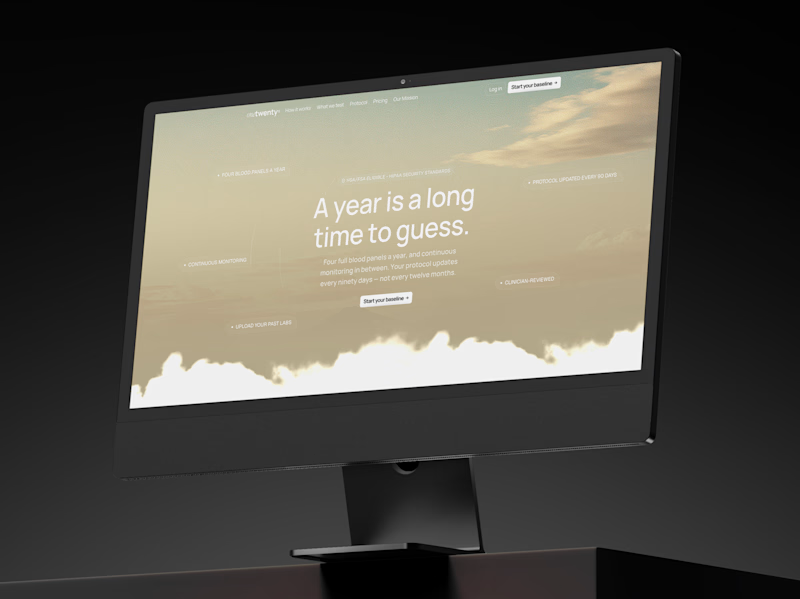
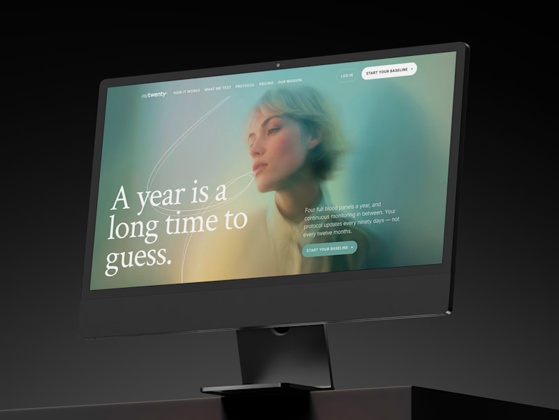
a longevity health membership asked me for the first ten seconds of their site. two opinionated directions, not four safe ones.
A · the instrument: https://onetwenty-direction-a.framer.website/
opens with how it works, shown through real product interface. the clearest version of what the category already does.
risk: one more health dashboard.
B · the publication: https://onetwenty-direction-b.framer.website/
opens with the reader's doubt, then explains. a big serif headline, one photo, a section that plays the idea out as you scroll.
risk: drifting into wellness.
the copy is nearly identical in both, on purpose. so the question isn't which one looks better:
which one would make you trust a health company with your blood and your data?
vote, and tell me why below.
10 voted
17%
49 voted
83%
59 votes
Closed

B look similar to this https://templatoria.com/templates/clearpath
templatoria.com
ClearPath — Framer Template for Therapists and Coaches
ClearPath is a warm Framer template for therapists, coaches, and personal growth professionals. Built for services, client stories, journals, and booking-focused websites.

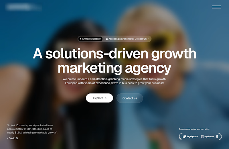
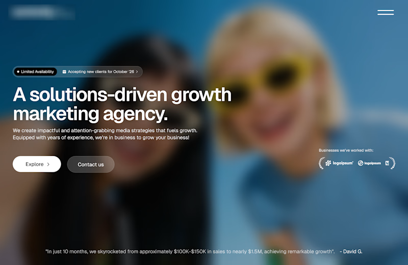
Working on a redesign for a marketing agency and I’m currently exploring layout options.
Assuming the background image is approved, which layout do you think will work best?
A or B?
11 voted
73%
4 voted
27%
15 votes
Closed

Option A works well


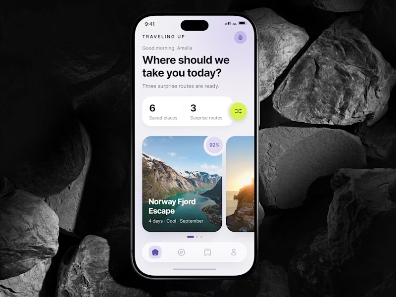
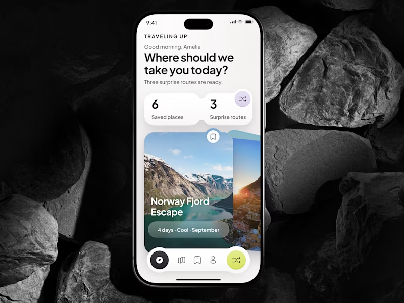
🎴 TASTY TEST 06/30: Which travel discovery experience would you choose?
Traveling Up is probably my first mobile concept outside client work in almost three years. It was inspired by a trip where not knowing the destination was part of the fun.
Same app. Same destination. Two ways to discover it.
🤍 A Clean Carousel
Calmer, lighter, more familiar.
💚 B Immersive Deck
Bigger imagery, stronger overlap, more tactile navigation.
Which one makes you want to swipe and see where the app takes you next?
A or B? 👇
#MobileAppDesign #TravelApp #MobileUX #UIDesign #ProductDesign #AsolDesign
23 voted
49%
24 voted
51%
47 votes
Closed
