The network for creativity
Join 1.25M professional creatives like you
Connect with clients, get discovered, and run your business 100% commission-free
Creatives on Contra have earned over $150M and we are just getting started
Back to feedPost
Taste Test

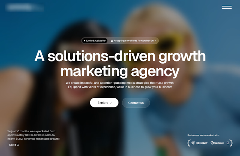
Working on a redesign for a marketing agency and I’m currently exploring layout options.
Assuming the background image is approved, which layout do you think will work best?
A or B?

11 voted
73%
4 voted
27%

15 votes
Closed

The comparison is clear and the hierarchy feels confident; I’d test a slightly stronger contrast between the two CTAs so the intended path reads instantly over the soft photo.
Alright Rohan.
Thanks for the feedback.

Option A works well
Thanks Blessing


Option A

Option A
Great job, Timi!
Good.
Thanks Dami.

Option A works best , the copy looks well positioned for the hero and the spacing around is evenly distributed
Alright Fisayo.
Thanks for the feedback.


the blue hero looks strong

The two options look great and beautiful but since you want me to choose, I will go for option A
The network for creativity
Join 1.25M professional creatives like you
Connect with clients, get discovered, and run your business 100% commission-free
Creatives on Contra have earned over $150M and we are just getting started





Related posts


Professional work Sergey

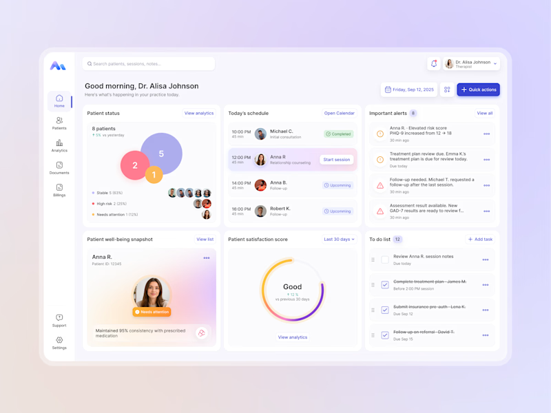
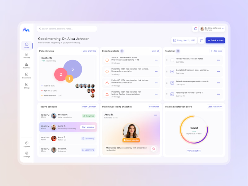
Designing for therapists means prioritizing what matters in the next few minutes, not just what looks good on a dashboard.
I explored two layout directions for a mental health practice management web app that helps psychologists manage sessions, patients, documentation, tasks, and follow-ups.
Both concepts use the same core widgets, but with different positioning and visual hierarchy. The goal was to make daily priorities easier to scan and act on.
Which option feels more intuitive - A or B? 🤔
17 voted
68%
8 voted
32%
25 votes
Closed


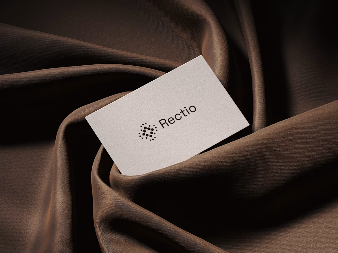
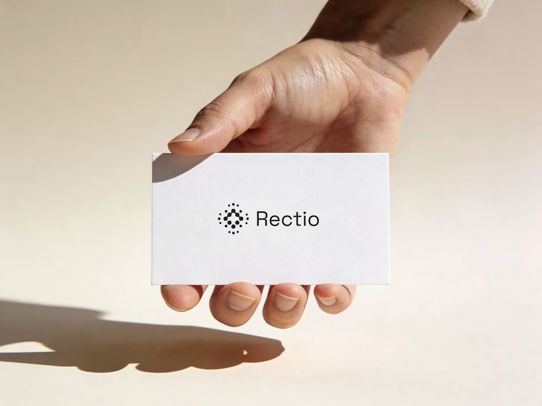
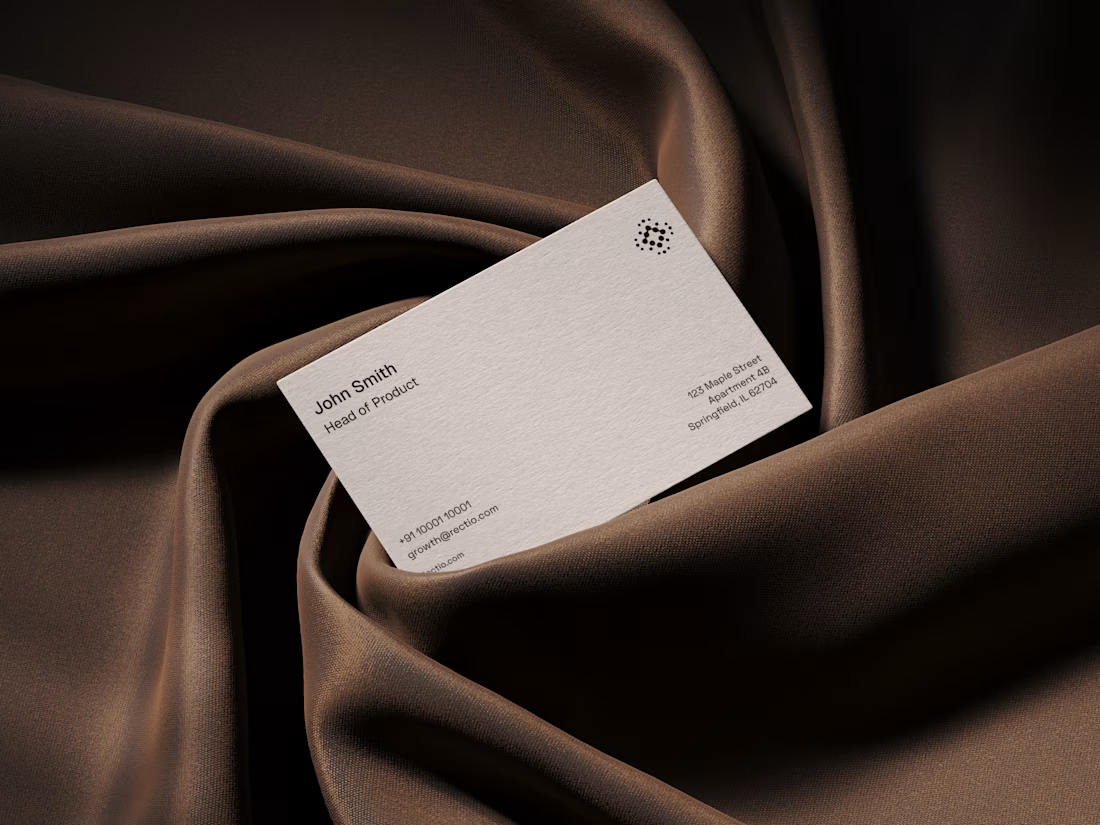
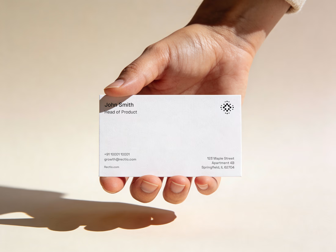
Rectio — Brand Identity
Brand Identity • Visual Direction • Business Cards • Mockups
A modern and minimal branding direction for Rectio, from visual identity to business card applications.
Created by Artonest Design Studio — artonest.design