The network for creativity
Join 1.25M professional creatives like you
Connect with clients, get discovered, and run your business 100% commission-free
Creatives on Contra have earned over $150M and we are just getting started
Back to feedPost
Taste Test


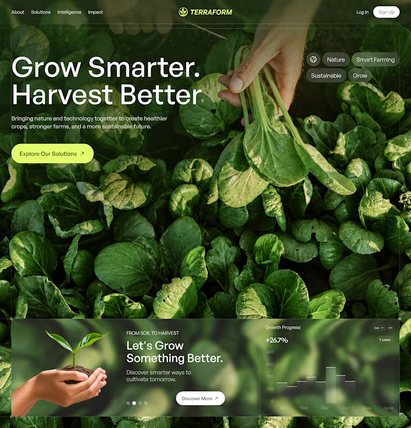
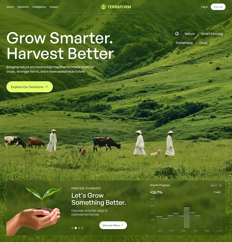

I'd go with B - It creates a stronger first impression and stops the scroll faster. A is cleaner but B has more personality and brand recall. If the goal is conversion, B wins for me. Curious what did the client pick? 👀
Absolutely Juice Lab! Curious to see what the client picks - both options were strong but B has that edge. Keep us posted!


B feels more immersive and creates a real connection with nature.

Definitely A! Clean, bold, and impossible to ignore.

B wins for me. The cinematic landscape tells the story beautifully.

Both look great, but A feels more memorable at first glance.

A for me. The close-up leaves feel richer and the headline pops against the dark green.

Upgoating B

B instantlu caught my eye and also the text readability is better.

B is more calming it's better ❤️

B looks more clear

B for me. A definitely has that bold, stop-you-in-your-tracks energy, but B pulls me in deeper with the storytelling. For a brand first impression, I'd bet on the one people linger on. Curious whether the client's team splits the same way the votes are splitting here.

B looks better

top tier work!

A is more logic because it's a website i guess 💯

Option B

I would pick A. The close-up of the leafy greens makes the product feel so fresh and real. It instantly grabs attention and connects better with people who actually care about food quality.

Direction B wins for scale and contrast. The open pasture tells a bigger agricultural story and the softer sky keeps the headline razor sharp compared to the noisy leaves in A.

The close up leaves version stops me more. Feels closer to the farmer and the headline reads cleaner on that darker green

Both look great, but A feels more memorable at first

I’d go with B. The landscape creates a stronger emotional connection and communicates the brand’s sustainability mission more clearly. 🌱

I love B option

Ohh it's tough both are amazing.

The network for creativity
Join 1.25M professional creatives like you
Connect with clients, get discovered, and run your business 100% commission-free
Creatives on Contra have earned over $150M and we are just getting started











Related posts

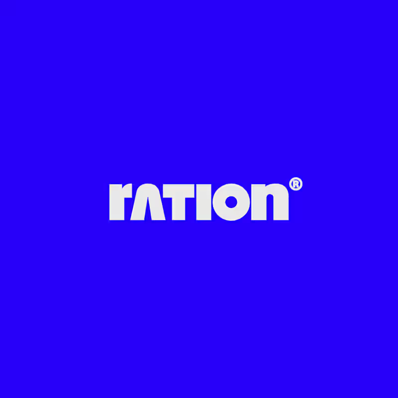
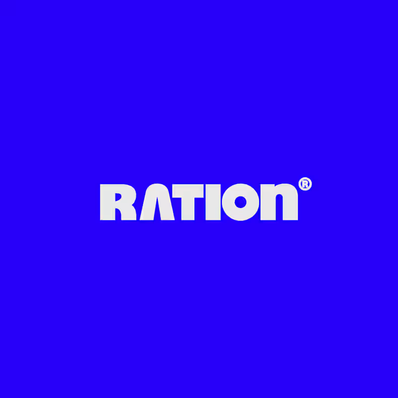
I’ve been working on a bold, modern-retro logotype and can’t decide between these two options.
🆘 Which one feels more aesthetically pleasing to you?

11 voted
26%
31 voted
74%
42 votes
Closed
CAPITAL is great but SMALL is unique great job Nawras 🔥🔥


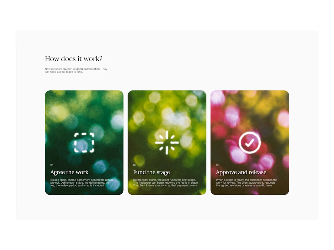
Your web sections always have such strong art direction. Great to see the brand carried right into the layout.


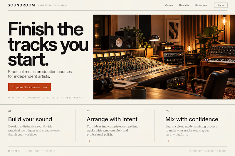
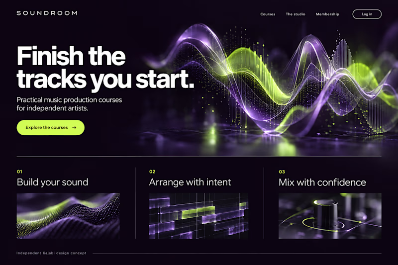
Which Kajabi music-course design makes you want to hit play?
Two original AI-generated website concepts for Soundroom, a fictional music-production academy. Analog Studio pairs warm recording-room imagery with cream and burnt orange. Digital Rhythm brings luminous waveforms, midnight plum and acid lime. Same course, two different first impressions.
Which direction would you choose?

13 voted
41%
19 voted
59%
32 votes
Closed