The network for creativity
Join 1.25M professional creatives like you
Connect with clients, get discovered, and run your business 100% commission-free
Creatives on Contra have earned over $150M and we are just getting started
Back to feedPost
Taste Test
I’ve been working on a bold, modern-retro logotype and can’t decide between these two options.
🆘 Which one feels more aesthetically pleasing to you?


11 voted
26%
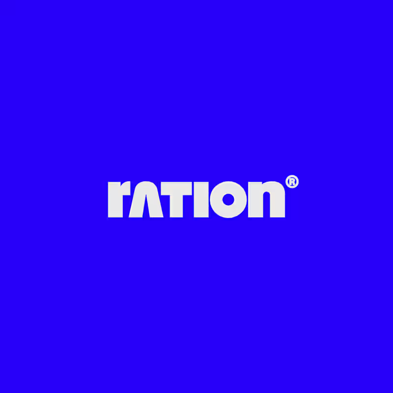
31 voted
74%
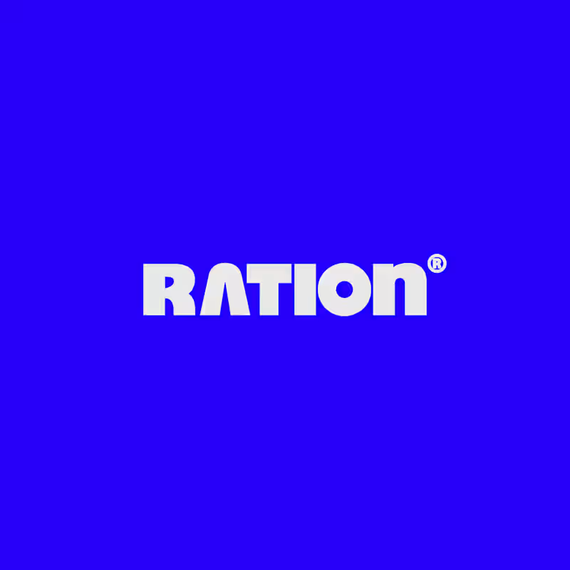
42 votes
Closed

CAPITAL is great but SMALL is unique great job Nawras 🔥🔥

Thanks Mostafa 🙌
Pardon Nawras❤️

Capital!!
Appreciated 🙌

Capital gives more professional vibe
Thanks pal!

I am keaning towards the Capital one!!...It looks fab against Small!
Thanks for share!

I'll choose CAPITAL
Good choice!

Capital. The retro weight wants width, and the all caps version holds the baseline like a sign. Small reads softer, which is a different brand.
Fully agree 👍

CAPITAL looks stronger—clean, bold, and more memorable. 🔥
I think that too 👌 Thanks bro!

The SMALL wordmark wins the kerning — the retro weight sits on a tighter, more contemporary grid and the counters stay open enough to read at a badge size. CAPITAL carries more of the era on its shoulder and reads heavier in lockup, which is the right call for a headline but...
It's a good POV 👍 Thanks for your share! Appreciated 😊

Captial works best here.
Such a strong insight! Thanks ☺️

I'm fully interest for your choice! Could you share me your opinion? Why you chose the small?

It's cool
Thanks buddy! 🙌

Brilliant ✨
Thanks a lot!

Good work Nawras
Thanks Afnan!
Thanks, Nawras - happy to share the read. Both are strong, and it really comes down to where the logo lives most. If the brand leans editorial/headline, CAPITAL is the call; if it needs to hold its own at small touchpoints (favicons, app icons, merch), SMALL's tighter grid will...

I'd lean toward the lowercase SMALL version, its silhouette feels more distinctive and ownable. The capitals read more clearly at tiny sizes though, so it depends where the logo lives most.
Thanks Artur for your share! Appreciated 🙌

Capital is working better here

I voted for SMALL. The lowercase version feels more distinctive and modern-retro, the CAPITAL one is bolder but a bit heavy. SMALL will also look cleaner on small sizes like app icons.
Thanks Irfan 🙌 Such a good insight!
Happy to help, Nawras! Glad it was useful. Excited to see how the final logo turns out.

capital somehow gives more promising look
Thanks bro! I appreciate that words


capital, feels closer to the bold retro direction you mentioned.. the small version reads a bit soft next to that blue
Thanks Kazi! I like the way you chose 😊

Fully agree! 👍

Capital for me too. It feels bolder and leans into the retro vibe more.

SMALL has more character for a modern-retro mark, the CAPITAL reads cleaner. Whichever you choose, the letterforms are strong.
Huge Thanks Timothy! 🙌
The network for creativity
Join 1.25M professional creatives like you
Connect with clients, get discovered, and run your business 100% commission-free
Creatives on Contra have earned over $150M and we are just getting started







Related posts

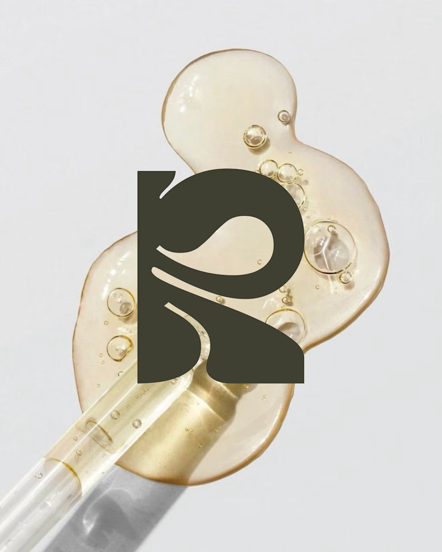
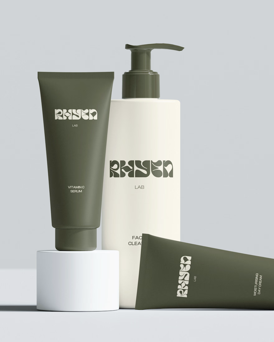
Rhyen Lab: Brand Identity & Packaging for a Skincare Brand
Rhyen Lab is a skincare brand built around science-backed formulas and a sensorial, human approach to beauty. The challenge was to create an identity that feels clinical enough to be trusted, yet warm and expressive enough to stand out in a crowded market.
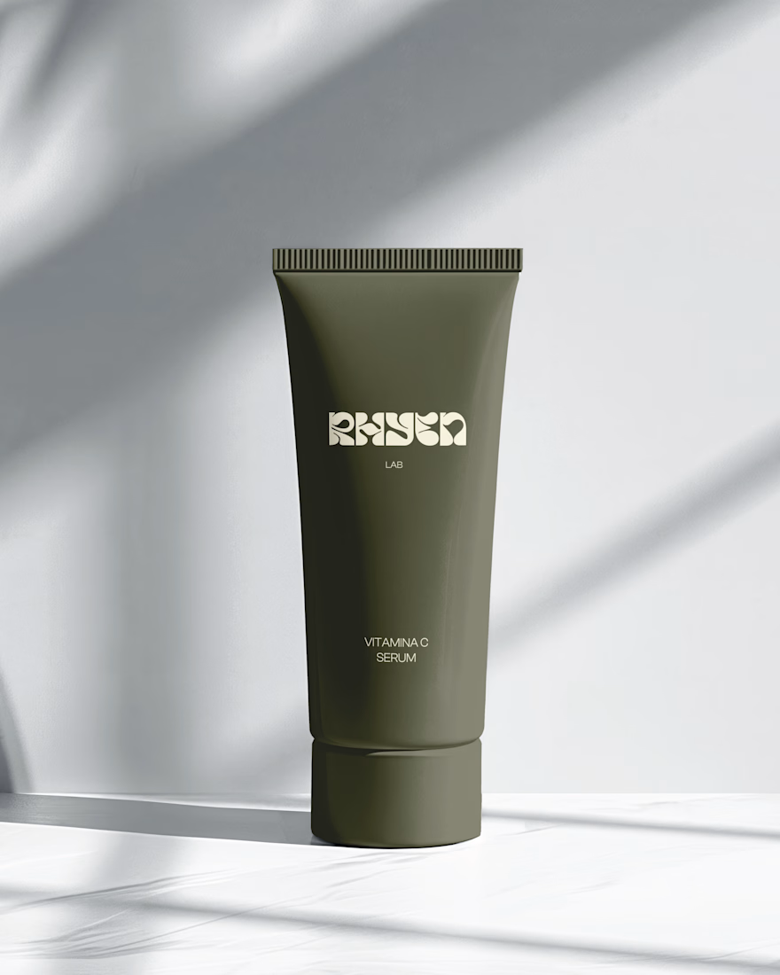
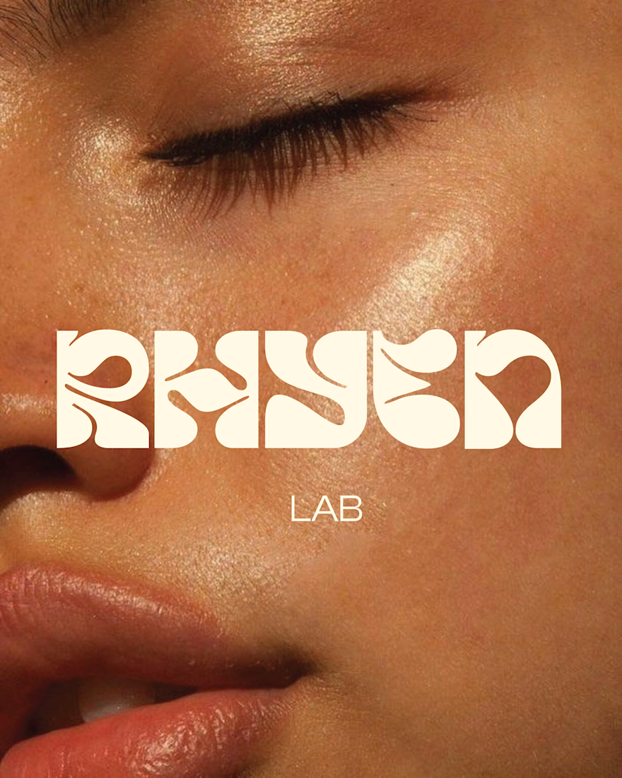
I designed a custom wordmark with fluid, organic letterforms that echo the texture of serums and oils, paired with a bold monogram “R” for compact applications. A palette of deep olive green and soft cream keeps the brand grounded, natural and premium, while macro photography of skin and product textures reinforces the sensorial tone.
The system was applied across packaging for the Vitamin C Serum, Facial Cleanser and Moisturising Day Cream, ensuring consistency across tubes and bottles.
Deliverables: Logo & monogram · Visual identity · Color palette · Packaging design · Art direction


REFORMR — Pilates Studio Brand Identity
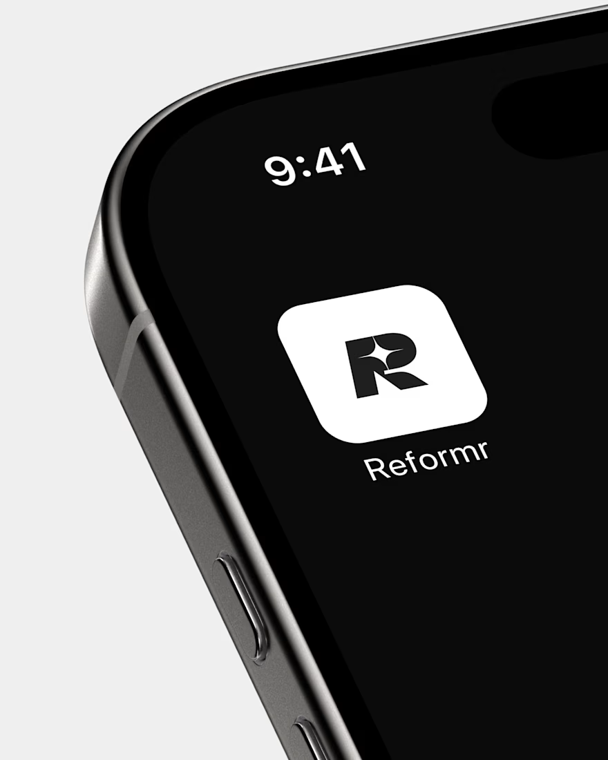
REFORMR is a self-initiated branding concept for a modern Pilates studio, built around movement, balance, and a refined visual aesthetic.
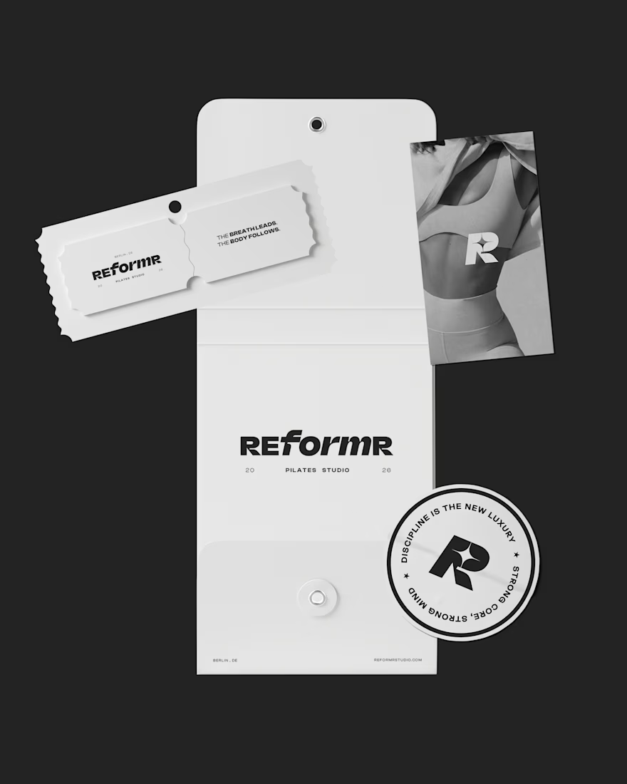
The visual identity combines bold typography, minimalist layouts, and monochromatic art direction to create a premium, contemporary brand. The project explores how a consistent visual language can translate across brand materials and advertising applications.
Scope: Logo design, visual identity, art direction, and mockup design.
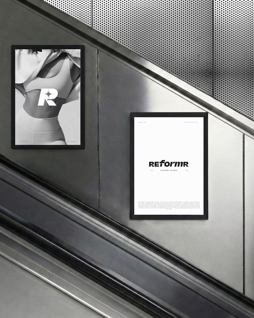
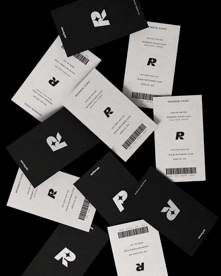


Love the bold typography and minimal direction. It feels clean, modern, and premium.
Ramen Brand Identity
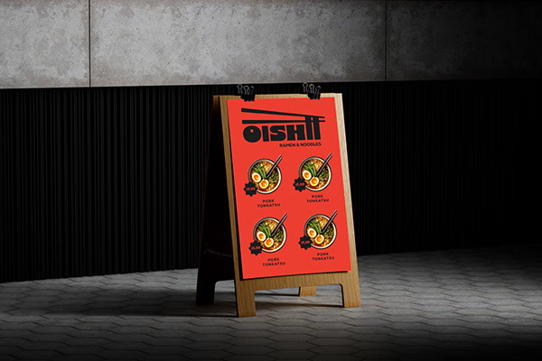
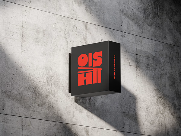
Oishii is a self-initiated branding project exploring the visual identity of a modern ramen brand. The concept combines Japanese-inspired aesthetics with a contemporary visual approach, creating a distinctive and cohesive identity across brand applications.
The project explores visual direction, typography, colour, and brand elements to build a memorable identity for a food brand.

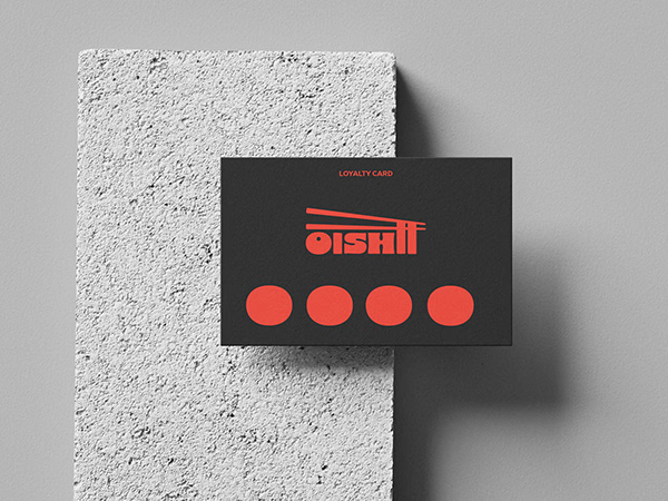
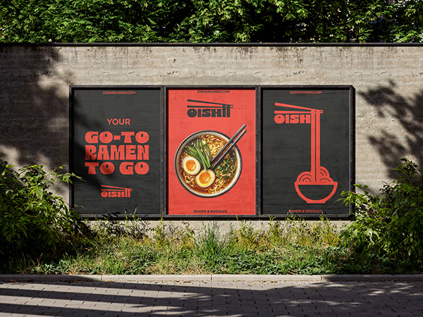
Love the mix of Japanese-inspired style and modern branding. The identity feels cohesive and memorable.