The network for creativity
Join 1.25M professional creatives like you
Connect with clients, get discovered, and run your business 100% commission-free
Creatives on Contra have earned over $150M and we are just getting started
Back to feedPost
Taste Test

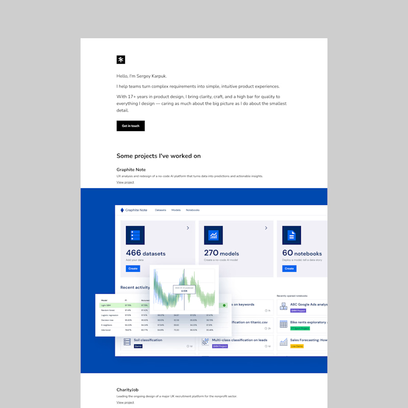
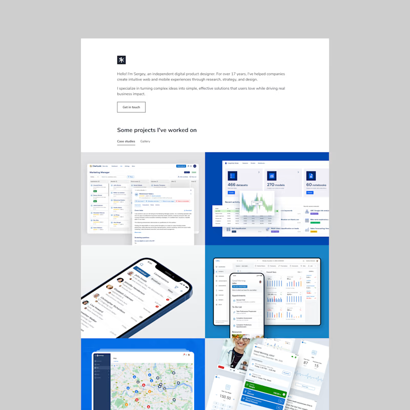

Went with Option 1. Cleaner hierarchy and easier to scan.


Option 1 feels much more premium and focused. Big full width project previews let people really see the details of your work instead of having to squint at smaller grid boxes.

Option 1 for me as well. The full width previews let the work breathe, and honestly that's what people come to a portfolio for, the work itself. Option 2 feels more like a moodboard. Were you worried option 1 might get repetitive with every project the same size, or does the content carry it?
The network for creativity
Join 1.25M professional creatives like you
Connect with clients, get discovered, and run your business 100% commission-free
Creatives on Contra have earned over $150M and we are just getting started











Related posts

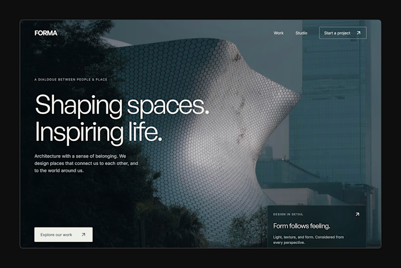
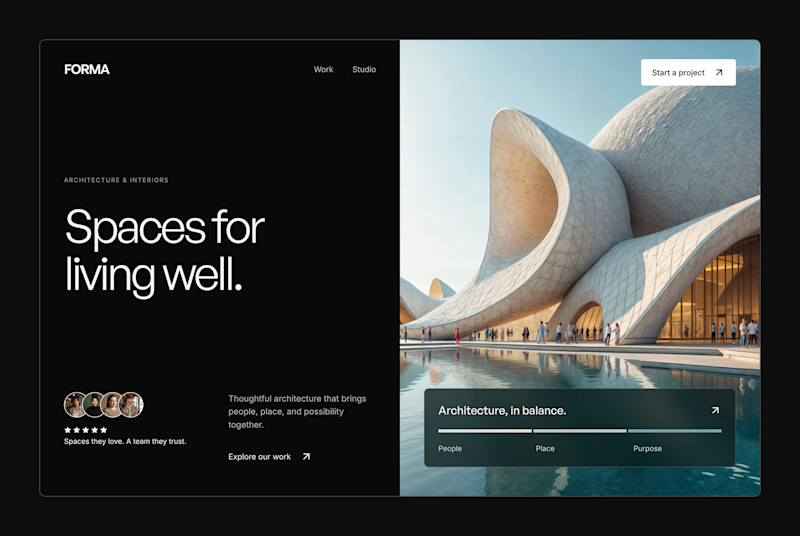
Design Exploration: Hero Section of Architecture Website. Which one do you think much better?


12 voted
43%
16 voted
57%
28 votes
Closed


🌲 Nordhaus | Prefab Timber Homes Website (Framer)
Homes that grow quietly with the forest, now on the web. 🏡
Nordhaus is a website for a Latvian builder of prefabricated timber homes, created in Figma and built in Framer as a responsive site for desktop, tablet and mobile. It brings the brand's calm Nordic character through full-screen photography, a scroll-driven process story, a horizontal model gallery and interactive testimonials.
✨ Template coming soon to Framer.


Wonderful design man

Just wrapped up a new website concept and would love some honest feedback. 👀
Been experimenting with layouts, visuals, typography, and interactions to push the design further. Let me know what you think and what you'd improve. WHICH ONE LOOKS BETTER...?
1 voted
33%
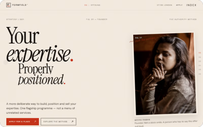
2 voted
67%
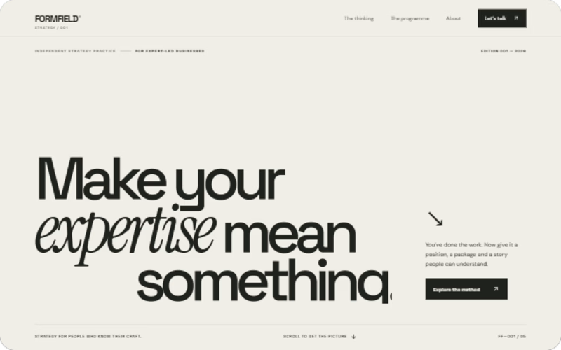
3 votes
Closed