The network for creativity
Join 1.25M professional creatives like you
Connect with clients, get discovered, and run your business 100% commission-free
Creatives on Contra have earned over $150M and we are just getting started
Back to feedPost
Taste Test

Which bag would make you buy the coffee?
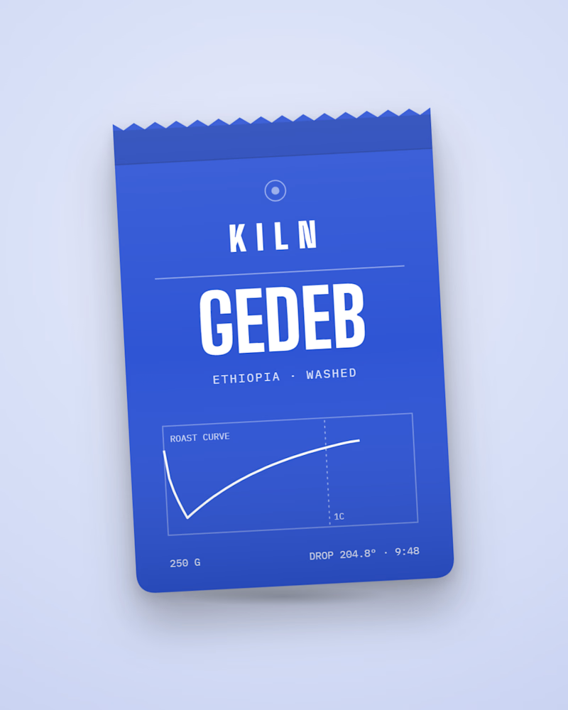
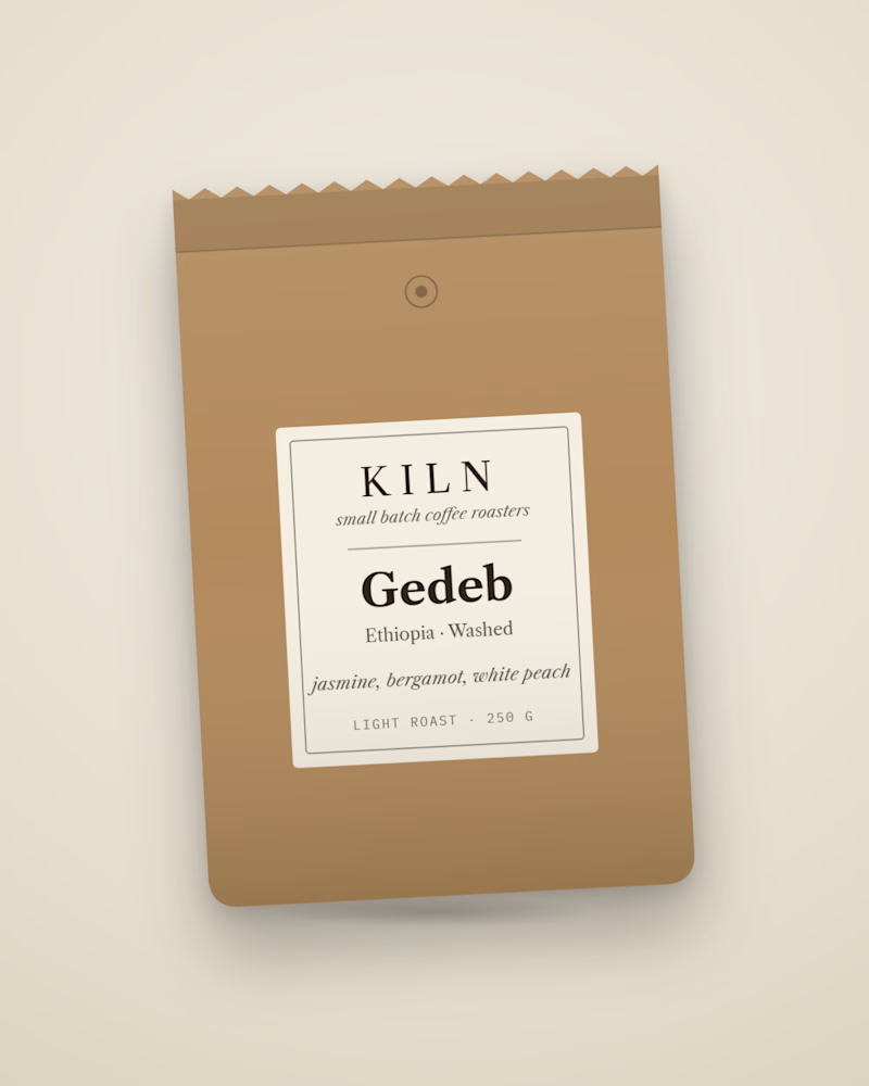
Same coffee, two bags. One prints the real roast curve from its batch: drop temperature, roast time, first crack. The other is the classic kraft label most roasters ship. I built the first into KILN, a Shopify store concept where every bag is generated from its roast data. Which one are you picking up, and why?

8 voted
62%
5 voted
38%
13 votes
Closed

I see the appeal. Kraft tells you what it is straight away. The curve has to make sense on the shelf too.

Roast curve all the way. It turns the bag into proof of craft, and people love sharing that kind of detail. Very cool concept.
That's what I wanted the curve to do. Give people a reason to look closer while keeping the coffee easy to understand.

The roast curve bag, easily. Real batch data on the front makes it feel honest and gives coffee nerds something to geek out over. Kraft is safe but forgettable
That extra detail interests me too. I'd still want the coffee and tasting notes to be easy to find, whether you're into roasting or just choosing a bag.

Printing the actual roast curve on the bag is such a good trust move, it turns the data into the packaging. I'd buy that one. Does the curve change with every batch on the print run?
Yes, that's the idea: each batch's data would produce its own curve. KILN is a concept, so I'm describing the intended print workflow here, not a live print run.
That makes sense, thanks for clarifying Nolan. A unique curve per batch is a lovely idea for building trust, would be great to see it printed for real one day.
Same here. The bag art comes straight from the batch data, so a short test print is the easy part. If you were holding one, which number would you want biggest on the front: the curve itself or the first-crack time?

Roast curve for me, and the part I love is that every bag is generated from its own batch 🤓 That's the kind of detail people take photos of. Maybe keep a kraft texture under the curve and you get both worlds.
Kraft with the curve could work well. I'd keep the texture subtle so the batch detail stays easy to read.
Halfway update: roast curve leads 64/36, but the kraft side has the sharpest argument so far. TRUEFRAME said kraft "feels like something I'd actually grab off a shelf." Moussa suggested a kraft texture under the curve. Kraft voters, would that win you over? Poll closes tomorrow.

Roast curve. It's a real detail from the batch, and the blue makes it stand out on a shelf.
The blue is a big part of it for me too. It gives the curve a clear place on the bag without burying the coffee details.
The network for creativity
Join 1.25M professional creatives like you
Connect with clients, get discovered, and run your business 100% commission-free
Creatives on Contra have earned over $150M and we are just getting started



Related posts

Need a second pair of eyes 👀
I'm designing the online store for FizzPop, a craft soda brand: all-natural sodas, sparkling waters and botanical tonics.
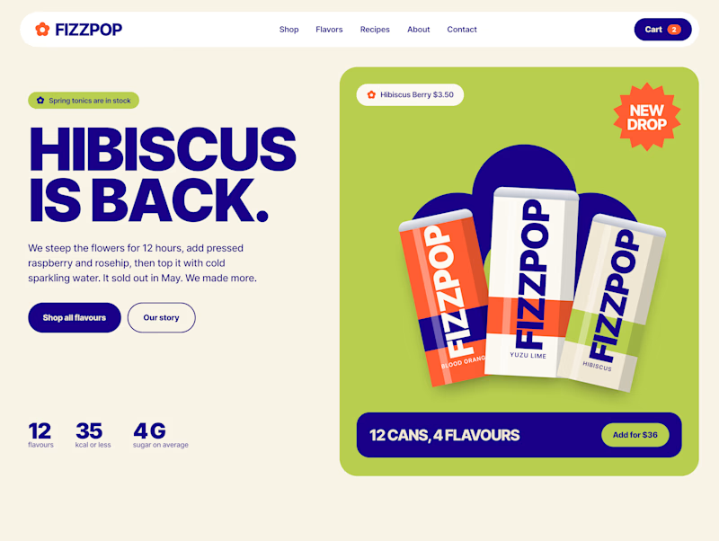
Flower Fizz(A): eggshell, tiger orange and deep ultramarine, with flower shapes and stacked colour swatches for the flavours
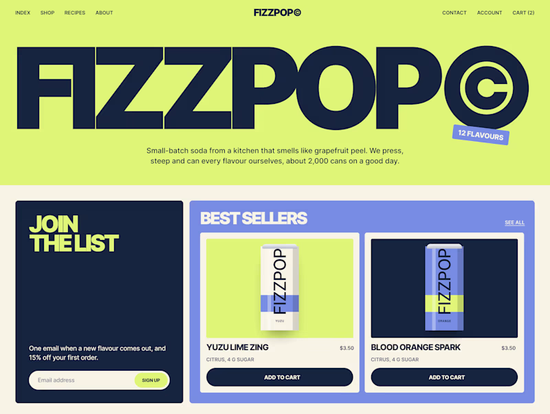
Corner Shop(B): lime, soft blues and navy, editorial layout with a giant wordmark and menu-style flavour tiles

38 voted
44%
48 voted
56%
86 votes
Closed


Working on a Contra project - which one is your go to?
90 voted
52%
82 voted
48%
172 votes
Closed

I will go for A - Spiral


Which one would you open the launch with?
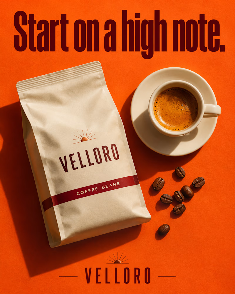
The first is a kraft bag laid flat on bright orange, shot from above, a cream cup of espresso with thick crema beside it, a few beans scattered toward the corner, hard sun throwing long shadows, a tall condensed headline in deep maroon.
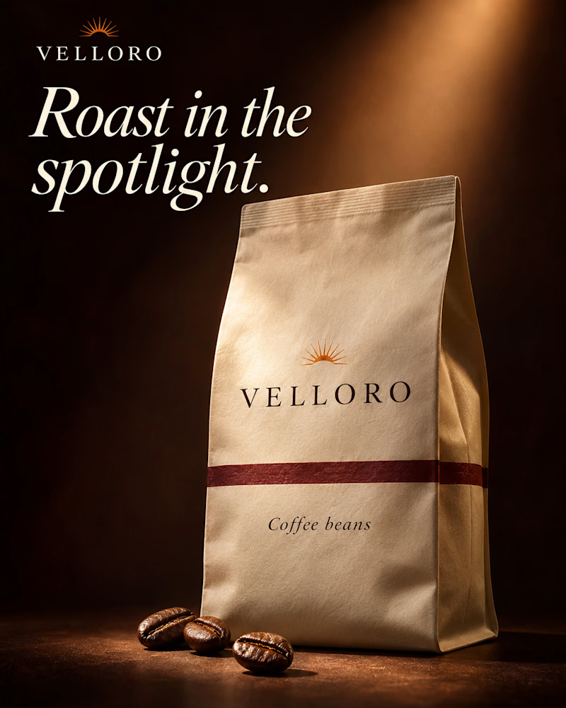
The second is the same bag standing upright in the dark, a single warm beam falling across it from above, three beans at its base, the logo set in fine serif and the headline in cream italic.
One sells the morning. The other sells the roast.
👇 #packagingdesign #brandconcept #productphotography
9 voted
47%
10 voted
53%
19 votes
Closed

spotlight looks nice!