The network for creativity
Join 1.25M professional creatives like you
Connect with clients, get discovered, and run your business 100% commission-free
Creatives on Contra have earned over $150M and we are just getting started
Back to feedPost
Taste Test


Went with Dithered. The softer texture feels more fitting for medtech than hard pixels.

I agree

Upgoating pixelated..... Superb!!!!!!
Thank you

Pixelated
Thanks Gargi

Dithered gets my vote. For medtech the softer, almost organic texture feels calmer and more trustworthy, while the hard pixels read a little glitchy to me in a health context. Was the card mainly a visual anchor, or does it carry dosing info that needs to stay crisp at small sizes?
This is a visual anchor

Dithered is more professional
I agree

Dithered more clean
Agree, Ahmad

great work!
Thank you Jahid

dithered
Got it

Definitely Dithered. It looks so much cleaner and feels like a credible medical product. Plus, the dot pattern matches the first card perfectly.
I agree

I’d go with Pixelated. It feels more refined and modern, and the subtle color gradients make the product visuals stand out without overwhelming the overall design.
hmm...makes sense.

Definitely Dithered, Nirmit! The subtle gradient dissolve gives it a much softer, high-tech aesthetic that aligns perfectly with a modern MedTech brand. The pixelated option feels a bit too retro/gaming for healthcare.
I get you

Voted Pixelated, with a reservation. The dithered pill is smoother, but on a Medtech site smooth reads as a stock render, while the pixelated one at least looks like a decision. Your own Or none? deserves a serious answer though. For a section about giving a drug a second life,...
Thanks Aditya, worth a try

Both are amazing
Thank you Afnan


dithered reads calmer against the blue pill icon. pixelated competes with the card edges more.
I get you, Kazi
The network for creativity
Join 1.25M professional creatives like you
Connect with clients, get discovered, and run your business 100% commission-free
Creatives on Contra have earned over $150M and we are just getting started











Related posts

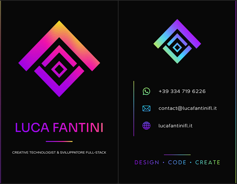
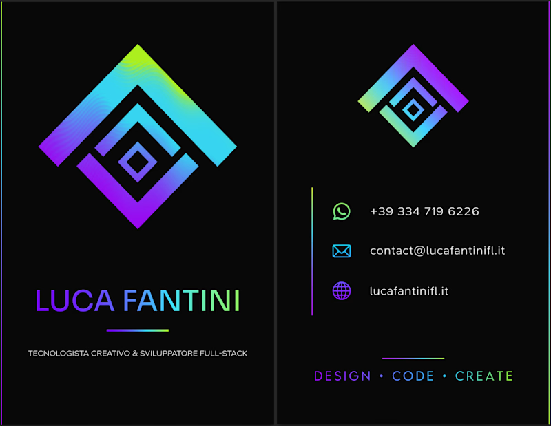
i've been making my business card today, which version do you prefer? what do you think about it?
2 voted
18%
9 voted
82%
11 votes
Closed

I'd lean toward the single palette. The cooler gradient keeps the contact icons readable, while the magenta in the second one starts competing with the logo mark. Worth proofing the neon on paper too, since it can shift a lot in CMYK.

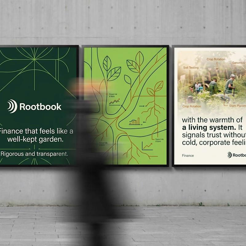
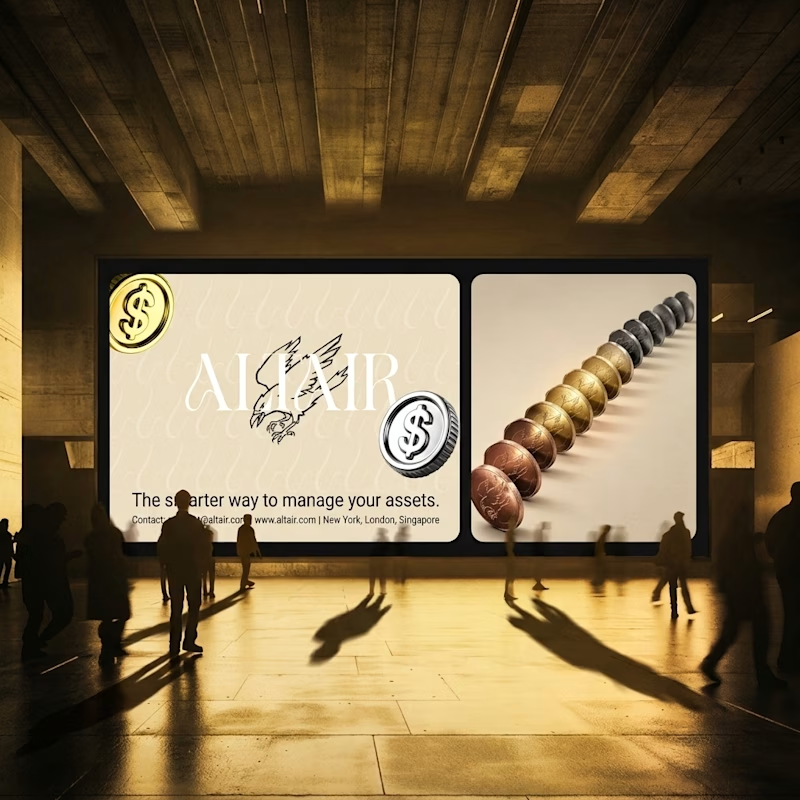
What does trustworthy finance look like to you?
A) Rootbook: Finance that feels like a well-kept garden.
B) Altair: The smarter way to manage your assets.
Two finance brands I’m designing, two completely opposite worlds. Which one gets your money?
28 voted
61%
18 voted
39%
46 votes
Closed

Rootbook wins for me. A finance brand that feels like a well kept garden is such a refreshing idea.

Two camera distances for the same Movable Ink cut. One leans in, one shows the whole layout. 1 or 2.
10 voted
50%
10 voted
50%
20 votes
Closed

2 is more stunning the animations feels unique and that's unbelievable 🎉🎉🔥🔥
great job Blahomyr❤️❤️