The network for creativity
Join 1.25M professional creatives like you
Connect with clients, get discovered, and run your business 100% commission-free
Creatives on Contra have earned over $150M and we are just getting started
Back to feedPost
Taste Test
a longevity health membership asked me for the first ten seconds of their site. two opinionated directions, not four safe ones.
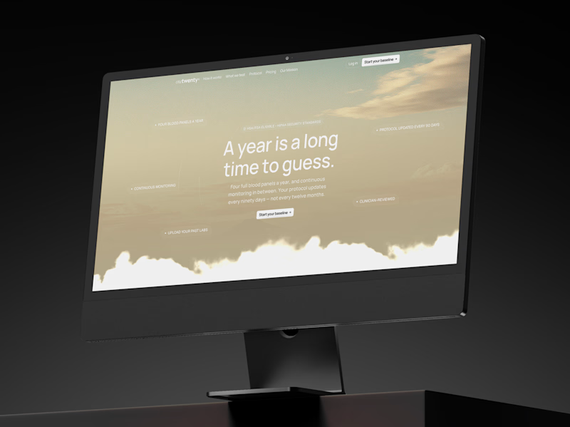
A · the instrument: https://onetwenty-direction-a.framer.website/
opens with how it works, shown through real product interface. the clearest version of what the category already does.
risk: one more health dashboard.
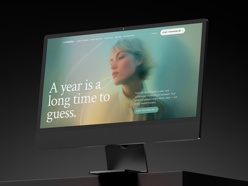
B · the publication: https://onetwenty-direction-b.framer.website/
opens with the reader's doubt, then explains. a big serif headline, one photo, a section that plays the idea out as you scroll.
risk: drifting into wellness.
the copy is nearly identical in both, on purpose. so the question isn't which one looks better:
which one would make you trust a health company with your blood and your data?
vote, and tell me why below.

10 voted
17%
49 voted
83%
59 votes
Closed

B is outstanding

The instrument direction feels especially strong—the product UI makes the value legible before the motion has to do any work. Nice restraint in giving the two concepts such different narrative jobs.

the instrument

I like the publication


A for me

Thr publication nails it

Two strong opinions beats four watered down options every time. Did the client end up torn between A and B, or was there an obvious winner once they saw both side by side?

Voted A. With blood and data on the line I'd rather see the actual product working than be persuaded by a doubt-then-explain narrative.

B for trust. A tells me what it does, B makes me feel like someone actually thought about why I might hesitate before handing over my health data.

B look similar to this https://templatoria.com/templates/clearpath
templatoria.com
ClearPath — Framer Template for Therapists and Coaches
ClearPath is a warm Framer template for therapists, coaches, and personal growth professionals. Built for services, client stories, journals, and booking-focused websites.


the orange and blue title pops

yeah! i used that framer template as the base for direction B! (it’s no secret if that’s what you were thinking haha - i talked it through with the client and suggested using it as a starting point)
honestly, it’s not the first time i’ve used a template for a client project either. that’s what they’re there for!! 🙌
ClearPath’s visual language feels calm and approachable—the warm palette and generous spacing fit the therapist and coach audience well. The card preview also makes the template’s content structure easy to scan.

B has more character and the headline looks much more prominent!

A for me


Good Work!!!! It looks quite appealing


In my own view, I will go.with the publication


Cool work !

The two designs are good but the publication looks better.
Your works are fantastic.

Cool work !


B. a big serif and one photo reads like someone signed their name to it.


B looks more visually captivating and that works well for a hero section in the first 10 secs , users will definitely want to scroll down to see more

I love the publications

B for the hero, looks creaive


They are both beautiful 😍

B nailed it

fantastic

For health workflows, I’d choose the direction that makes the care boundary explicit: what is educational, what is collected, and when a human responds. A short trust cue plus a plain-language privacy and booking path will likely beat a clever headline—especially for visitors deciding whether to share sensitive details.
The network for creativity
Join 1.25M professional creatives like you
Connect with clients, get discovered, and run your business 100% commission-free
Creatives on Contra have earned over $150M and we are just getting started





Related posts

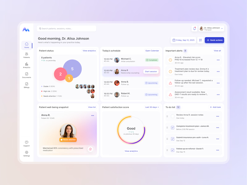
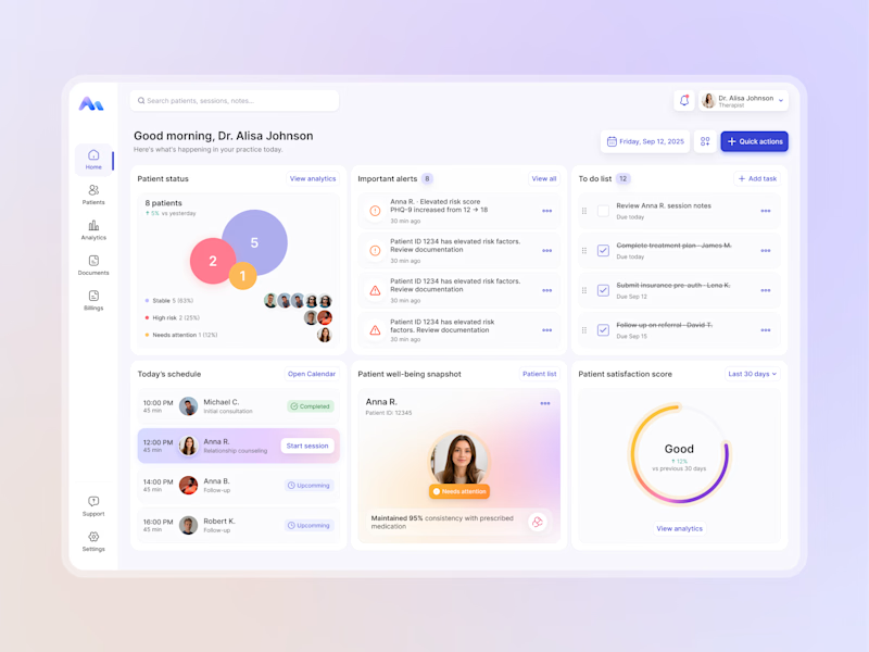
Designing for therapists means prioritizing what matters in the next few minutes, not just what looks good on a dashboard.
I explored two layout directions for a mental health practice management web app that helps psychologists manage sessions, patients, documentation, tasks, and follow-ups.
Both concepts use the same core widgets, but with different positioning and visual hierarchy. The goal was to make daily priorities easier to scan and act on.
Which option feels more intuitive - A or B? 🤔
17 voted
68%
8 voted
32%
25 votes
Closed


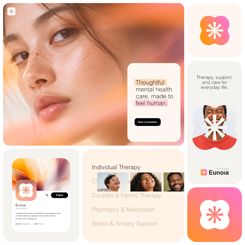
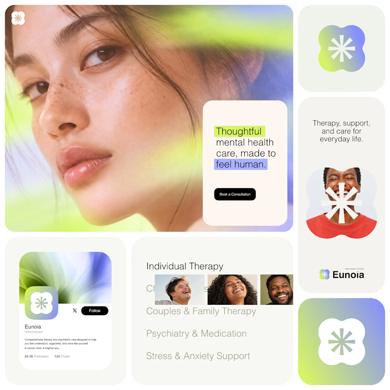
Exploring two visual directions for Eunoia, a mental health & psychiatry brand.
Direction 01 - Warm peach, orange and soft pink tones for a calm, human and comforting feel.
Direction 02 - Lime and periwinkle tones for a fresher, more optimistic and contemporary expression.
Same brand system. Different emotional energy.
32 voted
52%
29 voted
48%
61 votes
Closed

That's impactful, love to see fresh styles

🚀 Oda — an architecture studio template for Framer, with agent skills
Oda is a website template for architecture and interiors studios, laid out like a drawing set: graphite lines on warm paper, title blocks, sheet numbers and line drawings that draw themselves.
The Framer edition comes with five skills for Framer's agent, so you can make the site yours in plain language:
👉 /oda-rebrand — "Rebrand this for our studio in Porto." Studio name, city, the sun study's location and time zone, colours (contrast-checked), fonts and copy, in the right order.
👉 /oda-content — "Add three projects." CMS items with every field filled, ASCII slugs, sheets kept in order.
👉 /oda-code-components — "Make the cabin draw twice as fast." Properties first, code only when a property can't do it.
👉 /oda-design-system — new pages and sections use the Oda styles, grid and section numbering.
👉 /oda-before-publish — the checklist the template was built to pass, on every page at Desktop, Tablet and Phone.
What's in the template:
· A timber cabin that draws itself, with a sun study you can drag. The shadow uses real solar maths for your city.
· Project sheets on a sideways track, and a floor plan that builds as you scroll.
· Materials with drawn textures, a team section, awards and a contact form with a sketch pad.
· Responsive down to 390 px, WCAG AA contrast, reduced-motion support.
Framer edition $59. Also available in plain HTML and React.
https://no-code.supply/templates/oda/

Nice temple and nice animations congratulations Lauri good job🎉🎉🎉