The network for creativity
Join 1.25M professional creatives like you
Connect with clients, get discovered, and run your business 100% commission-free
Creatives on Contra have earned over $150M and we are just getting started
Back to feedPost
Taste Test

Designing for therapists means prioritizing what matters in the next few minutes, not just what looks good on a dashboard.
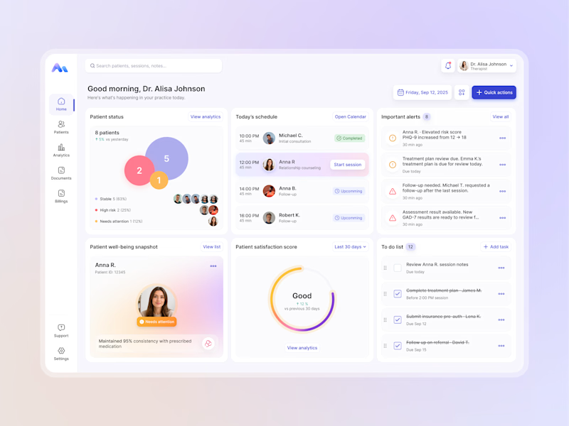
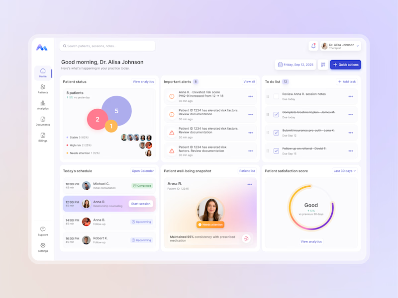
I explored two layout directions for a mental health practice management web app that helps psychologists manage sessions, patients, documentation, tasks, and follow-ups.
Both concepts use the same core widgets, but with different positioning and visual hierarchy. The goal was to make daily priorities easier to scan and act on.
Which option feels more intuitive - A or B? 🤔
17 voted
68%
8 voted
32%
25 votes
Closed

I choose A it was more managed I like how data is capped together it's nice good job 🎉🎉


sorting the day by what happens in the next five minutes, good lens


which direction feels more reassuring for therapists, B or A?

Leaning B, mostly because the session list sits where a therapist's eye lands first between appointments. Did any actual psychologists weigh in yet? Their gut pick might be totally different from what designers vote for.

Excellent work Anna.

I prefer A.

A option for me

A wins, todays schedules in that position is Nice

I really like both options, but A stands out to me. The layout feels more organized and the data is nicely grouped.

A for me. Designing for therapists means what matters in the next few minutes is the perfect lens, and A puts the session and patient info front and center where a busy clinician needs it. B is prettier but asks for more scanning. Function wins in a tool people use between appointments.


Excellent work !

A is much clearer to me

Option A's layout hierarchy is spot on placing immediate daily priorities front and center removes cognitive load for high-stress daily workflows.

really like your work and that kind of style! wow!

A is much better. Doctors check their appointments first thing, so having the day's schedule right at the top makes complete sense. Did you talk to practicing therapists to see whether they actually check their upcoming sessions or urgent patient alerts first when logging in?
The network for creativity
Join 1.25M professional creatives like you
Connect with clients, get discovered, and run your business 100% commission-free
Creatives on Contra have earned over $150M and we are just getting started











Related posts

Hey everyone! 👋
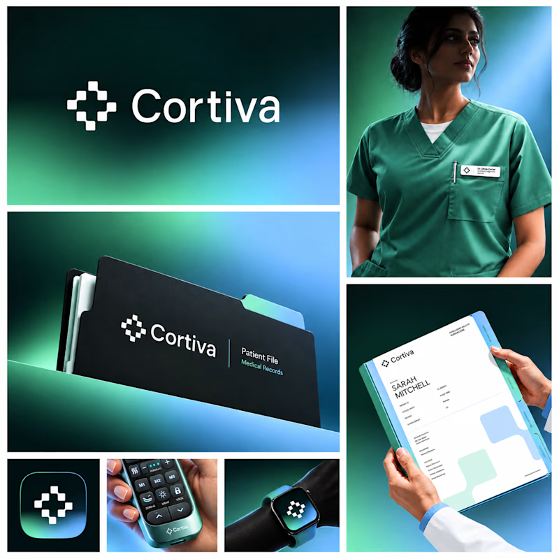
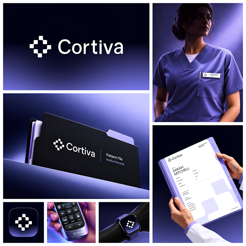
Working on Cortiva, an AI-first hospital branding project.
I've already finalized the color direction, but I thought it would be fun to explore two different moods.
Option 01💚 or Option 02? 💜
Both have their own personality, and I'm curious to see which one you prefer!
Let's see which one wins! 👀
5 voted
33%
10 voted
67%
15 votes
Closed

Both directions are strong, but I'm leaning towards Option 01. The green feels instantly like "care" and trust, which is perfect for a hospital. Option 02 looks more techy and premium. Curious, which mood are you aiming for - clinical and calm, or friendly and modern?


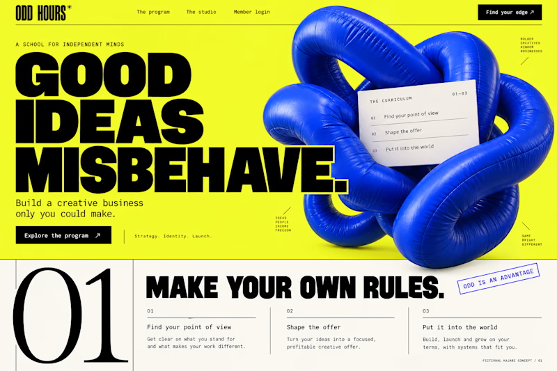
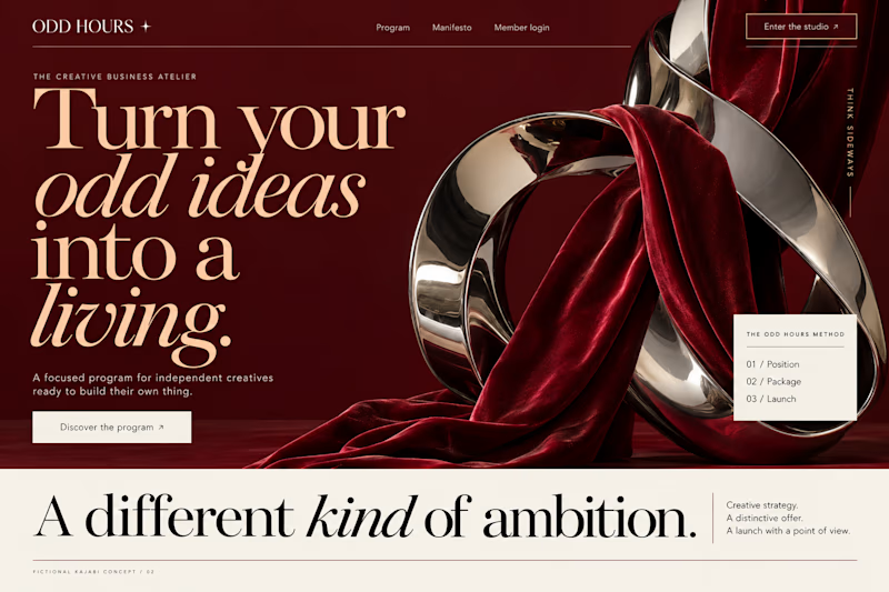
Which Kajabi direction would stop your scroll?
Meet ODD HOURS, a creative-business academy concept.
A / Acid Play: electric yellow, oversized type and a sculptural blue knot.
B / Velvet Rebellion: oxblood, chrome and velvet with fashion-editorial typography.
Two original AI-generated concepts. Same offer. Completely different energy.
Which one pulls you in, and why?

15 voted
65%
8 voted
35%
23 votes
Closed
It's only Acid Play it's unbelievable 🔥🔥🔥🔥
Great job Kraig🎉🎉

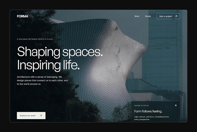
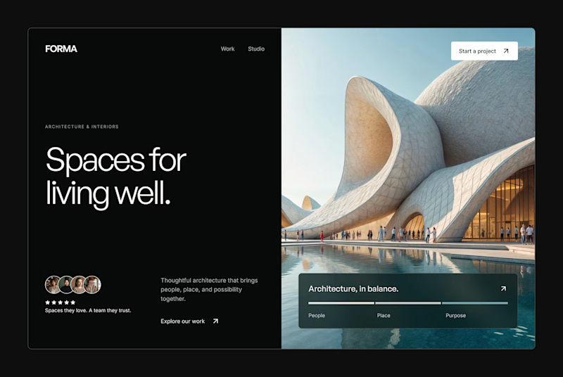
Design Exploration: Hero Section of Architecture Website. Which one do you think much better?


12 voted
43%
16 voted
57%
28 votes
Closed

