The network for creativity
Join 1.25M professional creatives like you
Connect with clients, get discovered, and run your business 100% commission-free
Creatives on Contra have earned over $150M and we are just getting started
Back to feedPost
Taste Test

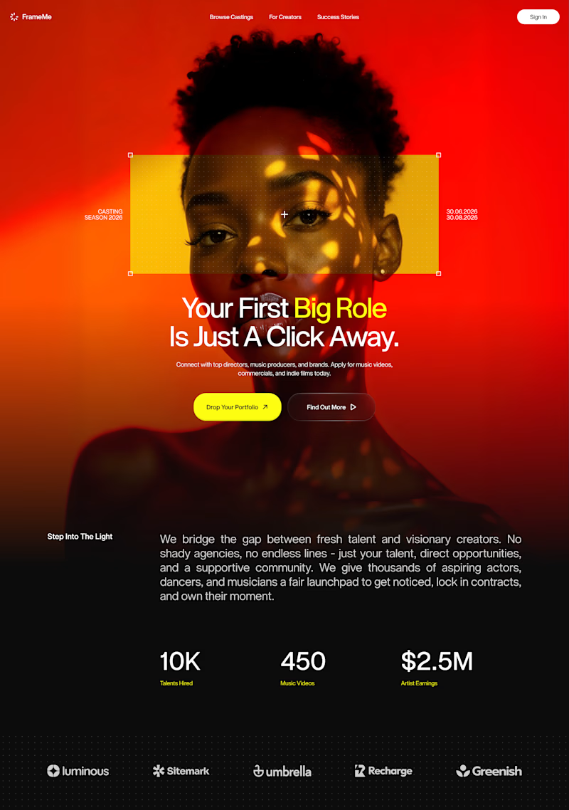
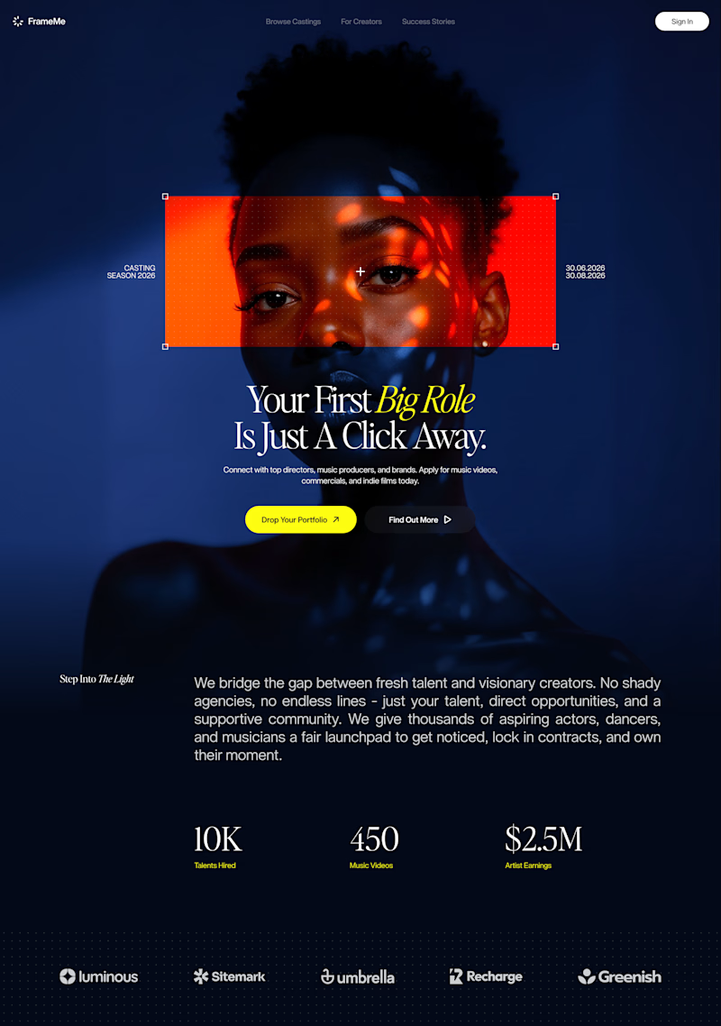
Which direction brings out the premium tech aesthetic better? 🔴🔵
Currently working on a brand new hero framework where typography meets high-contrast confidence. I’d love to hear your thoughts on which color palette feels more impactful.
79 voted
70%
34 voted
30%
113 votes
Closed

Red version because it makes the design looks sharper and vibrant

I will go with B, good contrast and von resoff effect 👌

Honestly speaking I like both 😊 But voted for blue version


Red for me, I dont like how the human silhouette disappears on the black background :)

red version

Really like the contrast of the dark blue with the small red frame. I feel that, in terms of tone, it balances the premium aspect really well.

Red one

Red looks good as it blends with the background

Really smart informational pacing structured across this casting marketplace landing page concept.


Definitely Red

Will go for the Red One

Red Version looks premium

i agree

For this design, red version looks better, awesome designs! 👍

Red version looks better and the color blend better

nice design!

The red version has a high contrast, and the typography looks clear and readable

The red looks premium

The red one, it looks good!

definitely love the red version

Red one


Both look really nice, but the red one gets my attention immediately!

Nice work!

The Red :v

Nice work

Red one for sure, Looks more premium

B. A felt more like a fashion brand at first without reading the content. B focuses on "You" which is the message

The red version definitely wins for that premium, high-contrast tech aesthetic! The bold typography against the dark-warm palette feels more confident and commanding. Love this hero framework direction!

The blue version

I love the Red version!
The network for creativity
Join 1.25M professional creatives like you
Connect with clients, get discovered, and run your business 100% commission-free
Creatives on Contra have earned over $150M and we are just getting started
Related posts

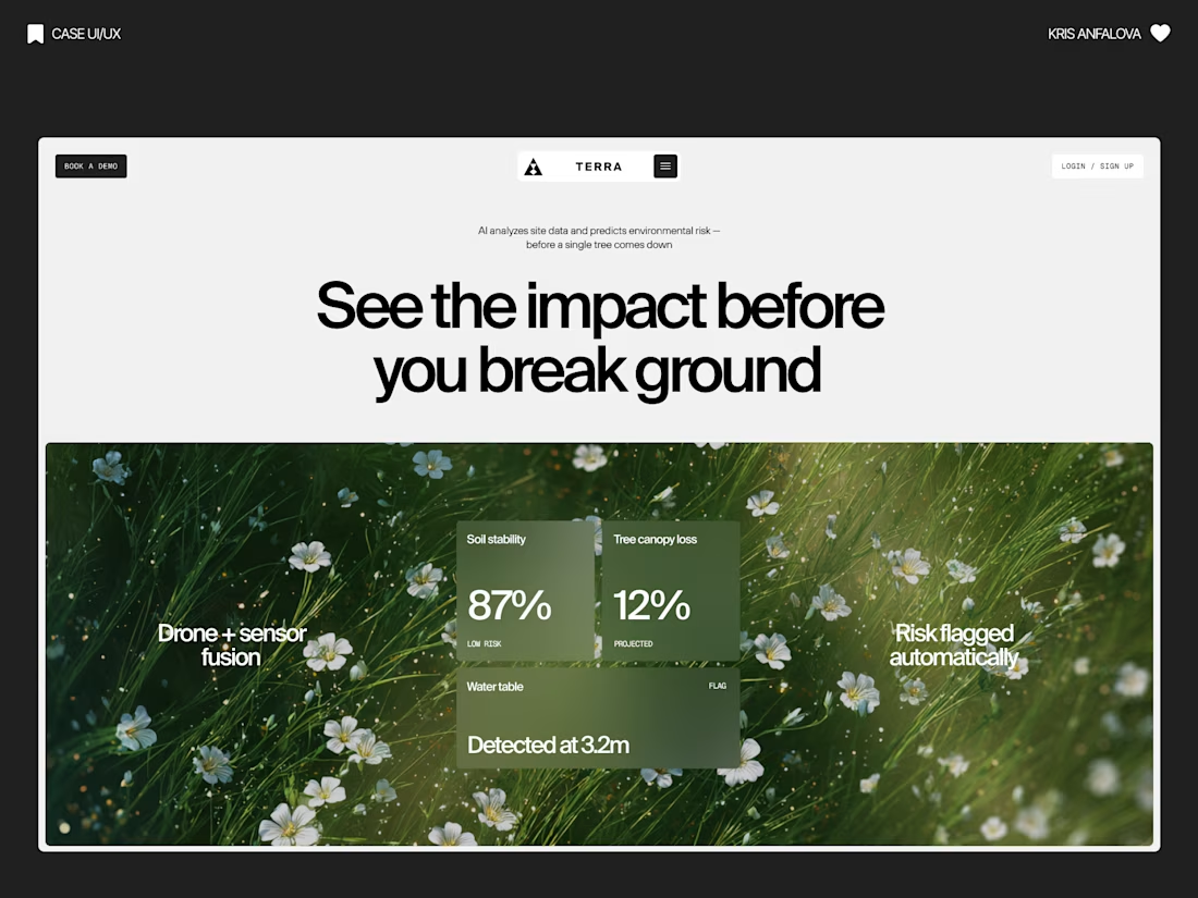
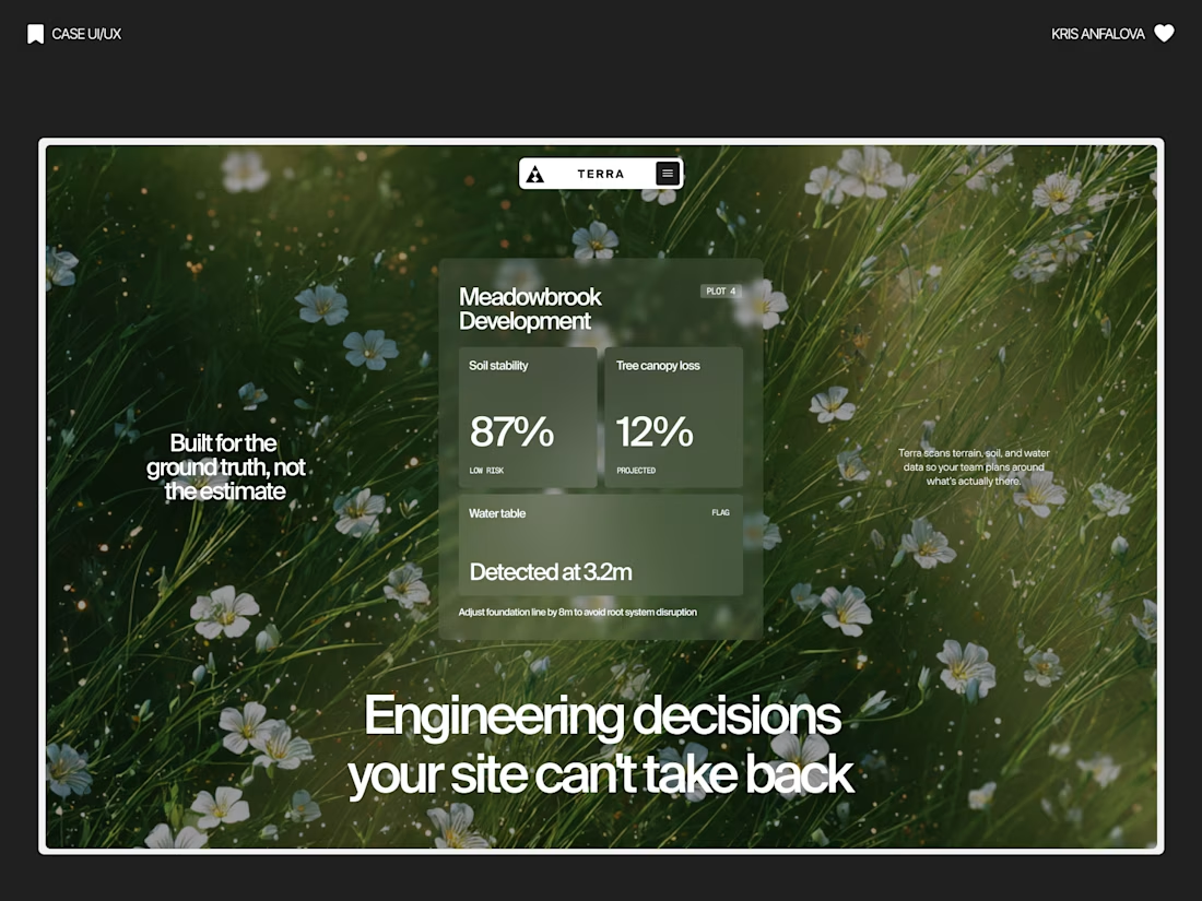
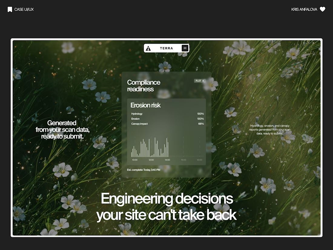
Terra — AI Environmental Risk Platform
Designed the landing page and product UI for Terra — a platform that helps land developers and engineering teams see environmental risk (soil stability, tree canopy loss, water table depth) before breaking ground.
The challenge:
Development decisions are usually based on estimates, not real ground data — and by the time issues show up, it’s often too late to reverse them. The interface needed to make complex sensor/AI data feel immediate and trustworthy, without losing emotional weight.
The solution:
Raw, organic photography (wildflowers, grass, natural terrain) paired with clean glass-panel data cards — creating a visual tension between “nature” and “precision engineering.” Bold editorial typography carries the emotional message, while translucent metric cards surface real numbers: soil stability, canopy loss %, water table depth.
A strong example of turning dense environmental data into something a non-technical stakeholder can understand in seconds.



Nice one

Most websites look good.
Few make people stop, trust, and take action.
This landing page was designed with one goal: clarity over complexity.
Every section has a purpose:
- Clear visual hierarchy
- Generous whitespace
- Clean, modern UI
- Scalable components
Good design isn't about adding more,it's about removing what doesn't help users.
I'd love to hear your thoughts:
What part of a landing page has the biggest impact on conversions?
If you'd like, I can also make it more viral, designer-focused, or client-attracting.


Weldone ☀️ 💖

Which logo do you prefer? For an Adobe After Effects extension - that deals with expression writing and reusing?
15 voted
71%

6 voted
29%

21 votes
Closed

Option 1 for me, the eye reads instantly and the negative space in the X still pops. Are you planning to animate the logo mark for the extension's loading state?










Trending

Claude
Claude has entered the design space. How are you using Claude Design?

Contra University
Learn from expert creatives how to earn more using next-gen AI tools.
creativeaiflow
Creative AI workflows are evolving. What tools do you use, and what are their strengths and weaknesses?
freelancerlife
Freelancer life is wins, pivots, and everything in between. What’s yours right now?