The network for creativity
Join 1.25M professional creatives like you
Connect with clients, get discovered, and run your business 100% commission-free
Creatives on Contra have earned over $150M and we are just getting started
Back to feedPost

Hot take: hair growth products don't have to look like medicine to work like it.
Most brands in this category go clinical white and blue, it reads safe, but it also reads like something you'd hide in a drawer, not something you'd want visible on your sink. For Maneup Labs, I went almost fully black instead.
That was a real risk. In a category this saturated with sterile, pharmacy-white packaging, going dark could just as easily read cold, or get lost next to competitors leaning into "clean = trustworthy." But it did the opposite: next to every clinical-looking bottle on the shelf, black reads premium, not medicinal, closer to what you'd expect from a grooming or fragrance brand than a hair-loss aisle.
That's the audience shift the whole rebrand was built around, not the guy who wants to feel like he's medicating something, but the guy who wants a product that looks like it belongs on his counter.
Would a bottle like this make it out of your bathroom cabinet and onto your sink?

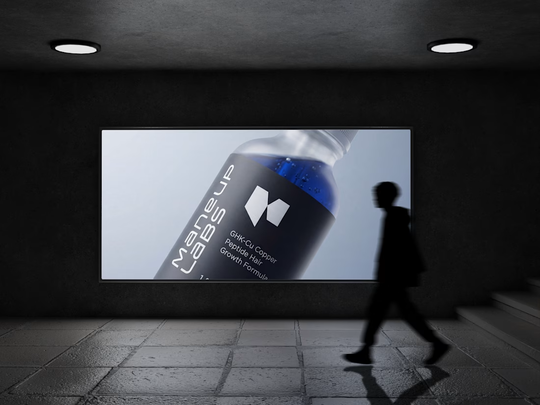
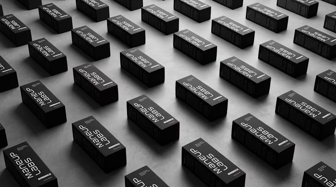
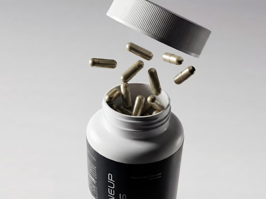
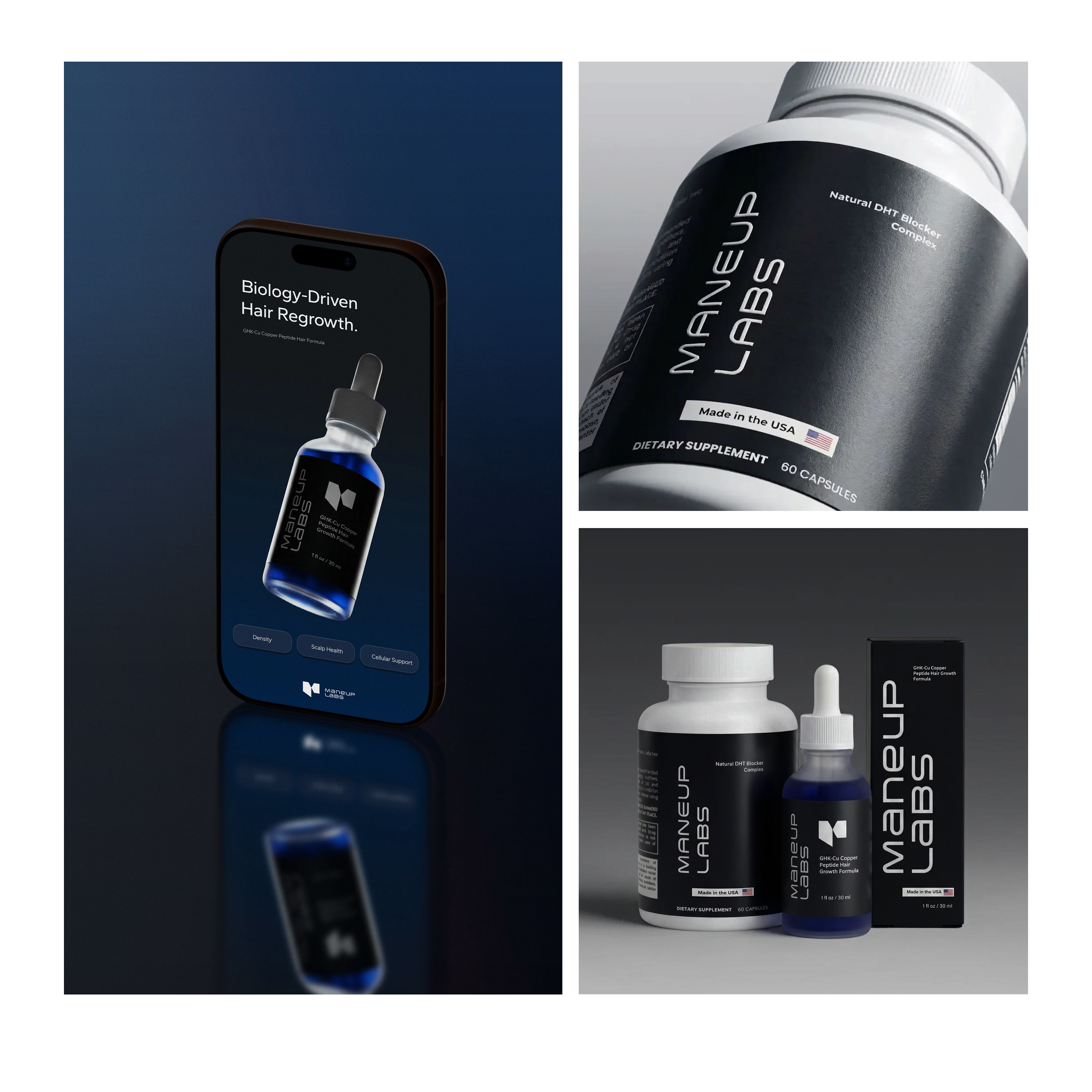

On my sink, yes — but clinical white is doing double duty in that category. It's ugly, and it's also the efficacy cue people are reading, so going black means that signal has to reappear somewhere else, usually in the copy or an ingredient callout. Where did you end up putting it for Maneup?
Good catch!! This is exactly the kind of thing I think about at the strategy stage. We chose to put GHK-Cu Copper Peptide right on the front instead of the ingredient list. It's the real proof point, and it let the credibility come from specificity instead of leaning on clinical white. Thanks for pushing on it😊

Looks amazing! 💙
Thank you!!

🔥

This hot take is just correct. Clinical white and blue signals side effects, not results. A hair growth brand you'd actually leave out on the sink is smart, shame is a terrible retention strategy. Maneup Labs looks properly premium here.
Thank you!!

definitely agree, you've captured a real sense of luxury here!
Thank you Nicolette!!

The shift from a ‘treatment’ to a grooming product comes through immediately. Bringing the GHK-Cu proof point onto the front feels like a smart way to keep the efficacy cue without falling back on clinical white. Did the darker direction also influence the brand’s tone of voice?
Thank you!! And yes, the tone followed the same logic as the packaging: confident and understated, not clinical or hype-y.

Going almost fully black for a hair loss product is a bold call, and honestly it makes sense the moment you say it out loud. I'm curious how you tested that risk before committing, or did you just trust the strategy and go?
Mostly the second, trusted the strategy! Looked hard at competitors first, so it wasn't blind, but I went with confidence over data on this one

It definitely feels premium and modern. Great work!
Thank you!!


amazing work

I will only praise this. And I love the product photography because it looks premium.
Thank you Mahmudul!!
Most welcome Virginia Roson

Amazing work

really amazing branding.
Thank you!!

yes it should feels like a grooming product rather than a treatment for a problem
Thank you!

Very professional work💯
Thank you!!

The renders came out clean!
Thank you Nishit!!

I love how the branding presentation is done here. The details make this stand out. What was your inspiration for this?
Thank you!! We looked at different directions but saw that supplement + sports brands aligned better with our strategy!

This hot take is so right. The all-black direction makes it feel like something you'd proudly leave on your shelf. Smart move breaking away from the clinical look everyone else defaults to.
Thank you Tabish! 🙌

The blue and black combo looks powerful.
Thank you!!

Love this approach, Virginia! Moving away from medical blue/white gives it such an executive, modern feel. These 3D visuals would look insane integrated into an interactive Next.js landing page. Exceptional work
Thank you Muhammad!! Appreciate it 😊

Attractive

This certainly doesn't look like the everyday saturated package usually used

Wow, such a unique style! Keep up the great work!
Thank you!

on fire
Thank you!!

Nice product design
Thank you Louis!
You are welcome

Really solid work 👏 Stepping away from standard clinical visuals to give hair care packaging a vanity-worthy presence is brilliant positioning.
Thank you!!

Awesome!
Thank you!


Great Idea,
Thank you!!

Congratulations 🎉🍾
thank you!!

looks really premium and better than those generic ones
Thank you Daxesh!
The network for creativity
Join 1.25M professional creatives like you
Connect with clients, get discovered, and run your business 100% commission-free
Creatives on Contra have earned over $150M and we are just getting started





Related posts


Does an AI brand still need to look like an AI brand?
Lupr helps small and growing businesses adopt AI without the complexity, so the identity needed to do the same.
We built a clean, approachable system around movement, connection and continuous improvement, without leaning on the usual futuristic tech clichés.
The idea was simple: make AI feel like useful business infrastructure, not something you need to be an expert to understand.
As AI becomes part of everyday business, do you think brands still need to visibly signal “AI”?
Full case study below 👇


Great design it feels alive 🎉🎉❤️❤️


The thing I keep relearning: a design is never finished because someone ran out of ideas. It's finished because someone decided to stop. Knowing when to stop is the hardest part.


Damn.... Crazy colors 👏😍

Next intelligence. A brand you can feel.
Ice blue, deep black and refracted glass bring texture, depth and a sense of touch to an invisible technology. An identity designed to be recognised. And felt.
Brand identity and visual direction for Niwos, a platform that brings AI agents together as a digital workforce.
Five modules. One W. A simple idea at the heart of the identity: working as one.
I’ve really enjoyed working on this project with Muhammed. His trust in my design judgement and openness to new ideas gave me the creative freedom to explore fully.
Here’s hoping this is just the first chapter of an exciting journey with him and his team.


👍 nicely done


