Built with Lovart
Brand Identity and Packaging Design for Maneup Labs

Virginia Roson
Verified


The ask
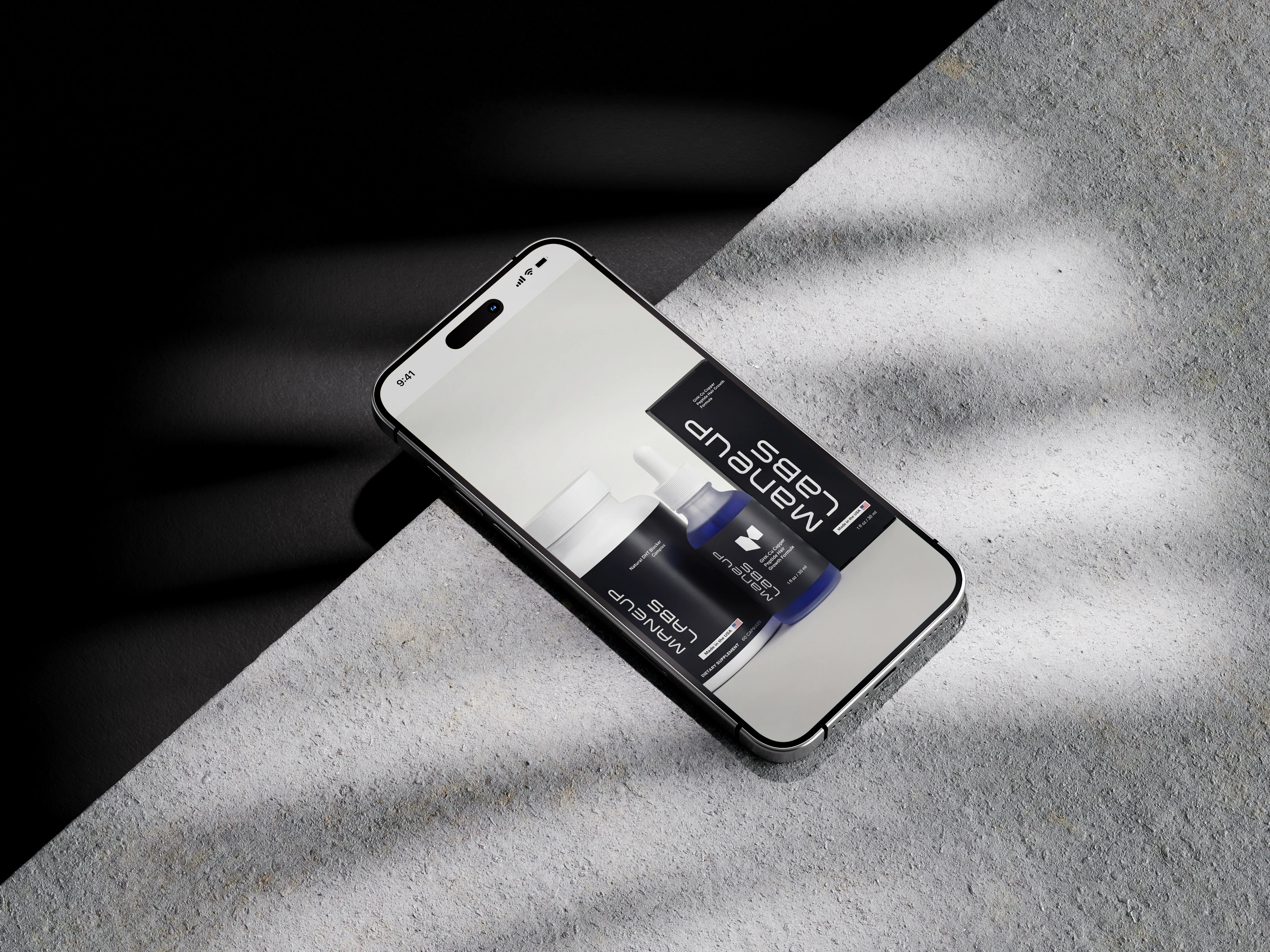
Maneup Labs came to me with a real, science-backed formula, a copper peptide scalp serum and a companion supplement, and packaging that didn't yet look the part. The name and the formula were there. What was missing was a visual identity that could carry both products, hold up on a printed box, and still feel premium enough to compete online.
The brief was simple to say and harder to hit: make it feel clinical enough to trust, and clean enough to want. Most brands in this space lean one way or the other, either sterile and forgettable, or loud and over-masculine. Maneup needed to sit in the middle, and look confident doing it.
The strategy
The goal for the rebrand wasn't to make Maneup look clinical, it was to make it look legitimate. Most hair loss brands go one of two ways: cold and pharmaceutical, or loud and over-promised. Neither builds trust with someone who's already tried a few things that didn't work. Maneup needed to look confident without needing to prove anything, which also opened the brand up to a different customer, not just the guy deep in hair-loss research, but someone who just wants it to work.
The foundation
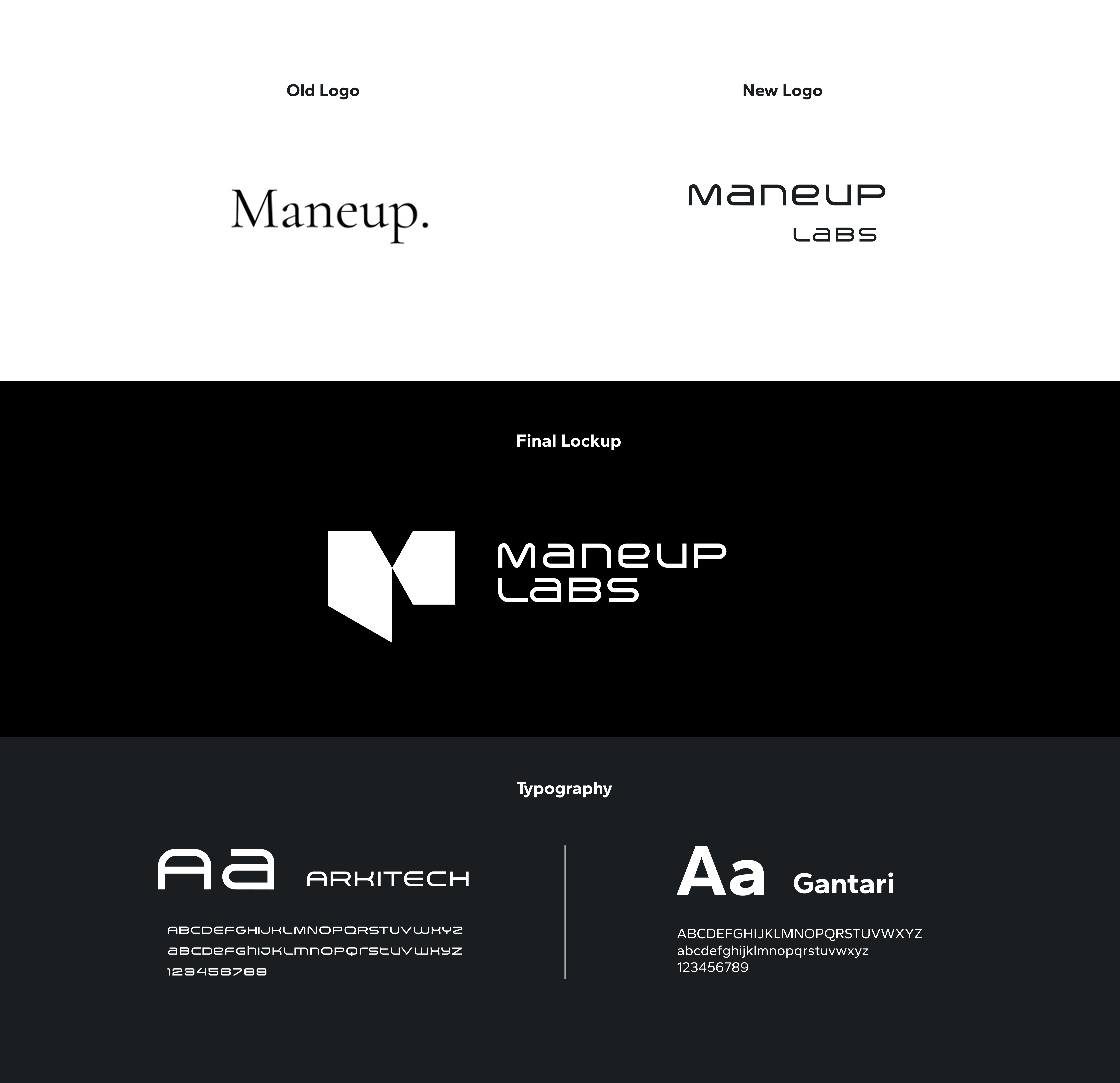
Before touching packaging, the identity itself needed to hold up: a mark that could be stamped in a single color, a palette with room for the product to be the only thing with real color in the frame, and a typeface built for legibility, not decoration
Packaging
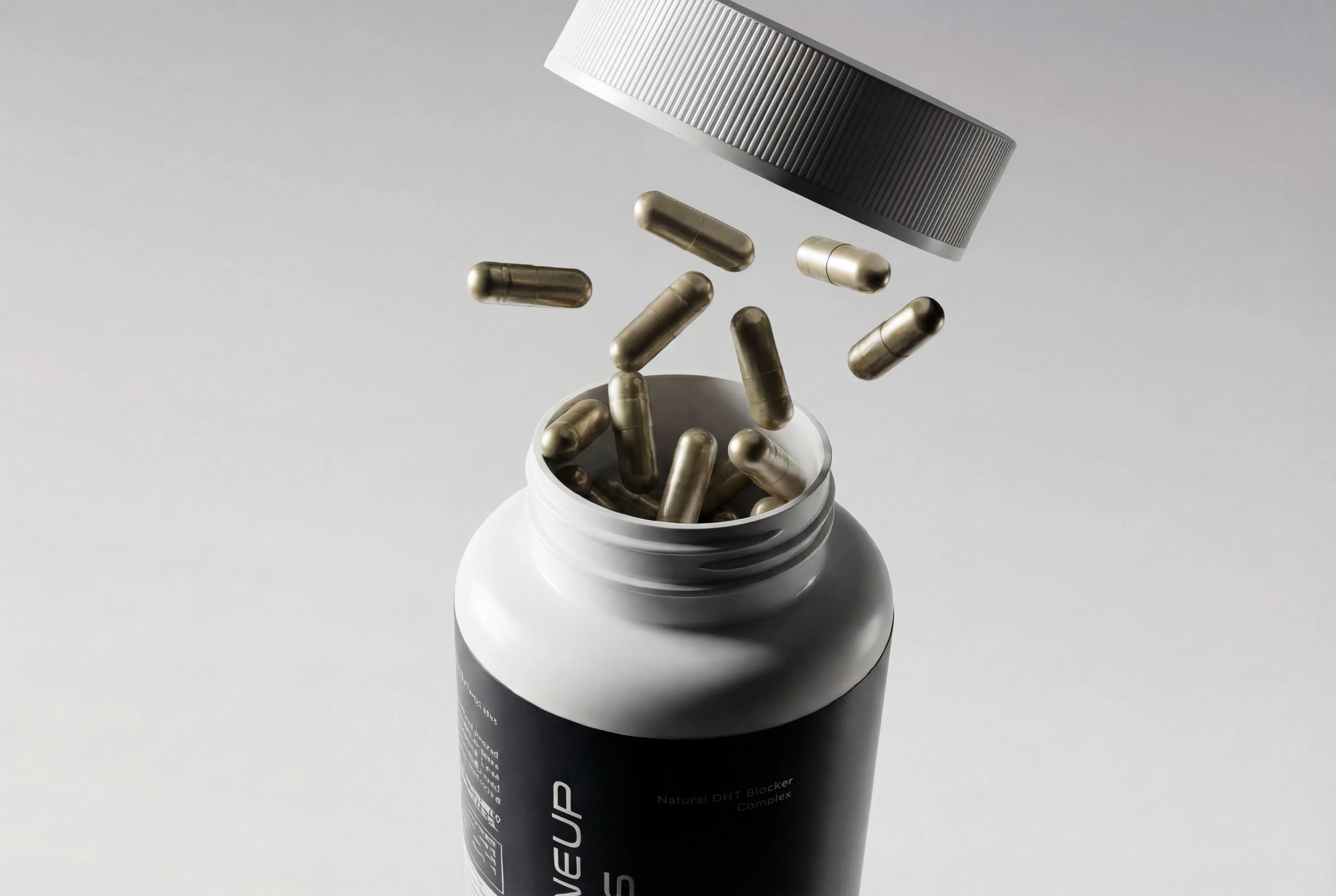
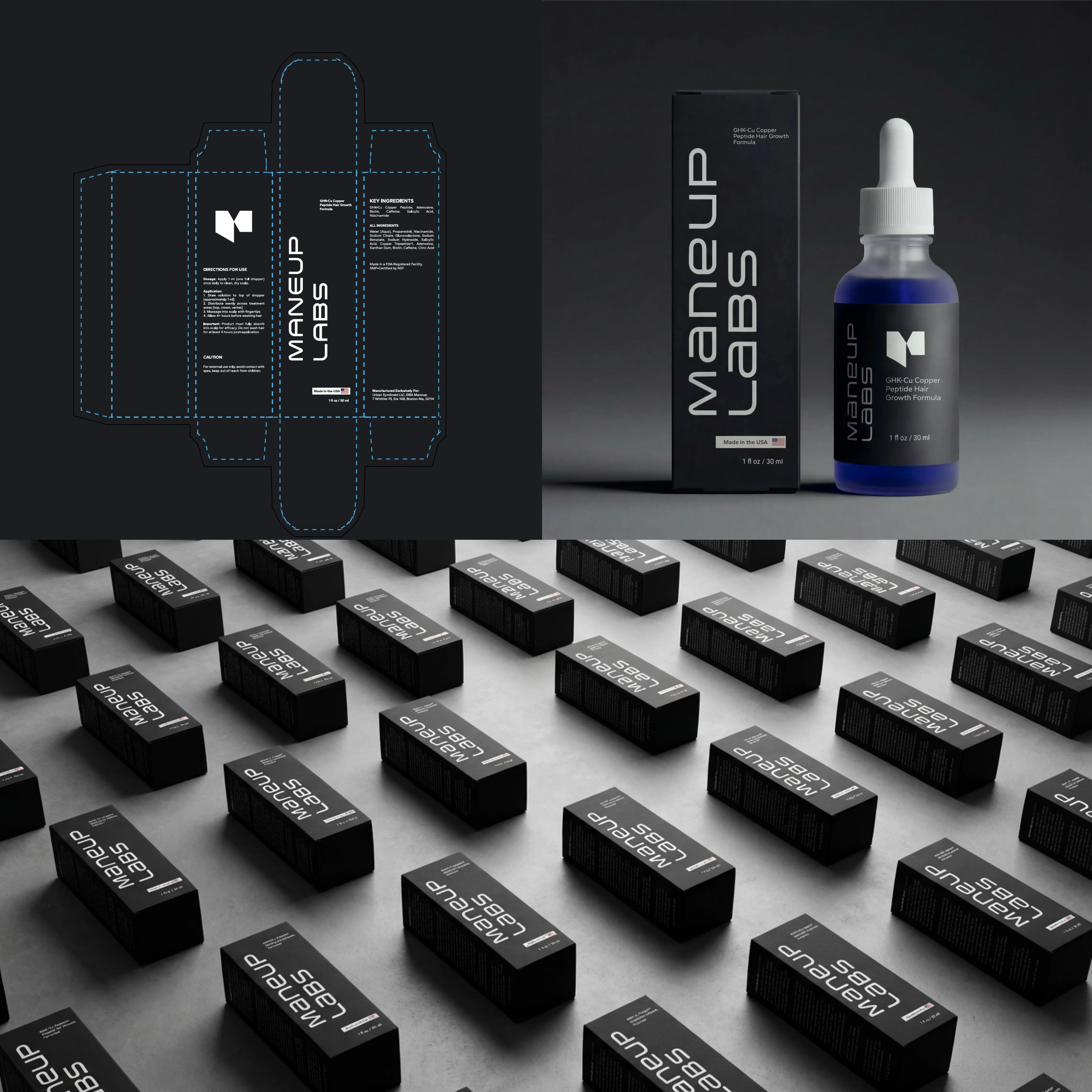
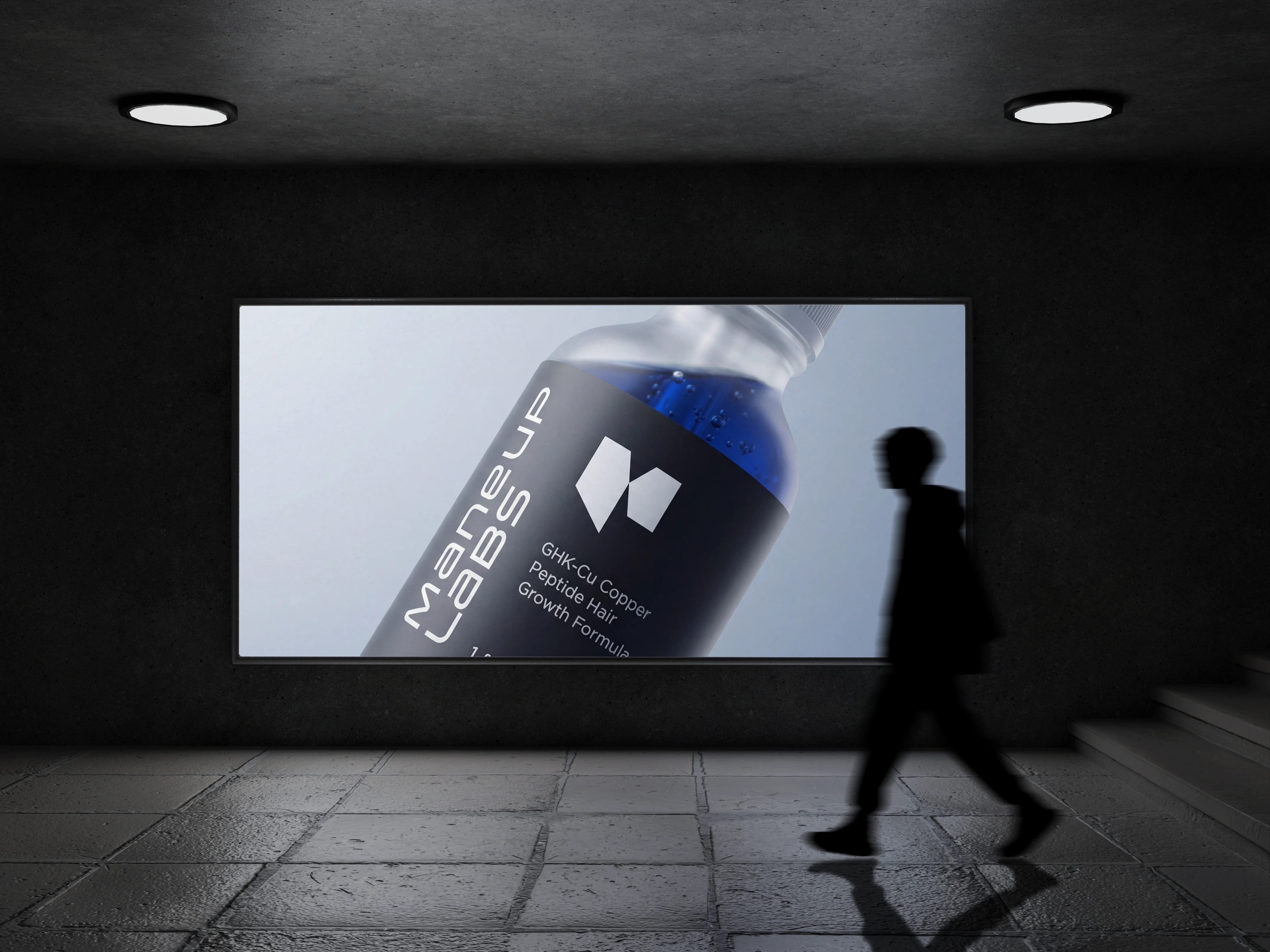
The packaging system was designed to feel credible, confident, and unmistakably premium, legitimate without needing to prove it. A restrained palette of near-black tones paired with a single cobalt accent keeps the formula itself as the only real color in the frame, while sharp, considered typography carries the sense of precision the product is built on.
Across the full run, the result is a system that feels ready for shelf, screen, and scale all at once.
The final design
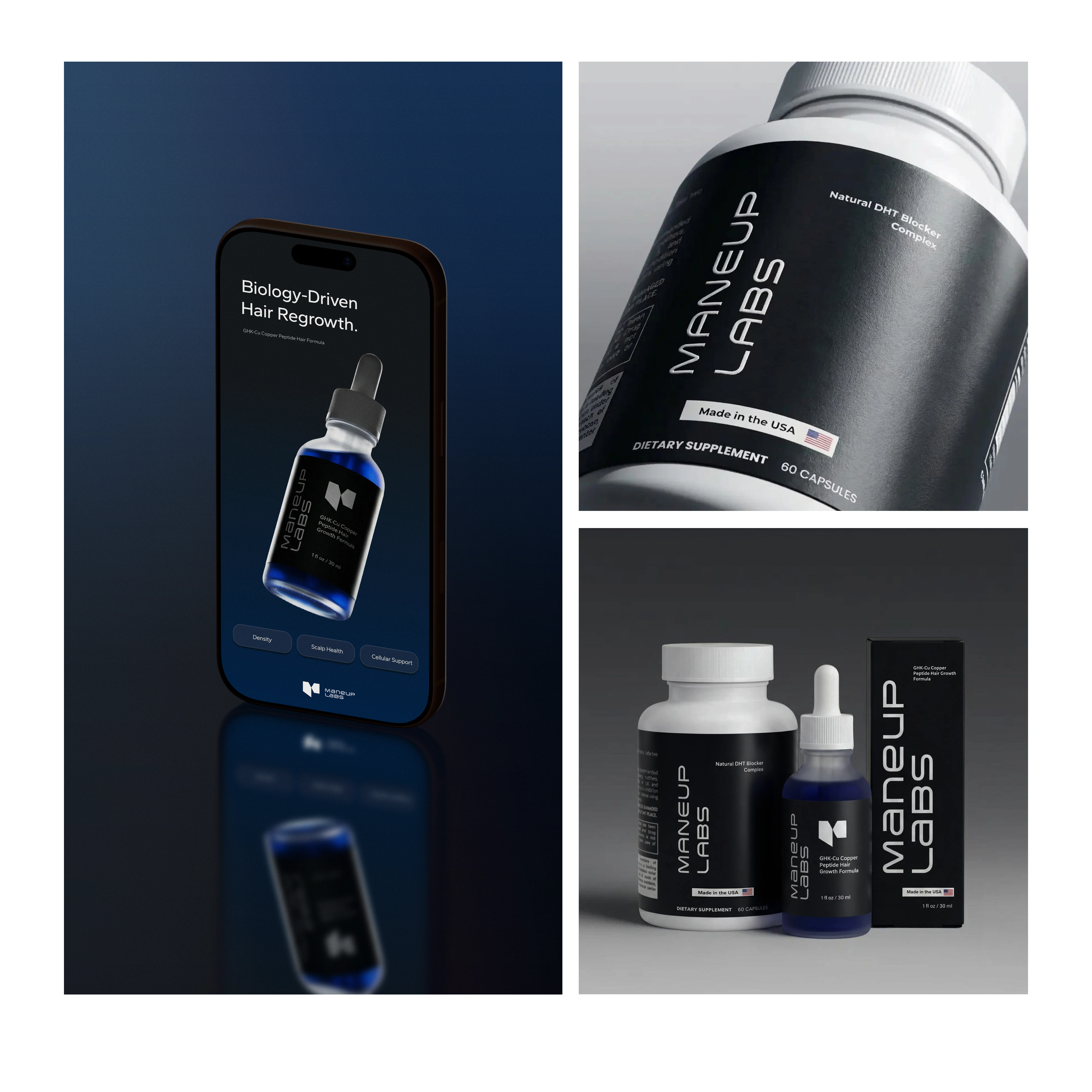
The final direction leans dark and controlled, deep, near-black tones with a single cobalt accent that belongs to the formula itself, so the product is always the brightest thing in the frame.
Outcome
What Maneup has now is a system that can grow with the brand, new SKUs, new formats, new placements, without ever needing to be reinvented. It looks like what it is: a real formula, backed by real science, presented with the confidence to match.
See the brand live
Like this project
What the client had to say
Virginia was awesome to work with! Communication was great, she worked with urgency, and was always ready to go above and beyond to make sure I loved the deliverables. She brings that rare "artistic eye" which is very valuable.


Beowulf Urban, Maneup Labs
Jan 15, 2026, Client
Posted Sep 9, 2026
A strategic rebrand for Maneup Labs, repositioning a hair growth formula away from medicinal and toward premium, identity, packaging, and product design.
Likes
12
Views
286
Timeline
Dec 8, 2025 - Jan 14, 2026
Clients
Maneup Labs