The network for creativity
Join 1.25M professional creatives like you
Connect with clients, get discovered, and run your business 100% commission-free
Creatives on Contra have earned over $150M and we are just getting started
Back to feedPost

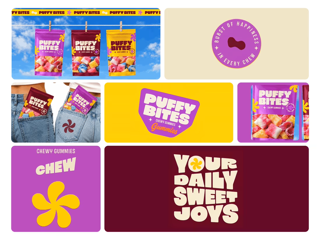
What makes a candy brand recognizable across every pack?
For Puffy Bites, I built the identity around rounded lettering, expressive symbols, and a palette of burgundy, purple, yellow, and cream.
The same visual language carries through pouch packaging, smaller wrappers, campaign imagery, and an animated brand showcase.
One design decision that ties it together: the packaging color changes, while the logo placement, product descriptor, and supporting graphics maintain a consistent structure.
I handled the full client project, from logo and visual identity to packaging and campaign applications.
Which colorway would catch your eye first—purple, burgundy, or yellow?
Explore the full Puffy Bites case study. If you’re developing a candy or snack brand, I’m available for branding and packaging projects.

great one really like the overall direction and consistency
Thanks, Hassam! Glad you liked the direction. I really enjoyed putting this identity together!

Thanks a lot, Saif! That's exactly the kind of feeling I wanted the packaging to have. Really appreciate your feedback, man! 🙌
Thank you @all

Love it,
Great work
Thank you
My pleasure

Such a vibrant and playful visual system! 🍬 The color choices and bubbly lettering pop so well 🙌
Thanks so much, Vijay! Really appreciate it! I wanted the whole identity to feel fun, energetic, and full of personality. Glad that came through! 🙌🔥

Purple catches my eye first. The chunky rounded lettering feels fun and easy to remember.
Thanks, Rafee! Purple was definitely one of the key colors I wanted to stand out. Glad the typography caught your attention too! 🙌

The colors are so vivid and pink with yellow color palette was stunning🔥🔥
Thank you, Mostafa! 🔥 I really enjoyed working with these bold colors. Happy to hear the combination worked so well for you!

amazing design . love the visual
Really Appreciated <3

great work!!
Thanks so much, Sahil. Really appreciate you taking a look at Puffy Bites. Did a particular colourway stand out to you?

Such a fun and eye-catching brand identity! Love the vibrant colours.
Thank you, Zara. That fun and eye-catching feel was the goal, a candy brand should feel playful before anyone reads a word. I loved working with those vibrant colours. Which colourway caught your eye first, purple, burgundy, or yellow?

awesome colour combos
Thank you, Akbar, I appreciate that. The combos were built so each colourway could change the mood of the pack while the logo placement and product details stayed exactly the same. Which combo caught your eye first, purple, burgundy or yellow?


Ha, purple wins again. It was the first colourway I built, and the one that set the tone for the burgundy and yellow packs. Glad it jumps out first, that is exactly what it is meant to do on a shelf.
The network for creativity
Join 1.25M professional creatives like you
Connect with clients, get discovered, and run your business 100% commission-free
Creatives on Contra have earned over $150M and we are just getting started








Related posts


How far can you take a logo beyond the first draft?
I started with Recraft's Logo Maker and a fictional idea: Bibu's Paws, a cosy little dog rescue and adoption shelter.
I wanted the identity to feel warm, homely and full of character, so I explored a few logo directions before settling on the little dog tucked inside a house.
From there, I took the idea further, building out the visual identity with an earthy colour palette, typography, illustrations and a few real-world applications: the shelter space, dog merchandise and an adoption welcome kit.
I enjoyed seeing how a small starting point could grow into a brand with its own personality and world.
Now I'm curious: if you were building a brand around this logo, what would you create next?






It turned out so cozy, you did great

My latest branding project for the Atlanta Museum of Paleontology.
Check out the full project at maximjungle.com


A T-rex drawn in one thin outline is such a good mark 🦖 I'd happily visit that museum.


I like the font!


