The network for creativity
Join 1.25M professional creatives like you
Connect with clients, get discovered, and run your business 100% commission-free
Creatives on Contra have earned over $150M and we are just getting started
Back to feedPost
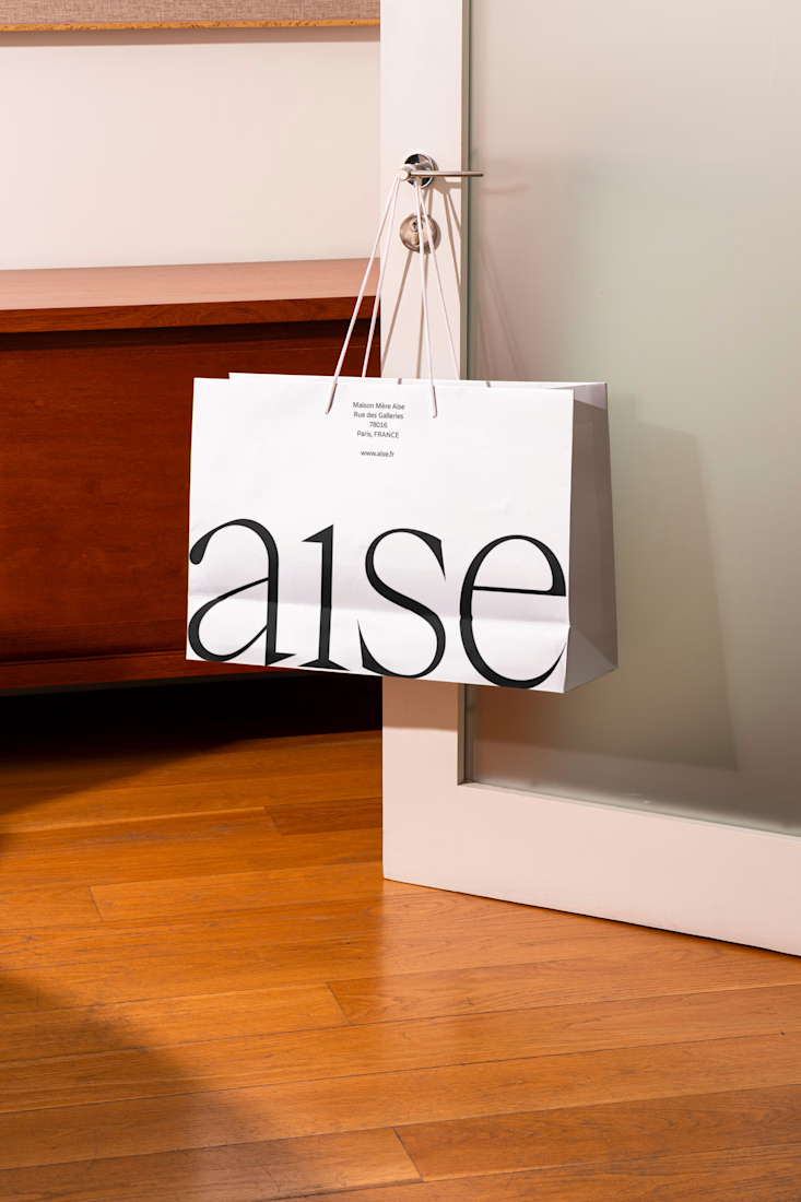
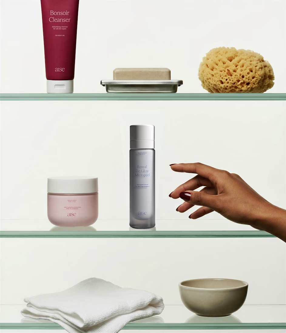
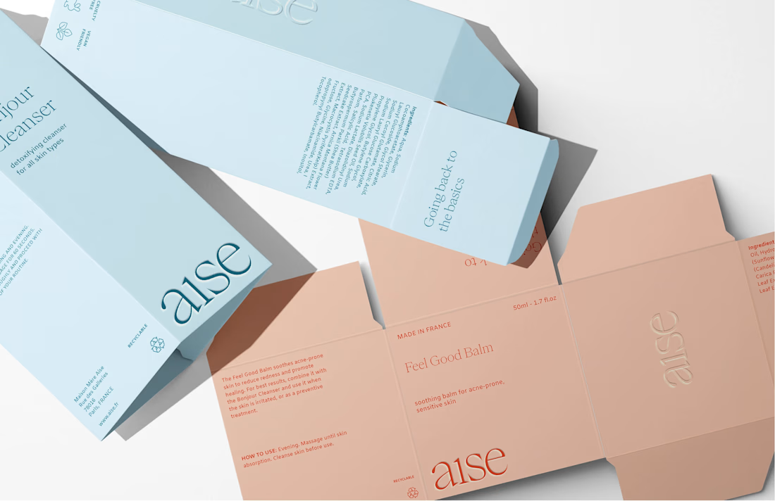
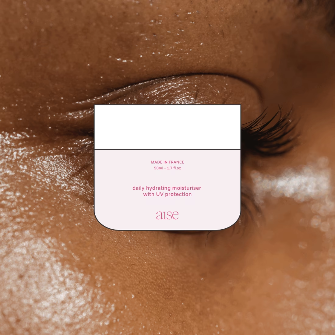
Aise is a conceptual skincare brand built around a simple premise: wellness should simplify your life, not add to it. Inspired by growing consumer overwhelm and decision fatigue, I developed a reduction-led brand strategy and visual identity that transforms minimalism into a functional system rather than a stylistic trend. Through restrained typography, intentional spacing, refined packaging, and clear product architecture, the brand is designed to reduce cognitive load and make skincare feel calm, intuitive, and effortless.



Beautiful work ✨

Thank you so much Bella! Love your work

Minimal design with maximum beauty 🤍
Thanks so much Nihal!!

Looks super clean and gorgeus!
Thank you Anita! 🫶🏽

Love how restrained the packaging feels, that wordmark on the outer box doing double duty as texture is a nice touch. Did you test other color combos before landing on the pink and sage, or was that pairing there from the start?
Thanks so much Maty! I did experience with other pastel/muted color combos. Ultimately this color palette felt just right 😃

So beautifully executed
Thanks so much Mariyam! Love your work


Leila amazing work 🫠

The work is clean and the typography go well with it

Wellness should simplify your life, not add to it is such a strong strategic foundation to build a visual identity around. The Aise system feels completely coherent, that warm terracotta and sage palette with the minimal wordmark says exactly what the brand promises.


Lovely! Love your mockups!!


stunning!!

The lowercase serif "aise" on that brown paper bag feels really intentional, it already signals calm before anyone reads the strategy behind it. "Reduction-led" is a good way to frame it too, most skincare brands just say minimal without actually building the system around it.

Clean work

This is so nice 😊

Lovely branding @Leila Sohaing

amazing

i like your style, amazing

Lovely work

great work

Wow! It looks very textured!

Elegant brand, with style. love it the color palette.

Nice!


Nice work, very clean


Amazing work


The mix of warm texture and pale blue packaging feels really well balanced
The network for creativity
Join 1.25M professional creatives like you
Connect with clients, get discovered, and run your business 100% commission-free
Creatives on Contra have earned over $150M and we are just getting started
Trending
retrofuturism
Share your favorite designs from the past exploring the distant future. Or your own take on the aesthetic 🚀
halftone
Dots. Texture. Grain. Let's see your designs using the halftone technique.

Midjourney
Creatives are showing off what they're making with Midjourney.
colorgrade
Video editors sound off: How do you enhance the mood of your video in color grading?


Related posts



Nice work!

They came in with a logo that was already live — just not landing. Too soft, too rounded, closer to "wellness product" than the bold, premium café they were building.
We refined the wordmark into something sharper, then built the system around it: brand guidelines, packaging, menu, social templates, merch — all timed to a soft launch in Davao City, Philippines.
The name "Borne" is a quiet nod to the founder's mom, who brought the family somewhere better. That story shaped every cut in the typography.
Check it out if you want to see how it came together 😊


Love the thinking behind this. A strong brand always starts with the story.

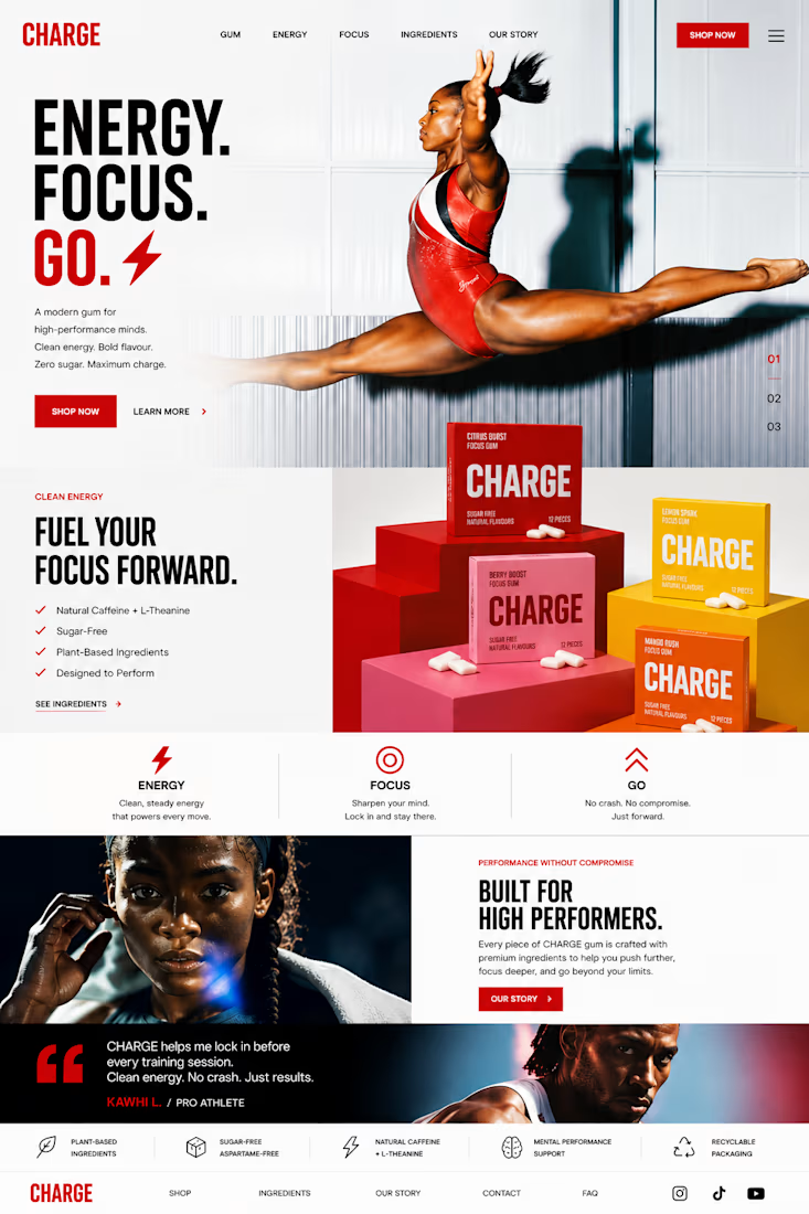
CHARGE — Brand Concept
Challenge
The focus gum category is crowded with products that rely on functional claims, lifestyle clichés, or overly clinical branding. CHARGE needed a visual identity that immediately communicated energy, confidence, and momentum while feeling premium enough to compete on modern digital shelves.
Idea
Energy. Focus. Go.
The concept treats focus as movement rather than concentration. Every graphic element—from bold typography and angular compositions to kinetic motion and athletic photography—reinforces the feeling of acceleration.
Rather than telling people they’ll feel energized, the brand is designed to make them feel energized the moment they encounter it.
Visual Language
A bold, high-contrast design system built around oversized typography, dynamic geometric forms, clean white space, and vibrant product colors creates an instantly recognizable identity. Bright lifestyle photography captures moments of determination, speed, and achievement, while the colorful packaging becomes a hero element across every touchpoint.
Motion System
The motion language is driven by momentum. Type slides with purpose, products snap into frame, athletes move through fast cinematic cuts, and macro product moments add tactile detail. Every transition is quick, precise, and intentional—mirroring the instant boost associated with the product.
Photography
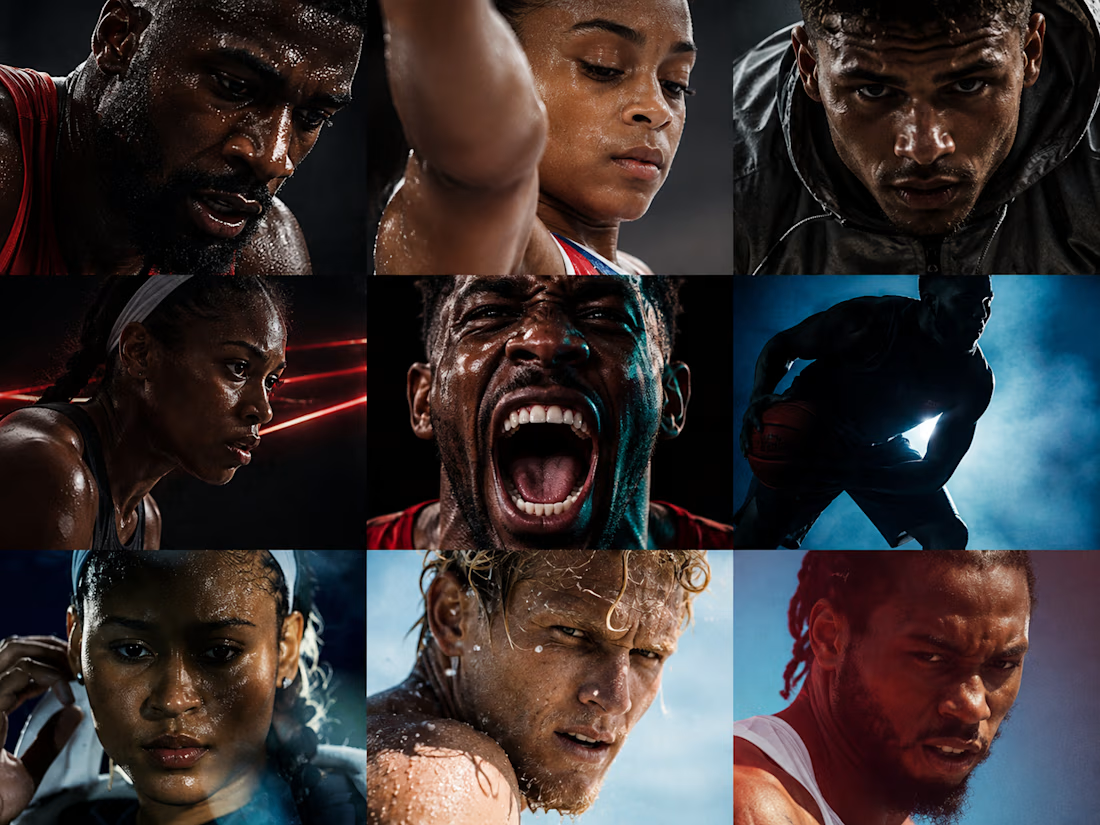
Instead of generic fitness imagery, the photography celebrates peak performance across multiple sports and disciplines. Powerful portraits, dynamic action, and vibrant outdoor environments create a feeling of optimism and forward motion while reflecting a diverse community of high performers.
Outcome
The result is a contemporary consumer brand that feels energetic, premium, and highly scalable. The identity extends seamlessly across packaging, social media, motion graphics, advertising, digital experiences, and retail—creating a cohesive brand system that is memorable both on shelf and on screen.


Treating focus as movement instead of concentration is a sharp reframe, most gum brands default to clinical or minty-clean visuals instead. The kinetic macro shots are doing a lot of the heavy lifting here. Was that photography direction locked in from the start, or did it come...